REVIEW: 27th Annual Exhibition of Artists in Michigan Prisons

Each year, the Prison Creative Arts Project (PCAP) at the University of Michigan organizes an annual exhibition to celebrate the 2D and 3D artwork of incarcerated individuals across the state. This year, the exhibition features works from 360 artists from 25 prisons, forming a stunning mosaic of 625 works— all with different stories to tell and drastically different mediums, but sharing a common passion for art as a mode of self-expression.

The work in the gallery is as diverse as you could imagine within a single gallery space, and far more diverse than you would expect from within prison walls. In terms of incarcerated artists’ resources, few are available; their small budget, when it fails, must be supplemented by any disposable material or item allotted to prisoners, such as toothpicks, tissue paper, ramen, and even blood, which are all used as mediums within this exhibition. The fragility of their resources doesn’t dampen the quality of the artwork but  rather imbues it with tenacity as well as a sense of masterful resourcefulness. This exhibition feels alive and buzzing with deep tension, each piece attesting to an emotionality that begs to be expressed even within despair and scarcity.

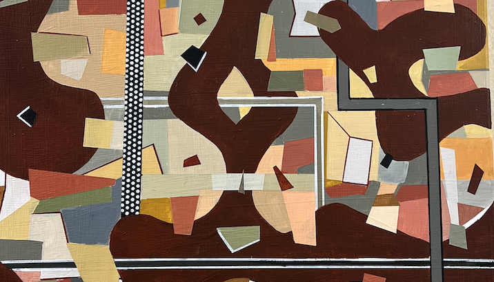
Condemned by M.J. Van Meter

When I stepped closer to a painting of a skeletal figure, one of many finely detailed works on a gallery wall, I realized that it was not a painting, but delicately carved bar soap with a layer of acrylic paint on top. I imagined all of the hours put into the construction of its curves, likely with a subpar or illegitimate carving tool. This painstaking work stands as evidence of the indomitable desire to create, and its transcendence beyond physical restraints; for incarcerated artists, art is both a beacon of hope and a weapon to break down the dehumanizing stereotypes surrounding imprisonment, rarely just a hobby.

Institutional Lobotomy by LIAM

Much of the art depicts the cruelties of the prison system— the separation of families, the bitter absence of human necessities, and the burden of emotional trauma. Many of the artists work in paint on canvas, although the two-dimensional art ranges from pen drawings to multimedia collages. The pieces most directly confronting incarceration are particularly colorful in their variety of expressions. Some artists took a surreal or even abstract route, inventing grotesque characters to represent their psyche; others pulled striking scenes straight out of reality, painting haunting memories with vivid oils. By contrast, a large portion of the works present placid and euphoric scenes— flowers pressed into ornate designs, loved ones with the sun beaming on their faces, three-dimensional log cabins made from scavenged materials— also expertly crafted. The passion poured into the more joyful work is just as evident as the passion put into the grim work, because, as a typical human response, hope is an essential component of resistance. By depicting some simple yet so out of reach, artists are reminiscing, or dreaming, or simply reclaiming their happiness from the oppressive grip of incarceration. Their labor-intensive work, done purely for the sake of it, is a slap in the face to a system that promotes and thrives off of the squashing of the human spirit. Art is resistance.


A Patient Man by Albert Krakosky

Much of the art is for sale, and some pieces cost as little as $10! The proceeds for sales will return to the artists so they may be used to purchase higher quality art materials. To learn more about PCAP, their mission, and to see (or buy!) the beautiful works of art in the exhibition, visit the gallery in the Duderstadt sometime before April 4th! The gallery is open Tuesday to Saturday from 10am to 7pm, and Saturday to Monday from 12pm to 6pm.

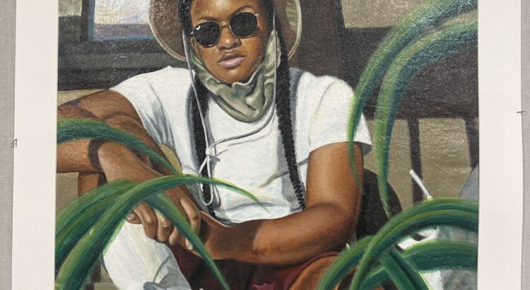
Featured Image: Portrait of Kamilla by Willie Anderson

REVIEW: Journey of Self-Discovery

Journey of Self-Discovery was quite a journey, indeed. I spent a good forty minutes perusing the paintings, scoping out the sculptures.

Upon entering the gallery, I chatted with the facilitator, who told me that two-thirds of the art had already been sold, as Rich’s work at the Dude was for sale through donation, the proceeds of which went directly to support a local grass roots food pantry ministry that serves areas of Ann Arbor.

The whole gallery, every space in it, was filled with a rich arrangement of whimsical paintings and sculptures. (Pun slightly intended.)

Hallucinations made me a little sick to stare at, like an onslaught of auras about to precede a migraine. A dark, whirling enchanted forest; walk through the maze and you’ll get woozy.

In Ignite, some of the scratched-off paint and its meddled, worn-by-time quality echoed graffiti. “ROM” in the corner made me wonder what other words might be hidden. The piece had the playfulness of a childhood scribble where we’d take our nails to a paper of crayon and get wax curled beneath them, but also the mastery of someone whose paid years of practice.

Spark’s thin, intricate mess of scrapes creates texture and noise. Almost like nails scratching against walls, it feels chaotic yet harmonious. It is quite a feat to achieve a composition of random shapes and colors with no recognizable pattern, that doesn’t border on busy, or unbalanced.

Are you there? haunted me, just from the title. I looked into the abstract and tried to pull something out. It took a few seconds, but I couldn’t help seeing a baby in a womb, floating, unattached to an umbilical cord, living lost in the guts of a mother.

Balancing Act feels like a futuristic, hypertech playground world, or the next version of the board game Chutes and Ladders. 

Future Daze gave off the lonely monotony of a city. I got a glimpse into the banalities of the everyday life of a citygoer. Vibrating with texture and pulse, peering into the painting feels like getting caught in a daunting big place, where you feel like one of millions of others. But the muted palette gives a sense of calmness, dullness, of having gotten used to it, enough to call this bustling place home.

I can’t help seeing some kind of creature in Concentricity, like a silly red panda or raccoon, calling out to me with crossed eyes, just to make me double-take in disbelief.

Junk Drawer Wisdom – a very interesting title. As if claiming it may be messy, but it’s an organized mess, because you know where things are in the clutter.

Suspension feels cakey, creamy; I don’t rly have the words to describe it, but it’s my favorite thus far. Maybe it’s the colors on the left or the texture that I have no idea how Rich achieved, but it feels like a unique ROM texture – a little Jackson Pollock, but more smooth than spattered.

Sitting Meditation was interesting. Especially because the rounded pod-like windows resemble the little apartments in the graphic novel, Apsara Engine. I would think a meditation calm, and maybe this one is, despite the overwhelming cogs-in-machine way about it. Because puzzle pieces are slotting into place, blocks are getting put away into boxes, things getting maneuvered into their rightful place. Thoughts are being stored away, put to rest, so the mind can quiet and not have all these anxieties sitting around, waiting to jump in. The white outline is like the cable in Monsters Inc bringing doors back to their homes.

Blast felt kinda mischievous. There’s a lopsided smiley face at the bottom center and a rounder circle encasing it. It reminded me of those No, David! children’s books because of the one spike on its head, which is so characteristic of a trouble maker (also like Jack Jack from The Incredibles). The black squiggles in the second quadrant are as if he just took to his hair with a pair of safety scissors, and mom is about to come through that yellow door on the right and have a heart attack when she sees him and the mess he’s made.

Tongue in Cheek is a potato cornucopia. A little potato society. There is a potato statuette, like the potato is on top of the world, sailing on a boat.

Got Dopamine? is fun: I couldn’t stop seeing all these silly faces in it. Maybe not all particularly happy or pleased expressions, but they gave me little bursts of dopamine.

Emerge looked like a mouth full of teeth and gums and bacteria, in full sickness. When will you emerge from your room? Pop off your bed? Not today.

I like the way Hanging ‘Round moves as you shift around it. This was just one of the many wood constructions and carvings, which all had so much movement for such a dead thing as the innards of a cut tree.

In Equine Driver, I see a sassy cat and a skirting teacup, like that of Chip from Beauty and the Beast. He is pretending to be a sailboat. Is the cat’s eye slanted at him, or the judgers?

Rhythmic Reverberation felt like it touched directly into my chest. I could hear the soundscape of nostalgic beeps and boops, glowing notes shooting through wires.


Forest For The Trees was fun. I had to wait to have my turn with this one. I witnessed a professor-like observer, an older man with glasses and a tweed coat, humming a sound of playfulness, of delight, humor, at shifting his perspective and seeing how the forest moves, like the whole swath of trees is turned on its side.

If there’s anything I’ve learned from walking around Rich’s gallery, it’s that the aesthetically pleasing – the ones that are easy to look at, that I’d be more inclined to buy or hang up in my house – are not the ones that tell a story, as much as the funky friends, the outcasts.

When I got home, my roommate saw Rich’s card on my desk and burst out in an accusatory smile, because apparently she worked there, at the Dude gallery! She had met Richie, his wife, and his family members who stopped by the exhibit; I had just missed her. I asked what he was like. She said Rich acts like his art. He talks with his hands, and does this thing when he talks, where he moves his head in a looping motion as if he’s drawing infinities with his ears. My roommate delighted in his art because she feels happiest when art, especially her own, is playful. I agree. Journey of Self-Discovery felt like a joyful, eccentric playground that you could dance through, get lost in.

REVIEW: 26th Annual Exhibition of Art by Michigan Prisoners

This diverse exhibition is definitely worth checking out.

Themed art exhibition makes you form prior expectations before you visit the place. The exhibition of Art by Michigan Prisoners made me expect a heavy exhibition with a lot of social messages, life in prison, and emotions. This turned out to be a prejudice: the exhibition was full of diverse artworks using various mediums and exploring different themes and topics. This proved my prejudice to put their current location over who they were as an artist. As if the exhibition already expected people like me to have this prejudice, the exhibition emphasized and invited the viewer to see the people behind the artwork. The visitor could write on the guest book which will go straight to the artist. Also, a computer was placed so that the visitor could search the artist’s art statement. Every artwork is marked with a price that the artist had decided on and the visitor could purchase artwork on the spot.

Here are a few of the artwork that showed well the themes shared by some artworks. I chose them not because they were better than the others but because these are the ones that I spent more time viewing.

‘Living the Dream’, John Riley
‘Popsicle Stick Chess 2.0’, Ryan G
Left: ‘Identity’, Johnetta Sullivan                  Right: ”An Old Memory (from before worst decisions & mistake)”, L. Wheeler


Quite a few artworks showed the relationship between real or imagined spaces and the artist: it could be their dream houses like Joh Riley’s ‘Living the Dream’, or a scene from their memory. Some directly addressed their current state as being imprisoned: imagining freedom or reunion with their family. There were also portraits that seemed to be of the person that the artist know. Also, I was amazed to find out that wooden popsicle sticks could create amazing artwork-some of artwork had created highly detailed sculptures with popsicles sticks, like ‘Popsicle Stick Chess 2.0’ by Ryan G.

Another factor why I was aware of the artist behind the artwork more in this exhibition compared to other ones is because of the knowledge that the majority of the artists were not trained in art. This made me focus more on why the artist would have chosen this medium and topic as the focus of their art. If the artist is a professional artist, I think they will choose something that is closer to their professional identity as the topic of the art. However, if the artist is a non-occupational artist who produces limited drawings, then you start to link the meaning of that specific piece with the life of the artist, drawing from a broader area than just personal identity.

The exhibition continues until April 5th. If you can’t visit the Duderstadt center before that date, you can see the artwork online here.