REVIEW: Digital Engrams by Gabriela Ruiz

L.A. artist Gabriela Ruiz is a self-taught multimedia artist whose sculptural pieces blur the line between the virtual and the real. I watched Gabriela talk at the Stamps Distinguished Speaker Series earlier this month and I was immediately captivated by her distinctly Gen Z artistic voice. Ruiz is unafraid to confront questions that are still emerging in our culture, such as: what does identity look like for digital natives? Decorated in vibrant colors, lush textures, and a tangle of animated pixels, her art captures the experience of being online, particularly the struggle of navigating memories and identity amidst virtual chaos.

An engram is a trace of memory; a digital engram, then, is a memory stored in an artificial code. Digital Engrams is an exhibition tucked into the Institute for the Humanities Gallery, occupying one beautiful room. Red walls drench the space in color, contrasting against the bright greens and psychedelic lights of Ruiz’ geometric sculptures. Built into and around the sculptures are swirls, soft grassy forms, collages of screens, and interactive audio-visual tools, forming an immersive experience that teeters between the natural and unnatural. Not only is her work multimedia, but it is multidimensional— it is in two, three, and four dimensions, containing everything from time-based media to stationery sculptures. It’s a satisfying installation because of the sheer variety of forms Gabriela Ruiz incorporates into the space.


As I walked around the space, watching the screens’ surreal montages and cryptic messages, I felt immersed in the hypnotism and strangeness of Ruiz’ digital world. The colors, textures, and sounds were overstimulating in a way that was familiar, echoing the feeling of everything happening all at once in digital space. The decontextualized montages and projections lend the exhibition a feeling of absurdity and disorientation. Still, these feelings are overwhelmed by fascination; I resonate with the organic, grassy forms lying near the digital structures because I am always trying to reconcile my “organic” identity with my digital identity; I resonate with the confused chaos and ephemerality of the mosaics of screens, representing moments passed and immediately forgotten but always preserved in a web of data; really, I resonate with Ruiz’ ever-changing sense of belonging in a world of overstimulation and non-stop movement.

My only complaint about this exhibition is that it isn’t bigger— I would have loved to explore an even larger room, a maze full of abstract structures and glitchy footage, as if exploring the depths of Gabriela Ruiz’ mind. I personally believe it is hard to make art about the digital world without the vastness and clutter of it drowning out the meaning; Gabriela Ruiz, on the other hand, approaches the subject beautifully. Her art is abstracted enough to be open-ended, simple enough to be digestible, and just colorful enough to be entrancing without being nauseating. She finds the balance between the tangible and the digital, creating a physical map of a futuristic generational struggle.

Digital Engrams by Gabriela Ruiz is a free exhibition at the Institute for the Humanities Gallery at 202 S. Thayer. It can be seen through December 8th and is open 9-5 on weekdays.

PREVIEW: Dopamine Dressing

What: an exhibition of YehRim Lee’s clay and metal sculptures inspired by the “dopamine dressing” fashion trend

When: December 17, 2022 – August 27, 2023

Where: UMMA, Irving Stenn, Jr. Family Gallery

Over the course of the last few weeks of fall semester, on my morning walks past the UMMA, when the lights inside the Irving Stenn, Jr. Family Gallery were on but it was still dark out, I had the opportunity to watch this exhibition being assembled as if in a stop-motion film. First the walls were painted pink (a shade which looks suspiciously like Baker Miller pink or Cool Down Pink, colors supposedly shown to reduce hostility and violent behavior). The title of the exhibition and a description were painted on the window facing Tisch hall. Geometric pedestals were constructed and then the sculptures themselves appeared, at first clustered together on folding tables. Admittedly, in those first days, my initial reaction to the art was negative. The sculptures made me a bit uncomfortable, with their bubbling textures and pastel colors smearing into one another. When I read the description on the gallery window and on UMMA’s website, I was surprised that YehRim Lee’s intent was to explore how colors and textures could spark joy in a viewer–and became interested in spending more time with her work to unpack my initial reactions. I look forward to visiting the exhibition this Saturday and sharing my musings with you!

REVIEW: Journey of Self-Discovery

Journey of Self-Discovery was quite a journey, indeed. I spent a good forty minutes perusing the paintings, scoping out the sculptures.

Upon entering the gallery, I chatted with the facilitator, who told me that two-thirds of the art had already been sold, as Rich’s work at the Dude was for sale through donation, the proceeds of which went directly to support a local grass roots food pantry ministry that serves areas of Ann Arbor.

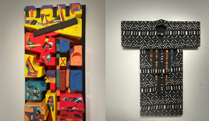
The whole gallery, every space in it, was filled with a rich arrangement of whimsical paintings and sculptures. (Pun slightly intended.)

Hallucinations made me a little sick to stare at, like an onslaught of auras about to precede a migraine. A dark, whirling enchanted forest; walk through the maze and you’ll get woozy.

In Ignite, some of the scratched-off paint and its meddled, worn-by-time quality echoed graffiti. “ROM” in the corner made me wonder what other words might be hidden. The piece had the playfulness of a childhood scribble where we’d take our nails to a paper of crayon and get wax curled beneath them, but also the mastery of someone whose paid years of practice.

Spark’s thin, intricate mess of scrapes creates texture and noise. Almost like nails scratching against walls, it feels chaotic yet harmonious. It is quite a feat to achieve a composition of random shapes and colors with no recognizable pattern, that doesn’t border on busy, or unbalanced.

Are you there? haunted me, just from the title. I looked into the abstract and tried to pull something out. It took a few seconds, but I couldn’t help seeing a baby in a womb, floating, unattached to an umbilical cord, living lost in the guts of a mother.

Balancing Act feels like a futuristic, hypertech playground world, or the next version of the board game Chutes and Ladders. 

Future Daze gave off the lonely monotony of a city. I got a glimpse into the banalities of the everyday life of a citygoer. Vibrating with texture and pulse, peering into the painting feels like getting caught in a daunting big place, where you feel like one of millions of others. But the muted palette gives a sense of calmness, dullness, of having gotten used to it, enough to call this bustling place home.

I can’t help seeing some kind of creature in Concentricity, like a silly red panda or raccoon, calling out to me with crossed eyes, just to make me double-take in disbelief.

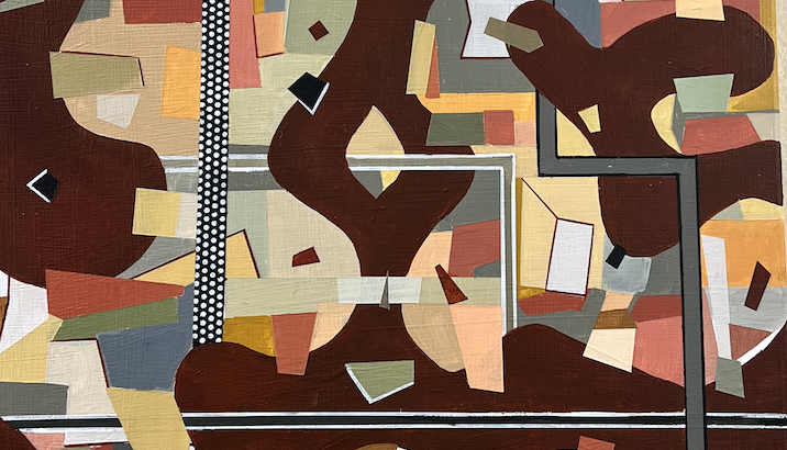
Junk Drawer Wisdom – a very interesting title. As if claiming it may be messy, but it’s an organized mess, because you know where things are in the clutter.

Suspension feels cakey, creamy; I don’t rly have the words to describe it, but it’s my favorite thus far. Maybe it’s the colors on the left or the texture that I have no idea how Rich achieved, but it feels like a unique ROM texture – a little Jackson Pollock, but more smooth than spattered.

Sitting Meditation was interesting. Especially because the rounded pod-like windows resemble the little apartments in the graphic novel, Apsara Engine. I would think a meditation calm, and maybe this one is, despite the overwhelming cogs-in-machine way about it. Because puzzle pieces are slotting into place, blocks are getting put away into boxes, things getting maneuvered into their rightful place. Thoughts are being stored away, put to rest, so the mind can quiet and not have all these anxieties sitting around, waiting to jump in. The white outline is like the cable in Monsters Inc bringing doors back to their homes.

Blast felt kinda mischievous. There’s a lopsided smiley face at the bottom center and a rounder circle encasing it. It reminded me of those No, David! children’s books because of the one spike on its head, which is so characteristic of a trouble maker (also like Jack Jack from The Incredibles). The black squiggles in the second quadrant are as if he just took to his hair with a pair of safety scissors, and mom is about to come through that yellow door on the right and have a heart attack when she sees him and the mess he’s made.

Tongue in Cheek is a potato cornucopia. A little potato society. There is a potato statuette, like the potato is on top of the world, sailing on a boat.

Got Dopamine? is fun: I couldn’t stop seeing all these silly faces in it. Maybe not all particularly happy or pleased expressions, but they gave me little bursts of dopamine.

Emerge looked like a mouth full of teeth and gums and bacteria, in full sickness. When will you emerge from your room? Pop off your bed? Not today.

I like the way Hanging ‘Round moves as you shift around it. This was just one of the many wood constructions and carvings, which all had so much movement for such a dead thing as the innards of a cut tree.

In Equine Driver, I see a sassy cat and a skirting teacup, like that of Chip from Beauty and the Beast. He is pretending to be a sailboat. Is the cat’s eye slanted at him, or the judgers?

Rhythmic Reverberation felt like it touched directly into my chest. I could hear the soundscape of nostalgic beeps and boops, glowing notes shooting through wires.


Forest For The Trees was fun. I had to wait to have my turn with this one. I witnessed a professor-like observer, an older man with glasses and a tweed coat, humming a sound of playfulness, of delight, humor, at shifting his perspective and seeing how the forest moves, like the whole swath of trees is turned on its side.

If there’s anything I’ve learned from walking around Rich’s gallery, it’s that the aesthetically pleasing – the ones that are easy to look at, that I’d be more inclined to buy or hang up in my house – are not the ones that tell a story, as much as the funky friends, the outcasts.

When I got home, my roommate saw Rich’s card on my desk and burst out in an accusatory smile, because apparently she worked there, at the Dude gallery! She had met Richie, his wife, and his family members who stopped by the exhibit; I had just missed her. I asked what he was like. She said Rich acts like his art. He talks with his hands, and does this thing when he talks, where he moves his head in a looping motion as if he’s drawing infinities with his ears. My roommate delighted in his art because she feels happiest when art, especially her own, is playful. I agree. Journey of Self-Discovery felt like a joyful, eccentric playground that you could dance through, get lost in.

REVIEW: GROW(ING): The 2022 Senior Exhibition

As a Stamps student eagerly stepping into my second year, I find that any glimpse I can get into the work of upperclassmen at Stamps is a treasure. The talent of Stamps students, refined by years of practice, discipline, and creative freedom, is manifested into varieties of works scattered throughout Stamps hallways. Although I enjoy the intricate jewelry and fiber sculptures put on display, many display cases remain empty; I often feel a disconnect from my fellow art students, constantly craving a more in-depth look at how Stamps allows ambition to blossom. The Grow(ing) exhibition was the first deep dive into Stamps work that I have experienced, and it was transformative.

Grow(ing) is a senior exhibition, showcasing the work of BA, BFA, and Interarts students at Stamps. The exhibition is arranged as a maze of large cubicles, each containing the work of one artist, accompanied by a plaque. Art across all mediums is included, from time-based art to wearable sculpture to projections on a floor. The variety is what immediately struck me the most— each artist was able to convey their personal message in truly whatever format they wanted, and this allowed them to communicate effectively, each work standing out from the rest. Three-dimensional art forms dominated two-dimensional, noninteractive art forms in this exhibition, which was shocking to me. I feel as if most Stamps students enter the curriculum with a focus on traditional two-dimensional forms— drawing, painting, et cetera— but Grow(ing) emphasizes the students’ capacity to expand their comfort zones. Stamps’ encouragement to explore creative possibilities paid off in the form of plant-adorned mirrors and enigmatic ceramic furniture sets. Even with limited time on my hands, I couldn’t help but stop at each and every cubicle to absorb the individuality of each space and how the artist’s energy dominates it.

Many artists combined mediums to create deeply layered works. One of my favorites at the exhibition was Silencio by Lissette Quintanilla, a collection of beadwork wearable sculptures that were both displayed on the wall and photographed. Lissette explores her heritage, upbringing, and the intersections of her identity through these delicate sculptures, portraying symbols of identity in a three-dimensional format. Although the sculptures are small, the obvious dedication behind them gave them an air of sophistication that demands your attention. I found that many smaller works throughout the exhibition were outstanding in the same way— although small, they are mighty, carrying a powerful message in a compact and detailed vessel.

Many of the exhibitions were larger sets, complete with instructions on how to interact with the work, lighting elements to boost the atmosphere, or sound elements. Each cubicle represented a fragment of an enigmatic world, a brief glimpse into the colorful mind of a creator. For non-art students and art students alike, the Stamps Senior Exhibition— and any Stamps exhibition at that— is a gift. Student exhibitions are a source of inspiration that naturally renews, encouraging its viewers to create more art, which will build future exhibitions, which will be viewed by more creatives searching for inspiration, and the cycle continues. Art is a beautiful thing, and fleeting moments to stop and appreciate it should be grasped. I look forward to future Stamps exhibitions and you should too!

REVIEW: 26th Annual Exhibition of Art by Michigan Prisoners

This diverse exhibition is definitely worth checking out.

Themed art exhibition makes you form prior expectations before you visit the place. The exhibition of Art by Michigan Prisoners made me expect a heavy exhibition with a lot of social messages, life in prison, and emotions. This turned out to be a prejudice: the exhibition was full of diverse artworks using various mediums and exploring different themes and topics. This proved my prejudice to put their current location over who they were as an artist. As if the exhibition already expected people like me to have this prejudice, the exhibition emphasized and invited the viewer to see the people behind the artwork. The visitor could write on the guest book which will go straight to the artist. Also, a computer was placed so that the visitor could search the artist’s art statement. Every artwork is marked with a price that the artist had decided on and the visitor could purchase artwork on the spot.

Here are a few of the artwork that showed well the themes shared by some artworks. I chose them not because they were better than the others but because these are the ones that I spent more time viewing.

‘Living the Dream’, John Riley
‘Popsicle Stick Chess 2.0’, Ryan G
Left: ‘Identity’, Johnetta Sullivan                  Right: ”An Old Memory (from before worst decisions & mistake)”, L. Wheeler


Quite a few artworks showed the relationship between real or imagined spaces and the artist: it could be their dream houses like Joh Riley’s ‘Living the Dream’, or a scene from their memory. Some directly addressed their current state as being imprisoned: imagining freedom or reunion with their family. There were also portraits that seemed to be of the person that the artist know. Also, I was amazed to find out that wooden popsicle sticks could create amazing artwork-some of artwork had created highly detailed sculptures with popsicles sticks, like ‘Popsicle Stick Chess 2.0’ by Ryan G.

Another factor why I was aware of the artist behind the artwork more in this exhibition compared to other ones is because of the knowledge that the majority of the artists were not trained in art. This made me focus more on why the artist would have chosen this medium and topic as the focus of their art. If the artist is a professional artist, I think they will choose something that is closer to their professional identity as the topic of the art. However, if the artist is a non-occupational artist who produces limited drawings, then you start to link the meaning of that specific piece with the life of the artist, drawing from a broader area than just personal identity.

The exhibition continues until April 5th. If you can’t visit the Duderstadt center before that date, you can see the artwork online here.

REVIEW: How to Build a Disaster Proof House

Tracey Snelling’s ‘How to Build a Disaster Proof House’ is on exhibition in Institute for the Humanities’ Gallery and Osterman Common Room. The exhibition itself is not huge – one can definitely squish it into their lunch or dinner time as an after-lunch/dinner art experience. I recommend doing so – this is an interesting exhibition where everyone will find different things to focus on and to muse that will definitely be worth your time.

The exhibition is mainly comprised of different styles of rooms, some small and some real-life sizes. There is no common theme shared in their aesthetics, and each and every one of them is decorated with vibrantly colored objects and cut-outs from prints. They seem to represent different lifestyles, or even, different scenes from life. However, they have kitsch, even a bit eerie, or extraordinary atmosphere. They do not fall into what we would mentally categorize as ‘normal life’. The feeling of wild, chaotic energy seems to derive firstly from the background, as the artist had placed huge posters or drapes of natural sceneries on the walls of the space, forming a background that adds energy to the exhibition. As can be seen from some pictures, these sceneries are not the ones that calm your mind. The colors in it are exaggerated and overly vibrant, adding to the active, uneasy vibe of the exhibition. Also, the use of diverse materials and colors for objects that demands attention all at once also adds to the vast input of information from the exhibition. Additionally, the placement of the artworks that place life-size rooms and miniature-size rooms together also creates unbalance in the scope of the attention: while the viewer is focusing on the smaller size works, their attention is overwhelmed by the relatively huge, life-size objects while the small ones nag and demands attention while they are taking in the life-size ones, creating the uneasy tension between the two sizes. Lastly, the artist had interestingly integrated video into her work-lots of videos are played simultaneously from the windows of small houses, adding chaotic audio on top of all the rich visual information that the viewer is already processing. All this adds up to create an audiovisual influx of information and this is where the exhibition consisted of static rooms filled with un-moving objects shifting into the concept of moving and alertness in disastrous situations. When in a situation of a disaster, people are more alert toward inputs from the world to detect danger and this overwhelms them. The exhibition creates a similar experience for us while reminding us that disaster is different from mundane life but perhaps not so far apart – this is expressed by how the artist chose the area that we are familiar with, personal rooms, but filled it with items and contexts that are not common.

There were also a few rooms where I could detect the trial to bring in social messages and status quo, like in the picture above. However, that was not emphasized much, and like it was addressed above, I think the author did a creative take on explaining disaster without using direct reference from society.