Visiting the Stamelos Gallery at the Mardigian Library on Monday was a powerful experience that gave me a deeper appreciation for Lester Johnson’s work. Stepping into the space filled with his vibrant pieces, I felt the energy of his journey as an artist, a journey that is deeply rooted in the history and culture of Detroit and the broader African-American experience.
The exhibition, FOUR: Lester Johnson’s Selected Works, is a captivating reflection of his life and creative evolution. As I stood in front of his large-scale totem sculptures, I couldn’t help but think about how Johnson’s work is so deeply connected to his childhood in Detroit’s Westside, a historically rich Black community. Growing up just blocks from the iconic Blue Bird Inn, a hub for jazz legends like John Coltrane and Miles Davis, it’s clear how the rhythms and melodies of Detroit’s jazz scene shaped his creative vision. Johnson’s art is infused with the spirit of this music, often created with it playing in the background, as he seeks to channel its energy and emotion into his sculptures and paintings.

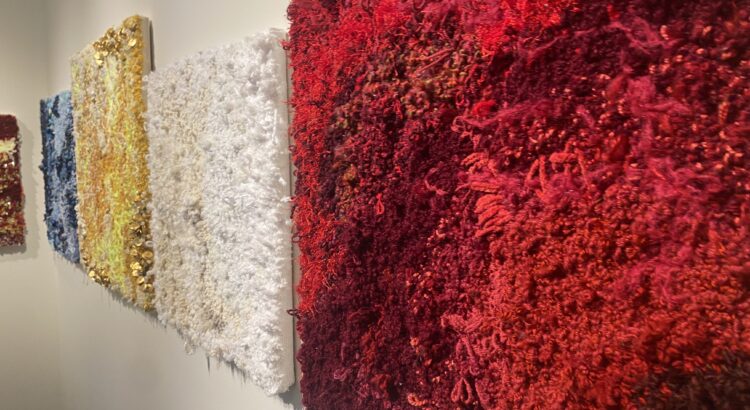
One piece that particularly struck me was the 26 Wood, Fiber, and Fabric Totems, which are a tribute to Rosa Parks and Judge Damon J. Keith. These works, rich in color and texture, tell a story of resilience and community. The fabric, woven with African-inspired patterns, speaks to the ways in which culture can bind people together, even in the face of adversity.
For Johnson, fabric is more than just material—it’s a symbol of the strength and unity that communities, particularly Black communities, have built over time despite systemic challenges. The totems were a poignant reminder of the importance of honoring the past while continuing to fight for justice.
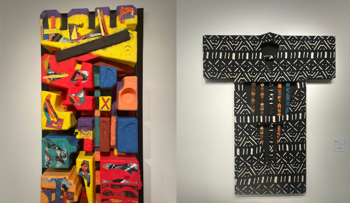
As I walked through the gallery, I was also reminded of how much Johnson’s personal experiences shaped his artistic direction. His move into papermaking in the 1980s, influenced by Al Loving and Lynn Forgach, marked a turning point in his work.
I could sense the new textures and depth in pieces like Lynn’s Song and Nerfetiti, where paper became a medium for exploring his longstanding fascination with primal cultures and natural materials. The three-dimensionality of the work felt so immersive, like I could reach out and touch the cultural stories embedded in the fibers of the paper itself.

The most moving aspect of Johnson’s work is its ability to connect deeply with the viewer. Each piece tells a story—not just of the artist’s journey, but of the shared human experience. Whether it’s the universal struggle for justice or the celebration of the cultural legacies that shape our lives, Johnson’s art invites us to reflect on what unites us as individuals and as communities. My visit to the Stamelos Gallery was a reminder that art isn’t just about what we see on the surface; it’s about the stories, struggles, and triumphs that are woven into every brushstroke, every piece of fabric, and every sheet of paper. Johnson’s work is a testament to the power of creativity to honor the past and inspire the future.