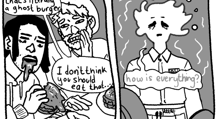
I’m trying out this 3 row page layout instead of my usual 4 row layout. I’m still fairly new to comics so I want to test different strategies for storytelling and figure out what works best for me. Not sure about this one yet, I might switch back next week, but first impressions: 3 rows means I make less panels overall than the previous layout, so the visual narrative needs to be more succinct, but I can put a little more time and detail into each panel. If anyone has a favorite comic layout or suggestions and would like to share, I’d love to hear it!
Basil + Gideon is an ongoing narrative comic, if this is your first time reading check out the first installment here!


Leave a Reply
Be the First to Comment!