

Welcome back to another post! Today is all about faux calligraphy, so let’s start by explaining what that even is.
Faux calligraphy got its name by, as you might have guessed, being a sort of “fake” form of calligraphy. Where traditional calligraphy uses a brush pen to get those thin upstrokes and thin downstrokes, faux calligraphy allows you to get the same technique with a regular old pen (or, really, any sort of pencil, marker, etc that creates a standard line).

So how does this work? It’s actually pretty simple, which is why a lot of people, especially beginners, prefer it over traditional calligraphy. A lot of beginners also use it as a gateway into traditional calligraphy, because it uses the same principles without requiring the technique involved in using a brush pen.
To start, you can just write whatever word/letter/phrase you have in mind. This can be in cursive, or in print, whatever you prefer! The next step is the key: you need to identify all the downstrokes. In the example below, I showed where the downstrokes are on the cursive letter “a”, but if you want a more comprehensive guide, I have a few other blog posts about handlettering basics that should help you out! Once you identify where all the downstrokes are, you simply make those lines thicker, whether by drawing an outline and filling it in like I did, or by just adding a few extra lines around it.


Once you’ve got the basics down, this another style where there are a lot of fun variations to play around with. I included some of my favorites below, to show that you can do this with cursive or print, vary the thickness of the downstrokes, bring in color, etc. With the “lazy” and “hard” styles, the lazy one is just what you’ve been doing already (it isn’t lazy, it’s just easier than the hard version). The “hard” version is where you kind of map the downstrokes out in your mind ahead of time so that the lines don’t intersect and downstrokes remain solid white. This takes some practice to get the spacing right, which is why I called it the hard version, but it’s definitely not impossible and can be really fun to practice!

I hope you enjoy trying out a new style, or at least learning about it, and for all the umich students out there, have a great spring break!


 When it comes to actually using this technique, the first thing you need to do is make sure you’re holding the highlighter the right way. Instead of holding it like you would to highlight a something, where it draws a thick line horizontally, you want it to be the opposite way; once you’ve rotated your pen so you’re holding it correctly, it will draw a thin horizontal line and a thick vertical line. Then you can start writing! You want to keep your pen oriented that same way the whole time, because that’s what will give you this kind of 3D/layered ribbon effect. Another tip is to keep your strokes simple, especially when you’re first starting out. For example, instead of writing a lowercase “a” like you would in your normal handwriting, it might be easier to write it as a circle connected to a vertical line.
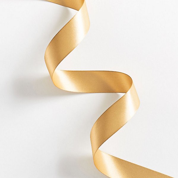 The next step is figuring out the “layers”, so to speak. For this part, it’s super helpful to think of what an actual ribbon would look like. In this photo I got from the Papersource website, you get a really good sense of what I mean by the layers of the ribbon.When trying to figure this out with your own letters, you want to look for junctions where there’s some overlap, which I tried to illustrate in the diagrams below. For ribbon lettering, there are a ton of options in terms of style, so you can either outline the sections of each letter, color in the “shadowy” parts, or do both! I showed both examples so you can get a sense of how they each work.


 As I’m sure you’ve all realized by now, the size of my pen collection is a bit absurd, and definitely not the most conducive to college housing. I had to leave a lot behind when I came to school, so whenever I go home, I get really excited to use them all again. I have a lot at home right now, and a little more room than I thought I would for pens, so I thought it would be fun to show you guys how I went through them all and picked what to bring back to Ann Arbor. For the major pen sets, I included their swatches and my opinions on them below. I know the swatches for some of the smaller pens are really tough to see, but I hope you can at least kind of see the colors and the size of the nib. I did also bring home the posca set you can see in the box picture, but I forgot to take pictures of those swatches.

 After that came all the random, individual pens. I tested a ton, but here are the ones I brought back. From left to right:
 The basics all come down to upstrokes and downstrokes. Upstrokes are thin lines that use just the very tip of the brush pen, and they start from the bottom and go in an upwards direction (as the name implies). Downstrokes, again, what a shocker, start at the top and go in a downward motion. These are thicker lines because they involve using more pressure on the pen. I demonstrated this with the pictures below, using my favorite brush pens, Karin brushmarker pros.
 Once you get these basic strokes down, you can start experimenting with more complicated strokes. I’m not sure who originally came up with this set of strokes to practice, but I know I’ve seen @thehappyevercrafter and @ensigninsights use these on Instagram (highly recommend their accounts, especially for beginners!). In any case, these are essentially the core kinds of strokes or lines you’ll need to be comfortable making, because they appear in a lot of letters.
 Here’s your basic lower-case, cursive “a”. To make this, you actually have to use two strokes (shown in the picture), meaning you pick up your pen once in between. For the first stroke, the oval-ish shape, you start where I put the little 1 in a circle. From there, you start with an upstroke, then transition into a downstroke, and finish off with another upstroke that connects to the first. Then, you pick up your pen, and begin stroke two! This one is a lot easier–start at the same height as the top of your oval, and just go straight down, then kind of flick your pen back up for that final upstroke. I’m not going to guide you through every letter because we’d be here forever, but I did include a little sheet I drew of all the letters and some guiding arrows for each of the strokes involved. I also color-coded them, so the stroke you start with is in red, followed by a yellow stroke, and on a few letters there’s a third stroke which is in blue. Of course, there are tons of styles for writing the alphabet, and every lettering artist does it a bit different, but this is how I tend to do it!
