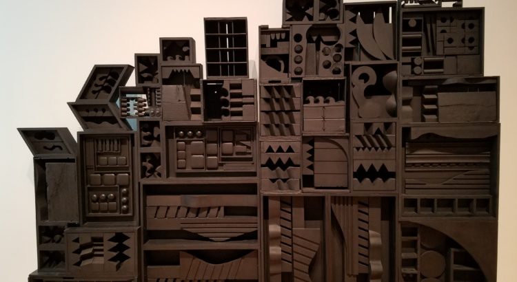
The title of this exhibit has more words than the exhibit has paintings. With such a long, dramatic title, I have to admit that I was expecting more. The room where the exhibit is featured isn’t really a room. It looks like the entrance to a much bigger gallery, and it is, but the rest of the gallery is full of other exhibits. The room is more of an entrance way, which is appropriate for its four art pieces. The first piece that you see is the pink and orange draped canvas featured in my preview. A painting hangs on the wall to the right depicting a sunset in a similar family of colors. Look to the left and things make a bit less sense when you see the geometric array of color blocked canvases fitting together to create what looks like an optical illusion. The last piece is entirely made of black, painted wood. It reminded me of a collage in that it felt like a collection of unrelated wooden objects brought together and placed on shelves. I simply could not figure out what made these pieces political, and I can make just about anything political. I see the abstraction and color but I struggle to understand what meanings these pieces represent or the messages they meant to convey. The titles weren’t much help with this either as they were equally vague and abstract. I can appreciate abstract art, but this kind of abstraction from a period when it wasn’t quite new enough to be considered rebellious, just isn’t political in my eyes.