REVIEW: Matisse Drawings

Walking into the UMMA exhibit, you are greeted by a sky blue wall detailing a small biography of Matisse.  On the other side is Kelly’s biography, with Kelly’s collection of sketches in that section.

I looked at Kelly’s side first, since it seemed to be the smaller collection.  I noticed a lot of experimentation with differentiation of line thickness.  While all the sketches were simple in nature, they had a subtle artistic quality to them.  For example, in “Catalpa Leaf,” there were two lines.  They started off thick at the top, and only crossed each other at the bottom of the leaf.  The lines faded out there as well, adding a sense of fragility to the leaf that likely was meant to represent the leaf’s qualities in reality.  This theme was present in most of Matisse’s sketches, so I see where the dialogue comes in between the two artists.

Regrettably, photography was not allowed in the exhibit. Here is an image of “Catalpa Leaf” I found from the internet!

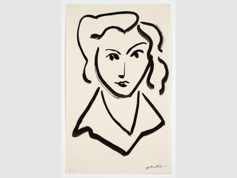
After viewing Kelly’s sketches, I went over to the Matisse side of the room.  I noticed a lot of exploration of the fluidity of form, as a lot of the objects in Matisse’s sketches seemed to blend into one another while still retaining their own shape.

One of my favorite Matisse sketches was called “Dance movement, Christiane.”  It detailed the legs and lower torso of a ballerina.  The lines, like in most of Matisse’s sketches, were shaky.  I thought maybe the unsteadiness of the lines was a representation of the dancer’s movement.  The woman I was with argued that maybe Matisse was inebriated while drawing it.  Both opinions are reasonable, I think.

A lot of Matisse’s other drawings demonstrated the progression of his creative mind.  For instance, “Acrobat, study” depicted a woman in the bridge position, with her torso facing the sky.  Matisse’s use of lines reminded me a little of the Kelly drawings – the only steady stroke represented the woman’s stomach.  If you’ve ever done the bridge stretch, you’ll notice the stretch in your core.  Matisse seemed to represent this in his ink strokes.  The rest of her form was loose and not accurate in any means.  Even from an expressionist viewpoint, it was not beautiful.

The sketch next to it, however, was interesting.  Entitled “Four studies of acrobats,” the figures were more well-defined and biologically accurate.  To me, this made them more aestethically appealing.  It definitely showed a progression in Matisse’s line of thought regarding how he wanted to portray the acrobats.

Other aspects of the Matisse collection that I found interesting were the drawings that reminded me of Picasso’s technique.  “Veiled woman” had many cubist qualities, such as the characteristics in her face and the way her arm melted into the veil around her head.  Beside “Veiled woman” was “Themes and variations VI.”The subject’s veil is unfinished, but should cover her face.  Her face, however, is obviously still visible and exposed to the viewer.  The same goes for her breast.  This suggests that Matisse saw her face and torso as the most captivating parts of her, and used expressionist technique to portray that.

Lastly, Matisse used lines to represent light.  In “Study, boat” the lines around the plant in the window are squiggly.  I saw this as the movement of light as it’s dappled by the world outside.  Of course, in a sketch, it’s impossible to make your subjects move.  Matisse accomplished a sense of movement by using different stroke techniques.

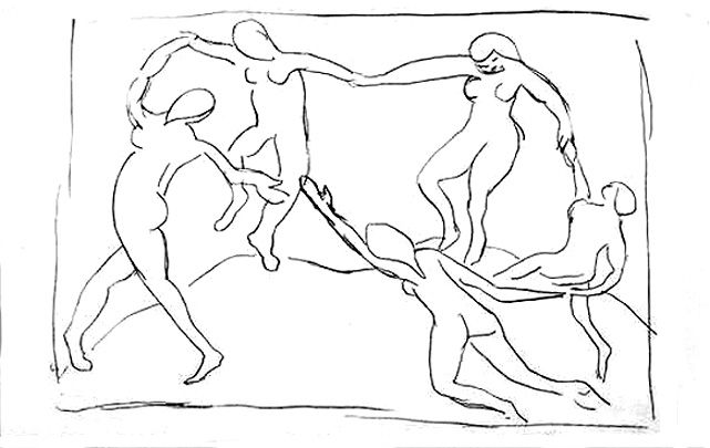
In conclusion, I was impressed by the collection at the UMMA.  It was fun to see “The Dance” in sketch form – it was actually really underwhelming compared to its meaning in expressionist history.  The progression of Matisse in his drawings and the (albeit somewhat minimal) dialogue between him and Kelly added a lot to my interpretations of the exhibit.

PREVIEW: Matisse Drawings

As someone interested in visual arts, Matisse has always presented somewhat of a predicament.  His works when viewed on their own have been criticized as lacking in artistic technique – harsh words to describe a world famous painter.  After taking a history of art class in which we briefly analyzed Matisse, I had to agree.  His work looked almost childish, shaky and unsure.  It wasn’t until we looked at “The Dance” that I changed my opinion.

It was the meaning behind the painting which made it beautiful… for me, anyway.  I’m sure a lot of people admire Matisse for his technique.  I, however, disagree.  I like to look at things in an almost backwards sort of way – how did the intended meaning influence the actual piece?  What did Matisse mean for “The Dance” and how does that meaning show up on the canvas?

That’s why I’m so interested in the UMMA exhibit, which opens tomorrow.  It’s from 11-5 until February 18th in the A. Alfred Taubman Gallery I.  It’s a collection of “forty-five rarely exhibited works by Matisse made in the first half of the 20th century, which reveal his process and range of creativity as a draftsman…” (according to the UMMA’s website).  Presented alongside Matisse’s work are drawings by Ellsworth Kelly (1923–2015).  Also taken from the website, “Kelly selected nine of his own lithographic drawings that derive from his time in France during the 1960s, when the American artist studied Matisse’s sketches and studies of nature and human figures.”

This exhibit will present a dialogue between two artists and will hopefully provide new insights regarding the meaning of each collection.

REVIEW: ENSPIRED

While EnspiRED is a fashion organization, they described the showcase last night as their annual multimedia event.  The purpose was to highlight the work of all artists around campus, making last night “more than just fashion.”

There were two paintings and a photo print making up the display part of the event, while the majority of the night consisted of live performances.  There were no labels on the visual art but I got a photo of the canvases near the door.

Chase Garrett, a poet, was the first live performer.  It was a political narrative preaching optimism even though the state of America is less than favorable at the moment.  It seemed to resonate with the audience, who was very responsive throughout the evening.

Next was a singer/guitarist, Jake Lemond.  While he reminded me a little of The Lumineers’ main singer, he was unique with his stage presence and skill with the guitar.  He played three songs, most of them alternating between a Travis pick-style verse and a strummed chorus.  There was a lot of strum pattern and vocal variation which made each song different.  He even used harmonics at the end of his last song!

Dennis London, another poet, came next.  His first piece was a rap in the middle of a song played over the speakers.  His second was, in my opinion, a love poem.  He called himself a “photographer by day” and talked about his newly-published book.  The book is about how happiness is earned.  The motivational speech he gave at the end of his performance seemed to be a snippet of that message.

After that, the dance group Ambiance performed.  They were an all-female group.  Their performance was an interesting mix of modern dance, showcasing fluidity of movement and form.  They also incorporated some ballet movements into the piece (which I only recognized because of a history of dance class I’m taking this semester) as interludes between dance exchanges.  I was sitting near the back, however, so it was difficult to see what they were doing sometimes as there was a lot of groundwork.

Unfortunately, my phone died during intermission and I was unable to take notes for the second part of the night.  It was, overall, a very cool experience.

REVIEW: Celebrate Creativity Art Show & Blueprint Magazine Reception

I set foot inside the Duderstadt Gallery, unsure what to expect.  I’ve been to reception events like these before, and even with the promise of free food, they are often dull and unoccupied.  Blueprint’s, however, was shockingly modern and one of the more popular exhibits I’ve attended.  There were people actively engaging with the displays, pointing at a piece and discussing it amongst themselves.  I even had a woman come up to me and ask which of the pieces were my own.  After I told her, she enthusiastically made her way to the other end of the room, giving my display much more attention than it was worth.

The space was open, leaving room to breathe.  Some of the artwork indeed needed a lot of space, and some of the art warranted taking a step back in order to properly absorb it.  Mia Massimino’s “Mattresses” were an example of the former, a literal mattress standing vertically in the center of the room.

That’s what set this event apart from some of the others I’ve attended – the fact that it included more than just photography or painting.  There was poetry lining the walls, taking its rightful place beside images on display.  There was prose, mosaic work, prints, contours, and much more.  This intrigue led me to stay for much longer than I intended, simply enjoying what was in front of me.

The magazine itself is really well-organized.  I haven’t had a chance to give the entire thing a proper read, but it seems to flow very well.  A lot of this is due to the aesthetic of the editing – there is poetry overlapping some of the images, using a gradient overlay as a background.  The fonts are all very minimalist, and although they are not all the same, none of them clash with one another.  Some of the spreads seem to be organized by theme: for instance, pages 53 and 54 are photographs taken by different artists (Priya Patel and Brielle Bonetti, respectively) but both emphasize sparks.

Another thing I enjoyed about Issue 6 was that some of the artworks included a bit of the backstory behind them.  My favorite image so far is on the spread of pages 21 and 22, “Love is Companionship” by Kaiwen Sun.  It is of a man sitting at an easel in a field of what looks like wheat, painting a wooden house in a mountain valley.  This photo caught my eye upon initial glance because of how well the colors go together – the image is filled with saturated golden hues and faded greens.  The man in the photo strikes a romantic image, his white gloves untarnished by the paints he has before him.  The photograph itself almost reminds me of a painting, which was an interesting parallel.

What interested me the most, however, and added to the photograph as a whole, was the text underneath it.  It was a mini love story concerning a man and his wife the photographer encountered during a trip to Grand Teton National Park.  A line from the caption reads: “Love is growing up and growing old together – one keeps the other person company to do the things they love.”  Reading it added a lot to the subject of the photo (whom I’m assuming in the man talked about in the caption) and made him more of a person than just an image.

All in all, I was pleasantly surprised by the art show and, by extension, its excellent job at portraying the magazine.  The show did, admittedly, omit some marvelous works (like the aforementioned photograph), but what would be the point of reading the magazine if all the work was before you on the walls?

PREVIEW: Celebrate Creativity Art Show & Blueprint Magazine Reception

Blueprint Literary Magazine is hosting their issue 6 release event & reception with the Celebrate Creativity Art Show tomorrow night from 4-6pm.  The art show has been running from February 13 and will go until Friday, the 24th.  A link to the art show and release event is here – Facebook: Art Show.

After briefly stopping by the exhibit at the Duderstadt Gallery on North Campus, I was surprised by the modernity of the space.  From a quick glance, there is everything ranging from photography and poetry to sculptures made from mattresses.  Some of the art on display will also be featured in Blueprint’s 6th issue, and magazines will be for sale at the reception.