
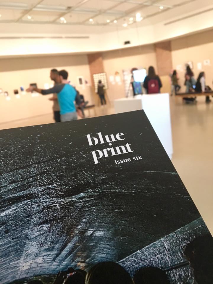
I set foot inside the Duderstadt Gallery, unsure what to expect. I’ve been to reception events like these before, and even with the promise of free food, they are often dull and unoccupied. Blueprint’s, however, was shockingly modern and one of the more popular exhibits I’ve attended. There were people actively engaging with the displays, pointing at a piece and discussing it amongst themselves. I even had a woman come up to me and ask which of the pieces were my own. After I told her, she enthusiastically made her way to the other end of the room, giving my display much more attention than it was worth.
The space was open, leaving room to breathe. Some of the artwork indeed needed a lot of space, and some of the art warranted taking a step back in order to properly absorb it. Mia Massimino’s “Mattresses” were an example of the former, a literal mattress standing vertically in the center of the room.
That’s what set this event apart from some of the others I’ve attended – the fact that it included more than just photography or painting. There was poetry lining the walls, taking its rightful place beside images on display. There was prose, mosaic work, prints, contours, and much more. This intrigue led me to stay for much longer than I intended, simply enjoying what was in front of me.

The magazine itself is really well-organized. I haven’t had a chance to give the entire thing a proper read, but it seems to flow very well. A lot of this is due to the aesthetic of the editing – there is poetry overlapping some of the images, using a gradient overlay as a background. The fonts are all very minimalist, and although they are not all the same, none of them clash with one another. Some of the spreads seem to be organized by theme: for instance, pages 53 and 54 are photographs taken by different artists (Priya Patel and Brielle Bonetti, respectively) but both emphasize sparks.
Another thing I enjoyed about Issue 6 was that some of the artworks included a bit of the backstory behind them. My favorite image so far is on the spread of pages 21 and 22, “Love is Companionship” by Kaiwen Sun. It is of a man sitting at an easel in a field of what looks like wheat, painting a wooden house in a mountain valley. This photo caught my eye upon initial glance because of how well the colors go together – the image is filled with saturated golden hues and faded greens. The man in the photo strikes a romantic image, his white gloves untarnished by the paints he has before him. The photograph itself almost reminds me of a painting, which was an interesting parallel.
What interested me the most, however, and added to the photograph as a whole, was the text underneath it. It was a mini love story concerning a man and his wife the photographer encountered during a trip to Grand Teton National Park. A line from the caption reads: “Love is growing up and growing old together – one keeps the other person company to do the things they love.” Reading it added a lot to the subject of the photo (whom I’m assuming in the man talked about in the caption) and made him more of a person than just an image.
All in all, I was pleasantly surprised by the art show and, by extension, its excellent job at portraying the magazine. The show did, admittedly, omit some marvelous works (like the aforementioned photograph), but what would be the point of reading the magazine if all the work was before you on the walls?
