REVIEW: I Am Not Okay With This

Despite a general acceptance of non-heterosexuality in modern media and society, queer characters are often placed in plots that are only focused on their ~journey of self-discovery~ or in supporting roles that stereotype and tokenize them. So often, they are reduced to their sexuality, communicating to the audience that this is the only part of their identity worth mentioning. Surely, it’s important to feature queer characters in media, but every story can’t only be about their struggles with unaccepting parents/religion/schoolmates/colleagues/whatever. We normalize queerness by incorporating it in media in a wide variety of ways. 

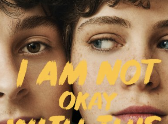
So I was overjoyed to find that this series has a queer star who spends some time recognizing her sexuality, but is primarily preoccupied with a full storyline about her new mind powers and their possible connection to her late father.

Based on Charles Forsman’s comic of the same name, the series honors the original work, often taking sections of text into the script verbatim. I’d say that the writers could have taken some more liberty with dialogue, which could be lacking in originality sometimes. The media move from comic to television necessitates this; while comics with a minimalist art style depend on fast-paced conversation between characters to drive the story, live action dialogue is generally less important. Makers of television are freer to insert some more artistry in angles, lighting, wardrobe, delivery and content of lines. 

A lot of talented people worked on the series: people responsible for Stranger Things and The End of the F***ing World, actors who starred in the updated version of IT. But if I know anything about logical principles, I know that past performance is not indicative of future results. I Am Not Okay With This is an unfortunate piece of evidence for that rule.

Along with the lacking dialogue, there were too many illusions to late 20th century pop culture, like The Breakfast Club-esque episode and the constant Carrie references. While I understand the the entire plot is literally another reboot of that classic Stephen King story, they could have strayed a little farther, style-wise. The spring fling dress is even similar to the one Sissy Spacek wears in the original movie, pale pink satin with spaghetti straps. She does the whole walking home from the dance in the middle of the road covered in blood thing, and she doesn’t add to it. If you’re going to pull so directly from classic works, you need to do something that differentiates it from the original, pushing it farther, bringing into modern times so it can be understood within current social politics.

It’s sad when the arc of creativity starts to decline for previously awed artists. This feels like the desperate reaction to writer’s block that should’ve been given some more time to simmer. Still, most folks are wont to continuously seek out media that gives them the same kind of satisfaction as they’ve experienced in the past. So, at this psychological level, the series does a great job. Though that feels like some kind of exploitation, it fills a demand. I’m not sure I’d call it art, though.


REVIEW: Stamps Speaker Series- Joe Sacco

I had heard rumblings that the night’s guest would draw a larger crowd than usual but I wasn’t prepared for how large the crowd might be.  As we filed into the theater from the packed lobby area, it was difficult to find an ideal seating spot. This presentation was co-presented with the University of Michigan International Institute’s Conflict and Peace initiative, and the official Stamps website contains a full list of the sponsors for the night.

Tonight’s event was not a formal speech, but more of an open discussion between the guest Joe Sacco and a host from the International Institute’s Conflict and Peace Initiative.  As the discussion proceeded different images of Sacco’s work were projected onto the screen behind them, and while switching from photo to photo could be highly distracting it was a nice visual supplement to the presentation, and often was used as a conversation point.

Joe Sacco, as we gradually came to know throughout the course of the talk, had originally received a degree in journalism at the University of Oregon, before finding that creating comics was both a way to indulge in his passion for art and to reach a wider audience that are put off by long history books and dense articles.  He approaches his subject matter in the same way a war correspondent might.  He traveled the world, and his very first comic, Palestine, was directly based off of his personal travels through Israel and the West Bank.  Some of his award-winning works include Footnotes in Gaza, Days of Destruction, Days of Revolt and Safe Area Gorazde.  He is highly regarded by comic lovers and news junkies alike for his careful research and thoughtful approach to delicate and politically charged subjects.

When asked what inspired his work and the topics he chooses to work on, Joe Sacco responded quite succinctly that anger above all else was the driving force behind his comics.  He looked for topics that created a sense of frustration or injustice in him, and just as importantly ones that he would maintain a passion for the many years that it takes to finish a single piece.  He also discussed his dislike of the word “graphic novels,” because of how his works are not novels despite fitting under that subcategory.  He admits, however, that the word is here to stay and will use it himself when describing his occupation to others.

One of the very first panels from “The Great Wall”

One piece that was discussed quite thoroughly was Sacco’s 24-foot-long graphic tableau “The Great War.”  Sacco spoke briefly about how fascinated he was with World War I while growing up in Australia, where that war takes up a large part of their cultural identity.  His inspiration for this specific piece was The Bayeux Tapestry, and he wanted to create a similar narrative scroll that told a story when read from left to right.

middle segment of “The Great War”

As an artist, I also found the discussion of the artistic styles to be quite interesting.  Sacco talked briefly about his upcoming project and how he will be turning traditional comic styles on their head in order to better convey the meaning and message that he wants to.  He’s working on a project about the indigenous peoples of Canada, and as such is experimenting with creating comics with no borders and an aesthetic style that focuses heavily on nature and natural forms.  He believes this will better fit the ideology and tone of the work itself, as the groups he will be focusing on have a specific way of thinking about nature.

Panel from his book “Days of Destruction, Days of Revolt”

As the crowds streamed out of the theater and into the brisk night air, we were once again greeted with live music.  A long line of people waiting for autographs trailed up the staircase to the second balcony, further proving the popularity of tonight’s speaker.

If you would like to check out more of Joe Sacco’s work you can purchase many of his books from amazon here.  The STAMPS speaker series is free to the public and is free to the public and is offered every Thursday at 5:10 at the Michigan Theater.  You can find a full list of the upcoming speakers here.


pictures from- 1, 2, 3 


REVIEW: Stamps speaker series Françoise Mouly

Françoise Mouly, current art director for the New Yorker, shares the story of how she became who she was today.  In an effort to make this a divergence from the wikipedia page, I will try my best to add as much of her charm to this as possible.

Mouly began her presentation at the beginning — with baby pictures.  First was a picture of herself in Catholic school next to a picture of her husband, Art Spiegelman, as a kid.  Mouly was born in Paris and growing up decided to pursue a degree in architecture.  But midway through her schooling she realized that a future in architecture did not appeal to her.  Alumni would come to the school and talk about their experiences and how much they remembered fondly the days of school better than their days at work.  She was not fond of this disconnect between the idealized structure put forth by the architect, who does not always have a direct hand in the realization of the work, and therefore who subject to change it was.

So for a change of pace, Françoise moved from Paris to New York.  Making the move does not sound like it would be an easy task – with job, housing, etc to consider – but when Françoise talked about it, she made it sound like it was a fond memory in her past, whether or not it was a difficult one.  It turned out to be a great turning point in her life, as she expected.  She came in contact with many different artists and filmmakers, and most specifically a comic artist named Art Speigelman.  Françoise would spend her time reading Art’s comics in MAD magazine to help learn English.  She invested a lot of time in studying the way comics were made and even took classes in print-making and bought her own press for home.  Along with developing a strong bond with Art, she also found a strong bond to the comics he made.  She loved the means of reproduction involved in executing the final product that is the comic.  She fond greater control in the process in that it bridged the gap between what you design and what gets built.  It offered a lot more control over production than she felt architecture ever did.

One of her first jobs was working as a colorist for Marvel magazine, and also started her own business publishing maps and guides of SOHO and Tribeca.  At the time she was living with Art and his parents were very keen on the two of them getting married.  So, in order to appease their wishes, she and Art had a “taudry wedding,” according to Françoise, which was really only done to make good with the in-laws.  Art and her decided to have another marriage ceremony in 1988, and that one was the real deal, she said.

In addition to meeting Art, she also started to take her printing press to another level.  She and Art founded RAW comics, an underground comic magazine.  Her and Art’s goal was to provide a striking comic magazine that would hopefully garner more attention for adults and aid in the reviving of the adult comic readership, which at the time was suffering.  The magazine feature friends and contributors from America and Europe mostly, but from all over the world really.   Because she wanted to put a handmade element in every piece, so in one issue she and Art placed hand designed gum wrappers from the gum factory Art worked at into each issue.  In another issue, she inserted a small flexi disc into the back cover of a copy of one of Reagan’s speeches.  This emphasis on doing things by hand makes it more thoughtful, Françoise believed.

The opportunity to work for the New Yorker came when Art was offered to do one of the covers himself.  A cover he suggested was considered too bold for the running style of the New Yorker, which had grown in recent years to feature landscapes and non-abrasive images.  The current editor reached out to Françoise, seeing the work she did with her comic magazine, and asked for her to assist in the cover design process.  Françoise knew what she wanted from comics – powerful images that made it hard to remember what you thought before having seen the images.  This is what the current New Yorker was lacking.  So she went through older covers from the 1940s and 50s issues of the New Yorker and used those as example for what a cover for the magazine should look like.  There was more story telling in those covers, and more of a human attitude in them, that was lacking in the current issues.

In 1993,  Mouly became art director of the New Yorker and also publisher of her new project, Toon Books, which specialized in hard cover comic books for young readers.  She lives a dream, and the way she talks about it is as if it were what happens to any other person in a lifetime.  Her humility and charm make her an exceptional story-teller and person.  In her final words, Françoise said the New Yorker magazine will not lose itself in the modern age because its’ images have no time.  People take the images out of context of any time period and make them something accessible to many generations and future generations to come.