
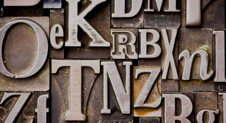
When an average person thinks of graphic design, usually they rarely think about the type of text used. An individual usually focuses on the greater message that the poster, ad, etc. conveys. However, text design plays a bigger role in what is and is not noticed by the viewer than one might think…
For example, if I were to look at a poster with good type, I would look past it and instead focus on the graphics displayed. On the other hand, if the type was presented poorly I would be stuck on the fact that the text is bad rather than looking at the poster as a whole.

During the process of choosing the overall type of a project, many factors are involved. One must first think of who their audience is, what they want to say, and/or what they are literally saying in the text itself. You must consider what you are printing on, the colors of the type, the colors of the background. Do you want the text to be legible and readable? What spacing and alignment do you want? How will this affect the overall look? What do you want the shape of your text to look like and what emotions will that evoke? What about the tracking and kerning? How will you alter those to contribute to your piece? Furthermore, one must think of text size, line length, leading, and a million other characteristics when creating their text design.
Before heading into my typography course this semester, I never even knew there’s a difference between a font and a typeface. Did you not know there was a difference either? Well, font refers to if the type is roman, boldface or italic type and typeface is the design of a set of characters; usually referred to as what family the type’s style is in. So when choosing the type you think of what typeface or family your text should be in and you also consider what “member” of the family or font you desire. For an example, in this blog post, I am typing in the Georgia Pro typeface and the roman font style–the default typeface for WordPress hoorah!
A typeface that leads to a huge controversy is Comic Sans. Initially created to present a warm, childlike, and innocent feel, it has been used in comics but also used very inappropriately in other text designs. When it was “born”, the typeface went global and was used immensely. However, since it was used too much, people started to have a “hatred” for it which proved the typeface’s limitations. Without hesitation, a majority of people can tell when Comic Sans is used properly or not well. Since the typeface portrays a comedic-like feel, when used in other scenarios than children’s books or cartoons it seems very very veryyy wrong. See below.


If I have learned anything from my typography professor(Audrey Bennett… a true icon), it is to never use comic sans.
Since I have been in my typography course, my eyes have been opened to a whole new world, an overwhelming world at that. Now that I have knowledge of all that goes into picking a typeface, it is even harder for me to select one. I used to just be like “Alright I guess this seems right.”, but now I go through questions like, “Does the alignment look right?”, “What type weight do I want to use?”, “How is my kerning?”, “Does this have enough gestalt?”.
Most individuals don’t typically consider type an art, but boy are they wrong. Not only are there so many aspects of choosing a font, but there is even more when creating one. Some fonts have been revolutionary to society and the art world especially. Take Helvetica. With its simplicity and elegance, this typeface is multifaceted and allows people to show their message in a straightforward manner. Helvetica is the face to thousands of businesses, companies, and brand logos. It is one of the most significant fonts in history and shows how vast the world of typography is and how it links everything together. I mean, the typeface even has its own documentary.

Whether or not you agree typography is an art or not, it is the core of how humans communicate with each other and there is no arguing that. Typography is one of the most influential factors in our decision making but because it has become second-hand nature, we have come to think of how it affects our life subconsciously. If one were to take a step back and observe how much type is around us and how it is being presented, surely they could create a discussion that could last an infinite amount of time.
Typeface and the study of typography are usually not seen as art to the average person. However, it is important for us to reflect on how typeface is something we interact with every day and what art is truly defined by.
This week, I encourage you all to ponder if typography is an art and maybe do some light research on how much goes into type design. And with that, I shall say, “See ya next week!” and also, please don’t ever use Comic Sans. It’s for everyone’s sake.
Peace!

Leave a Reply
Be the First to Comment!