The Rise of the Band Geeks, Episode 8: 42-27

In light of our resounding victory against That Team Down South, your local band geek would be remiss not to write about The Game from the perspective of the Michigan Marching Band.

I’m just going to preface this with a simple yet eloquent statement:  WE CRUSHED THEM, BABY!!!!!!  YEEHAAAAAAWWWW!!!!!!  ONLY ONE FOOTBALL TEAM IS GOING TO THE CHAMPIONSHIP, AND IT’S NOT THAT TEAM DOWN SOUTH!  (As you can see, I’m still basking in the glory that comes from defeating Public Enemy #1.)

5:00 am.  Yes, really–we arose at 5 am in the shadow of the waning night to get fired up for the day we had all been waiting for.  Bundled up in multiple layers with our garment bags in tow,

I forgot where I obtained this from, but I am 99.99999% confident the image is public domain.

we traversed the distance from our dwellings to the sanctified building known as Revelli Hall.  For all the hype that coiled through the frigid atmosphere, the uncertainty of what lay ahead–namely, the expectation that we were going to lose–crouched in the backs of our minds for the most part.

We all wanted to win, of course.  But being a Michigan fan, as we all know, means preparing for the worst during The Game.  Were we going to be subjected to abysmal ref calls?  Succumb to a walloping by That Team Down South (TTDS) for the ninth game in a row?  Or were we finally going to show TTDS who was boss?


Pregame.  In all my time as a marching band member (so basically just this season), I have never heard the fans be so loud.  This was easily the rowdiest the student section has ever been.  And when the band took the field doing entries?  Utter chaos.

It was cheering for the most part, though there were spurts of intense booing that were audible with and without foam earplugs.

Truly, it was magical.


The First Half.  Cold.  Cold.  Cooooooooooooooold.  Where I’m from, temperatures do not dip this low for such extended periods during which we must be outside.  Compared to the eager snow and vengeful wind, the sweater weather that dominated October was a tropical paradise.  Lukewarm handwarmers, semi-numb fingertips, and–hang on a second–

WE GOT THE FIRST TOUCHDOWN OF THE GAME.

The rest of the first half unfolded as a true nail-biter (or glove-biter, if you were fortunate enough to have gloves).  The holy band beanies were indeed a saving grace against the winter weather (it’s still fall, right?  RIGHT!?!?!?!?!?!?)…until the time came for the halftime performance.


Source: @umichband via Twitter

Halftime.  Arguably the most crucial part of The Game other than the victory, the halftime performance provided heat where the weather did not.  The dusting of snow revealed the tracks of marchers as we went through our drill, our breaths almost as visible as the bull’s ferocious puff at the end of the first song.

By the very end, my fingers were numb and I was in physical pain, but retrospectively it was awesome.  And playing El Toro Caliente evidently worked, because the weather was less miserable during the third quarter.


The Second Half:  Where it All Went Down.  With each touchdown, each stands cheer, the tenuous hope we’d clung to throughout the first half gradually solidified.  Was this really happening?  Were we finally going to dominate TTDS?

I didn’t let my excitement carry me away until the fourth quarter.  When the score was 28-20, I knew The Game could easily be tied with a TD and a two-point conversion, which has been a sore sport for the Wolverines this season (read:  we’ve missed it every time, and the other teams seemingly snuck past our defense to score.  Yes, I’m looking at you, Sparty).

Then, in the fourth quarter, it happened:  the cymbal rank leader called Cheer 8.

The drumline calls a series of cheers throughout the game, each in a different context.  Drum cheers are similar to stand tunes other than the fact that only the drumline plays.  Cheer 8 is reserved for moments when we are definitively beating the other team and involves a dance that includes the whip, so its being called was a watershed.  All of a sudden, the possibility of victory felt real.

When Haskins scored the sixth touchdown, we knew.  The final minutes were those of surreal anticipation and chaotic thrills as the seconds ticked toward zero–

And then the football team rushed the field.

 

Source: @umichband via Twitter.

Triumph.  Elation.  Screaming brazenly as our lord and savior Carl Grapentine announced the final score to thousands of victorious Michigan fans.  A fervent rendition of “The Victors” exploding from our instruments as fans began to storm the field.  I sensed going into the season that the field would be stormed if we won The Game, but it was a mere fantasy, a wishful hope the dream of smashing TTDS would finally come true.

As my overjoyed hollering joined the ecstatic roars of thousands, the cold evaporated into a storm of maize and blue.


Aftermath.  …for about ten minutes.  Then, we had to wait for quite literally thousands of fans to clear the field.  (Also, it was snowing again.)  The field, when we did finally set foot onto it, was littered with detritus:  primarily maize pom-poms, although I did spot a shot-sized bottle of Fireball whiskey.

The MMB celebrates wins by wearing our shakos backwards from the conclusion of our postgame performance to the moment we enter Revelli after cadencing there.  Flipping around my shako as I had done for all the home games this season felt differently than before.  It felt magical, incredible, fantastic.  It also felt unstable because my chinstrap was not adjusted accordingly, and I was too dang cold to bother adjusting it.  Perched as it was atop my beanie (with help from my hand holding it in place), my backwards shako bore the victory as I marched along the pavement with a giddy smile stretched across my face.

Although the regular season is over, the band/football season and this blog are far from finished!  Tune in next week for more band-related hubbub.

In the Eyes of an Architecture Student: About Mental Health

Hi Everyone!

I’m back again this week to discuss the topic: Mental Health.

More specifically, I will be discussing my take on what mental health is, how to deal with it, and what design potential there is in this field.

Disclaimer, these are by no means definite answers or correct answers. This is my own take on mental health and the field of architecture.

In my Health by Design course last night, I was struck by three thoughts during class, that I did not mention despite the open share quality of the course.

  1. Design has so much potential, yet we are constantly stuck in the aesthetic realm thinking about it
  2. Health, especially mental health, is a hot topic in today’s society, yet we have only just tapped the surface in the amount of research that has been done about it, over all of these years that humans have been existent on this planet.
  3. I think it’s ironic how much I value the idea of wellbeing and health, including mental health, yet it is still something I grapple with to improve within myself.

Why didn’t I share these thoughts in class? Well, first off, it would sound pretty irrelevant in context to what we were discussing during class, or more so that I would be going off on a dramatic tangent. We were discussing essentially different methods of using design to solve for issues for specific personas (people) that we made up, but are highly realistic. And it hit me that, sometimes, it’s hard to understand and believe that our field and abilities as humans can be limited. For instance, we often take the internet for granted. we expect everything to be stored and processed through this virtual space, yet so few of us really understand how it works, and mos importantly forget that virtual space still has limits despite how limitless or imaginary it seems. In other words, google drive, which a ton of people use (still an understatement) has a lot of space but it will run out one day, and you’ll be doomed, once you’ve already utilized all hard drives, etc. Now, think of architecture. Really, it is quite similar in the manner that architecture can only do so much to attempt to reshape human interactions and habits. But what both these fields share is the potential to do so many things, to say the least. Yet, we as humans are still in control of the decisions we make.

Perhaps this is the issue. We as humans, are surface creatures. We like pretty things above all, and this is shown with research that has been done demonstrating that people within the US value beauty care more than health care, and this is evident from the enormous gap of spending between these two sectors. And, this is not just because of the price ranges or number of products offered from either sector. This is seen once again even through design. Products are made to be most visually appealing to capture the eyes and hearts of consumers, and this includes everything from the plastic wrap around the toilet paper you purchase, to the home you decided to settle into. Even humans can unfortunately be seen as products, when we are commodified through apps like Tinder or Facebook, where the surface qualities are prioritized. All of these “little things” add up and you end up with the medical bills for poor physical and mental health.

What can we do, to improve our own health? If we each are able to easily answer such a task and do so, then health would never be such a societal issue as it is today. I found it sad, yet truthful that perhaps not all, but a lot of college students tend to prioritize anything but their wellbeing. I definitely see myself as someone that prioritizes work above all else. Peper not finished? I’ll sleep later. Model not done? Just a nap will do. Have class until 9? I’ll have dinner after (if I remember or feel hungry still). I laughed when my professor asked us these exact questions, and totally agree that it’s almost ridiculous how basic these questions are. Anthropologically speaking, these questions are essentially the basis foundation of how people survive. But this is what is different about humanity is now, than the humanity that really prioritized survival all those thousands of years ago. Humans today depend on more than just the essentials before being fully happy and satisfied with life. This varies from person to person, but it’s pretty much real and true for humans nowadays, and it makes me anxious to ponder how the future humans may be. So, what can we as humans, and designers do to reverse this habit and fully change society?

That is the big question in architecture today, and unfortunately I am still frazzled with how to even begin to process such a question.

Above all, I consider my interest in architecture to be about wellbeing. I want to design spaces to create a sense of comfort and serenity for people, not just in hospitals. I want to create spaces that inspire people to do the best they can for themselves and for others. Such spaces that would encourage people to desire to live, not just make living “work.”

Much of design is about aesthetics, but also a lot about functionality and efficiency as well. And, after having thought about this a lot, I argue that these are all qualities that we as designers need to let the consumers decide what is best for them.

Designers often mean well, doing mass research in attempts to “get to know” the person(s) they are designing for. But no matter how much we do, we will never truly be in their shoes, and we will always be designing for our own ideas about them. Designers cannot help but project a personal manifestation of their own thoughts and beliefs about the consumer and the context. This will never change, no matter how much we are aware of it or despise it; it is simply something that happens as humans, in any field honestly. But consumers also cannot do the design tasks themselves because they have not been schooled for such things. And to be fair, designers should really be working more with people from other fields, so that more voices are heard in the design process to provide the best possible results, partially because other fields are much more well-researched. I do also argue that architecture itself is a challenging field to do research in, mostly because of how long it would take to yield results, and how difficult it can be to take measurements of specific things, like the amount of happiness or anger that a space has resulted in. There are sort of ways around this to make it work, but these are also very complex “things” to take measurements of even if you can get closer to doing so through, say, taking measurements of blood pressure or vitamin deficiencies. Perhaps some issues were never meant to be “solved.” Perhaps this is the essence of existence. Not to be philosophical, but it really hits me that all of these fields on study were meant to be used together to yield the best possible results to help us as humans, and yet we are expected to “specialize” in one, being almost completely clueless about others.

I’ll let you ponder on these things, but I will definitely be thinking about them more on my own, and through the perspective lenses of that course. I’d love to hear your thoughts and opinions on this subject, so feel free to drop a comment!

Ciao 🙂

In the Eyes of an Architecture Student: Answering “What class is your favorite?”

Hi everyone! I know it’s been a while, with break and everything, but I’m back again this week to open a discussion about my answer to the question, “what class is your favorite?”

And yes, I am well aware that this is one of those cliche icebreaker questions, but it’s actually also a common question you’ll hear people in studio talking to each other about from time to time, whether it’s asking for peer suggestions on what class to replace with another, or just curiosity. With that said, I’m also well aware that prospective students are probably wondering the same thing and probably worried about the answer I’ll give like, “oh jeez, will I be able to enjoy such a class myself?”

Again, in no way am I representative of the whole body of architecture students here at the University of Michigan, where we all have different values and aspirations, so each one of our answers to this question will likely vary.

***

Over the years, I’ve taken a great mix of courses.

  1. I will say that the first year, I took mostly prerequisites such as calculus and English, and this is similar to what other majors do as well. within the first year. Is this enjoyable? Well, you definitely will still be adjusting to college lifestyle and workload to a certain degree, but it seems to me that this is the closest you will get to high school courses. I personally see prerequisites as bridging the gap between your high school education and the educational standards at the University of Michigan. These courses are just the bland standard to me, they’re just in place to ensure you can handle survival at this university, and they’re just in the way to the actual excitement of your discipline, which is to come! I believe you only get a peak at your discipline in the first year. I remember taking a few basically introductory courses to architecture, and feeling hungry for more of it.
  2. In the second year, you’ll be finishing up prerequisites and taking more official architecture courses to set you up for the studio life that’s to come. This includes actually purchasing expensive drafting equipment, constructing your first models, learning studio sharing culture, along with being thrown into a few different software programs that you’ll be expected to learn either on your own or with your studio mates. Honestly, this year is both exciting and frustrating because you’re finally tasting what it takes to become an architect, but you’re also held back by the fact that you can’t really do “real” architectural stuff if you haven’t intermediately mastered such materials.
  3. In the third year, you’ll be using everything you’ve learned in the past two years and applying it to hypothetical, yet realistic scenarios in studio. You will (likely) become more digitally oriented because of the amount of work asked to produced in both the forms of drawings, renderings, and scaled models. And you’ll probably also be getting a nice camera to document all the amazing work you’ve done so that you can create your own portfolio that’ll lead you to internships.
  4. In the fourth year (my current year), you’ll be sort of be given more freedom in terms of deciding on what aspects to focus on when creating the project, but you will still have a structured prompt given to you in studio, along with a professor who will oversee your work and give you suggestions, but it’s definitely a more self-oriented year where you can take more electives as well, to ensure that you can get more flavor into the architectural experience that you’d like to get out of the university. I’ve actually taken my non-architectural electives during my sophomore year, but I’ve been taking more architectural electives these past semesters. A bit off track, but I’ve finally been able to get into a health design course that I’ve been looking for for awhile (it’s a completely new course) and I’m VERY stoked that the professor seems amazing, and this course is so valuable in that it provides interdisciplinary perspectives to architecture and its effects on both physical and mental health. Anyway, I was just really happy about that and wanted to share that with you all!
    With that said, I would have to say that my hands-down favorite course, out of all of the courses I’ve taken all of these semesters here at the University of Michigan in architecture is my first studio course, UG1. People claim it is the “weeder course” because it is the first time you are asked to apply a plethora of newly-acquired skills into a real world scenario, with many projects thrown at you. But I personally found that it was the most imaginative studio. And, hear me out. Yes, you are asked to do all of those things listed above as a newly developing designer, but you’re also given less restrictions because at that point we have not quite understood building code and real-world spatial regulations. You’re able to freely express yourself and that is what I found the most refreshing, because all options are “on the table” so to speak.

***

Unfortunately I gotta launch back into my assignments again, but I’m so excited to hear your comments and thoughts on this blog! Once again, if you haven’t already, if you want to see more of my photography and what studio works I’ve been up to, give me a follow on instagram: @themichiganarchitect
Ciao 🙂

From the Eyes of an Architecture Student: Has being in Architecture School Brought on Odd Habits?

Hi everyone!

I’m back again this week to write about this week’s topic: Odd Habits (acquired from Architecture School?).

So, “odd habits,” what does she mean? you must be thinking.

Well, I say “odd habits” in reference to habits that you may call bad or just downright strange, or maybe they’re just neutrally necessary habits. They’re really just small, amusing things that I realize I notice on a daily basis, or I “step back” to see the big picture and realize they’re things I pretty much only see within my studio setting, or even just the art and architecture building (aka AAB) in general.

  1. Whenever there’s (free) food present at an event, we tend to bud in, or even just walk near the region to see if we can snag some, even if we did not RSVP etc… #brokedesignstudents #spendentirewalletonprojects
  2. We really wish free printing (of all sizes and media honestly) was a thing. Like, c’mon, we pay for all our supplies and materials for ourselves (yes, even desk lamps and mini heaters as necessary), yet, whenever we need to print something, either the nearest printer(s) are down or printing to them ends up being a rip-off because we’ve worked SO hard to produce the best images in their best resolution quality and then the printer is just jacked-up and has stripes of pink (yes, randomly) per page… just 🙁 is my reaction, along with the feeling that my wallet has an unfix-able hole in it
  3. There’s only one media center store in this whole facility… and unfortunately, not the most accessible in all of its destinations. So we’ll often find ourselves in awkward situations where we either have to carry large materials (along with food sometimes if we’re extra lazy and refuse to make an extra trip down to the store) long distance, and if we’re lucky, we’ll be able to safely transport that material all the way back to our desks without running into anyone we know or getting any scuffs or marks and fingerprints on the materials we just emptied our wallets over.
  4. We get used to overpriced everything, really. Materials are claimed as “discounted” but honestly, it’s just a dollar or two cheaper. The food there isn’t unaffordable, but it’s also not a good deal… they have both unhealthy and healthy selections to cater to both preferences, but prices are still (mostly) more expensive than what you could find on a regular basis at U-Go’s or Mujo’s at the Dude. The main reason why people still constantly buy food there is mostly out of convenience, willingness to pay that extra two dollars to keep from having to do a twenty minute run to the Dude.
  5. Seeing people fall asleep in class(es) or Studio in general is no shocker. Honestly, everyone here has different lifestyles. Some people pretty much don’t sleep and somehow still look alive. Others barely scrape by with three hours. Others are even as lucky to get five hours of sleep daily on average, and then we all pass out on the weekends (figure of speech).
  6. We don’t got time for #basic scissors. We’ve become accustomed to the perfection and definitive cut via Olfa knives. Need to cut some paper? Olfa. Need to chop some wood strips? Olfa. Struggling to open that bag of gummy worms? Olfa. We will do this anywhere and everywhere. (Yes, I have a collection of Olfa’s.)
  7. We become natural hoarders and scavengers. We agree with the statement, “one man’s trash is another man’s treasure” even if we don’t explicitly say so. We regularly check-out the dumps for extra materials, and proudly take them back to our desks to incorporate them into our projects, or even preserve for other future projects. I tend to find myself reluctant to dispose of past material scraps “just in case” I’ll need it again. I think we’ve all experienced that moment in the past when we’ve discarded scraps and then realized a while later that we needed that material again, but not too much of it, and end up totally regretting the fact that we ever discarded anything. Legit, all of us have these boxes under our desks filled with materials of all shapes, sizes, and textures.
  8. Everyone here dresses stylishly. Maybe not STAMPS level, but there’s definitely the “designer look” going around. Whether it’s all-black apparel ensembles, or high-waisted, perfect-fitting pants, I’m not sure what it is but everyone here has no problem expressing their uniqueness through both their work and appearances.
  9. The lingo we use to describe our work, I often find also is the same manner in which we see the world and talk with others even to those who are not also in design school. It’s a mindset I guess. Or maybe it’s just still something we all need to learn as designers, to be able to effectively communicate between disciplines using the appropriate language.
  10. The professors often expect much more from us, but also are very understanding and diplomatic with deadlines if we all unite and discuss things with them beforehand, After all, this whole school is dependent on shared spaces, and that often is reflected to classes’ professors being aware of each others’ topics and assignment deadlines.

***

Honestly, the list could go on, but I must get back to grappling with my current project now.

Anyhow, I hope ya’ll found these as amusing as I did! Or maybe you might even learned a thing or two about the harsh reality of design students and their (likely) odd lifestyles. Let me know what you think 🙂

Ciao for now 🙂

In the Eyes of an Architecture Student: Projects and their Realities

Hi everyone!I’m back again this week to discuss the topic: Projects and their Realities!

No matter what your major is, or whatever your specific task is at your workplace, I’m sure you’ve asked yourself why you’ve been assigned to do such a task, and how it benefits your future in terms of employment or its effects on the world.

***

As an architecture student, I often find myself doing the same.
Actually, I often find it TOO difficult to detach myself from what’s assigned in my classes. This may sound normal, but for me, it’s been a bit of an issue sometimes because I’m human and tend to take things a little too seriously and personally sometimes. It’s mostly an issue during presentations and critiques. Projects are often given in prompts detailing certain parameters we can work in, and are often situated within real sites. Oftentimes, we visit these sites and document them, looking deep into the details of their location and questioning why certain buildings or clusters of buildings, are situated as they are, and interpreting why we think they look the way that they do. Projects must have some sort of root within their site, which makes them feel more real, as though my design in the end will be an actual constructed building. In other words, I suppose it is the nature of our work that inevitably makes it feel ultra-personal. I put a lot of thought and sometimes even pull from memories to detail design proposals, and that’s what makes it feel almost embarrassing (probably not the right term)  to present my ideas in front of these award-accredited professors and critics, and when they critique my work in even a bit of a harsher tone, I find myself feeling the blow to my ego.
But, really, the issue was how I framed my mindset about the projects. The presentations are simply supposed to be discussions with guests so we can be provided with fresh, outside perspectives rather than just our own professors’ suggestions. The presentations often become tense experiences because of intimidation about our preconceptions about people and their status and our imagined view of their judgements on us, which then influences us to dress as best as we can (which isn’t always the most comfortable attire) and pull all-nighters so that the images we print out for the pin-up display will be our best representation of our ideas and, in turn, ourselves. The point is, whatever feedback the critics give, they’re all about improving the ideas we’ve presented to them- the feedback is not meant to be a personal attack on ourselves (usually), But yes, the feedback they give also makes the projects feel more real, because it is a discussion on hypothetical scenarios of our design, which is meant to prepare us for future projects that may actually be constructed live!
For the projects themselves, on the other hand, I think it’s safe and completely reasonable to think about them as a real-life setting so we can completely immerse ourselves in the design process and best discover what interests us most, and the logical design features behind those interests.

***

Unfortunately I gotta launch back into my assignments again, but I’m so excited to hear your comments and thoughts on this blog!
Ciao 🙂

Architecture and its Inspirations: from the Eyes of an Architecture Student

Hi Everyone!

I’m back again this week’s topic: Design Inspirations!

So, I’m curious, what things or what places would you guess we as aspiring designers get our ideas (please don’t say “your mind” or anything of the like)?

Take a moment, think THINK, give a guess?

Well, I’m going to give an educated guess about your guess, and say that you most likely said something along the lines of something on this known universe!! Like, famous precedents of the past, or perhaps a current proposal from a starchitect? Or even mundane, everyday objects? Experiences from our own memories? Or maybe even something that happened to us, almost as though in parallel to Newton being hit in the head by an apple?

So, this is gonna sound lame, but I’d consider all of the above as listed, as a partially right answer. I mean, we’re still humans, and we draw our ideas from live experiences from our human minds, so yes, all of the above could serve as points of inspiration, since they are all valid sources of Earthly experiences that can feed into our designs.

But, I say partially, because, all of those things are just the factors that serve more like kick-offs to further ideas into our designs. In other words, they’re like the lighter to firecrackers- they serve their single purpose to ignite the flame, and the rest of the party happens a few moments later, after having had time to absorb and chemically react to the ignition.

***

As a design student, we are often given a relatively detailed yet open-ended prompt to give us some context and general guidelines for the proposal that we are to make. Usually, I read it over a few times and look into any words I find confusingly used or I’m unfamiliar with, then try to interpret the prompt as concisely as I can in my own way, as I often find this to be the best way for me to understand what is expected of me and narrows down my scope of research for inspiration for my proposal!

In my current studio, we are doing a partnered project and our prompt is to make a facility to allow for the storage and display of artwork/artifacts primarily, but we are free to add any additional programs as we see fit.

My partner and I came to a compromise and agreed that our proposal is to make a facility that primarily functions as storage for artwork and artifacts of any medium and size (with just the limit that it must be able to fit within our site, and estimated square footage), and it would be able to accommodate for pop-up exhibitions through proactively interactive elements from the infrastructure of our facility.

From this, our first assignment (under this overarching project) is to (as best) clarify and demonstrate our first-pass ideas to actually build such a facility. We call this phase another research process, where we gather what other information we need, and create concept drawings (usually quick sketches) to communicate our thoughts in how we imagine as “answering” this “question” of how to make a storage facility that can also have interactive elements that change the building’s function from storage to pop-up exhibition. And these concept drawings then lead to concept models, also known as sketch models, which are usually pretty ratchet, and serve as a first attempt for us to literally get our hands on our ideas, and it shows us what does or doesn’t work, and usually also functions as yet another source of inspiration for more of ideas, which then lead to an ongoing cycle of creating other concept drawings and concept models.

Usually, what happens after this is, we present our ideas through talking with our studio professor about the idea, showing him our concept sketches along with that, showing him our concept model(s) and then explaining what elements of our ideas worked/didn’t work from those first-pass models. The professor would then usually reword the purpose of your proposal, to verify that we are on the same page of what ideas we are trying to portray. Then, he will critique what you’ve just showed to him, and when things can be done differently to be more effective, he will suggest his own ideas and even insight on how to make such amendments to our initial ideas. Sometimes, this can be pretty frustrating and end up in tears and torn up models and drawings, and you end up pursuing a whole new idea. Other times, we get the “okay” and continue to build upon it, revising drawings to make them ultra-clear to read, and building further models if necessary to clarify or experiment on a specific topic from those previous models.

***

So, my partner and I each decided to make our own study models over this weekend (since we agreed that we may each come up with interesting elements that we can then combine to create a perfectly partnered proposal afterwards).

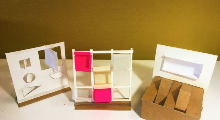
I chose to tackle our proposal by brainstorming three potential methods for the storage infrastructure to become pop-up exhibitions. I asked myself, how can I create something that can assume both identities as storage and interactive exhibition spaces? Naturally, I went on Pinterest, and got hooked on images of origami til parametric architecture; essentially the idea of folding elements to create a new object and or space- I was envisioning elements that could be folded to save space, but also add elements of surprise to the space, especially if they could be reconfigured, or we play with different colors, textures, or  materials.

And I came up with these three ideas, initially concept drawings, where I attempted to sketch what I was imagining, and then going back, scrutinizing that chicken scratch of a sketch, and writing down possible logistics on what would help it to function, and what would keep it from functioning well. In the image below, you can see I attempted to give each idea a sort of summary title (which helps to keep me focused on what the sketch should be and what purpose and elements it should have).

Then, I proceeded to look upon my leftover materials, and made decisions on how the heck I would construct a rough model to display these ideas best.

This is my first model (see below), which corresponds to idea #3 from my sketchbook, and I chose to just use Bristol- kind of like a fancier cardstock. I chose this because I like the clean look of white paper, but also it is a relatively easy-to-cut material that’s cheap, and that was really all I needed because I was just looking for a way to convey my ideas in the most affordable and decent-looking way possible! It’s a bit gnarly, but it serves its purpose (and ironically, it’s sometimes the ugliest of models that inspire the critics most haha).

The second model (see image below), which is meant to display concept sketch idea #2, I decided to construct from a mix of thinly sliced4-ply museum board, a hot-pink post note I found chilling around my desk, masking tape, regular tape, some white sewing thread, and scraps of trace paper. I was shooting for different materials that could suggest different materialities, and it was also just me trying to get a handle on how to best create these forms while attempting to maintain overall stability of the standing model.

Lastly, the third model (see below), corresponds to idea #1 of my sketches, and I decided to use a mix of scrap pieces of 3-ply cardboard, 4-ply museum board, and some bristol scraps. I was simply aiming for stable materials that wouldn’t be too much of a pain to cut and scour for folds, and they would be able to stand alone when re-positioned or refolded during demonstrations.

As you may have noticed, I took as best photos as I could of these ratchet models, not just for my own enjoyment as a photographer, but also since they serve as documentation for future mentions in portfolios,  and I’ve learned the hard way that anything (drawings, sketches, mental mindset, etc) you bring to a critique can be drawn over or torn up for the interests of pursuing another idea off of your initial ideas!

***

I’m a little nervous and excited to present these to my partner, classmates, and professor in class tomorrow, but I’ve sort of gotten used to this feeling, as these kinds of assignments happen all the time for class.

But thanks again, to all of you, who took the time to read all the way to this exact line!! I hope you enjoyed my insights! If you have any questions or comments, feel free to respond to this post, and I’ll be so excited to read it! And if you’re interested in seeing more of my work, in and out of the studio, give me a follow on instagram: @themichiganarchitect!

Ciao 🙂