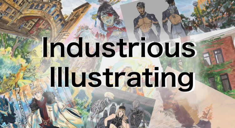
Hello, and welcome to Industrious Illustrating! This is a new weekly column updating on Fridays which will show process pictures, sketches, and sometimes finished works that show what goes into making character designs, illustrations, and the like.
This week we will look at two different pieces I created based on photographs I took on a 2019 summer trip to England.

Last night, I digitally painted this piece of two girls hanging out in an alcove on the University of Cambridge campus. I directly painted over my photograph for the background, but I took liberties in the exact details and drew two figures who weren’t present in the original picture. I had to construct the lighting and proportions on the two characters based on my own understanding of how lighting and scale would work in that environment.

I traditionally painted this piece with watercolors and alcohol-based markers in the fall of 2020 based on a photograph I took at the Bridge of Sighs in Oxford. I had to eyeball all the proportions and perspective and then draw the environment by hand, albeit while referencing a photograph. In retrospect, I think some of the details and perspective look a little off. But that was the best I could do at the time without the ability to directly paint over the original photograph.
For both paintings, I had to rely on my own understanding of lighting and perspective to construct the scene. The original photographs were also unquestionably my work. Since I wanted to depict real places in the United Kingdom, I couldn’t just rely on my own imagination to recreate existing scenery, and it wasn’t practical for me to return to the UK in person every time I wanted to paint a real-life scene. So my best option was to use photographs as a tool for inspiring interesting illustrations.
Digital art programs make image adjustments such as brightness, contrast, and saturation much easier, and they also have the blessing known as the undo function (ctrl-z). They also have the ability to directly integrate photographs into paintings for textures and references, which professional concept artists and illustrators often use so that they can finish detailed paintings on a timely basis for their clients. Using these tools isn’t cheating, as no amount of fancy tools can compensate for a lack of artistic skill. Rather, digital art programs enable artists to speed up their workflow and create finished works faster for both professional and hobbyist purposes.
I’m still proud of both pieces, and I think they both have their own merits. But this comparison should hopefully show that while digital art programs didn’t teach me the fundamentals or my current skills, they do help smooth out the process as a tool akin to a paintbrush or a pen.


Leave a Reply
2 Comments on "Industrious Illustrating #1: References"
These look awesome, but can you increase the size so we can see all the details? Zoom is not working well on my phone.
Ah, sorry about that! I’ll make sure that the images in all current and future Industrious Illustrating posts are at a larger size! Thank you for bringing this to my attention.