The Greatest City That Was

A city is a vertical landscape, organized linearly, radially, sometimes seemingly at random; the horizon is not the edge of the earth’s curvature, but instead the structures that define not only space but the dynamics of the space. It is not a sterile grid in which everything is set in its own place, but an integrated system in which everything is interdependent, and yet, it can be self-sustainable all on its own, self-contained cohesive unit separate from the world without.

Then take this city, and compress it. Compress it tenfold, a hundredfold, pushing ever more into a smaller space, and suddenly the old structures are no longer sufficient to support its populace, its original infrastructure and functions and standards. Some things must shift in order to re-adapt and to accommodate its new conditions, while others must be sacrificed altogether. The result is a hyperdense urban area, a living, breathing organism, complex and incomprehensible and breathtakingly terrifying all at once.

Perhaps one of the most intriguing examples exists in the Kowloon Walled City of Hong Kong.

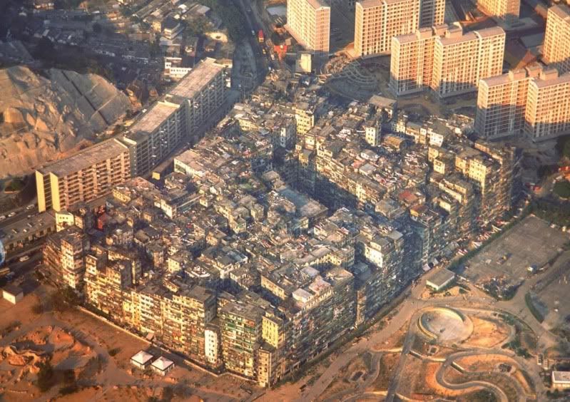
It was once a military fort, existing for hundreds of years without much change. Once urban settlement began, however, it grew and grew- never spilling outside the boundaries of its walls, but building upon building upon building springing up and around and against and on top of and between one another. The buildings tended to hover somewhere between 10 and 15 storeys, depending on the source one reads- and at is peak population may have reached a density of 3,249,000 people per square mile. It was fraught with crime and and violence, and although many of its residents might have been perfectly average and hardworking, the area lay outside the jurisdiction of both the British government and the Chinese. There was no official control, no official regulation. The Walled City was left to its own devices. Yet it thrived and it flourished, a city and a world all unto its own.

Architecture was, on average, haphazard; additions were were made wherever there was space. Wikipedia provides:

The City’s dozens of alleyways were often only 1–2 m (3.3–6.6 ft) wide, and had poor lighting and drainage. An informal network of staircases and passageways also formed on upper levels, which was so extensive that one could travel north to south through the entire City without ever touching solid ground. Construction in the City went unregulated, and most of the roughly 350 buildings were built with poor foundations and few or no utilities. Because apartments were so small—about 60% were 23 m2 (250 sq ft)—space was maximized with wider upper floors, caged balconies, and rooftop additions. Roofs in the City were full of television antennas, clotheslines, water tanks, and garbage, and could be crossed using a series of ladders.”

Instead of streets, there are only alleys so one may navigate between buildings. Yet the buildings are packed so closely together that the space between them is nearly negligible. There is little light, little breathing room. Were one to stand outside at street level, there might peek a sliver of sky, and perhaps sunlight would reach down when the sun was high, as a deep and narrow rift cut through canyon walls. The buildings of the Walled City look less like separate structures than one whole, as if one took any other city, ran it through a trash compactor, and spit it back out- fissures here and there, a crack, a small awkwardly-shaped opening there, where nothing else might fit- but the distinctions and boundaries between personal and public space are no longer defined by conventional standards.
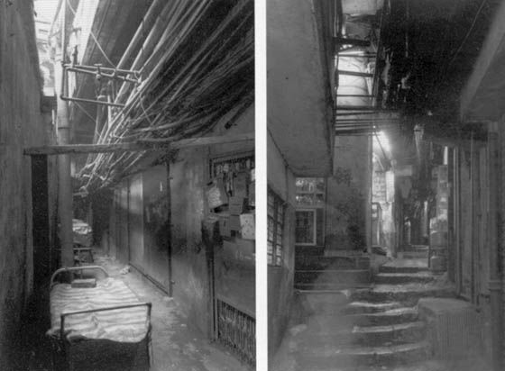
It was demolished in 1993, and in its place today stands an open park. Broken and whole, derelict but alive, the Kowloon Walled City was (and is) nothing to be trifled with. Should it have survived, it might yet be a microcosm of its own, a hyperbole of the metropolis, a distinct urban ecosystem unlike any other.

Other images of interest (which you really ought to look at): The Walled City in 1973, and a ridiculously detailed artist’s rendering of a cross section.

Ah, Sweet Dissonance

Space chords are perhaps among the most beautifully chilling sounds in existence. Like a proclamation of terror and enlightenment, of omnipotence and microcosms, of everything and nothing at once, space chords are nothing short of awe-inducing.

Observe, the Blue Devils at warmup:

(Skip to 1:08-ish to cut straight to it.)

To be honest, I know little about this musical phenomenon. A quick Google turns up nothing particularly explanatory, and it seems that the majority of results are of the brass section of some professional drum corps going away at their warming-up or tuning exercises with impressive skill and precision.

I’ve always wanted to know how these chords were constructed, but never, never, could I pick apart exactly what notes were in there (I’ve a bad ear for that sort of thing). Somehow, “simultaneously playing every note in existence” did not seem like it would achieve the intended effect. Apparently, space chords are particularly finicky and there is a finesse to getting them in tune.

Consider: that’s not only a bit of dissonance, such as one gets by playing two notes very close to one another at the same time (like the jarring wails of sirens and alarms), but it’s dissonance on top of dissonance. They cannot be so messy so as to be a meaningless jumble or sound, nor can they fit too well and become suddenly harmonious. It’s a tricky one to balance.

But what defines the allure of the space chord? It is in human nature to shy away from discord and conflict, from clashes and horrid sounds that grind and screech against one another. Harmony offers a path of less resistance, seems natural and pleasing to the ear, and does not require shoving a shoulder against the offending sound with a lopsided grimace and proclaiming, “of course it sounds beautiful!” In medieval times, the tritone, a far simpler and more common form of dissonance, became associated with the devil and was subsequently banned by the church. The space chord? Like a tritone, multiplied tenfold. Even I occasionally wince a tad upon hearing one. They are, admittedly, an acquired taste.

That, perhaps, is what one might see in these unusual chords. There is a sort of otherworldly, indefinable quality to them, something that is off but not off, something that is almost right but not quite. The sound, the eerie feeling, is everywhere and nowhere all at once, now and in the past and the future. It might foreshadow something ominous, but is so much greater than you, so beyond the scope of your comprehension and your ability to do anything about it, that there is naught to do but to listen. It’s strange, and it’s beautiful.

By the by: I found this.

Do You Hear It, In Your Very Bones?

I have a thing for soundtrack music. Soundtracks, particularly of the film score variety, that are big, symphonic, powerful.

The thing is, soundtrack music hardly if ever exists outside of a soundtrack, and not all the music on a soundtrack is automatically what shall be henceforth referred to as soundtrack music.

Music written for film, by nature, must have the ability to convey and induce emotion. It was, after all, composed to fit a story. Where there danger, the music must foreshadow it. Where there is longing, the music must draw it out. Where there is a sense of urgency, the music must make it all the more urgent. If something new and brilliant and breathtaking appears, so must the music take it, reflect it, draw it up and magnify it, and project it across the heavens. It is simply the nature of soundtrack music.

There is something about the way the combined powers of choral and orchestral interlace to create something entirely new and wholesome. Sometimes individual strands of voice or instrument breathe alone, floating along an ethereal and invisible membrane, or they may cut and dart among the others in playful jest. Other times, the music may be composed of vertical blocks, of solid chords built with the strength of a thousand voices. Air rushes through tubes of metal and flesh. The vibrations of strings and skins reverberate through the walls, the ground, through bone. They cut and pound. It is an army on the march, an evil on the loose, a world on the brink of destruction.

But by far the most powerful sort of piece is the sort that begins as a small, steady tune but sweeps upward as it goes. It begins to grow. There is a destination, but we do not yet see it. Slowly, as a rumbling below the surface, the music grows. It builds and builds, churning, working, expanding. A new melody emerges- but is it really new? They intertwine and separate and intertwine again. Something disappears. It reappears. And everything crescendos, crescendos, drawing up elements never noticed from below, expanding, rising, until there! The crest, the summit, the peak! Light breaks out from the darkness, and the barrier has been breached, and from there the music pans out (as might the camera), drifting unobtrusively back down.

And that? That is the magic of the music of film. Soundtracks are no mere background music. Imagine a particularly poignant scene from a movie, any movie. Now cut out the music. Chances are, it’ll not achieve half the effect it had before. Music in film often remains unnoticed, but its function is integral.

Now excuse me while I toddle back to my Lord of the Rings Pandora station.

The Many [mis]Uses of Fonts

I am neither a typographer nor an expert in graphic design. Yet, there’s a lot to be said for fonts and their effects. Or rather, the proper (or not entirely appropriate) application of them. What is in the appearance of a letter? In its placement?

Different typefaces, when used in contexts appropriate to them, are as good as invisible in the everyday world. Language, so integral to human interaction, occurs in written forms perhaps more often than one would notice. Books, tags and labels, signs, advertisements of every kind, informative, entertaining, philosophical- the written word is ubiquitous. How it is physically manifested, however, is something that the average reader does not tend to notice unless something goes horridly awry. And it does, it does.

Everyone has seen this, or done this themselves, at least once, I am certain:  It is an email, perhaps, or a hand-coded website, or perhaps a homegrown flyer or pamphlet or newsletter. It has clearly been produced in Microsoft Word because there is WordArt on it. Eye-squinting, brow-contorting, mottled-brown (or perhaps wavy blue, rainbow, or shiny chrome), 3-D (or the kind with drop shadows) WordArt that reads “OUR VISIUN 4 THE FUTRUE” like a whack in the brain with a crowbar. There may be neither misspelling nor poor grammar in actuality, but its appearance does not precisely emanate the glow of professionalism, either.

Without the aid of WordArt, the overenthusiastic font-decorator may turn to the handy-dandy format bar for some nice garnishing. In the same page, there may be eight different fonts, six different font sizes, ten different colors and probably excessive and extraneous punctuation or some glitter and unicorns thrown in there for good measure.

Please, please, no.

Understandably,  simplicity is not always the solution. Less is not always more. A single classy, clean black typeface will not necessarily do the trick. 12pt. Times New Roman in black will leave the correct impression only in certain cases.  But there is often something to be said for restraint. A font that is overly spiky, flourish-y, blocky, or otherwise irregular can certainly be fun to use sometimes, but reading a block of text written in one is most assuredly not fun. Putting up a poster telling everyone about the party would not be very effective if, say, it looked like this:

No.
Can we not

Also, this is a fantastic guide to fonts.

But in all honesty, now, what is it that makes some fonts more effective than others? Is it the curve and thickness and slant of their lines, the way their letters sit next to or apart from one another? The exact details are difficult to pin down. But one can definitively declare one type ephemeral, another heavy and authoritative. One can have age and dignity; another, cleanly cut, modern and progressive.

About a year ago, I was tasked with the analysis of a graphic novel. I do not entirely recall what the prompt was, or what we were to glean from it, precisely, but I chose to do a study of different fonts. In a graphic novel or comic, a story is told not only through words and illustrations, but a blend of the two- the appearances of said words. Language becomes not only verbal, or even visual, but both. Darkness and foreboding? Use dark heavy slashes and angular letters. Uncertainty? Weak, widely spaced letters, uniformly shaped but perhaps a bit shaky. Something archaic can be conveyed with an Old-English- style type, evocative of bygone flourishes and grandness, of academia and the intellectual. Flat, angular, typewriter-generated font can suggest a detached coldness.

The connotations and effects associated with different fonts provide a fascinating study. We will explore this further, perhaps, another time. But until then–

-TChen

Seeing May Not be Believing, But Believing Is Seeing

What happens when you take reality and multiply it, bend it, sculpt it, until a world that is simultaneously familiar and exhilaratingly new stretches before you?

Imagine an endless dreamscape that unfurls at your feet as you run; you are moving too quickly to see the details of what is around you, to imagine what lies ahead- but no matter, a city springs up wherever way you turn. It is impossible to consciously imagine such a highly-detailed world so instantaneously, and yet, it appears, seeming to build itself from the back catalogues of the fringes of your subconscious memory.

In an eerily reminiscent mix of Escher, Inception, and something else that just escapes definition, Jean Francois Rauzier’s highly surreal art evokes nothing less than a sense of awe.

Rauzier is best known for his hyperphotography. He arrives on a scene and shoots hundreds, sometimes upwards of a thousand images, gathering bits and pieces, angles and planes, flutes and cornices, sheen and grain. Windows, reflections, branches, ripples in the water. These are then stitched together and assembled into an environment so large and seamless it is difficult if not impossible to tell where one piece ends and another begins.

His galleries are worth taking the time to explore. Open images to fullsize; the viewer is interactive. Zoom in. And in. And in. Marvel. Pan over, repeat.

What you will find as you zoom in is that unlike a conventional photo, everything between the foreground and very distant background remains in sharp focus. Even when one thinks that the resolution has been maxed out- that there is no possible way to zoom in further without a mess of pixels- there is sharp detail. What appears to be a solid, if slightly mottled structure, turns out to be covered in windows and architectural details. Inside the windows are lamps. Furniture. Potted plants. And stretching out to the horizon, a veritable army of similarly mottled structures.

Rauzier’s work is an infinite labyrinth of visual treasures. One gets the sense of a meta-meta-meta-world, a recurring landscape in which the both the environment and what it contains might appear multiple times in various forms, but no one can quite put a finger on precisely what, when, and where, if at all. The closer one looks, the more there is to see.

It’s hard to not be fascinated.

It is only in an idealized world, one might think, that there could be such a richness of sensory opulence. But it’s not. It’s not. New details, interesting sights and things and facts are all there, are already there, all about you, waiting for you to notice them, for you to make the right connections.

What Rauzier does is merely put together permutations that have not yet occurred in this plane of existence.