An Interview with Artist & Student Yuki Obayashi

I recently sat down with Yuki Obayashi, a junior pursuing a BFA in Art & Design here at Michigan, to hear what she had to say about her own work and art as a whole.

Valerie: Hi Yuki, can you tell me about yourself and how you became an artist?

Yuki: I was first introduced to art by my family. My mom was always really handy, and did every craft with a needle and thread. My sister was always painting and drawing. I used to watch drawing videos as a hobby, but in middle school I realized I really enjoyed it. People asked me to make things, and in high school, I took an art class and realized I wanted to keep [making art].

V: Wow, you come from a very artsy family. Where are you from?

Y: I was born in Novi. I lived my whole life in Michigan and I go to Traverse City every summer, so Michigan is always close to my heart. I also identify as Japanese American.

V: Cool! How do you define art and your place within it?

Y: There’s no real definition. Even though it’s cliche, anything can be art. It’s more a state of mind–it belongs to everyone, so I’m part of this larger thing. I’m not sure I have a specific place in it so I’m just happy to be there.

V: That’s an interesting point of view. I think you are definitely an artist within the sphere of art. Now, who influences your art?

Y: In the beginning, it was definitely my sister–she had a beautiful way of portraying things. I would see all of her high school paintings and artwork and it really resonated with me. I wanted to be able to say things in that kind of way. Now, I’m really influenced by designers like Paula Scher, Jessica Walsh, Michael Bierut–they are not quick to define things. 

V: Yeah, I like them too! [Paula and Michael] are partners at Pentagram. I really like their work. Speaking of work, what is one of your favorite projects that you’ve done?

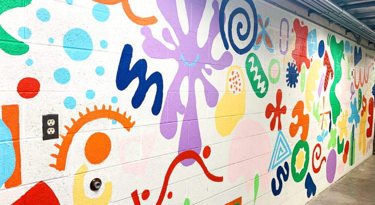
Y: I’m never really proud of the stuff I’ve done because I always look back and think about the other things I could have done. I like painting the murals [LiveinColor] is doing. We do so many, so I’m constantly having my mind opened because many different painters come in with what they want to put on the walls. Sometimes at first I’m narrow minded but seeing the final work makes me realize that I come out a slightly different person. So I wouldn’t say there’s one piece of work I’m most proud of

V: I hope you’re proud of your work, it’s so good! I’ve never had anyone give me an answer like that before; you’re very insightful.

V: In your work, what do you care about?

Y: I realized that within my work I care about the process itself and idea formulation. The end product can be anything, but it will only be successful if there’s a clear intention. I care about people who are willing to do things that aren’t conventionally seen as beautiful–there’s so much intelligence behind it and i really admire people who do that. I hope to pursue similar ways of thinking in my own design.

V: Everything you say is so eloquent. I think that emphasis on process is really important, and I’m trying to get better at that too. So where do you see yourself going in the future?

Y: I think my state of mind is going to be the same. I’m going to be painting or designing, but I’m still going to question myself. I always want to take risks and be more open to them.

V: Nicely said. Thank you so much for speaking with me!

Digitally Rendered Objects


Hand Drawn Lithograph


Wolverine Tower Mural


Flowdom Hoodies


SHEI Magazine Spread

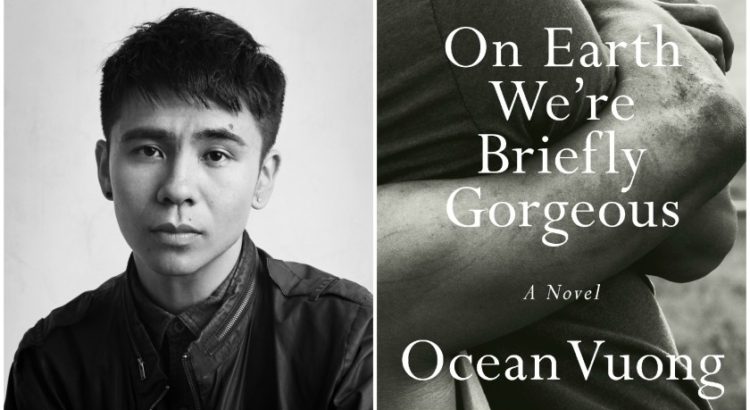
A Review of Ocean Vuong’s On Earth We’re Briefly Gorgeous

Even the author’s name, Ocean Vuong, is quite beautiful. I came to this autofictional novel with high hopes in mind, going off all of the hype that Vuong’s first prose debut was generating. Named a best book of the year by many, I was a bit skeptical of the power of this book at first, because his previous chapbooks of poetry weren’t my style. Nonetheless, I checked out the black-and-white-covered novel and set forth.

On Earth We’re Briefly Gorgeous took me two days to finish. I was amazed, impressed, shaken a little. Knowing that Vuong is also a queer Vietnamese person, I strongly identified with his intense emotional narratives. The novel blurs the line between personal lived expreience and literary fiction, but seeing a Vietnamese immigrant gain immense praise and popularity in the literary world gives me a sense of inspiration and pride as well.

Written in the form of letters from an adult son to his illiterate single mother, Little Dog reminisces on his current life and turbulent childhood growing up as a first generation American in the back of a nail salon where his mother works. He writes of his well-meaning grandmother with schizophrenia, his first sexual experience with a farm boy, and the trauma associated with growing up in a town rife with addiction.

Most striking to me was Little Dog’s complicated relationship with his mother. Abusive at times and loving at others, the author gracefully explores how people experience unconditional love and healing. The author writes at one point, “Perhaps to lay hands on your child is to prepare him for war.” Vuong’s prose is so fluent and eloquent, yet parts of the book were so emotionally violent at times, I was left in awe of his words. Each sentence is equally beautiful and striking.

To sum it up, I absolutely loved On Earth We’re Briefly Gorgeous.

Ranking the 2020 Presidential Candidate Logos

With the growing importance of a specific brand image, I thought it would be fascinating to look at and rank each of the current (as of January 24th) 2020 presidential candidates’ campaign logos. Whether put on websites, podiums, stickers, signs, or t-shirts, logos say a lot about a person or a company, and are one of the most important things when it comes to recognition among diverse audiences. This grading will be absent of any political/ideological judgments, but will be purely based upon aesthetic design. Also, due to the large number of running democrats, the democratic candidates included in this discussion will only be those that qualified for the last democratic debate held on January 14th.


Biden (D)

Image result for biden logo

Biden’s logo is visually bold and simple. The clever “E” representing red stripes alludes to the American flag and works quite well in this design. However, the logo’s simplicity lacks a sense of personality and presents itself as pretty generic. 6/10


Buttigieg (D)

Image result for buttigieg logo

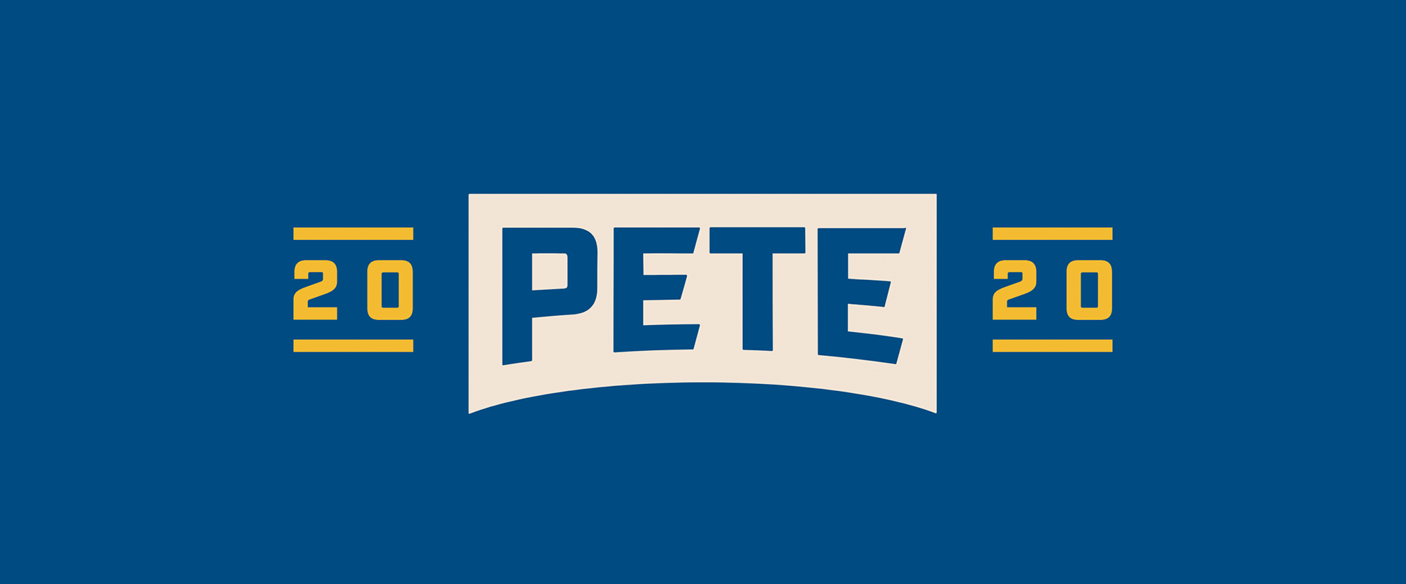
Pete’s logo is interesting in that he has a lot of logo variations intended for the public to use as they wish. His main logo shown here contains a mixture of strong typography and slight curves, giving a hint of youth and contemporary awareness. The cream, gold, and blue color give off a very athletic, vintage sports feeling as well – which could be detrimental for older audiences. 8/10


Klobuchar (D)

Related image

Klobuchar’s logo displays “Amy” large, immediately catching the viewer’s eye. Although simple, the combination of three different typefaces at different sizes and colors makes the design lack a cohesive direction. 3/10


Sanders (D)

Image result for bernie 2020 logo

Bernie’s logo utilizes a slab serif typeface and curving lines to indicate a sense of both historical experience and dynamic movement. The star is a nice, playful touch, and the overall design uses classic red and blue colors that are not too harsh. But, the lines are a bit too reminiscent of toothpaste.  7/10


Steyer (D)

Related image

Steyer’s logo immediately stands out for its arresting thick text, accompanied with an orange 2020. The usage of navy and orange is interesting, as orange is uncommon among presidential logos. Yet, the typography doesn’t work too well here. 3/10


Warren (D)

Image result for warren logo

Warren’s logo contains large, unconventional lettering – a good choice for a progressive candidate. While the horizontal line is fine, the purplish-navy and mint green colors don’t suggest much, and are rather holding back any sense of distinctive personality. 4/10


Trump (R)

Image result for trump logo

Trump’s logo is very strong, recognizable, and pretty straightforward. Bold navy and red create a mood of patriotism, and the red stars and navy box frame the logo well. The exclamation mark seems a bit unprofessional, however. 6/10


Walsh (R)

Walsh for President

Walsh’s logo is pretty much as simple as it gets – just text in two colors. The black and firetruck red seems like a strange choice, and a bit too arresting. It’s unmemorable and doesn’t contain much information, as if a high schooler designed it in five minutes. 2/10


Weld (R)

WELD 2020

Weld’s logo takes a different approach in structure, with a combination of lines and text. However, the innovative look does not work well visually, and appears quite messy. The two shades of blue also don’t lend themself well to a presidential campaign. The “Weld 2020” would work fine on their own, but the addition of a subtitle makes the design quite clunky and awkward. 2/10

Two Humans Making (Gorgeous) Things: CW&T

CW&T, the art and design practice of Che-Wei Wang and Taylor Levy, are a dynamic duo based in Brooklyn. I came across their products while browsing Instagram one day, and have been thinking about it ever since. They develop all kinds of items such as electronic sculptures, pens, installations, apps, and more. The artists and designers, who have a child together, also teach in New York City.

CW&T create projects “that we want to see in the world.” Everything is thoughtfully designed and manufactured to last, and meant to improve the lives of creative people. As a designer myself, I’m allured to the elegant aesthetics and functionality of the products, such as a titanium bookmark pen or a kitchen salt vessel (that comes with matching magazine). Although the products can be quite pricey, it’s the attention to detail and perfection, not to mention the hours of development that goes into them, that makes them totally worth it. The thought and research put into each object is quite incredible (including designing a house in Tokyo 2013-15)!

An interesting part of their work is the emphasis on process – in photos they continuously share the development of a new product. It’s honest and intriguing “obsessive documentation.” Each image is accompanied by a unique naming system, which when decoded contains information about the purpose, date, quantity, material, and more. Even exploring the CW&T website or their colorful Instagram account is a treat for your eyes.

Salty


Pen Type C


Time Since Launch clock

Is Awkwafina Problematic?

Actress Awkwafina (Nora Lum) recently made Golden Globes history by being the first Asian American to win Best Actress, for her role in “The Farewell.” In “The Farewell,” she plays a Chinese-American struggling to figure out her own identity while attempting to protect her grandmother Nai Nai from the actuality that Nai Nai has only weeks to live.

Awkwafina has made quite a splash in the last couple of years, especially for her parts in “Ocean’s 8” and “Crazy Rich Asians.” She is notorious for releasing a song called “My Vag” in 2012, and other humorous and inappropriate rap songs. Part of her fame stems from her identity in opposition to the model minority stereotype, in which Asian Americans are expected to be quiet and submissive. Awkwafina’s performative personality in her music and acting roles have consistently portrayed her as loud and in-your-face, spunky, and refreshingly brash–a milestone in representation for Asian Americans.

Hailed as an irreverent, hilarious popular figure, some critics have attacked Awkwafina for building her celebrity upon appropriation of black culture. Is she simply a standout example of an Asian American who has garnered fame for her in-your-face persona, or has she actually profited off problematic cultural appropriation? While the answer may be tricky, I wanted to explore this issue further.

One writer explains that Awkwafina’s role as Peik Lin in “Crazy Rich Asians” demonstrates the appropriation of the “blaccent.” With wagging fingers, language such as “bawk, bawk, bitch,” and the use of “be,” and an overall sense of swagger, Awkwafina’s depiction of Peik Lin shows a cross-cultural connection to black vernacular. Yet, is she just portraying a character or is she complicit in a perpetuation of anti-blackness? The writer also suggests that maybe the quirkiness of Peik Lin’s character doesn’t stem from explicitly black language.

Cultural appropriation is not a new issue. Through media like Nicki Minaj’s “Chun Li” or Post Malone’s rapping, famous artists are no strangers to accusations (perhaps deserving) of stealing from other cultures. To some, cultural appropriation only occurs when someone from a dominant culture/ethinicity takes something from an oppressed culture (such as white people portraying black stereotypes).

Vernacular invented by people of color, notably black and brown folk, is commonplace among young people. Can a culture own language? This issue is particularly tricky to discuss in the current era–with the mixing and morphing of all dialects and accents in 21st century of America, the cultural diversity of people is abundant. I think this meshing of cultures is quite beautiful and is what makes our country so unique.

However, what is truly problematic about Awkwafina is the fact that her entire portfolio relies on the flamboyant, swagger-filled potrayal of a common stereotype of African Americans. This usage of African American Vernacular English and black mannerisms unfortunately has real-world harmful consequences for black and Latinx people, who are often discriminated against for not using Standard English, which is ethnocentrically thought of as culturally superior. While I am proud of the Asian American representation Awkwafina has helped achieve, it’s worth noting that her fame stems from a derogatory caricature of black people, which is inherently problematic in itself, no matter who the perpetrator is.


*As an Asian American woman, I obviously do not speak for any entire culture. These opinions are entirely my own.

Eating Animals

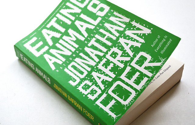
I recently re-read a book by one of my favorite authors, Jonathan Safran Foer, called Eating Animals. Originally published in 2009, Foer’s book is an intriguing look into why humans eat meat, and the environmental, ethical, and moral implications of consuming it. The idea came about when Foer’s son was born, and helps him to decide whether or not he raises his son on a vegetarian diet or not. As the new year begins, I hope to be more mindful of what I eat, and consume less meat–for both ethical and environmental reasons.

I also saw Foer speak at Rackham this past fall, presenting his new  title We Are the Weather: Saving the Planet Begins at Breakfast. A seasoned fiction writer, Foer now turns to discussions of how diet choices affect climate change and writes from an honest and personal point of view.

In Eating Animals, Jonathan Safran Foer utilizes many sets of stories to illustrate powerful points: he describes in gory detail the conditions of modern factory farms which kill thousands of cows, pigs, chickens, and turkeys, but also interviews owners of small family farms whose practices are more ethical but dwindling. Foer eventually comes to the conclusion that eating animals is a sort of negligence of our own humanity, because both humans and animals can suffer, yet one species is deemed superior to the other.

In an era where people are becoming more conscious of their food and where it comes from, Eating Animals is a stark but real look into the industrialized farming complex within the United States. While switching to a totally vegetarian or vegan diet can be a lot for some people, Foer urges that even small choices such as not eating meat for one meal or one day still carries a significant impact, especially if many people do so. If you are thinking about decreasing your meat consumption, or simply want to learn more about the meat industry and its effects, I strongly encourage you to pick up a copy of Foer’s books and dig in.