The First Part of Many: A Look at Illustration

This is going to be a multi-part blog post as I rummage through my thoughts on several illustrators. They will not be posted in sequence.

Upon returning to campus I visited the Dawn Treader Book Shop on Liberty in order to find some cheap copies of novels I required for the semester. I’d figured, at least, that the novels for my Fantasy class would be on the shelves given how widely read they were, for instance, novels from the Harry Potter series or Alice in Wonderland. I did find Alice on the shelves, but they weren’t complete versions of the texts, missing the ever-important Through the Looking-Glass. Also, I’m not proud enough to admit that the cover was not particularly appealing. However, as I was about to leave the shop with nothing, my eyes were drawn to a book that had an interesting illustration on it. It was a bird (perhaps a crow?) with a top hat and cane, walking briskly, eyes shut, towards some location beyond the silhouette of the cover. The title? You Can’t Get There From Here. Ogden Nash wrote the book but what truly piqued my interest was that Maurice Sendak illustrated it.

My only encounter with Sendak is, of course, Where the Wild Things Are. I can never quite remember how many times I read it, but I don’t think I read it as much as other children claim. But quite recently, I’d found a new interest in several illustrators from Sendak’s era, or perhaps those who preceded him. I’d become affixed to the elegant line drawings and incredible draughtsmanship of E.H. Shephard, Saul Steinberg, Jean-Jacques Sempe, Ronald Searle, and Tomi Ungerer just to name a few. So it was only natural for me to pick this book up.

The entire book is composed of several poems, most of which are comedic, while some are sublime, but all of them are whimsical. One particular poem I find quite coincidental is titled, No Woe is Gossamer to Mr. Bessemer. The poem describes, not a pessimist, but a man who always expects the worst, and one of the lines is, “He is certain that the train he must catch will leave early, / and that, once caught, it will arrive late, / And, as a Michigan alumnus, that the Big Ten title will / go to Ohio State.” The illustration accompanying this poem features a man in a raincoat, holding an umbrella, sun hanging high, walking past a group of puzzled children, one sticking out his hand waiting for a drop of rain that is not coming anytime soon. Ha Ha. chuckle chuckle. Turn the page.

Now, as I write this article, I wonder, should I not be reading “children’s books”? I’m not too sure if such a thing even exists actually. Or at least, the books that I remember reading as a child and still loving are those that are timeless. Even now, I pick up books I never read as a child and find them fascinating. So it sort of comes back to that word (doesn’t it?) – timeless. Does that just mean a book is re-readable? Not quite. Or maybe it suggests something like what Calvin and Hobbes does so well, each time you revisit a strip by Bill Watterson, you appreciate it in a different way.

Then, naturally, I guess the proceeding question might be, how do these illustrators/writers create something that is timeless? Perhaps I can explain it this way, by introducing a bit of unrelated yet related information, Ungerer used to draw illustrations for a children’s book on his desk while nearby, he had his stove on, with a pan filled with Barbie dolls that he was melting in the heat. And of course, he wrote incredibly famous children’s books while also creating art books like The Underground Sketchbook of Tomi Ungerer – a book that features a naked woman on the cover, with no head, and in the cave like entrance of her bleeding neck, sits, huddled, a man with a bloody knife.

I’m not suggesting that this is the only answer, but it may be a answer. Yes, it is a far cry from the pairing of pessimistic poetry and whimsical illustration, if anything, a lot of wild illustrations seem restrained compared to what Ungerer did. How does a man, who drew the adorable, Moon Man draw a man using a woman as a vacuum at the same time. Honestly, although it may seem ludicrous to the public eye, upon consider what Ungerer went through, his history, his context, and a variety of other “character building elements” it doesn’t seem all that crazy. I’d like to suggest that perhaps his inclination towards drawing images of manipulated bodies, both man and woman, isn’t all that unique. Perhaps he is just more honest than the average individual. Is that what it takes? Honesty?

Oh Snyder…Tsk Tsk

In preparation for a project, I re-watched Watchmen this weekend. Let me get this out of the way – I’ve never been a fan of Zach Snyder. I haven’t seen every film that he’s directed, limiting to myself to his disappointing comic book adaptations instead. I’ll make the argument that 300 was probably his best comic book adaptation because that was the only instance where the source material actually benefited from Snyder’s muted colors and penchant for sporadic slow motion and extended fight scenes. Should there be any more narrative involved with the film, Snyder becomes utterly lost in his own artistic tendencies, producing a film that may entertain during certain sequences but one that is easily forgotten as soon as the film is over.

Snyder’s allergy to good story is probably best exemplified by Sucker Punch, a film he both directed and wrote. The film is filled with characters that suddenly get incredibly strong and gain Superman-like powers with little to no explanation. It also follows a boring structure where the characters have to get three different items after having their quest literally explained to them by a character that exists solely for exposition. What are their names? I don’t know and I don’t really care. Never before have I been too lazy to even provide a plot summary, but this film has broken my back.

So this was the film that proceeded Snyder’s adaptation of Watchmen. Which contextualizes, somewhat, why the studio would let him create his own project from scratch. I remember when the first trailer for Watchmen came out and one of the title cards read, “From the Visionary Director of 300.” I was cynical even at that point. Visionary? Really? You know what, fine, I’ll give it to him, at least 300 looked nice. At the time, I hadn’t read Watchmen yet and I didn’t even know about Alan Moore either. However, during the time the film was announced, my high school was ripe with anticipation because our very own drama teacher played Nixon in the film. It was a minor role (and honestly, looking back, I cannot say that he was the best Nixon I’d ever seen) but still, it was exciting. So in response to all the energy at my school, I finally read the “greatest graphic novel of all time.” After I’d read it, I could finally remove the quotations – it truly was a work of genius.

Now the problem with adapting something like Watchmen is just that – it cannot be adapted. The way in which the graphic novel is genius is its ability to utilize the medium in ways that only this particular medium can be used: the nine-panel grid repeats certain character positions in order to mirror how Dr. Manhattan exists in a fluid time; the chapter title pages all feature a clock that slowly clicks towards midnight; the image of the blood stain on the smiley face is repeated over and over again; we never quite see the entirety of the slogan, “Who watches the Watchmen?” and so on.

At the very core, film and graphic novels are astronomically different because the means in which they juxtapose images is entirely different – graphic novels use space while film uses time. All those techniques mentioned above are examples of a precise use of spacial juxtaposition: from panel to panel, page to page, or chapter to chapter. The fundamental natures of these two mediums are different! So why does Snyder think the graphic novel is a ready-made storyboard for his film? This is not only a failure to understand the graphic novel, but it’s also a failure to understand film.

It doesn’t quite surprise me that Snyder’s latest comic book movie was regarded with much disdain. Dull colors, mass destruction, a lack of story, it’s the same flaws over and over again, yet studios keep entrusting him with comic book adaptations – it’s about as mind numbingly nonsensical as Snyder’s understanding of adaptations in the first place. I haven’t seen Batman v. Superman and something tells me I never will. I know this post reads like a grilling of Snyder…well that’s because it is.

But to be fair, I don’t think anyone can do justice to a graphic novel like Watchmen, so long as we consider the film as an adaptation. The day a good “Watchmen” film is made will be when a director is able to pluck the very themes and motifs of the graphic novel, while restructuring and rewriting a large portion of the source material in order to accommodate a new medium. In other words, the best adaptation won’t be an adaptation at all.

The Far Side from Comics?

If it is just one image, is it a comic? Scott McCloud, a famous cartoonist and comic scholar, says no. He expels single panel works, for instance comics found in the New Yorker or works akin to The Far Side. But is this fair? Perhaps under the strict definitions of sequential art…

“Juxtaposed pictorial and other images in deliberate sequence, intended to convey information and/or to produce an aesthetic response in the viewer.”

Is this the best definition? Probably not, but it isn’t half bad either. But the key word in the definition is “juxtaposed” In The Far Side, the images are not juxtaposed because there is only one image. Lets look at this comic for example.


Here we see a single panel (at first, we will exclude the captain at the bottom from our reading), with dogs running around, repeatedly exclaiming, “Hey!” In the foreground, we have a man who appears to be a scientist wearing some sort of electrical contraption on his head. As is, we could make a variety of guesses as to what’s going on. Is his contraption making the dogs go wild? Perhaps it is emitting a particular pitch much like a dog whistle. I won’t try to sustain this mystery any longer, because I didn’t photoshop the image to exclude the caption, so you probably already know what is going on.

But with the added caption, we now know that the scientist is listening to what the dogs are saying and I think he is less than ecstatic to hear the mundane word repeated non-stop.

So the caption is critical in the understanding of the comic, yet it’s still not a comic to McCloud’s definition. However, we know for a fact that The Far Side is one of most celebrated comic strips ever, only sitting behind the likes of Peanuts, Garfield, and Calvin and Hobbes.

I propose that the caption is an image in and of itself. Sure, it isn’t pictorial (I suppose you can go into a lengthy debate of why it is, but I won’t do that here for I am unprepared for such a task), but it juxtaposes with the panel perfectly, not only explaining the panel itself, but also adding depth to the emerging form created by the unification of words and pictures. From the caption, we get a glimpse of the past, when the scientist was excitedly building this contraption and the caption along with the picture tells us of the present.

In other words, the caption adds such a unique depth to the singular panel, that it’s hard to suggest this isn’t a comic. Perhaps you can compare this to a photograph with a caption explaining the photograph. But it isn’t, for there are speech bubbles and the specific use of the word “hey” is absolutely crucial to the joke. You are never going to convince me that you can see speech bubbles floating above dogs in un-tampered photographs.

It’s strange to me that McCloud feels the need to define a comic in such a fashion. Perhaps the most critical medium it needs to differentiate itself from is the storyboard, but this definition doesn’t exactly do that, for the differences between those two mediums is far subtler.

To me, comics have always been a very fluid medium. Web comics have incorporated moving images or scrolling effects. Perhaps this definition doesn’t work, for it seems to exclude the masters of the simplest of comic forms – the one panel punch line.

Video Game Music

Last semester, one of my friends asked me to take a video game music class with him. I was hesitant at first, but I soon decided adding a two-credit course couldn’t hurt. Now I’m no musical savant. For although I may listen to music, ranging from pop music to classical, I’m unable to, in a learned fashion, explain why my musical choices are excellent or worthy of your praise.

Interestingly, before this class, I would occasionally listen to film scores but never before had I considered music from video games. Of course I knew the legends of musical scores like the Mario theme, but what of the effect of music on games? What about how themes are constructed? Leitmotifs? What are those? All these questions!

Through the semester, all was made clear. We learned about how the original sounds were created on limited hardware, how video game scores handled the problems that came with looping, and we spoke with current video game composers like Austin Wintory (flOw and Journey). Speaking with industry professionals was an absolute treat. Although I’m not an aspiring composer, I sat there, thinking, “I wish this happened in other classes.” There was something rather candid about talking to a giant head projected onto a screen in the basement lecture hall at the art museum. It was a conversation, not some form of high profile celebrity interview. We learned about the normalcy these composers came from. How they were just musicians who managed to get involved in a growing market.

“A friend told me I should try video game music.”

“I was composing music for commercials at the time when I discovered I could make video game music.”

The video game is probably the most immersive medium available to us today. As technology advances, it would seem immersion is the one thing that is continuously amplified. Another immersive medium, movies, incorporated music, photography, and writing in a way that was new. Then video games included another dimension, the active participation of the audience while also including new technologies. Amidst all this, it becomes harder to focus on one particular element amidst the clustered form. But perhaps it is necessary, in such a complicated form, to focus on one thing and build from that point. Wintory told us that Journey was developed based on his composed music. The levels and the animation, the lighting and the gameplay mechanics, all of these things revolved around what Wintory was composing for the game. Oddly enough, by leading with one element, everything else forms in a cohesive manner. All it takes is one recommendation, and you enter into a complicated world that just clicks.

Another aspect of the course I enjoyed, although I didn’t partake in the exercise, was the chance to compose music for an EECS class that had developed their own video games that semester. Now I understand that organizing interdisciplinary opportunities is a logistical nightmare for professors. However, when it happens, it’s priceless.

I cannot say that I’ve started playing more games because of the class. But I’ve started to revisit nostalgic video game scores. More importantly, what I learned about the processes of composing video game music has affected my approach to writing as well.

No medium seems to be alone nowadays.

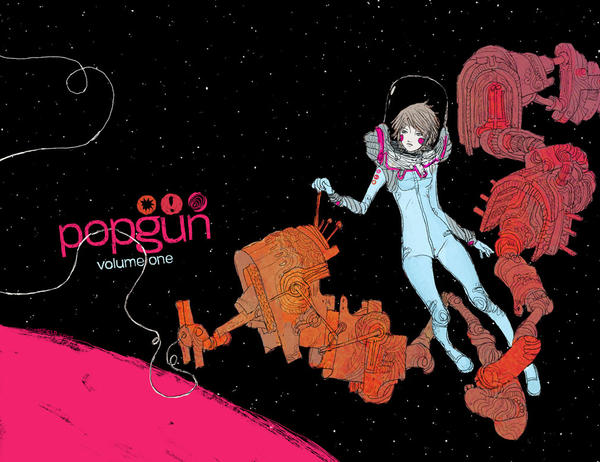
Popgun Volume 1 and the Comic Book Anthology

Anthologies are a bit of an odd animal for me, especially comic book anthologies because the difference in visual style from story to story is glaring. In anthologies with just short stories for example, until you read each work, aesthetically, it feels as if it all blends together.

Although I’ve already spoken about Island, I recently discovered an older work of anthology with Popgun. Now the reason I struggle with this particular work despite absolutely adoring the first issue of Island, is the sheer length of it. The anthology is packed with short and long comics for a total of 450 pages.

When an anthology reaches a length of this magnitude…do you work around a central theme? I don’t think that works, simply because it can become dull over the great length, especially with the sporadic aesthetic and prose an anthology can offer. The Island was, for the most part, short, featuring no more than 4-5 stories. However, here, there are well over 40.

But the loss of a theme can leave a reader directionless, but perhaps that is the point of an anthology like Popgun – to bombard you with work from a large pool of artists and writers – most of whom were not famous yet.

As a reader, it is easy to forget about the opportunities available to the writers who are featured in works such as this. By having so many pages of content, the platform grows larger for aspiring comic book creators and it is a chance for them to be featured in a book edited by famed comic book creators and published under Image. Popgun is a mix tape of up-and-coming creators and should be considered as a bag of random goodies rather than a cohesive work. In other words, it’s not only a platform for new creators to get published, but it’s also a means of readers discovering new creators.

The Island magazine has the right idea, but maintain a smaller dosage of stories in order to maintain some sort of cohesion. However, although it may be a bit overwhelming, the need for expansive works like Popgun may need to return.

Watching Zootopia

I don’t remember when I last saw a Disney animation at the theater. Maybe it was Treasure Planet? Maybe. Possibly The Incredibles? But for the most part, my Disney filmic experience consisted of me sitting in front of an old tube TV and watching: The Fox and The Hound, Dumbo, or Hercules once again. However, over the break, I finally decided it was time to see a Disney film on the big screen for the first time in a long time.

Zootopia sounded interesting to me, because, animals are nice…ya? I can’t say I’m a sucker for anthropomorphized animals (which may seem odd given two of my favorite Disney movies contain talking animals). However, seeing as there were no princesses involved in this film, I thought, “Fuck it, why not?” Now I know it sounds as if I’m not the biggest fan of Disney animated films. And you would be right in assuming so. A part of the reason is because I’ve been rather disappointed with the Oscars giving Disney the best animated film award year after year, despite there being wonderful films produced overseas. At first, I figured, “It’s the Oscars, why do you care so much? I mean your favorite actor is Joaquin Phoenix, and you know what he said about the Oscars…” But yet, I end up caring, and I hate myself for it. So I’ll just say this, somebody has to take ole Oscar home; I mean it can’t stay there at the ceremony. Right?

On the subject of the Oscars however, it was interesting to watch Zootopia after a ceremony that was so heavily swamped in the whole #whiteoscars bonanza. The film, to my surprise, was heavily about stereotypes and crept into other mature themes like drugs and the mafia. The film was quick to touch on how the optimistic girl (bunny) from the farm found out quickly how much different species don’t get along in a city where such perfect inter-species relationships hypothetically exist. We get other racial jabs like, “Only bunnies can call other bunnies cute, and when another animal does it…” Which is funny. Haha, Racism but it’s a bunny. And we move on. However, the overarching conflict occurs to be between predators and prey however, which is odd because all the sudden, we are now reduced to just two groups.

Now let me sidestep around this for a second and say, I thought the last season of South Park was perfect as they tackled the subject of PC.

At the Oscars, Chris Rock made a joke about Asians. Correction, he made two jokes. Was I offended? Not really, because the joke pertains to the Chinese more than the Koreans. And lets be honest, we only truly get offended when it pertains to a very specific group we belong to. However, did I think it was offensive? Yes. I found the lack of diversity in a quest for diversity very interesting. Even Zootopia lacks this diversity. Although it may show various animals, we cannot fully explore each species and their relationships with other species because there is a limited run-time. If people want to see films, that pertain to every race equally, we are going to be sitting in the theater for like eight-hour films. Chris Rock mentioned in the Oscars, how he finds it hilarious that black people are mad at the Oscars in this day and age. To which he concludes – black people had more important things to be angry about in the past.

I don’t need to verify this; we all know it’s true. And of all the fucking things, the Oscars? Really? This is an institution that gave best film to Forrest Gump the year Pulp Fiction came out. They gave it to a film that portrays a mentally disabled white man who bumbles his way through history, magically taking credit for many major African-American achievements. The Oscars never fucking mattered or were an authority on anything. Ever! All I ever used the Oscars for was as a way for me to vent some anger – to be mad at all the obvious yet annoying picks they make, every year. And then be pleasantly surprised when they acknowledge how great Mad Max: Fury Road is.

The Oscars shouldn’t be a standard for anything because it’s shit. The average viewer doesn’t even end up watching the films that won after the ceremony. The show dictates so little it is laughable. So why try to change it? It’s like getting mad at a rock that wasn’t in your way in the first place. Just forget about it and move on, knowing, that people will watch what they want to watch and love the films they fall in love with. Just because Big Hero 6 won last year doesn’t meant I suddenly love it more than The Tale of the Princess Kaguya. Not one bit. You know why? Because, say it with me, THE OSCARS ARE SHIT.