Mixed on Campus #1 – Alice Conner


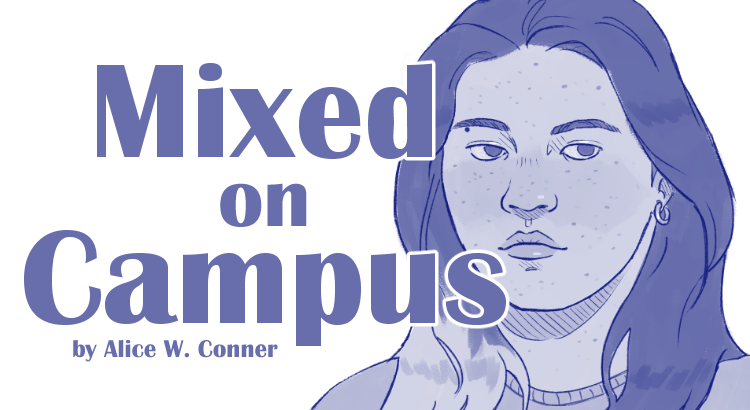
Hi, my name is Alice Conner! The first post of this series is a self-portrait. I’m a 2nd-year undergraduate student majoring in Industrial & Operations Engineering. I racially identify as mixed (Japanese and White-American) and drawing is one of my hobbies! This series is called Mixed on Campus and was inspired by the Humans of New York project. The purpose of Mixed on Campus is to give a voice to this university’s mixed community and shed light on its members. Being mixed means to be multiracial, multiethnic, and/or a transnational adoptee. Through Mixed on Campus, mixed students have the opportunity to have their portrait drawn and share their experiences!

Being mixed has been a defining part of my life, even when I didn’t fully understand it myself. Growing up, I struggled to find a community that would accept my whole identity as it is without judgement or discrimination. Since coming to this university, I’ve been able to find a place within a supportive and inclusive community that has helped me understand my identity and uplift myself. I’m very grateful to the student organization Mixed@Michigan, whose purpose is to foster a community of mixed, multiracial, multiethnic, and transnational adoptee students at the university. I joined in the fall of 2022 and now serve as a board member for the org. This project would not be possible without Mixed@Michigan!

Industrious Illustrating #32 – Risograph Printing

Lately I’ve been playing around with different methods of design and printing, which has led me to make use of the risograph printer available at UMich Stamps. Risograph printing is a type of printing that uses a type of Japanese office printer that layers bright halftone dots of ink, creating a visual effect similar to a screenprint or a retro comic book.

Below are some examples of bicolor and tricolor risograph print designs I recently made or converted into risograph printing format:

Risograph printing is great for creating its signature pixellated texture and intense colors, as well as for mass-producing large print runs nearly instantly — a risograph printer can pump out dozens of identical prints in under a minute once the master copy of the print has been burned into the pigment rolls. The risograph can also print in fluorescent orange, fluorescent pink, and metallic gold — colors that I want to try out once I come up with some good ideas for them. I’m looking forward to bringing more risograph prints with me to conventions as well as for my own personal enjoyment in the future!

Industrious Illustrating #31 – Sticker Designs

Sorry for the late post — midterms week and the beginning of spring break were a bit chaotic for me. This week I have a few sticker designs to show that I made for the Hong Kong Student Association. I don’t do a lot of sticker or small designs, so trying my hand at them was interesting. I personally really like cute food-themed designs, and my favorite Hong Kong foods are egg waffles, shrimp dumplings (and dim sum in general), and egg tarts, so I made three designs inspired by them.

In the end, HKSA ended up selecting the first two designs, and the tshirt/sweater/sticker order form is currently open to club members! I’m glad that I took the chance to challenge myself by working with something different, and I’m going to consider making more dessert/food-themed designs in the future for my personal enjoyment in the future.

Industrious Illustrating #12: A New Semester

A new season means a new semester, and a new semester means a new Industrious Illustrating banner! It’s been a while since I last posted to this blog, and I hope that the summer was a restful or productive time for all of you, whichever one was your goal. While I have some exciting new projects I want to share with you guys over the next few weeks, I want to focus first on a brief recap of a few pieces I made over the summer.

For most of the summer, I was spending time living with my parents in Hong Kong. We lived pretty close to the beach, so sometimes I’d go down to the beach and look for interesting-looking animals in the sand and rocks. Attached are a few watercolor and ink sketches I made of a Fiddler crab, as well as some clams, sea urchins, and sea snails I found when the tide was low.

Aside from sketching the wildlife, I also made more refined illustrations based off of the scenery and sights I saw in Hong Kong, albeit with a few changes for artistic effect. For example, one of the new pieces on my year 2 banner features a tiger girl dressed in summery clothing while leaning over the railing of a staircase next to overgrown terraces. This is actually based off of a real staircase near my summer home that led down to some tropical fruit trees and a tiny beach (though it wasn’t the one I frequented).


If you look at the other side of the new banner, one of the pieces I added features a girl floating in a brightly lit vestibule as if she’s in a spaceship. This is actually inspired by the Moncler clothing store display in Hong Kong’s International Commerce Center, which always caught my eye when I was walking from the Kowloon MTR stop through the ELEMENTS shopping mall and the ICC lobby. I made a few tweaks to the lighting to make it look more dramatic, but otherwise I kept it close to the reference in an attempt to capture what I liked about the design.

For a side by side comparison:


Unfortunately, I haven’t gotten around to making more studies of the sights I saw in Hong Kong, or even more pieces inspired by what I saw in Hong Kong, but I’ll be sure to work on some and post them when I have time!

What did you guys do over the summer? I would love to hear about it in the comments.