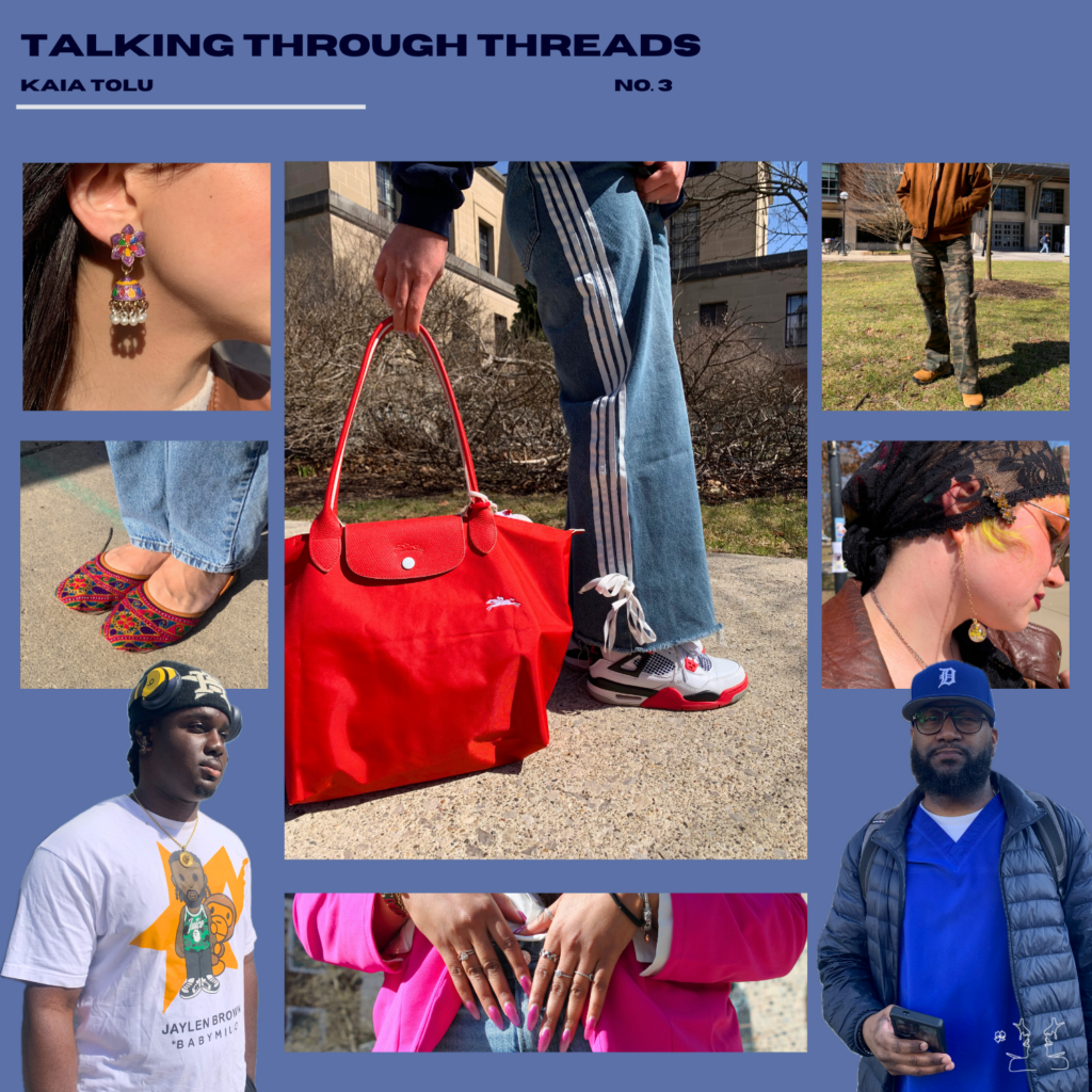
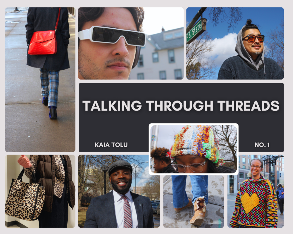
All coordination/ Matching to the heart’s content/ Let the mind wander


All coordination/ Matching to the heart’s content/ Let the mind wander
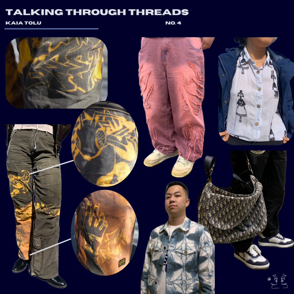
Walking through the streets / What I spotted was all bleach / Just art, style, and dye
Note: The cargo pants with the yellow bleach designs are from the brand: Requiem Tears
Be sure to support! The designer is passionate about his designs and the story they tell.
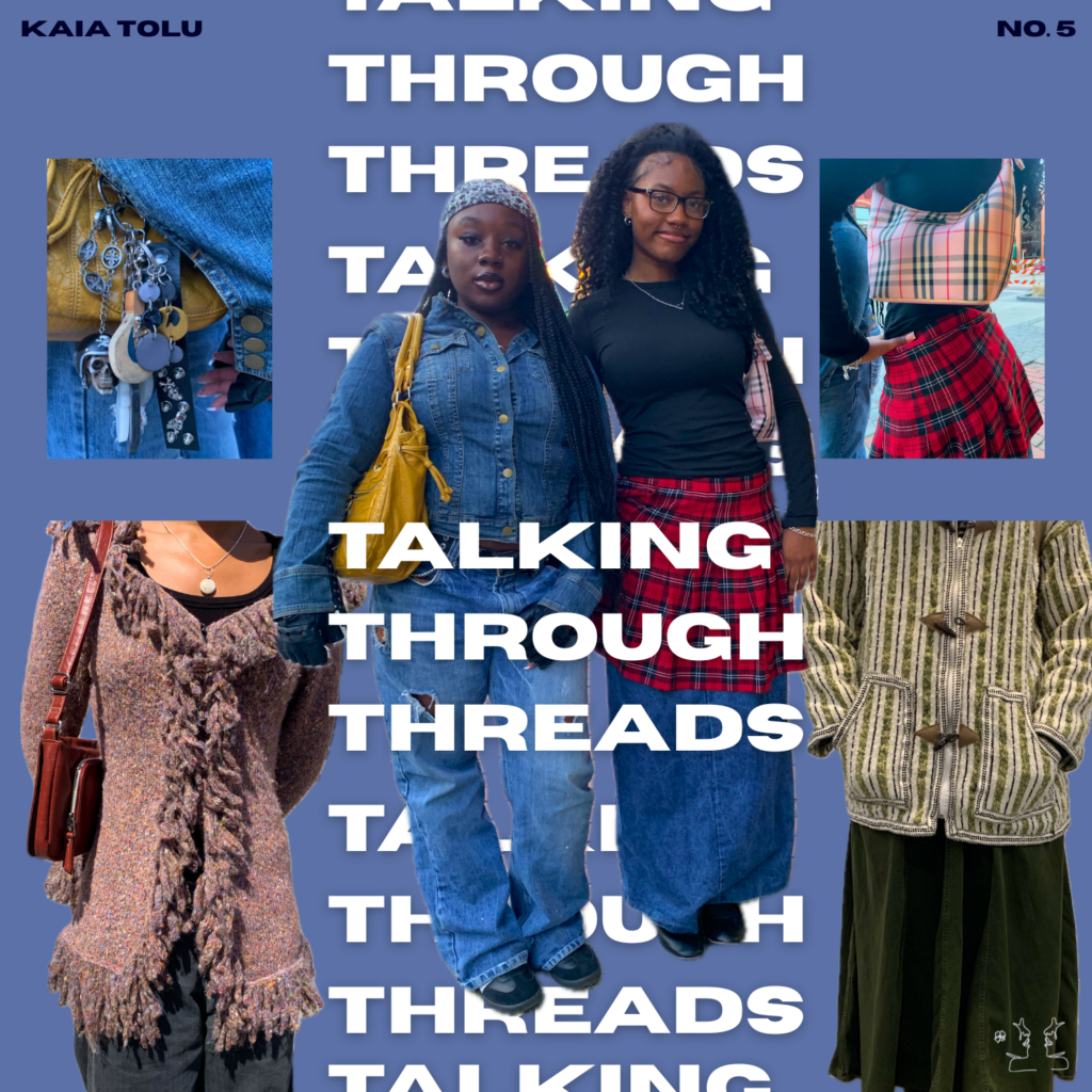
The colors aligned / Then everything seems to shine / All, adorned and bright
Speech from head to toe / The details entice the eyes / Show what’s within you
Thread of connections
Weaving your thoughts for display,
What are you saying?
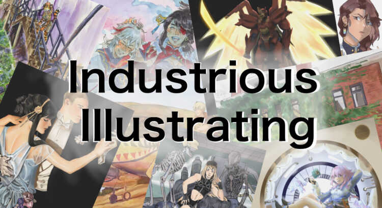
A new season means a new semester, and a new semester means a new Industrious Illustrating banner! It’s been a while since I last posted to this blog, and I hope that the summer was a restful or productive time for all of you, whichever one was your goal. While I have some exciting new projects I want to share with you guys over the next few weeks, I want to focus first on a brief recap of a few pieces I made over the summer.
For most of the summer, I was spending time living with my parents in Hong Kong. We lived pretty close to the beach, so sometimes I’d go down to the beach and look for interesting-looking animals in the sand and rocks. Attached are a few watercolor and ink sketches I made of a Fiddler crab, as well as some clams, sea urchins, and sea snails I found when the tide was low.


Aside from sketching the wildlife, I also made more refined illustrations based off of the scenery and sights I saw in Hong Kong, albeit with a few changes for artistic effect. For example, one of the new pieces on my year 2 banner features a tiger girl dressed in summery clothing while leaning over the railing of a staircase next to overgrown terraces. This is actually based off of a real staircase near my summer home that led down to some tropical fruit trees and a tiny beach (though it wasn’t the one I frequented).


If you look at the other side of the new banner, one of the pieces I added features a girl floating in a brightly lit vestibule as if she’s in a spaceship. This is actually inspired by the Moncler clothing store display in Hong Kong’s International Commerce Center, which always caught my eye when I was walking from the Kowloon MTR stop through the ELEMENTS shopping mall and the ICC lobby. I made a few tweaks to the lighting to make it look more dramatic, but otherwise I kept it close to the reference in an attempt to capture what I liked about the design.
For a side by side comparison:


Unfortunately, I haven’t gotten around to making more studies of the sights I saw in Hong Kong, or even more pieces inspired by what I saw in Hong Kong, but I’ll be sure to work on some and post them when I have time!
What did you guys do over the summer? I would love to hear about it in the comments.
