Industrious Illustrating #52 – Experimentation

Hello, and welcome back to another week of Industrious Illustrating! It’s now 2024, which opens up a lot of new possibilities and directions for the rest of the year. That means I want to highlight a few drawings I’ve made recently that are more experimental or different from what I usually draw.
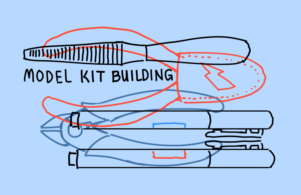
This was more of a graphic design-esque drawing I made for some zippered coin purses that I ordered from a supplier during a sale depicting a plastic file, two different types of plastic nippers, and two hobby markers that would all be common tools for building model kits. I wanted to go for something simple yet bold, as my usual style focuses a lot on details and elaborate painting.
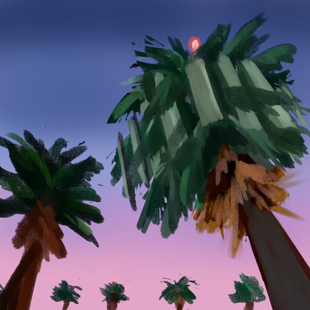
This, meanwhile, is a quick digital doodle of the cell towers disguised as palm trees that I saw all around the Los Angeles and Orange County areas when I was visiting family there over winter break. I wanted to convey the feeling of driving home after a long day and realizing something is slightly off with one of the freakishly tall palm trees lining the freeway. I also wanted to free myself from needing every drawing to be highly polished, so I set myself a time limit on this one and stopped drawing once the 20 minutes was up.

That’s all for this week, but I want to wrap things up with a quick question. What ways have you personally experimented with your artwork recently — and if not, how will you experiment with it in the future? I’d love to hear about it!

A Day In Our Lives #22

Hey guys,

This week I wanted to talk a bit about my process and how I create a lot of my more complex digital drawings. I originally studied Illustration at the College for Creative Studies in Detroit. During my time there, I spent a lot of time learning anatomy and perspective. In the illustration program, almost all of my work had to be on paper, they teach traditional art for the most part in that department.

With this, I usually start out my drawings on paper, and then take a photo of them. I then upload the image to procreate on my Ipad, where I color in the image. Sometimes I will include line work, but I really just love using value in my digital artwork. I like to think of it more as a digital painting than anything. It is a lot easier to digitally paint in the colors in my opinion. Then I am able to get exactly the right tones that I want, and if I mess up there is always the undo button.

I know this isn’t a good tutorial on digital drawing, but it is just my different way of going about most of my more complex artwork.

See you next week!

Marissa

Industrious Illustrating #21 – Two-Tailed

Hello again, and welcome back! When I was abroad vacationing in Spain and Portugal over Thanksgiving break, I saw a lot of interesting art and architecture, but one particular image I saw depicted on tiles particularly stood out to me (warning for some partial nudity): 

After seeing the twin-tailed mermaid, I immediately had the idea of making a drawing where her tails more closely resemble legs. This is what came out of it:

I’m swamped with final projects and assignments at the moment, so I didn’t have the time to push this further than a black-and-white sketch, but I hope to develop this piece and this concept further in the future to make something interesting out of it. Good luck with the last few weeks of this semester, everyone, and see you again next week!

Industrious Illustrating #18 – Ten Thousand Buddhas

Hello again to another week of Industrious Illustrating!

Last week I tabled at Youmacon with my tablemate Ria, another STAMPS student. My half of the booth was on the left, while hers was on the right. I blocked out everyone’s faces in the below picture to preserve their privacy.

By the end of the weekend, both of us had recouped all of our production costs as well as the cost of the table spot, and we’d made several hundred dollars in profit on top of that. Our total revenue was somewhere in the low four figures range split between the two of us. While we don’t plan on splitting a table again because we could both use the full 8′ table for our displays, we’re both hoping to apply to Youmacon again and table next year if possible!

Anyway, while I’m currently trying to keep up with a deluge of work and deadlines before Thanksgiving Break, I took some time last night to make a quick painted study of a photograph I took at the Ten Thousand Buddhas Monastery in Hong Kong this past summer. I focused on describing the value relationships and lighting as quickly and efficiently as possible rather than letting myself get mired in the details. Hopefully I can find more time to make these studies so that I can brush up on my painting skills and build up a better visual library in my head.

Good luck to everyone working on exams and projects close to the end of the semester, and see you again next week!

Industrious Illustrating #14 – Oil Painting

Mini Con Ja Nai last Saturday was really great! I enjoyed talking to the people who came by and selling art prints. That just leaves Youmacon on November 4-6 next month before I will likely take a break for a few months from selling my art at conventions.

I haven’t had a lot of time for making observational work or studying new techniques recently between being a full-time student, being the lead artist on an indie game project, and working on expanding my illustration portfolio to sell at conventions, but I have been trying to proactively learn from school assignments to hone my craft and develop my artistic techniques. For one thing, I’m currently taking Intro to Painting (ARTDES 250) at Stamps, which teaches oil painting techniques that I could also apply to digital painting one day.

A recent assignment was to paint whatever we see on the ceiling and use warm/cool colors to make objects seem closer or further away, respectively. I ended up painting a ceiling vent in front of some windows and exaggerated the colors a little while also letting some of the orange underpainting show through for a warm, almost sunset-like look.

My next assignment is to paint a fruit still life using scumbling, which is applying a layer of dry opaque paint over a previous layer of paint so that both colors are visible on the canvas. I only have the yellow underpainting laid down at the moment, but the still life should start to look more distinct once I start to apply further layers of color.

While the specific application and look of digital paint is usually pretty different from analog/real-life oil paint, I could still try to replicate these techniques using oil paint-esque brushes in a digital painting for a similar effect. Stay tuned to see if you can identify exposed underpainting or scumbling in any of my future paintings!

Art Biz with Liz: Assimilated

Happy Friday, Arts, Ink. Readers!

In case you aren’t tired of seeing my amateur paintings yet, here is one I created today. I’m not sure of the title yet, but I’ve been thinking of calling it “Assimilated.”

I hope you are able to take a moment for yourself as the semester winds down. If you’re looking for something to do, I highly recommend turning towards art – such as painting – for stress relief. As evident by my work, you don’t need to have experience or artistic ability to enjoy it!