REVIEW: Hey, We Need to Talk!

Through its Vote 2024 suite of programs, the U-M Museum of Art has asked the campus community, “How can we strengthen our democracy?” Visiting artist Philippa Pham Hughes answers this question with the title of her exhibition: “Hey, We Need to Talk!”

Hughes, the current Visiting Artist For Art & Civic Engagement at UMMA, is a social practice artist who works to create a flourishing society through human conversation and connection. With the presidential election approaching and politics an increasingly divisive subject, it’s harder than ever to communicate with those who disagree with us. With “Hey, We Need to Talk!” Hughes encourages us to sit down, break bread, and talk honestly about our fears and hopes for America.

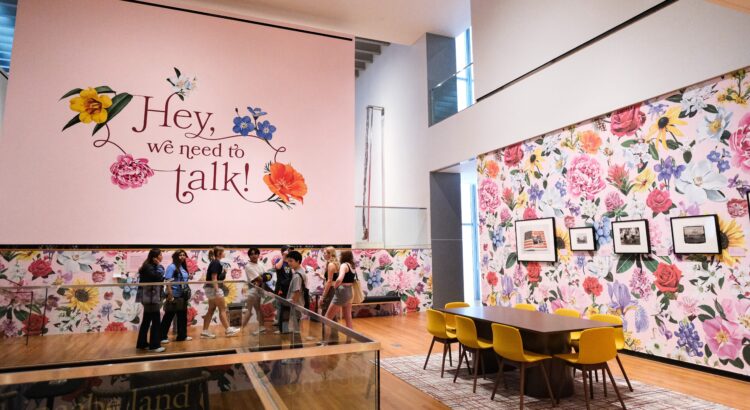
The second-floor Crumpacker gallery has been transformed into something that is part curated art exhibit, part interactive experience, and part community gathering space. Brightly colored wallpaper (designed by artist Louise Jones, also known as Ouizi) covers the walls, bursting with beautiful illustrations of the nation’s fifty state flowers against a pastel pink background. Groups of comfortable chairs and low tables form places to sit and converse in small groups. The space feels instantly joyful and welcoming. The works of art hanging on the gallery walls are well curated, chosen from UMMA’s collection to provide discussion prompts about American life and values, but they take a back seat to the social artwork of the exhibition as a whole.

The exhibition’s Gallery Guide describes it a “social sculpture,” and invites visitors to “complete the artwork” by making social connections with others in the space. It gently encourages discussion with other viewers, and provides a series of open-ended questions about the artworks as a conversation starter. There is also a tear-away card in the back of the pamphlet, asking participants to write their answer to the question, “What does it mean to be an American?”


A selection of answers to the question “What does it mean to be American?” written by visitors to the exhibition. Photos by the reviewer.

I found these cards to be the most compelling part of the exhibition. Large photo albums filled with them are placed on tables around the room. I sat and flipped through one, reading the answers, which ranged from silly to profound. Some were clearly written in elementary schoolers’ handwriting, some in other languages. They expressed a wide range of sentiments, from gratitude and hope to frustration and despair.

Throughout the period of the exhibition, numerous events focused on fostering dialogue about American democracy will be held in the gallery space. This includes the weekly Common Sense Diner events, where people with differing political viewpoints share a meal and guided conversation. Participants are not asked to reach an agreement or change their views—only to ask questions, listen, and try to find care and common ground if they can.

This exhibition is unlike any other I have experienced at UMMA. It goes beyond artwork on gallery walls, fostering genuine delight, comfort and connection. If we want to build a stronger nation where everyone can flourish, maybe all we really need to do is just sit down together and talk.

“Hey, We Need to Talk!” is on display at UMMA until February 9, 2025.

REVIEW: How to Build a Disaster Proof House

Tracey Snelling’s ‘How to Build a Disaster Proof House’ is on exhibition in Institute for the Humanities’ Gallery and Osterman Common Room. The exhibition itself is not huge – one can definitely squish it into their lunch or dinner time as an after-lunch/dinner art experience. I recommend doing so – this is an interesting exhibition where everyone will find different things to focus on and to muse that will definitely be worth your time.

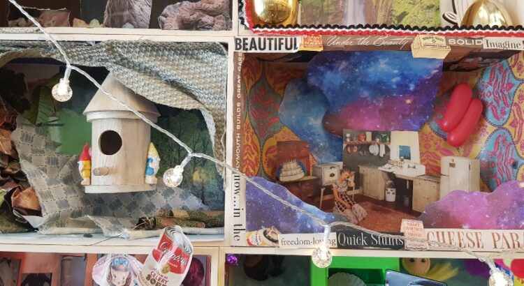
The exhibition is mainly comprised of different styles of rooms, some small and some real-life sizes. There is no common theme shared in their aesthetics, and each and every one of them is decorated with vibrantly colored objects and cut-outs from prints. They seem to represent different lifestyles, or even, different scenes from life. However, they have kitsch, even a bit eerie, or extraordinary atmosphere. They do not fall into what we would mentally categorize as ‘normal life’. The feeling of wild, chaotic energy seems to derive firstly from the background, as the artist had placed huge posters or drapes of natural sceneries on the walls of the space, forming a background that adds energy to the exhibition. As can be seen from some pictures, these sceneries are not the ones that calm your mind. The colors in it are exaggerated and overly vibrant, adding to the active, uneasy vibe of the exhibition. Also, the use of diverse materials and colors for objects that demands attention all at once also adds to the vast input of information from the exhibition. Additionally, the placement of the artworks that place life-size rooms and miniature-size rooms together also creates unbalance in the scope of the attention: while the viewer is focusing on the smaller size works, their attention is overwhelmed by the relatively huge, life-size objects while the small ones nag and demands attention while they are taking in the life-size ones, creating the uneasy tension between the two sizes. Lastly, the artist had interestingly integrated video into her work-lots of videos are played simultaneously from the windows of small houses, adding chaotic audio on top of all the rich visual information that the viewer is already processing. All this adds up to create an audiovisual influx of information and this is where the exhibition consisted of static rooms filled with un-moving objects shifting into the concept of moving and alertness in disastrous situations. When in a situation of a disaster, people are more alert toward inputs from the world to detect danger and this overwhelms them. The exhibition creates a similar experience for us while reminding us that disaster is different from mundane life but perhaps not so far apart – this is expressed by how the artist chose the area that we are familiar with, personal rooms, but filled it with items and contexts that are not common.

There were also a few rooms where I could detect the trial to bring in social messages and status quo, like in the picture above. However, that was not emphasized much, and like it was addressed above, I think the author did a creative take on explaining disaster without using direct reference from society.