Xhaska’s new vs old square. As you can see, the old square has very harsh, prominent shading and highlights, and a different eye shape. That eye shape got hard to draw over and over, so I changed it to something simpler. I also simplified and softened the lighting, reserving the high-contrast highlight parts to the eye area. I prefer the way the old square did the hair and ribbon though, the new hair and ribbon look to simplistic and cartoony.
Author: Micey
Pallasite Veins
This is Lias, formally known as Yim before I changed their name because ‘Hima’ and ‘Yim’ sounded too similar. Lias is a fae-dragon with a third eye and facial markings that resemble sliced Pallasite meteorites (look them up, they’re beautiful). Originally, they were just going to be a flat pallasite-inspired pattern slapped onto Lias’s skin. Then, I was struck by inspiration. What if Lias instead had a series of translucent nictating membranes layered over each other that resembled pallasite patterns? That’s infinitely more eldritch, body-horror-esque, and interesting to think of!
Here are my test patterns. I settled for a base layer of yellow that looks like it’s glowing from within. Then, I worked backward and started with the outer layer of dark brown. Then an inner layer of silver, then orange. I wanted to get that intricate veiny feel, and I went from careful layering of lines and crisscrosses to just scribbles. I think all experiments look good at a distance, but up close you can see the sloppiness of the scribbles versions.
Overall, I think the middle test on the top image looks the best. It’s the one where I drew all the lines carefully. It’s also the most time-consuming to draw. Going forwards, I think I only need to make the outer layer carefully drawn, and go looser with the inner layers. I’ll need to keep in mind to not make the lines too thick or numerous, to really get that base layer glow across.
Io Redesign
Wow, Io changed a lot. The image on the bottom is a character sheet I did of her two years ago, for June 2022. I can’t believe how chunky my lineart was.
Over the two years, Io changed from a snake lady to a siren, someone who can shapeshift into a bird form. I made her coat longer to convey how she has a position of authority over the other characters, and orange because Hima already has a long red coat, we can’t have two characters with that. I gave her coat these fringes inspired by bird wing cloaks to reference her bird form. Her bird form, which I am still working on, has a face inspired by ancient greek theatre masks, because the type of siren Io’s based on is from ancient Greece.
Going forwards, I would like to make Io’s human form more monstrous. Snake!Io has her scales and her snake mouth. Siren!Io has her…coat? I might give Io feathers in certain areas of her skin or face, or talons, or both.
Hima Concept Sketches
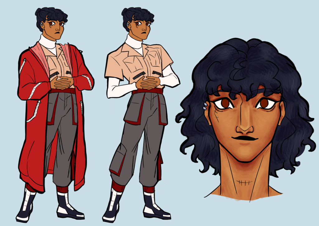
Here are the Hima concept sketches I mentioned a lot of weeks ago! You can tell I tried to make her look younger. I found the solution to be making her eyes bigger and her face smoother. She is 21, after all.
Throughout the sketches, you can see my drawings of her in workwear. I also added sketches of her in fancy dress, her as a child, and her in a bra. The more revealing pieces are to show off the scars she got working under a tyrannical company. As you can see, I gave her face stitches, to show that she can’t hide the damage no matter how many bandages she wears. In her poses, I try to communicate how tall and lanky Hima is. I think it worked.
Cyrene’s Redesign
I redesigned Cyrene! My girl! The redesign’s on top, while the Summer 2023 design is on the bottom.
I didn’t have many goals for this redesign, except to give Cyrene a functional jaw and also to make her fancier. I’m glad her redesign exposes her tattoos because those are a big part of her witch powers. I’m also glad I added more purples to her look, and let her roots show to humanize her better.
Cyrene’s hair was always a challenge for me. I though basing her look of a live-action character, Sabrina from the Chilling Adventures of Sabrina would make things easier because I had a live-action reference. It didn’t and I always had trouble with making Cyrene’s hair look too sculpted and unnatural. I found the solution was to relax my lines and remove the amount of curls I drew.
Simon’s Redesign
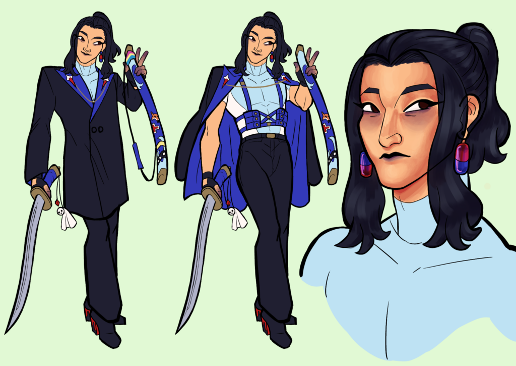
Here’s Simon’s redesign. It’s the one before the readmore. His old, summer 2023 design is on the bottom. As you can see, I made the blacks darker and replaced the magenta with red. I can really tell how my style changed with this one. I’m less angular, and my noses at a 3/4 view are bigger.
Here are my changes: I made the insides of Simon’s jacket a royal blue to contract better with the light blue. I gave Simon a muscle shirt to replace his open one because the open one’s folds were too complicated to draw. In a sense, I wanted to make the royal blue Simon’s signature color, so I also changed his scabbard to royal blue. I changed his pose and made his tattoo more visible by turning the ink purple. The old design had a scar from getting struck by lightning, but I read somewhere that lightning scars fade fast, so I had Simon get a tattoo to memorialize the event. I also gave him purple spots on his body because of story updates. Overall, I’m pretty happy with his redesign.