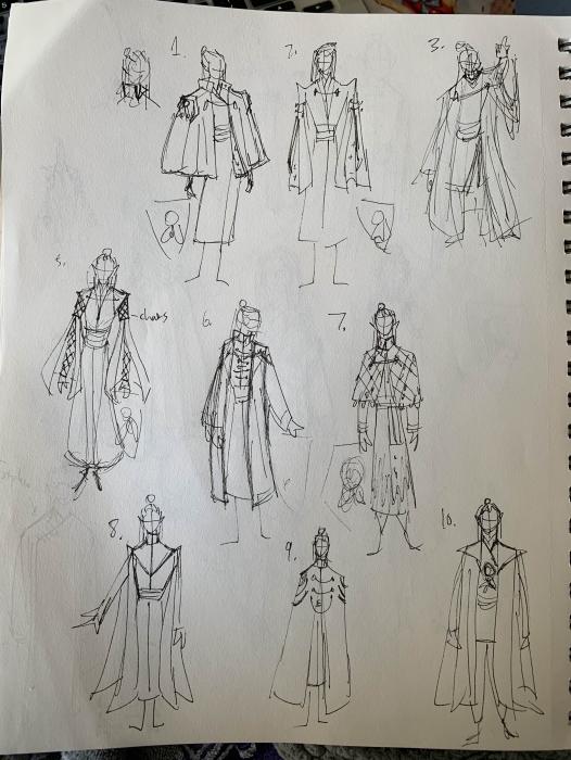
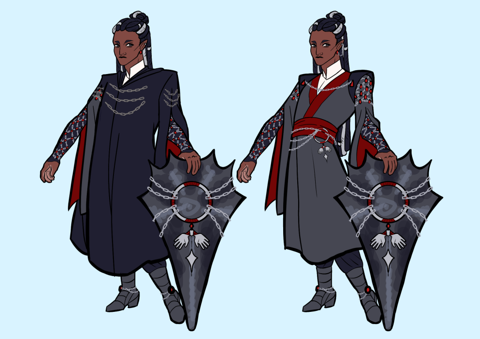
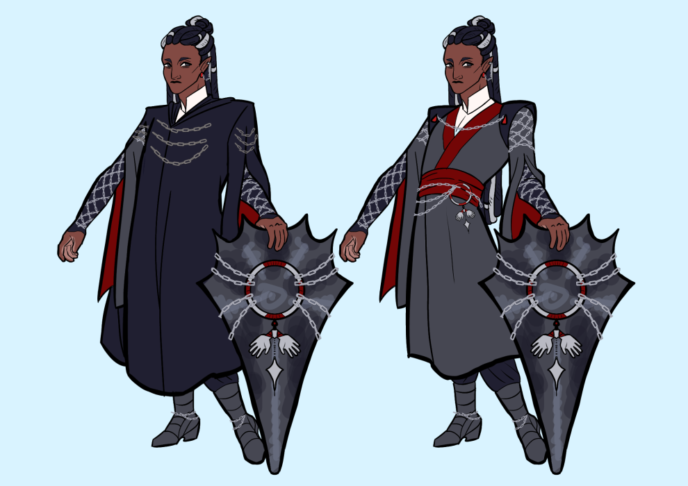
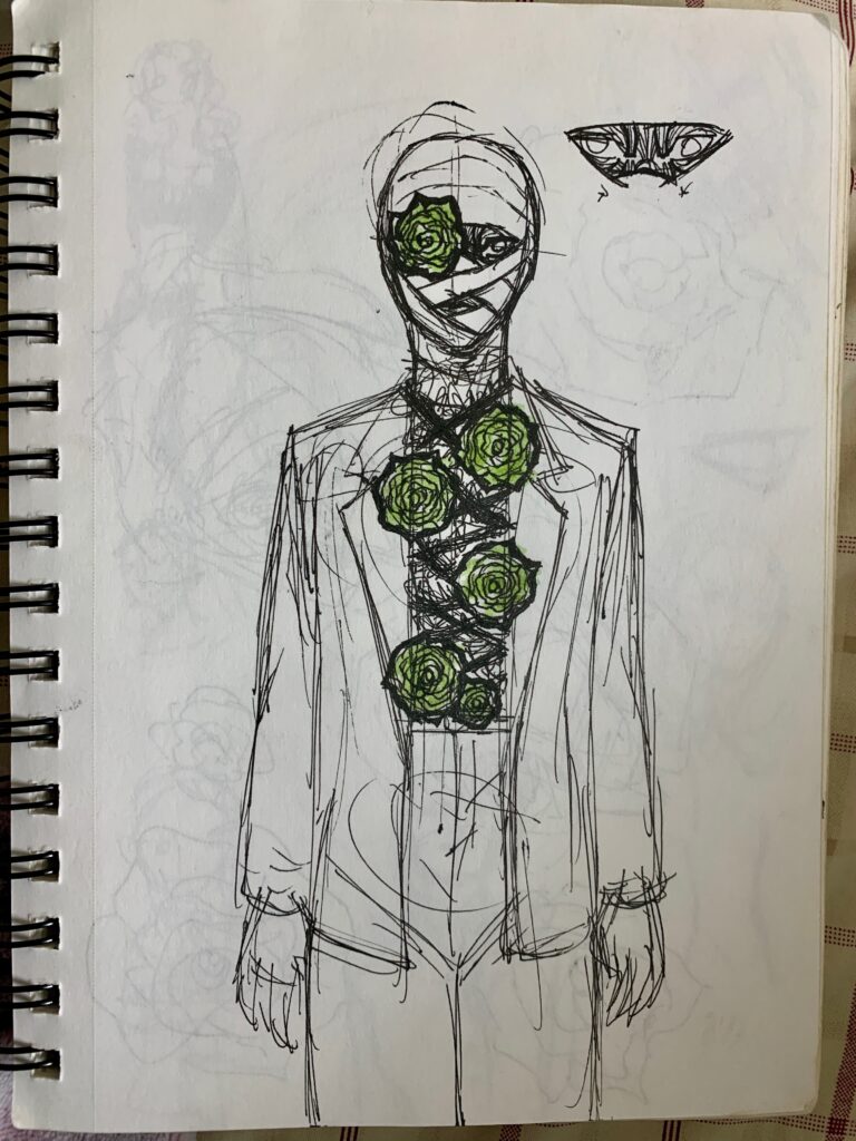
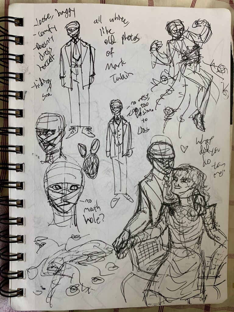
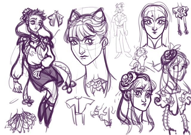
Well, I can’t finish without a glimpse into my digital sketchbook. I have a cool concept for a Chinese water/lake ghost thrown from the Ming Dynasty to the mid 2000s. This was purely because I think Ming Dynasty Hanfu is pretty and I want to do something with it. Hanfu and its associated hairstyles and accessories can get complicated, which I had to work into my more streamlined schedule. I want to create details that evoke complicatedness without the design actually getting complicated. I’m still hammering it out.
Read more: A Final Design for the RoadMy vision was for a fairy-like character. So that meant lots of feminine features and pastels.
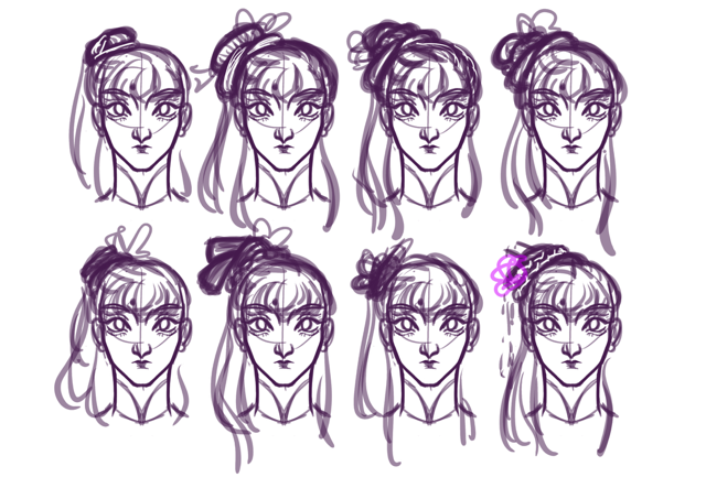
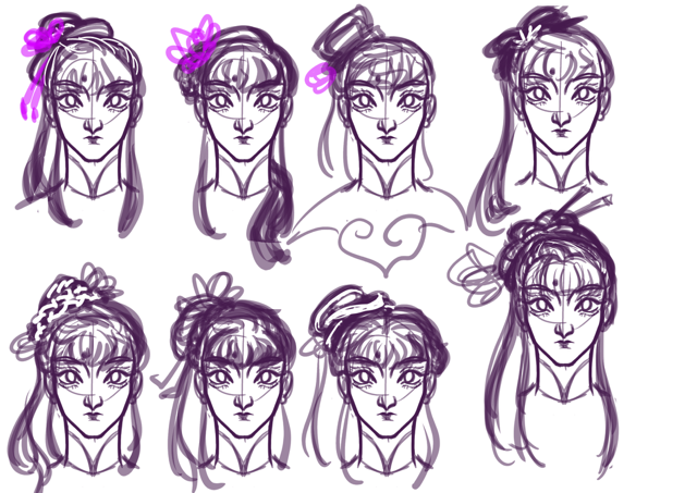
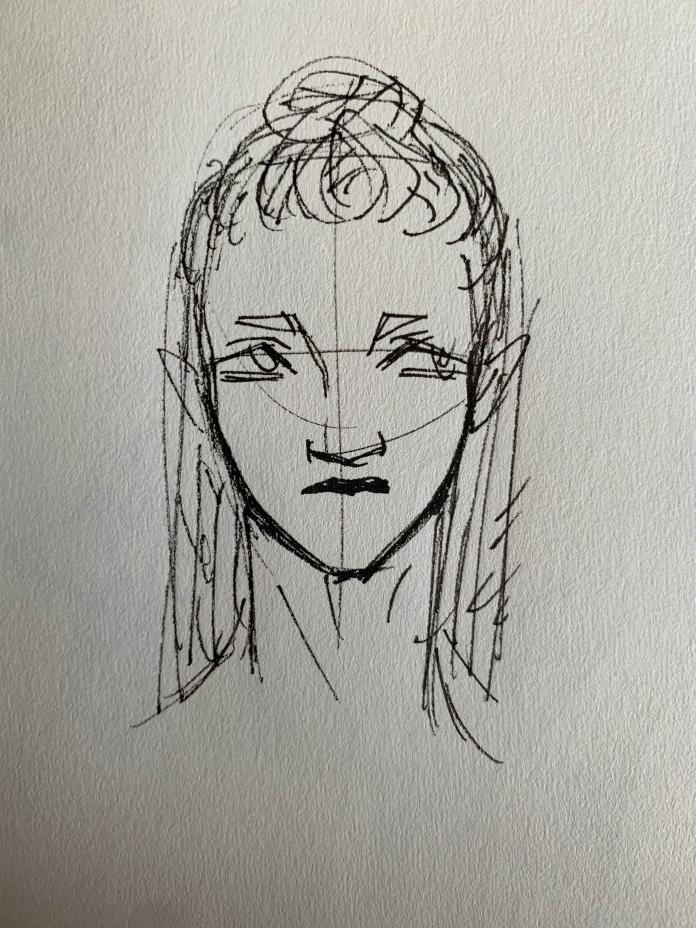
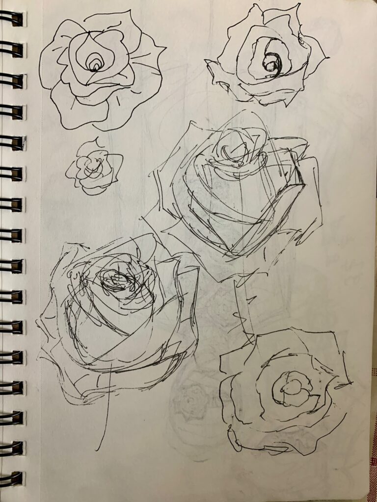
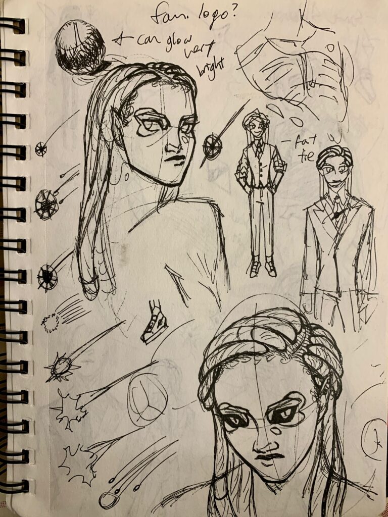
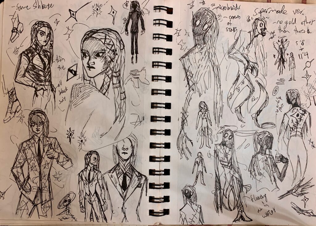
I had to go through a lot of hair concepts before I found something I liked. I like the side-pony because I imagine it would look good flowing around in water.
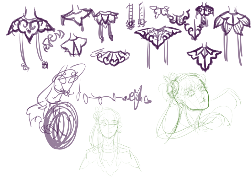
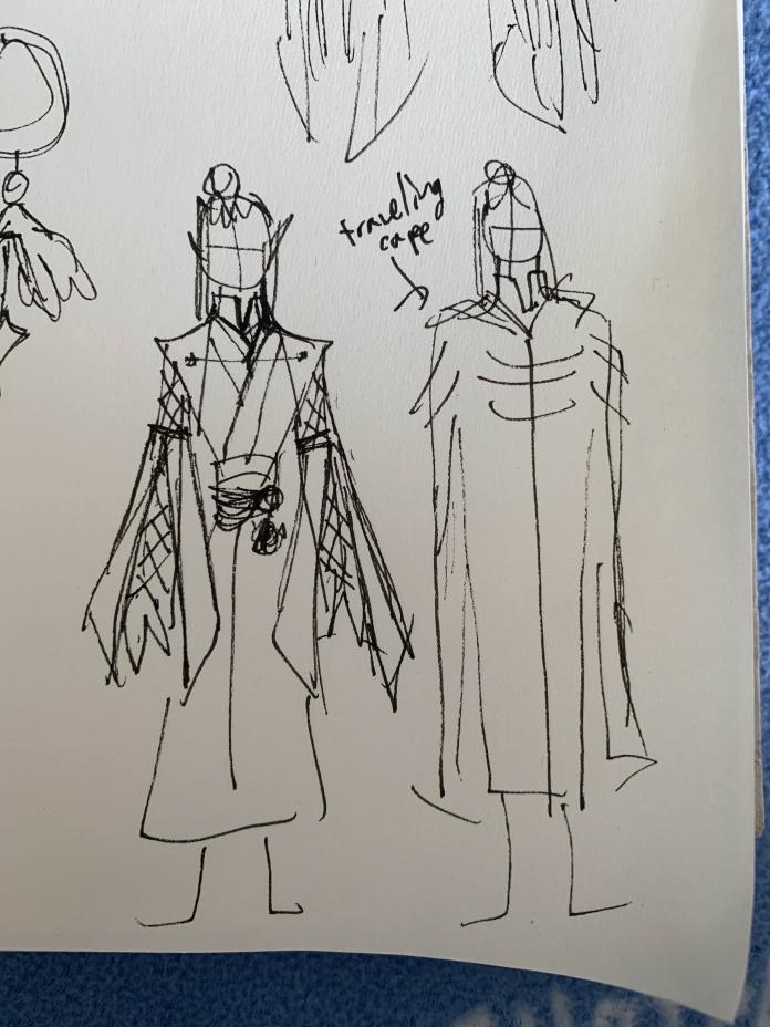
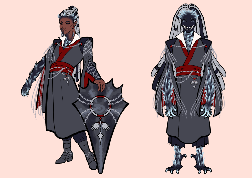
Here are my attempts at hammering out the cloud collar, which is a fancy upper garment. I had settled on water lilies for the hair, but I didn’t want to repeat the motif for the collar. I want her design to say ‘lake’ instead of ‘lily’. I settled on a design that resembles the fog above lakes.
Here’s the final-ish iteration! I still have a monster form to think about, but I’m happy with how her human form turned out.