
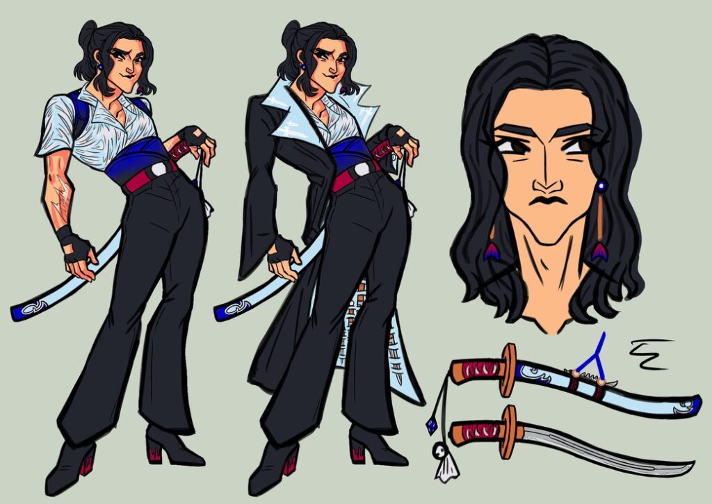
Here’s Simon’s redesign. It’s the one before the readmore. His old, summer 2023 design is on the bottom. As you can see, I made the blacks darker and replaced the magenta with red. I can really tell how my style changed with this one. I’m less angular, and my noses at a 3/4 view are bigger.
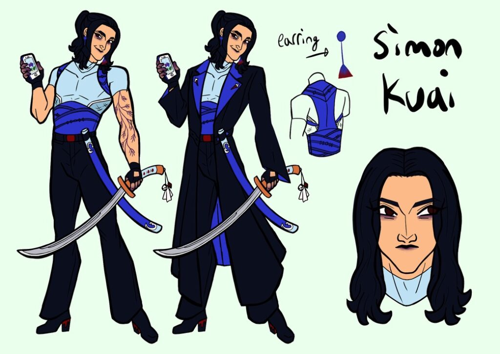
Here are my changes: I made the insides of Simon’s jacket a royal blue to contract better with the light blue. I gave Simon a muscle shirt to replace his open one because the open one’s folds were too complicated to draw. In a sense, I wanted to make the royal blue Simon’s signature color, so I also changed his scabbard to royal blue. I changed his pose and made his tattoo more visible by turning the ink purple. The old design had a scar from getting struck by lightning, but I read somewhere that lightning scars fade fast, so I had Simon get a tattoo to memorialize the event. I also gave him purple spots on his body because of story updates. Overall, I’m pretty happy with his redesign.

Leave a Reply
Be the First to Comment!