
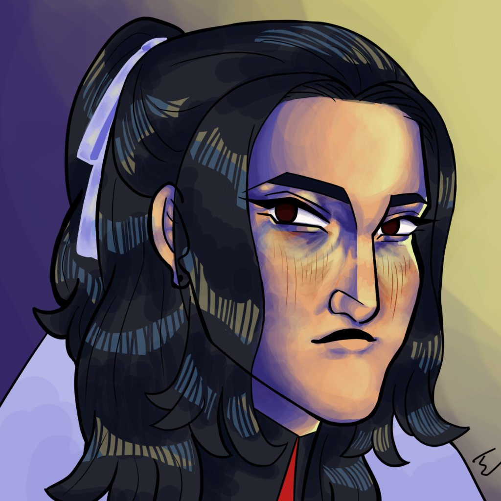
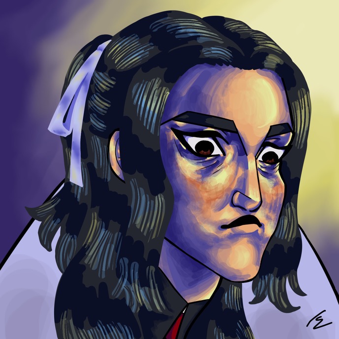
Xhaska’s new vs old square. As you can see, the old square has very harsh, prominent shading and highlights, and a different eye shape. That eye shape got hard to draw over and over, so I changed it to something simpler. I also simplified and softened the lighting, reserving the high-contrast highlight parts to the eye area. I prefer the way the old square did the hair and ribbon though, the new hair and ribbon look to simplistic and cartoony.

Leave a Reply
Be the First to Comment!