I made a website with short stories about my world for a class last semester. Meant to post it at the end of last semesters, but here it is! It has short stories, an intro, and a bunch of character intros. Here is all the headshots I drew for the website:
Over the break, I redesigned some characters, so the sheet’s already a bit outdated. I didn’t want to spend too much time on the art, hence the rough coloring style.
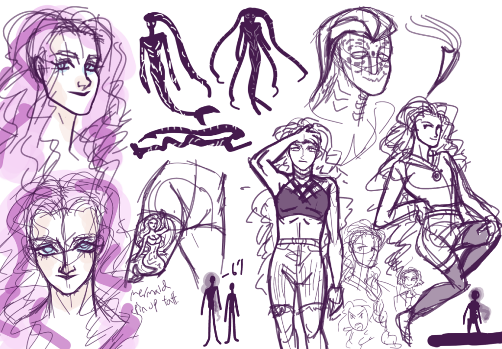
My general concept was Cyrene’s tall cousin who turns into a mermaid. I really like her mounds of fluffy pink hair and I envision her mermaid form to have bioluminescent lights all over. She gets a mermaid thigh tattoo and her color scheme is pink and black. I want to make her seem more approachable than Cyrene. I’ll continue to workshop her design and how similar/apart it should be from Cyrene.
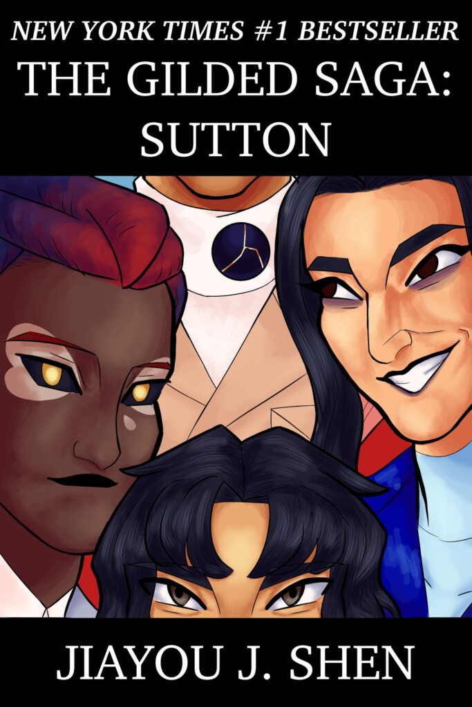
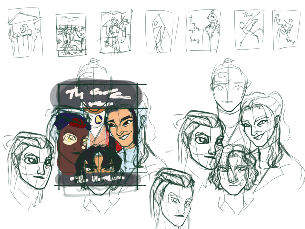
This is my fake cover design for my hypothetical book on my writing minor capstone website:
Here’s my design/concept sheet:
I wanted to do something realistic fiction-ish and intimate, like a snapshot into the lives of a bunch of odd people. I settled on a photograph-like image that highlights the height differences of the main cast. I kept Lias’s eye colors and floating orb because I want to hint at the fantastical nature of the story. Poor Hima got nearly her entire head cropped.
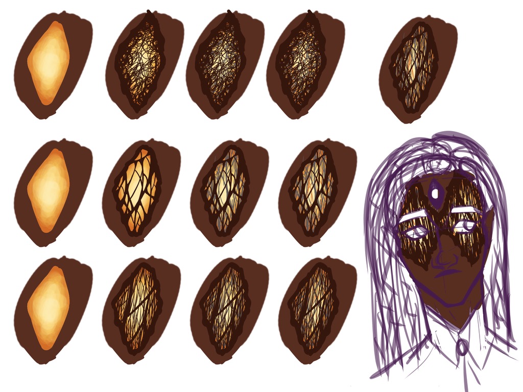
This is Lias, formally known as Yim before I changed their name because ‘Hima’ and ‘Yim’ sounded too similar. Lias is a fae-dragon with a third eye and facial markings that resemble sliced Pallasite meteorites (look them up, they’re beautiful). Originally, they were just going to be a flat pallasite-inspired pattern slapped onto Lias’s skin. Then, I was struck by inspiration. What if Lias instead had a series of translucent nictating membranes layered over each other that resembled pallasite patterns? That’s infinitely more eldritch, body-horror-esque, and interesting to think of!
Here are my test patterns. I settled for a base layer of yellow that looks like it’s glowing from within. Then, I worked backward and started with the outer layer of dark brown. Then an inner layer of silver, then orange. I wanted to get that intricate veiny feel, and I went from careful layering of lines and crisscrosses to just scribbles. I think all experiments look good at a distance, but up close you can see the sloppiness of the scribbles versions.
Overall, I think the middle test on the top image looks the best. It’s the one where I drew all the lines carefully. It’s also the most time-consuming to draw. Going forwards, I think I only need to make the outer layer carefully drawn, and go looser with the inner layers. I’ll need to keep in mind to not make the lines too thick or numerous, to really get that base layer glow across.
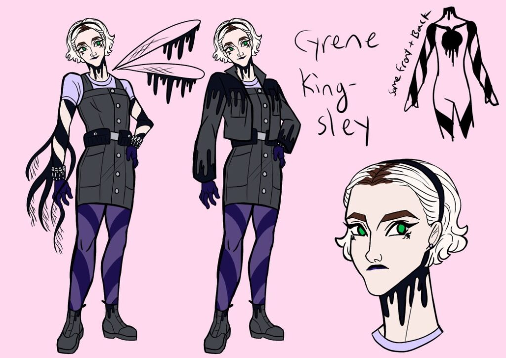
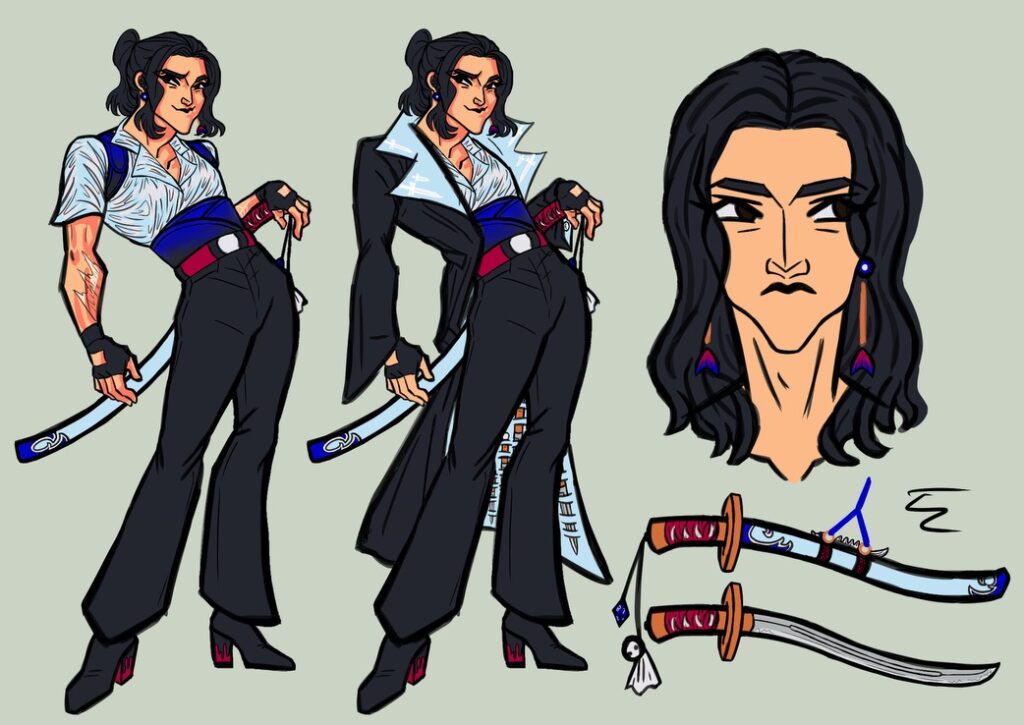
I redesigned Cyrene! My girl! The redesign’s on top, while the Summer 2023 design is on the bottom.
I didn’t have many goals for this redesign, except to give Cyrene a functional jaw and also to make her fancier. I’m glad her redesign exposes her tattoos because those are a big part of her witch powers. I’m also glad I added more purples to her look, and let her roots show to humanize her better.
Cyrene’s hair was always a challenge for me. I though basing her look of a live-action character, Sabrina from the Chilling Adventures of Sabrina would make things easier because I had a live-action reference. It didn’t and I always had trouble with making Cyrene’s hair look too sculpted and unnatural. I found the solution was to relax my lines and remove the amount of curls I drew.
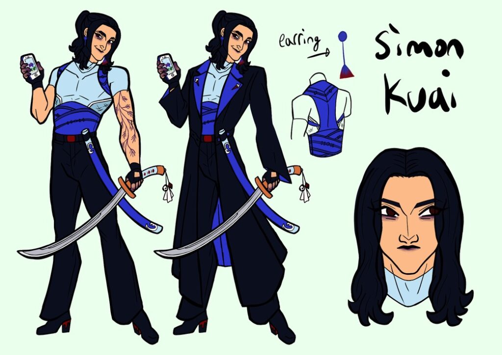
Here’s Simon’s redesign. It’s the one before the readmore. His old, summer 2023 design is on the bottom. As you can see, I made the blacks darker and replaced the magenta with red. I can really tell how my style changed with this one. I’m less angular, and my noses at a 3/4 view are bigger.
Here are my changes: I made the insides of Simon’s jacket a royal blue to contract better with the light blue. I gave Simon a muscle shirt to replace his open one because the open one’s folds were too complicated to draw. In a sense, I wanted to make the royal blue Simon’s signature color, so I also changed his scabbard to royal blue. I changed his pose and made his tattoo more visible by turning the ink purple. The old design had a scar from getting struck by lightning, but I read somewhere that lightning scars fade fast, so I had Simon get a tattoo to memorialize the event. I also gave him purple spots on his body because of story updates. Overall, I’m pretty happy with his redesign.