Shutter

I remember when Tomb Raider came out. Not the game, but the movie with Angelina Jolie. Terrible movie. But I enjoyed it. All the temple shenanigans and adventure and lets be honest, seeing Jolie, it was all perfectly entertaining when I was young. Honestly, if I turned on the tube right now and saw the first movie playing, I might consider watching all of it. But then I won’t, because I found something better.

Surprise! This post isn’t about Tomb Raider. It is instead about Shutter. No not the dumb horror movie…the comic book! by Joe Keatinge and Leila Del Duca.

Alternate cover for the first issue, by Brandon Graham

When I first found this Image series I was like, “wait…is this just Indiana Jones with a female lead, so…Tomb Raider?” So I quickly flipped through the first issue at which point the ghostly hand of Keatinge reached out of his written words and slapped me across the face and waved its index finger back and forth.

The story has an energy to it that keeps you going, never forgetting to create new questions while answering old ones. But I want to talk about Leila Del Duca’s art. An astronaut, a minotaur, a triceratops, an anthropomorphic fox and lion, a robot that looks like Tik-Tok, an alarm cat, a dragon like thing with a skull, a skeleton butler…is there anything she cannot draw? It is to the point where she imitates the styles of past comic artists. In one issue, there is a segment that is done in the style of Winsor McCay’s Little Nemo (couldn’t find a picture, sorry).

What is this thing! I read the comic and I still can’t name it.
From left to right: Kate, Alarm Cat, and Alain.

This visual inventiveness and willingness to try various things (ranging from having a main character that is multiracial and a best friend that is transgender) makes me very excited as a reader. If there is one thing that I absolutely love about comics, it is that it is collaboration (I am considering only projects in which the writer isn’t also doing the art. Although rare, there are some creators who do everything). The way Duca explained it in an interview is that Keatinge only says a couple of things in terms of art direction when he gives her the script. He would tell her that the character must be seated next to an astronaut here. But that is it. Everything else he leaves up to her. Keatinge is an example of a comic book writer who does not encroach into the territory of the artist that he is working with. She is not drawing for him. There is no artistic hierarchy. Keatinge gets last say in his side of the medium while Duca gets her say on her area of expertise. But this is not to say that they don’t ask each other for opinions. It is through this form of collaboration, amazing projects are produced – when two artists discuss how to make something right, not about who is right or wrong. This is the true definition of collaboration.

The comic book loving community also upholds this strong sense of collaboration. There is little to no sense of competition, of jealously. Instead, artists celebrate the success of their contemporaries because nothing gets you more excited about working in your medium than seeing a friend of yours create a wonderful new project that directs the medium in new ways. I myself find influences for specific projects/content outside of the medium that I work in, but other writers instigate the initial spark of enthusiasm that springs within me time and time again.

I will not lie; I have started to look for artists to work with. Comic books have certainly reinvigorated my creative hunger. My palate has expanded. Let me leave you with Alarm Cat. There is never enough Alarm Cat.

Kot’s LA

I am not sure if this is a view shared by many, but season two of True Detective was quite disappointing. Nic Pizzolatto tried to do too many things in the allotted runtime of a season whose story won’t continue in a future season.

But the world provides remedies for disappointment quite quickly, and often, in places that are not too distant from the original fizzled out artistic project.

In this case, I found a comic series from Image that does LA more justice than Pizzolatto did. The comic is called Wolf. Ales Kot, the writer, who is only 29 years old, is already being considered the Grant Morrison of his generation, writes it. This is huge praise, equivalent to some young novelist being compared to Hemmingway in his debut. This is perhaps founded on the fact that Kot has never been one to shy away from psychedelic material whilst exploring resounding philosophical themes and often avoided discussions – like racism. Also, his list of influences include: Raymond Chandler, Dashiell Hammett, James Ellroy, HP Lovecraft, Neil Gaiman, Joan Didion, David Lynch and Joni Mitchell. Makes sense.

Yet, right now, comics that produce first issues like Brian K. Vaughn’s Saga or Rick Remender’s Tokyo Ghost, issues that both hit the ground running, are having the most success. On the other hand, Kot starts his work with an almost disorienting lack of direction. So many concepts are explored in the first issue that it can alienate the reader.

Now here is why I compared Wolf to the second season of True Detective. They are both set in LA and they are both crime noir. That is it. But Wolf approaches the world of LA in a far more enjoyable way.

The story starts with a man in a straightjacket on fire looking at the city while singing Hellhound on My Trail. I won’t say any more to avoid spoilers. Only this, the world he creates is this muted city that lets the reader feel the bubbling machinations in an LA that is, in this fictional reality, filled not only with people, but with myths as well.

I suggest, if you are up for a heady and incredibly interesting comic book read, check out the Czech-born writers newest project, Wolf. Also, take a look at his older stuff, like Material and The Surface.

Internal/External: Island

Cover art for the magazine. Drawn by Brandon Graham.

Brandon Graham has once again led me to another interesting find. This time, it is in the form of his multi-artist project called Island – a comic-magazine that hosts 3-4 stories that cover a similar theme, all written by different writers/artists. Prior to this, I never knew comic-magazines existed but to my surprise there were many illustrated magazines that had existed or are still running – one of which is called Heavy Metal (which incidentally has a new editor – Grant Morrison – a beloved and incredibly talented comic book writer).

My first foray into this format was undeniably pleasant for the magazine was constructed with great artistic and thematic eloquence. In total, there were five artists whose work was featured in the first issue. The first artist is Marian Churchland, a Vancouverite (and so beautifully captured by the her portrait – a white skinned goblin protecting its shiny stone), who drew the title pages, or rather, painted, with broad and bold brushstrokes of oil paint. However, she did not write any of the stories.

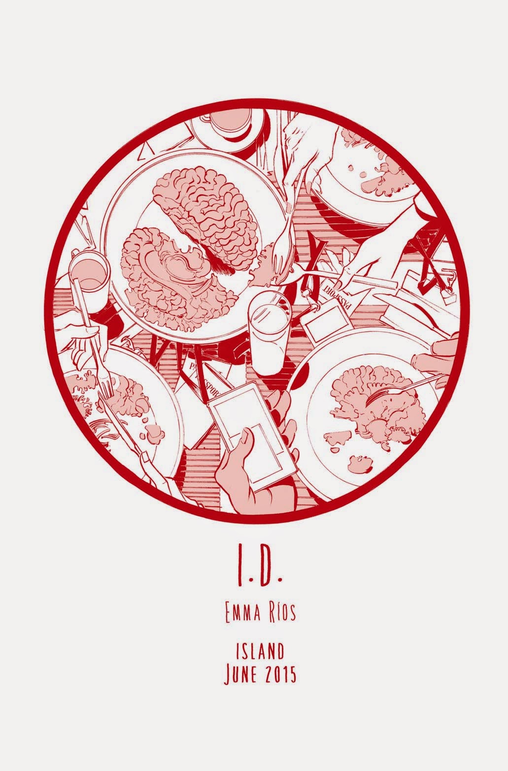
The title page for I.D.

Then there is Emma Rios who wrote and drew the first story called I.D., which features three individuals who are unhappy about their bodies and wish to partake in a body transfer. The whole comic is done in red ink and although the basic story is tried and a little stale, the beautifully rendered background and swift lines keep the otherwise subdued tale, very energetic.

Afterwards there is an essay called Railbirds by Kelly Sue Deconnick, who, if you read comics, you might have heard of. She created, with Valentine De Landro, Bitch Planet (another title published by Image Comics). The essay is first and foremost, a tribute to the late Maggie Estep, with the undercurrent of whether or not Deconnick feels like she is a writer or not and how her interactions with Estep shaped her. The essay is fairly meta at times, and is quite conversational, but it is still interesting to see how someone worked through the question of: am I what I am?

Nikoli walks around the city…searching.

Now we come to the comic by Brandon Graham called Multiple Warheads 2 (a continuation of Multiple Warheads which he did far prior to this project). Reading and viewing Graham’s work is always a treat and quite possibly the only time I allow myself to laugh at stupid puns (in the title spread, he has a sentence that says, “A pound of flesh but they won’t get a Graham.”). The story is about a boyfriend who is lounging about, in “vacation” mode, in a floating city while his girlfriend goes around doing smuggling work. Oh, also, did I forget to mention? The girlfriend smuggled a wolf penis and sewed it onto her boyfriend, making him half wolf. That is how biology works right? But in the midst of all this, the question of identity comes in again, as the boyfriend tries to find himself, as he considers how his girlfriend is doing so much work while he does nothing.

Graham’s work is, as is expected, visually dense. There is just so much to soak in. The backgrounds are littered with tiny details of tiny figures doing tiny things. Graffiti soaks the walls of shops that are cluttered with junk that are both of and not of this world. There are seemingly arbitrary numbers written on tree trunks and the backs of animal heads. But his density doesn’t create frustration; it creates wonder because of the breath of its creativeness. A whale café. How could you not want such a thing? He also has an interesting reaction panel, where there are two different outcomes based on what the female character, named Sexica, orders at the café. It is a visual inventiveness; one that is so aware of the possibilities of the exploration of space and narrative in a comic format, that is nothing short of astounding. Even his choice of color is beautiful. He uses muted tones that complement each other perfectly. And the smooth and clean lines and lack of tonal shading, gives it a Tintin vibe.

The mummy gets attacked by cats…with knives.

The final story is a skateboarding story by Ludroe called Dagger Proof Mummy (I can’t make this up – this title is amazing). It is a story about a mummy who gets attacked by cats with daggers and also about a girl who misses a skater named Dirk, a boy who can skate on walls and ceilings, who believes that once you stop “rehearsing for failure” you can break down all barriers and achieve greatness. Why wouldn’t the girl be convinced? He can skate on the ceiling! I won’t tell you how Dirk disappeared, in case you want to check out the magazine yourself.

By the end, the magazine does end in a grace note. Which is nice, but slightly cheesy. In the limited confines of a magazine, that is an accumulation of different artists’ work it is hard to know how to end it. But, if we consider the content outside of the individual stories, we can take into account the bookends that Graham created in this magazine.

In the very beginning, before the table of contents, the reader is treated to a very short comic featuring Brandon Graham’s actual head, spitting out the self-portrait of Graham, a yellow slug-like creature. It also features a godlike voice, commanding Graham to wake up, and not waste the creative freedoms he has been bestowed. Graham then considers creating a magazine, this magazine that features work from his fellow artist friends. Then at the end Graham ends with a quote from Federico Fellini.

“People ask me, ‘Why do you recreate Venice in a studio instead of using the real one.’ I’m always a bit surprised by such questions. I have to recreate it, because I have to put myself in it.”

He then goes on to muse about style, and space, and external versus internal influences on a story.

The ending bookend not only closes on a note that lets you forget about the cheesiness that happened earlier. But it also gets you thinking, not purely about identity, but the way in which an artist interacts with their medium. We have almost moved on, past the internalized struggle, and now towards finding yourself in something other than you.

I don’t know if this is an appropriate thing to mention given that the writer wrote in different fully formed personas, but it is still relevant, and nonetheless true. So, Fernando Pessoa once talked about the power of meditation, how “…the contemplative person, without ever leaving his village, will nevertheless have the whole universe at his disposal,” that, “One can sleep cosmically against a rock.” But eventually, when all our thoughts are but formulations of meditation, we yearn for life, a form of meditation that is absolved of intellect. Instead, drenched in the tactile richness of nature and life. We cannot live in ourselves forever.

A Tribute to Cartoons

The elementary school I went to had a program allowing students to eat lunch at home. So, every now and then, I would sign out at the front office and make my two blocks walk back home. Like a master of timing, my mother would have already finished cooking a nice plate of spaghetti, or some Korean dish, and before I sat down at the table, I would run over to the living room and tune the CRT television to Cartoon Network so I could watch reruns of old cartoons while eating. At which point I would rush back to the table and sit in expectancy for the meal my mother was bringing and the shows that would begin playing.

At the time, there were a slew of great cartoons that were new, for instance, Dexter’s Laboratory, Courage the Cowardly Dog, The Fairly Oddparents, Arnold, and many others. But the show that I probably watched the most during my lunchtime visits, was the Hannah-Barbera classic, Scooby Doo, Where Are You!

But it is only now that I begin to wonder why I liked it so much, the sort of questioning that is lost to a child who is just enjoying it, not dissecting it. But at the same time, I wasn’t stupid back then, I think. I knew that the story had a formula, that the monster would be unmasked after Freddie’s plan went awry thanks to Scooby and that the person would be some man or woman who appeared earlier in the episode. After a while, the show is no longer creepy, but that is okay, because I don’t think that was the point. I think Courage the Cowardly Dog was supposed to be creepy. But the adventures of the Mystery Gang were just that, adventures.

They were mysteries and as a child, I was taken along for the ride each time. I didn’t care about whether or not the monsters weren’t real. All I cared about was that I got to go to a new place, meet new characters, see a new “monster”, and most importantly experience a new adventure. That was the appeal of the series – that in its simplicities was its holistic bundle of entertainment.

So let’s talk about the Looney Tunes.
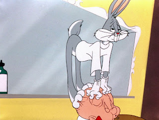
This was never on during my lunch trips, but whenever it was on I was watching it. I would never change the channel, even if I had seen The Rabbit of Seville 10 times already. And thank God that Cartoon Network had the colored shorts at the time. Otherwise, who knows when I would have been exposed to it? I had many Looney Tunes favorites when I was growing up: Rabbit of Seville, Duck Dodgers in the 24 1/2th Century, One Froggy Evening, Feed the Kitty, What’s Opera, Doc?, and Duck Amuck. If you haven’t seen these, please go and do so right away.

If I am going to talk about how simplicity made Scooby Doo enjoyable, then how can I skip one of the most simplistic cartoons of all time? Helmed, of course, by the genius of Chuck Jones. Simplicity and minimalism runs rampant in his work. Everything from the characters themselves to the gestures and expressions they make. Let’s take Wile E. Coyote for example; he wants to eat the Road Runner and his trust in ACME and his faith in his own plans is his undoing. Never is his suffering brought on directly due to the Road Runner. Then, there is Pepé Le Pew; a skunk that just wants love, but when he receives it, he runs from it. Of course, Bugs Bunny is perhaps the simplest in that the one rule he revolves around is that he must be provoked to get involved. I don’t think any show has been able to create such complete characters with such simple guidelines.

Daffy Duck is my favorite character. Ever since I was little, I related to him the most. Bugs was too smart, but Daffy, Daffy was human, he failed, over and over again, but at the same time, he never gave up. He wanted glory, but couldn’t have it, he wanted riches but remained poor – a duck of great ambition yet forever cursed by the animators to never see success. This was what Jones was so good at, creating honesty and thus, believability, in his characters and in his drawings.

The expressions that were featured on the characters, before they got hit by a train, before they fell 10 stories, when the realized something important, and many other poignant yet brief moments of time, are all so minimalistic. And so many of them are done with just the eyes. Even outside the realm of cartoons, how actors use their eyes in film reveals so much. When I was in Korea this summer, as I walked by my mother watching Korean Drama’s I noticed that all the actors did the same thing. They opened their eyes as wide as they could in moments of shock, sadness, horror…basically, the same expression was used for one too many emotions. But Jones had variation in his emotive arsenal. Just look at the episode called Feed the Kitty where the bulldog goes through so many expressions with its eyes.

When it gets caught putting the kitten in the flour bin, he does a “Who. Me?” look.
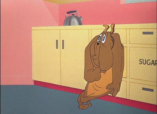
Then there is his worried look as he believes the kitty is in danger of being turned into a cookie…

…that is eventually followed up by his look of complete sadness, as he believes the kitty is dead.

Then there is the happiness of finding the Kitty once again.


Jones was an expert of going through various emotions in such a short amount of time. In the short I just mentioned, I went through laughter to choking up in a matter of a minute! Of course this was in part due to Jones’ masterful use of expressions, but also timing. He was easily one of the most efficient animators in terms of timing (my moms cooking wasn’t the only timely thing I would mention in this post). Especially, with gags. He played with expectancy, so that he would wait for the last possible moment before releasing the build-up in order to get to the punch line. Never did he remain too long on the build-up and never was the punch line too sudden. It was always perfect.

I am talking about these cartoons at this time because I recently finished watching Rick and Morty, which is, I think many people would agree with me, a staple in modern era cartoons, and it got me thinking about the classics and got me asking the most rudimentary question – why does this work?

Does the simplicity found in Looney Tunes and Scooby Doo work in the same manner for the successful cartoons of today? I would say yes. Let’s look at Rick as an example. Rick is a complex character with complex emotions, but that complexity sprouts from very simple human characteristics – he is sad, lonely, and his vast intellect leaves little for him to enjoy. Of course there are some characters in the show that are much simpler, like Mr. Meeseeks (he just wants to die after accomplishing his one task). The humor of the episode Meeseeks and Destroy stems from the simplicity of that character. Although the ones summoned by Beth and Summer finish their seemingly hard tasks quickly, the one summoned by Jerry cannot do the far more mundane task of taking two strokes off Jerry’s golf game – so the Meeseeks goes crazy and summons more Meeseekses (what is the plural of Meeseeks?) to help, making the situation all the more crazy. Although the show can seem, at times, to be the unrestrained and unfiltered imagination of co-creator Justin Roiland, it never fails to remember that what makes a cartoon, or any form of art, succeed, is simplicity at its core and fundamentals. But that is the trick isn’t it? Never in the history of mankind, has it been easy to create simplicity in an artistic medium.

Beach House at the Royal Oak

On Sept. 19, I experienced Beach House live and the performance was nothing short of spectacular. One thing that I was immediately surprised by was how loud the band was. Listening to their records on your phone or computer with headphones doesn’t measure up to the bass that leaves your body weak and the wall of sound created by Alex Scally’s melodic guitar and Victoria Legrand’s vocals – that reach tones on both ends of the spectrum with such power and rocking ferocity – forcing you into a trance. It was a concert that was so visceral it left you wondering how the time went by so fast. But you feel rejuvenated and excited. The experience is virtually ineffable. As one person at the show put it, “You guys are fucking killing it!” And to give you a context of the vibes of the show, Victoria responded to all the praise at one point by saying, “This is gonna be a four hour set.”

For a moment, I want to talk about the lighting on the show.

But before that, I will make a brief aside and say that the Royal Oak Theater (the venue where the concert was held) was absolutely beautiful, I highly recommend everyone to check out their website for future shows (they have acts varying from Beirut to stand up shows by Craig Ferguson – a man who, with absolute genius, deconstructed the Late Show format).

Anyways, back to the lighting. On the stage, there were three white rectangles that were made from some light thread – for the light easily went through it. Behind those rectangles were lights on the floor that could change color along with the lights from the top of the stage. The combination of these transformed the stage from deep red, to a rich sea blue, to a starry white. Complimenting these colors was the lights in the backstage, that were filled with dotted light bulbs that lit up for certain songs to emulate a starry night. Here is a link to some professional pictures of the show.

Beach House at Royal Oak Music Theatre

It is quite interesting that their album jacket for their new album, Depression Cherry (for the vinyl anyways, I assume that the CD cases are the same), is covered in deep red velvet. The comfortable feeling of the velvet doesn’t account for their visceral live show. The two are so considerably different and perhaps that is why it is so special. This is only the second concert I have ever gone to, so although such conclusions may seem late, it is only because of my lack of experience that I am just now beginning to realize the power of concerts.

Here is the set list for those that are interested.

Levitation
Walk in the Park
Lazuli
Gila
PPP
Beyond Love
Norway
On the Sea
Other People
Space Song
Myth
Wildflower
Wishes
Sparks

Encore
Wherever You Go
10 Mile Stereo

Here is a full stream of my favorite Beach House album, Teen Dream, for those who have never experienced the majesty of this band (but honestly all their albums are amazing – hard to pick a favorite – so I included all the streams provided by Sub Pop).


But…I don’t like Cats

The cat is an artist. Or the artist is a cat. Or wait. I don’t like cats.

I am a dog person, but this claim of identification is purely based on the fact that I have had one dog during my short existence in this world. I have never owned a cat; I have touched cats, but did not find it appealing, it seemed so distant, like it could not care less about the fact that I was petting it. Of course, I can entertain the thought that I was not stroking the cat the right way or maybe that particular cat was an asshole.

But regardless, dogs are important to me, because I grew up with my first and only dog. I met him when we were both young, and unfortunately, he passed away when I was entering my senior year of high school. Sorry to bring the mood to a somber level, but it happened. Nothing can make me forget about the connection I had with my dog – but it makes me wonder, what if my first pet was a cat? (I mean I swear my dog purred once)

I was surfing the internet, as one does to run away from the last bit of work they have to do during a semester, when I ran into a blog post that featured pictures of famous artists with their cats.

Apparently cats are frequent muses for artists – a “creative companion” of sorts. So wait, am I not an artist then? Should I go and buy a cat? The only cats I have ever respected is Tom and Sylvester – both of whom never give up despite their foiled efforts to catch their prey. But neither of them is real. You cannot find me a cat that will sit on the train tracks in depression after his girlfriend dumps him. You cannot find me a cat with such an intense emotional gravitas.

Of course, this whole photographical representation of the relationships between artists and their cats is to be considered in moderation. By no means is it a requirement. But often, these little posts that bring up interesting coincidences that are backed up by some sort of statistical evidence, make me wonder about my own position. The conclusion is never that relative to the very coincidence that got me going in the first place, but nonetheless, I realize a little bit more about myself. Similar to how we respond to banal platitudes. And everyone knows how clichéd those are, right?

Pablo Picasso

Link to some more pictures.

Intimate Portraits of 50 Artists and Their Cats Compiled by Alison Nastasi