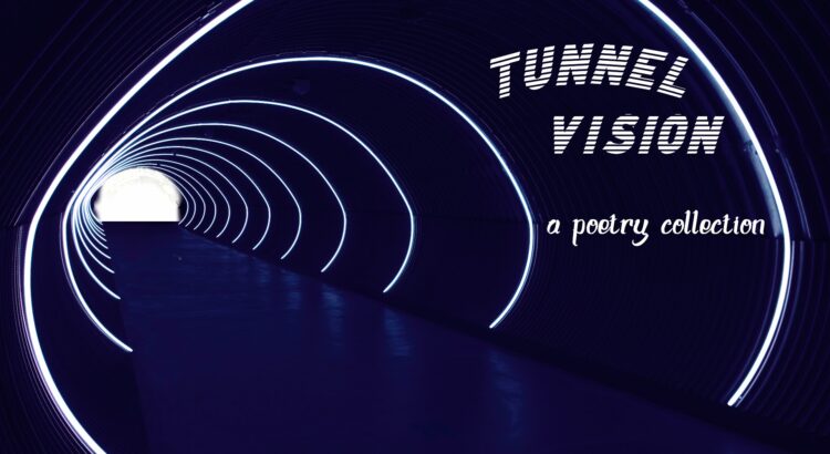
Lyrics from “Human” by Of Monsters and Men. Oftentimes the best we can do is be present in the moment and feel what we need to feel.

Lyrics from “Human” by Of Monsters and Men. Oftentimes the best we can do is be present in the moment and feel what we need to feel.
“My medicine works especially well on women.”
What a strange claim to make. The thought makes Robert hesitate. It feels like such a lie.
Yet, sacrificing caution, Robert believes it.
He opens the door.
The Devil is drawn — domination . . . giving into the shadow
The crow-like creature examines his mother. Its beak hovers over her, looking ready to pierce through her sweating skin at any moment. Robert suddenly feels himself ready to tackle the thing out through the window.
But then, he sees his mother’s nose twitch with the barest hint of life, and he fools himself into believing it is a result of some plague doctor magic.
The creature straightens to its full (albeit tiny) height. It turns its menacing beak toward Robert. For a few moments, it simply stares, and Robert wonders if it wants him to break in some way — down to his core and pull his stomach out.
His grotesque fantasies, however, are halted when the doctor begins feeling for something beneath its robes. It pulls out a leather pouch lined with metal studs on the bottom. Robert blinks for a second making sure his eyes aren’t deceiving him. He would expect such an accessory from a teenage girl looking for something to keep her makeup in. It shocks him to see it being held by the strange doctor. Sure, the black fits the creature’s aesthetic, but the object in itself is so mundane.
Robert expresses his observation out of curiosity. “Where did you get that?”
The doctor pauses in the middle of taking out some simple-looking tweezers. “Where someone would normally get such a thing — a store.”
Robert refuses to let himself feel stupid. This pouch, for some reason, makes him suspicious of the doctor.
He feels childish with the question he’s about to ask, but he pushes on as it feels necessary.
“I wouldn’t have expected a plague doctor to have such a bag.”
“You didn’t expect a plague doctor in the first place. So how would you expect to expect anything from me at all?” It snaps at him.
The creature quirks its head to the side, like the bird it imitates. The action threatens Robert to silence. It steps toward him. He takes a step back.
It continues in a commanding murmur. “So what do you expect of me?”
The blank black eyes bore into him. He wants to walk back further — run, anywhere away from here. But he remains in his spot, locked by invisible chains.
“I expect you to help my mother.”
“And that is what I will do.”

To be continued . . .

Welcome back to Letters by Lydia! After last week’s introductions, we’re finally getting into our first pen review!
This week’s target: Marvy Uchida LePen Flex.

The set I have has 10 pens, each in a bright pastel shade, although you can get other sets with different colors and amounts. These pens are great for a lot of reasons, but one thing that makes them unique is the convenient little case they come in. If I’m packing pens in my bag, I often find myself reaching for this set because they’re great pens and they don’t take up a lot of space.
Marvy Uchida has a lot of products out there, but these have got to be my favorites from them. You may have heard of the original series, just called LePen, which looks the same as these, except they’re fineliners instead of brush pens.


You can see the difference between the two in the photos here (LePen Flex on the left, LePen on the right), but if you need an explanation, a brush pen is exactly what it sounds like (almost). There are a lot of different types, but the tip is usually shaped like a brush, and they can bend and move in a way that allows you to get a lot of line variation, meaning thin and thick strokes.
Size-wise, these are pretty small nibs (tips). For my fellow pen lovers out there, I would say they’re comparable to the iconic Pentel Fude Touch. In terms of the nib itself, I love these. They’re a great size for doing small lettering, but the pens are juicy enough that using them as markers to color in larger areas works too. Note, though, that they can dry out a little quickly if you use them a lot, so make sure to store them horizontally.  The tips are flexible, but also incredibly easy to control, which earns them major points. As for durability, these are pretty decent. If you aren’t using paper specifically for handlettering, the tips will fray faster, but that’s true of most pens. As for the colors, they’re beautiful–very pigmented and rich.
  They offer a wide range of colors between all the sets, which you can see even just in the ones I have; there’s the super light pastels all the way to the deep, rich hues. That said, I wish they offered a higher quantity of different colors. For example, they have tons of different blue/green shades, but only one red between all of the sets. The price depends a lot on where you get them and what colors/size you choose, but a set of 6 is about $10-12 and a set of 10 is about $15-20.
I think that about sums up my thoughts on these pens, but I would be more than happy to answer any questions about these! If you’ve tried these, what are your thoughts? Also, let me know if you have any requests for pen reviews or anything else, and thanks for reading!

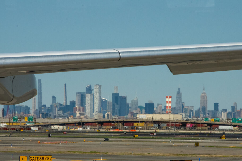
Before I jump into how beautiful Ann Arbor is in the fall, I wanted to post some photos I took over the summer. My favorite was probably a series I didn’t expect to take in the first place – I had a layover in Newark while flying home and got a beautiful view of the New York City skyline, which I thought I would share.
Getting settings right was tricky because of the air at the airport and planes that were constantly moving, but I think I got some pretty decent shots.


If you want to get in touch, you know where to find me:
akilian@umich.edu
IG:@akilian.jpg
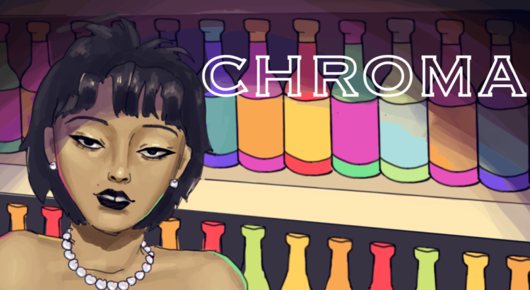
Hey! I’m Dai, and this is the first post for my new series, Chroma. In this series, I’ll generate a random color palette each week and create an illustration based off of it. I’ve always loved adding color to my works, but I often find myself struggling to choose which colors to use. Through this series, I hope I’ll be able to improve my coloring skills, as well as create new art for the readers of arts, ink. to enjoy.

This week, I generated this palette on Coolors.co. I loved the contrast between the bright red/pink and the cool blues and purples, and I knew I wanted to create a night scene with this palette.

Recently, I’ve been wanting to draw more animals in my illustrations. For the longest time, I only drew people, barely drawing objects, animals, or backgrounds, so I went slightly out of my comfort zone with this piece, though I’m very happy with how it turned out! I ended up using the blue, purple, and black mainly for the background/sky, while using the red/yellows for the lighting and the tiger. I wanted to capture the atmosphere surrounding railroads at night, and I hope I captured it well.