Reader’s Choice

Do you solemnly swear that this was your choice and your choice alone to read the content of this post that hereby follows? The author claims absolutely no responsibility for your choice to continue to let your eyeballs fall on the letters she put on this page. She would like to say that she did not write this with you in particular in mind. 
Image via gyphy.com

I’m joking, obviously! Of course, I wrote this with an audience in mind – you, the readers of Arts at Michigan! But, in no way, have my words hypnotized you to read them (that would be amazing if they could!), and in no way, am I forcing you to agree with what I’m writing. You can exit the page at any time.

Still there? Good. 

This idea of “warning” your readers about bawdy content and reminding them of their choice to read it is centuries old. For example, Chaucer famously does so in the prologue to The Miller’s Tale – undoubtedly, the raunchiest story in The Canterbury Tales. (Let’s just say there are a few exposed rears that make appearances throughout the tale).

The narrator of the Canterbury Tales, generally named as “Geoffrey,” writes in the prologue,

 And therefore I beg every gentle creature, for the love of God, not to judge that I tell it thus out of evil intent, but only because I must truly repeat all their tales, whether they are better or worse, or else tell some of my matter falsely. And therefore whoever wishes not to hear it, let them turn the leaf over and choose another tale; for they shall find plenty of historical matters, great and small, concerning noble deeds, and morality and holiness as well. Do not blame me if you choose incorrectly. The Miller is a churl, you know well, and so was the Reeve, and the two of them spoke of ribaldry. Think well, and do not blame me, and people should not take a game seriously as well.

Chaucer himself reminds his readers that they have the choice to read the tale or flip the page to a new tale or perhaps to close the book altogether. He renounces all responsibility for the reader’s choice. While some might call this a sell-out, his attempt to build a safety net for himself is commendable. Once the publication circulates into the public, the author himself has no control over who reads his work and what their specific taste in literature is like. It’s actually one of the smartest things that an author can do!

Image via amazon.com

Another example comes from Daniel DeFoe, who writing the 1724 book, Roxana, about a mistress who “thinks herself a whore,” prefaced with the disclaimer, “If there are any parts in her story, which being obliged to relate a wicked action, seem to describe it too plainly; all imaginable care has been taken to keep clear of indecencies, and immodest expressions; and ’tis hoped you will find nothing to prompt a vicious mind, but every where much to discourage and expose it. Scenes of crime can scarce be represented in such a manner, but some may make a criminal use of them; but when vice is painted in its low-prized colours, ’tis not to make people in love with it, but to expose it; and if the reader makes a wrong use of the figures, the wickedness is his own.” 

DeFoe here echoes Chaucer’s “do not blame me” stance, and blames the reader for misinterpreting and misjudging the words put before them. Again, if they are offended by what they read, either it is their mind that is in the gutter or their error for not reading close enough to the meaning and psychology lurking between the lines.

But should these authors have to preface their work? Is not life itself often times dirtier, more violent, and more disturbing than anything we could read on paper? All material we read (other than schoolbooks) is consumed because we chose to read it. Maybe a friend recommended it to us. Perhaps it was praised by a critic. Maybe we were just intrigued by its cover. If we come to a part that doesn’t fit our fancy or unnerves us, we the readers are under no obligation to finish it, or indeed, read it ever again.

I’ve been wondering why books of today don’t come with these “trigger warnings” and “disclaimers” that they once used to. As a writer myself, I’m glad that I don’t have to preface my work. I wrote it because I wanted to. I wrote what came out of my head. I shouldn’t have to apologize for that. But then, why do other creative minds out there – inventors of video games and film – why must they label their products as PG or M or Explicit Content?

Image via primusdatabase.com

Even musical artists must warn their followers of explicit language, while no book I know ever has had to apologize for swearing. What’s so different about books, I wonder? And how did the Chaucer tradition of “don’t blame the author” fall out of style?

What’s your take on the issue? Should authors have to warn readers of their content? 

A Vexillological Look at Detroit

Vexillology, the study of flags, seems like a frivolous subject for one to become interested in. It is often used as a joke for extreme nerdism in television and movies. However, flags and their design can be incredibly important for a people and their culture. Two places we can look to in order to prove this are the recent surge against the confederate flag, and the importance of the French flag during the French revolution. Obviously, these symbols wouldn’t mean so much to their respective movements if flags didn’t hold so much importance in society. They unite various people under a single banner and instill pride in their culture.

Now a lot of bad flags exist, usually from cities or smaller districts of nations. They range from confusing, to over-designed, to cartoonish. It is honestly surprising that some of these designs actually made it all way to being printed on flags. But before we start analyzing the flag of Detroit, we should learn the basics of good flag design.  I will summarize these, but this TED Talk is really great at explaining it and is the inspiration for this article.

Ted Kaye, a member of the North American Vexillogical Association, set out five basic rules for good flag design. This is the basis that we will use to determine where Detroit failed in its flag design. Obviously “good” design is subjective (to a point), but these rules are pretty simple and allow for a lot of creativity. They can be a good measure for how well received the flag will be.

  1. Keep it simple: Ted Kaye states that a child should be able to draw it from memory. This is important because it means it’ll be easy to recall from memory, which makes it easy for the populace to get attached to it.
  2. Use meaningful symbolism: This one is easy to understand. The symbols on the flag should be important to the culture since the flag is a representation of that culture.
  3. Use 2-3 main colors: In addition, these colors should be used cleverly and contrast well to create a striking image which catches attention. This is based on a basic rule of graphic design in general. Too many colors muddle the image and distract the viewer.
  4. No lettering or seals: A flag will be viewed from a distance, flapping in the wind. The lettering or seal will be too small to be seen by the average viewer in the average conditions. In addition, this ruins the purpose of the flag. The flag should be immediately recognizable for a specific city/region/nation without the flag having to tell us.
  5. Be distinctive or be related: The flag should be unique and easily distinguishable from other flags. It is okay to call back to other flags’ designs, like various African flags which use similar colors to refer to the Pan African Movement. However, if it does relate to other flags, it should be distinct enough that it is clear that it belongs to that particular city/region/nation (without the use of a seal or lettering).

Now that we know the unofficial rules for good flag design, we can look towards the flag of Detroit:

Detroit Flag

Most of you, even those from Detroit, have probably never seen this flag. I’m from a suburb of Detroit and have never seen it. There is a reason for that. This is a poorly designed flag and not very attractive to fly. (In addition, it must be very expensive to produce due to the complex design.) It breaks 3 of the 5 main rules of flag design. Sometimes it is okay to break a rule if it is for good purposes, but it must be done carefully and be well thought out. It is clear that Detroit didn’t do that.

Let’s start with the positives of the flag.

  1. It is very distinctive and related. It would be impossible to mistake this flag for another one. It also calls back to the flags of the areas three owners, giving historical weight to the design.
  2. It has strong meaningful symbolism behind it. Using designs of the three countries is a clever idea and could have been a great way to unite the people of Detroit behind their unique history.

Now there’s the negatives, of which there are many.

  1. The design is way to complex. It’s difficult to focus on any one thing because of all the competing ideas. It would be impossible for anyone, let alone a child, redraw this from memory.
  2. There are too many colors and they contrast in an unappealing way. The quadrants and their different color schemes don’t flow together in a way that makes sense. They should not be separated as it makes the flag feel disjointed.
  3. It uses the seal of Detroit. Way too many cities just put their seal on a flag and it is never effective. Seals are made to be printed on paper and therefore do not need a bold design to be understandable, unlike flags. When this flag is on its pole, we will not be able to see the seal or read the writing. It is a waste to put a seal on a flag.
  4. As stated before, the flag should not be split into quadrants. this unnecessarily breaks up the design, which could have been very powerful if they mixed the three flags together to create a unique, attractive design. I love the idea of referring to Detroit’s history, but it could’ve been much better.

Now that we know the issues of the flag, how do we go about designing a new, more powerful one? The first step is to determine what is important to the city of Detroit and taking design elements from those aspects. These could be of historical, contemporary, or geographical importance to the city. Here are some things that could be integrated into the design: the Detroit river, Ambassador Bridge, the three countries that owned it, the automobile industry, Fort Detroit, Pontiac’s Rebellion, the Renaissance Center, etc. To start, I would pick 2-3 elements that are important to Detroit and see how I can use them to create meaningful imagery for the flag. Then, if the flag is still plain and non-distinct, I could further integrate more important aspects of Detroit. I have detailed two design schemes for a new Detroit flag below:

  • Elements: Detroit River, Ambassador Bridge, Spirit of Detroit. To represent the Detroit river, the flag will be on a field of blue. To represent our strong connection to international partners and the historical importance of the Ambassador Bridge, it will be drawn in the middle of the flag in white. To represent a Detroiter’s strength and pride for the city, the orb in the hand of the Spirit of Detroit statue will stand above the Ambassador Bridge, also representing the bright future of the city.
  • Elements: Detroit River, Automobile Industry, the historical owners of the area. This will be a tricolor flag of blue, black and white. The top band will be blue to represent the Detroit river. The bottom band will be black, to represent the automobile industry (the original and only color of the Model T). The white center band will host the symbols of the three countries that owned the area (all in black). The first will be a star to represent USA, next will be a simplified lion to represent Great Britain, and finally there will be a fleur-de-lys to represent France. They are in this order to represent ownership going back in time.

These are simple designs that evoke strong connections to the city and could hopefully inspire people. I have also been able to find two other redesigns by MrThrowaway109 on Reddit that I believe would also be strong symbols for the city:

View post on imgur.com

View post on imgur.com

While I believe both of these are well designed, I do have some contentions with them. For the first one, I still do not like the act of splitting the flag into quadrants, but it is a lot more skillfully done in this one than the actual one. Also, the star in the center feels too similar to the “Lone Star State”. It is really nice though that it only uses 3 colors and they are positioned in a way that is enjoyable for the viewer. The second one is simple, yet distinct, which is exactly what a flag should be. My issue is that it gives too much preference for France. Yes, France once did own the area, but French culture is no longer a strong influence on Detroit, unlike New Orleans.

Flags can be a very powerful symbol of a region and Detroit is in need of something like that. The city is slowly coming apart and I believe a strong flag could bring the strong people of Detroit together under one banner and lead efforts to fix the city.

The Way I See It: Thoughts on Albums Part 1

It seems fair, to me, that the same week as the Grammy’s I should be talking about music. Even though I haven’t quite yet gotten to watch the Grammy’s (it’s on my DVR I promise I’ll watch it soon), I’ve seen words flying around my news feed throughout the past week, artists like Kendrick Lamar and Taylor Swift at odds with each other.

Bu that’s not what I want to talk about this week. We all know that the Grammy’s aren’t necessarily the be-all-end-all, and oftentimes don’t represent the music community as a whole. So instead, I want to talk about something a little bit more personal.

If you run in any type of circle that cares a lot about music, especially alternative/indie/rock music, there’s a conversation that is bound to happen. What is the best album of all time?

That’s quite a heavy burden for someone to bear, to pick the best album of all time. This is more than just a hi, nice to meet you, what’s your favorite song? kind of question. This becomes especially difficult, too, since people who claim to like “good music” often bow down to the rock classics, to The Beatles, The Rolling Stones, Nirvana, U2, etc. And a lot of times these albums are picked as the best of the best of the best.

But it’s always seemed to me that this question is a thinly veiled disguise aimed at probing if you are “worthy enough” to be considered a true music fan. To navigate this exchange, you have to simultaneously pick something old, perhaps pretentious, highly acclaimed but perhaps not widely known by a general music fan, someone who listens to the radio (because who does that…besides most of the US population).

That’s not how I see this question, though. No, this may not be a first date, could-I-actually-like-you, I’m curious tell me kind of question, but I think asking about someone’s favorite album can be a lot more telling. Something they can listen to over and over again. Something that fits every mood, every whether. Their go-to for when their music runs dry. Not necessarily an album that they listen to constantly, but, even after a year, two, or three of not hearing one song on that album, they can go back to it.

To me, that kind of answer speaks volumes more about who a person is rather than asking them to nominate only one album as the greatest of all time. I think this week’s Grammy’s showed us that there can be vastly different opinions on how to choose an album of the year, much less of all time.

So that’s my version of that question. Simply modified, perhaps not easily answered (can you pick just one?). But I wonder: what’s your favorite album of all time?

Midnight Book Release Parties

Four children sit on a bench each reading their own copy of

Recently, one of the greatest announcements of my generation was made: there will be another Harry Potter book! Well, sort of. The announcement came earlier this month that the new play, Harry Potter and the Cursed Child, will be made into a script book available to everyone this July. JK Rowling didn’t exactly write it, but the giddy excitement of anyone who has ever taken the magical journey to Hogwarts and fought Voldemort beside Harry, Ron, and Hermione is still palpable.

Excited? I haven’t even said the best part, yet. Along with a new Harry Potter book comes new opportunities to celebrate literature with people who care at midnight release parties! Remember those? Dressing up in your dark cloaks and coke bottle glasses and boasting to anyone who would listen that you were a particularly good finder so it was okay you had the yellow and black scarf. Stuffing your face with chocolate frogs and cauldron cakes? Playing games and standing in long lines all to do what? Be the first to read the newest Harry Potter book!

Now, it’s been a while since I had the good fortune of going to a midnight release for a book. Movies, sure. All the time. There are so many that have midnight releases, complete with dressing up, long lines, and the mad rush when they open the doors to the theater (Harry Potter, The Lord of the Rings, anything Marvel, The Hunger Games, Twilight, etc.). But books are different. Books rarely get as much attention as movies. Even incredibly popular books, like Rick Riordan’s Percy Jackson series, haven’t had any release parties (at least in my area). That makes me sad.

Being able to commemorate the release of a book is one of my favorite things to do. People of all ages and all backgrounds come together for one reason—to get excited about reading. Inside that book store, you’re surrounded by other people who love the book just as much as you do, who are so excited to read the next book, to touch the next book, that they can’t imagine waiting even a few hours. There’s dressing up, games, food, and excitement. Then, there’s something even more special. There’s silence. Everyone has his or her book. They’ve found a place to read and sat down with their noses almost touching the freshly turned pages. They’re feverishly reading and they’re not stopping until they’ve finished. It’s pure magic. And soon it’s coming back; hopefully not as a one-time event.

Sean Murphy: The Ink Master

Sean Gordon Murphy is a comic book artist/writer who has worked on famed ongoing titles like Batman and Hellblazer, but the title he created on his own, is Punk Rock Jesus; a comic about a clone of Jesus Christ who then rebels and becomes a punk rocker. Ya.

The first time I encountered Murphy’s art was when I picked up Tokyo Ghost, a new Image series he developed with Rick Remender (Deadly Class, Low, Black Science). His art melted my eyes, so I wanted to share some of it with you.

Splash page from Punk Rock Jesus
Splash from Tokyo Ghost

Needless to say, Murphy is technically excellent and a remarkably talented artist. But it’s his ability to lead the eye via black and white ratios that really amazes me. Just looking at his art, you realize, he gets it (he explains it in the video). Oh, and that understanding of the elliptical. Beautiful.

Weighing Realism Against Entertainment

Everybody knows that realism is overrated when it comes to art. Even focusing on the genres of realistic dramas and comedies alone, even without elements of fantasy or science fiction, we typically don’t want to watch something realistic. Aaron Sorkin’s movies and TV shows are popular partly because all the characters are intelligent and witty and think quick on their feet, and you get to have fun watching them all shoot comebacks back and forth at each other.

Of course, some people don’t like ultra-stylized dialogue. My roommate Julie told me she thought John Green’s acclaimed book “The Fault in Our Stars” (one of my favorite books) was extremely overrated, and one of her reasons was that teenagers don’t actually talk like that. They’re too clever, she argued, too quick at thinking on their feet. It seems like John Green, at least when it comes to witty banter, is like a YA form of Aaron Sorkin.

“You had three weeks. The universe was created in a third of that time.” “Well, someday you’ll have to tell us how you did it.”

I think it all boils down to what the given story is trying to achieve. “Steve Jobs” and “The Social Network” don’t strive for realism when it comes to speech, but they each have beating emotional hearts—Steve’s denial about being a parent and Mark Zuckerberg’s contentious relationship with his friend Eduardo Saverin, respectively. The same goes for “The Fault in Our Stars,” which deals with death, grief, and the innate human desire to leave a mark on the world. You can bring out those sophisticated themes without having dialogue that necessarily bears a great resemblance to real speech.

And then there’s the mumblecore movement, films that luxuriate in all the mundanity and awkwardness of real life. Dialogue is filled with “um”s and “uh”s and “kind of”s and “sort of”s. There are often no scripts, leaving actors to struggle to find the words that make the most sense to them. It’s like a modern form of the neorealist films that populated Italy after World War II. These are movies that purposely portray the day-to-day lives of people who feel real, with little sensationalist conflict.

The strange, anticlimactic ending of Red Desert (Antonioni), which might not technically be neorealist, but has a similar fizzling-out ending.

Mumblecore movies are still fairly overlooked when it comes to mainstream filmgoers, though, possibly because they’re anti-climactic by design (just like the Italian neorealist films). It’s only natural that movies like “Drinking Buddies” fly under the radar, even when they have stars like Jake Johnson, Anna Kendrick, and Olivia Wilde. Crowds have the rightful desire to want to be entertained, or at least engaged. Sometimes unconventional endings—like the romantic leads never actually acting on their desire in “Drinking Buddies—leave you unsatisfied. Sometimes I feel like happy endings are underrated, not overrated. There’s nothing inherently wrong with the guy and the girl ending up together in the end if that’s the ending that feels right for the story.

Still, I think part of film’s gradual evolution should be a greater willingness to challenge audience expectations and force people to ask themselves why some movies feel so unoriginal. Maybe sometimes a movie doesn’t have to have a satisfying, conclusive ending to be worth watching. Sometimes giving a disarmingly accurate portrayal of life is enough.

I wrote about this before, writing about “Boyhood” and “The Strange Little Cat.” “Boyhood” has no conventional plot, conflict, or arc; it’s just an authentic portrayal of a boy growing up, and it’s enormously affecting despite lacking a climax or conventional path of rising and falling action. “The Strange Little Cat” is far more challenging, instilling mundane reality with a sense of mysteriousness. There’s almost a sense of spirituality in the movie the way characters tell minor stories about things that have happened to them over the course of their day. The movie makes every seemingly insignificant anecdote seem indicative of some higher power, some nebulous force we can only barely sense and never comprehend. As I wrote in my article, “Sometimes it seems like we always think of life in such broad terms. When we watch our movies or TV and read our books, we look for commentary on big, important concepts like love, hate, God, war, success and failure. It makes sense that we’d want a movie to give us a new perspective on something important, but too often, that makes us forget everything else. Things like a stranger’s foot or the white side of an orange peel may seem inconsequential, but they become important through the sheer amount of space and time they take up in our lives.”

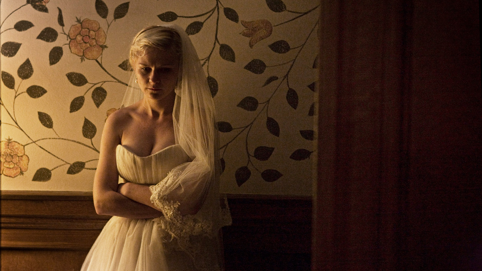
Another unconventional portrayal of reality is Lars von Trier’s “Melancholia,” the first half of which is dedicated to a psychological exploration of Justine (Kirsten Dunst) on her wedding day. Justine has depression, and despite her loving, patient husband and the perfection of her wedding, she just can’t be happy. She collapses, sobs, wanders away from the wedding into the cold night, and has sex with a random guest.

I’ve only watched “Melancholia” once, and I came away from it thinking it was okay, but not great. Maybe the depiction of depression was accurate, I thought, but I had to admit that it got boring simply watching her be depressed for an hour or more. Movies are defined by change, by things happening, and no character should only play one note for the majority of the movie. In the second half, “Melancholia” becomes about how depressed people sometimes feel a sense of peace and calmness when faced with exterior catastrophe, so the lack of change isn’t much of a problem anymore, but still, it was hard for me to get through that first half, so humorless and dour and…well, depressing.

But “Melancholia” has stuck in my mind. I don’t have any plans to watch it again—it’s really hard to watch from its darkness alone, and I still stand by my belief that it was a little too one-note in the first half—but I remember it sometimes, its rawness, its realism. I don’t have depression, but I somehow know that there’s something unspeakably real about it. There’s something about the image of Justine’s face, completely apathetic and dead while she looks at her husband, or the image of Justine’s sister Claire (Charlotte Gainsbourg) helping carry a naked, despondent Justine to the bathtub and bathing her. Again, this isn’t how every depressed person acts. This is how Justine acts. But Dunst’s utter vulnerability and the honest imagery of her experience shows that these experiences don’t belong to Justine alone. “Melancholia” is perhaps the most unrelentingly grim yet accurate depiction of depression I’ve ever seen, and it’s stuck with me. I never would’ve seen it if I was only concerned with conventional crowd-pleasers.

Maybe “Boyhood” is a better example to use than “Melancholia”; “Boyhood” was received warmly by mainstream moviegoers, and I doubt most people would love “Melancholia” if they had to watch it. But my point is that movies like these don’t necessarily need to be loved, to have beautifully cathartic endings or naturally escalating first acts. Not every movie you watch should be one of your new favorite, most satisfying movies. Sometimes, challenging us emotionally is enough.