Hi everyone! I hope you’re all having a lovely week 🙂
For this week, we’re gonna look at a good set of markers to start with if you’re new to lettering, and talk about some lettering basics at the same time.
This week’s star: Mondo Llama Classic Washable Markers

As you can probably tell, these are technically supposed to be for children. But who cares? If you’re new to art/lettering or on a budget, kids art supplies is the best place to start. The quality is usually pretty high for what you’re paying, you pretty much always get a solid set of rainbow colors, and there’s no reason to feel guilty for overusing them or not taking care of them.

When talking about kids markers, Crayola is obviously the most popular, and for good reason. I plan to do a separate review on Crayola Supertips, because they’re too beloved in the handlettering community to only get a brief mention (so if you don’t know what that means, just stay tuned!). However, this Mondo Llama set does the trick just fine for your basic, broadtip marker. In this specific set, you get 10 colors (swatches below!), and I believe I paid about $2.50 for them, which is ridiculously cheap compared to higher end brands. I actually bought this set at the Target on State Street, too, so it’s super accessible if you’re on campus here.

Getting into the nitty gritty of it, let’s talk about what you can actually do with these. Broadtip markers have a large, conical tip that differs from a brush pen in that the entire tip is firm as opposed to being bendy and flexible. These really in only exist in kids markers, as far as I’m aware, because they’re great for coloring in big spaces. However, you can also use them as a sort of beginner brush pen! A broad tip is firm, but it’s still flexible enough that you can get quite a bit of line variation. You can also tilt the marker so you’re writing with the side of it, which gives you the thickest line. This allows you to do tons of different kinds of handlettering with them, which I showed a bit in the picture above. I know we haven’t talked about lettering styles yet, so that’s more just so show you how versatile these are. Below is a little doodle I did with these markers, just to show you can make some pretty neat stuff with them!
As you can see, they hold up really well in comparison to more expensive art supplies! That said, they are cheap and for children, so they aren’t perfect. I highlighted a few examples of that below. You can see that it’s really difficult to get precise, clean lines with these. They also don’t layer very well, so if coloring in a large space, it might look patchy and have some sections end up lighter than others. These are also water based and pretty juicy, so sometimes they bleed on the page or when interacting with each other as well.


Overall, though, these are a great set of markers that are absolutely worth the small price tag! I hope you enjoyed reading, and see you next week!


 When it comes to actually using this technique, the first thing you need to do is make sure you’re holding the highlighter the right way. Instead of holding it like you would to highlight a something, where it draws a thick line horizontally, you want it to be the opposite way; once you’ve rotated your pen so you’re holding it correctly, it will draw a thin horizontal line and a thick vertical line. Then you can start writing! You want to keep your pen oriented that same way the whole time, because that’s what will give you this kind of 3D/layered ribbon effect. Another tip is to keep your strokes simple, especially when you’re first starting out. For example, instead of writing a lowercase “a” like you would in your normal handwriting, it might be easier to write it as a circle connected to a vertical line.
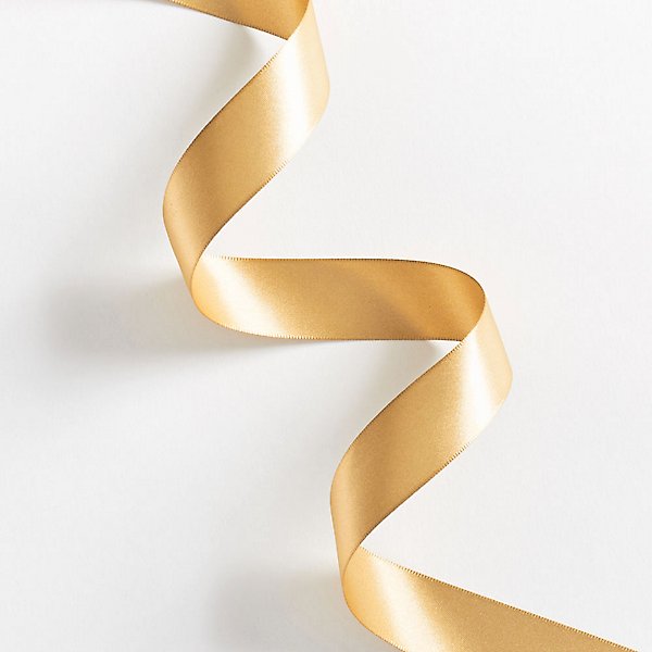 The next step is figuring out the “layers”, so to speak. For this part, it’s super helpful to think of what an actual ribbon would look like. In this photo I got from the Papersource website, you get a really good sense of what I mean by the layers of the ribbon.When trying to figure this out with your own letters, you want to look for junctions where there’s some overlap, which I tried to illustrate in the diagrams below. For ribbon lettering, there are a ton of options in terms of style, so you can either outline the sections of each letter, color in the “shadowy” parts, or do both! I showed both examples so you can get a sense of how they each work.


 The tips are flexible, but also incredibly easy to control, which earns them major points. As for durability, these are pretty decent. If you aren’t using paper specifically for handlettering, the tips will fray faster, but that’s true of most pens. As for the colors, they’re beautiful–very pigmented and rich.
  They offer a wide range of colors between all the sets, which you can see even just in the ones I have; there’s the super light pastels all the way to the deep, rich hues. That said, I wish they offered a higher quantity of different colors. For example, they have tons of different blue/green shades, but only one red between all of the sets. The price depends a lot on where you get them and what colors/size you choose, but a set of 6 is about $10-12 and a set of 10 is about $15-20.