Letters by Lydia: Sometimes it Doesn’t Work

Welcome back to Letters by Lydia! Hopefully everyone was able to stay safe and warm in the snow, or maybe even go out and build a snowman 🙂

Today I want to talk about all the times–and trust me, there are many–that lettering ideas and techniques don’t work out.  A lot of times in the art community, especially on social media, we only see the work that people are super proud of: work that’s polished, high quality, creative, unique, and so on. Because of this, it can be really easy to fall into the trap of feeling like your work isn’t good enough, or that everyone else is much more talented. That said, I have noticed lately that people on social media seem to be getting a little more vocal about the importance of the process. Bad art is just as important as good art, because it helps you learn and grow as an artist. If your art was perfect all the time, there would be no room for experimentation, doodling, mistakes, and most importantly, fun!

I’m sure none of this is news to most of you, but I wanted to share an example of some lettering I did today that I couldn’t quite figure out. I wanted to try a new lettering style where it looks like letters someone wrote with their finger in the snow, which ended up being much harder than I anticipated.

After consulting an overwhelming number of google images, my first attempt landed me with this:

When I first did this, I wasn’t in love with, but with some distance I can honestly say this might’ve been my best attempt.  I chalk it up to beginner’s luck, though, because I could not for the life of me produce this kind of style again.  In hindsight, I think the key was only using two colors, because this was the only attempt where I limited my color palette that much.

My next attempt I’m actually super proud of and think looks pretty realistic. The issue? It took forever, so it didn’t feel reasonable to try and do a whole word in this style. My original idea was also to have this as a type of style, not a kind of one-time piece that would be difficult to recreate.  In any case, this is what I ended up with here:

After this, I started trying whole words, and played around with using the colors in different ways, different textures, and different thicknesses.  I don’t dislike any of these, but I don’t think any of them read quite as I wanted them to–they look like pretty snow-themed pieces, but not necessarily like someone was writing in the snow, unless you’re looking at them with that style in mind.

Of course, in this example of things not working out, I still generally liked the end results, they just weren’t what I had in mind originally.  That said, I can’t tell you the number of times I try things that end up looking absolutely terrible, and I can definitely start sharing that stuff too! But I thought it was important to show that there’s also this middle ground where the work you produce is still good, it just doesn’t align with the vision you had, because this also allows for artistic experimentation and learning new styles and techniques.

This is a style I plan to experiment with a bit more and see if it’s something I can refine, but even if it isn’t, I had fun playing around with something new!

I hope you enjoyed reading, and stay safe out there in the snow!

OTM #23: Run

I used to run every day in high school. I was on the cross country team all four years, and the track team for like, three. It was hard, yes, but it was really cathartic and cleansing for me, too. I love the feeling of running, the ability to be in tune with my body. Once it gets really intense, my brain feels full – full of joy, of adrenaline, of stress – it’s a magical combination of emotions spurted on by physical activity. I never fully fell out of running after graduating, but coming to college definitely made it harder. I lost my motivation to do it every day, I didn’t have a coach or events to look forward to. But I’ve never stopped; as of late, I’ve been getting super into it again. My apartment building has treadmills that I’ve been getting on almost every day of the week. And I’ve noticed how much harder it’s gotten – running, I mean. I used to be able to crank out six miles easy, but now I’m struggling to finish three. Sweating feels good, though. I feel like I’m sweating out schoolwork, stress, societal pressure. I love it, I can’t get enough. I have shin splints right now, and I wouldn’t have it any other way (despite these being a bad thing). I guess what I’m trying to say is, hobbies are cool; nowadays there is so much push to monetize every single hobby, but running is one that I’ve kept beautifully sacred to myself. I think it’s important to have those.

A Day In Our Lives #14

Hey guys,

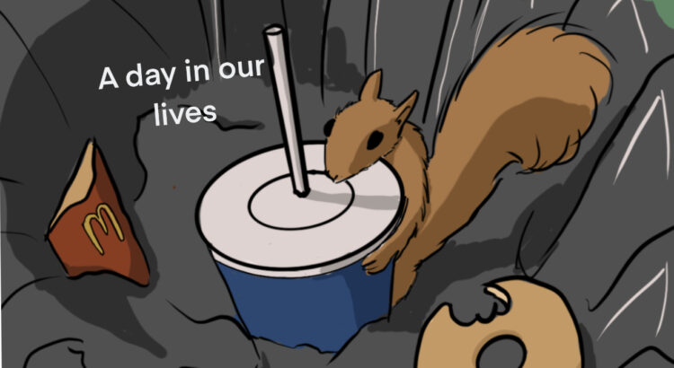
This week is a little out of the ordinary, my drawing this week is on paper with colored pencils instead of on my iPad. I lost my apple pencil and I’ve been looking everywhere for it! I saw a squirrel for the first time in like two months so I was inspired to draw this little guy. I gave him a. little Starbucks cup to keep him warm. I liked drawing this week’s post on paper, so I might do something similar in the future. I regularly am a traditional artist and sometimes I feel like I am able to be looser with my drawing. It is hard for my brain to register the Ipad as some form of paper I think!

See you guys next week
Marissa 

Letters by Lydia: Cursive vs Calligraphy vs …?

Happy Wednesday, y’all!

Today we’re gonna take a bit of a deep dive into the terminology for different types of lettering.  Overall, it really doesn’t matter, but I would say the most common question when it comes to lettering is “isn’t it just cursive?”  If you don’t know the difference either, no worries!  Hopefully this clears things up 🙂

So what’s cursive? I’m sure most of you are aware of what cursive actually is, but things probably get a little foggy in terms of how it differs from other forms of lettering. The main difference is that cursive isn’t really a form of art and instead a style of writing. Cursive is supposed to be a way of writing that’s more efficient than regular writing because your pen never has to leave the page–in other words, it’s practical and more of a fancy-looking shortcut than anything.  It’s also much more rigid in terms of style and rules; there’s a cursive alphabet that, aside from a few stylistic variations, is pretty set in stone.

Lettering (synonymous with handlettering), on the other hand, is an umbrella term for all sorts of word art. Calligraphy, which falls under the lettering category, is probably the most similar to cursive.  There’s a lot of different kinds of calligraphy, but it’s typically based loosely on cursive, and is centered on the idea of using strokes (you can check out my post on upstrokes and downstrokes to learn more about that!).  Unlike cursive, calligraphy is much more flexible and can involve a lot of experimentation or style variation, which in my opinion makes it a lot more fun.  You can see my version of a calligraphy alphabet below, and then I also included potential variations of uppercase letters (A) and lowercase letters (I chose “r” because it has a lot of fun options).  Some people also refer to this as modern calligraphy, because calligraphy can also refer to the sort of gothic style that would use a pen and ink or some sort of pen with a nib.

Lettering in general essentially just means “drawing letters” in an artistic way.  This means that instead of adhering to strict rules like cursive, or requiring the use of strokes like calligraphy, lettering can be any creative depiction of letters.  For example, bubble letters would fall under the lettering category, because instead of using lines and strokes to create a letter, you’re using shapes.

There are pretty much limitless other categories that fall under the umbrella of lettering, but some other common ones include brushlettering, which I’ve talked a lot about, faux calligraphy, serif and sans serif, gothic, and tons of other ones.  Hopefully that helps clear up any confusion, but feel free to leave any other questions in the comments!

Have a lovely rest of the week everyone 🙂

OTM #22: Perception / Characters

Lately, I’ve been thinking a lot about art. About how much I draw myself. I can give myself any form, and over time this can become more and more abstract.

I’ve been doing OTM for almost two semesters now, and thinking about how I’ve created a sort of persona for myself. I’ve always loved character design; I think comics and cartoons are so amazing at creating relatable characters with simple shapes. I’ve tried to make my own drawings of myself come off that way – I’m most inspired by stuff like Calvin and Hobbes, using simple dot eyes and fun expressions. I don’t really draw myself based on how I look most days anymore, but rather use a recognizable, repeatable, exaggerated version of myself. Truth be told, the blonde streaks I draw on the underside of my hair are barely visible anymore. But over time, I’ve grown really attached to them as a part of my cartoon “persona”, so I continue to draw them. It’s really fun to be able to think about these things, and I’m really grateful I get to reflect upon how I see myself through art. That’s always been my favorite aspect of art – being able to see how people view the world through their work. I’ve been thinking about characters and character designs a lot because of this, practicing making my own interpretations more.

These are a few of my results from my drawing exercises; characters from one of my favorite childhood games, “Ib.” The original sprites are above, my drawings are below. The original sprites are pretty vague and simple, so it was super fun to be able to draw out fun colors and interpret what kind of outfit each character was wearing. My result is very different than the original, but that, to me, is what makes it so fun. Fans of “Ib” could still recognize them as characters from the game, but I’ve given my own personal touch of love. Character design is so amazing!!!

A Day In Our Lives #13

Hey guys!


This week I thought that I would show a comic that I worked on last semester. I really like incorporating science and science fiction into my work. I like dinosaurs and wanted to pursue a minor in Paleontology but didn’t have room on my schedule. It has a little bit of humor at the end. This comic took roughly half the semester to work on all of the individual panels. I used a mix of colored pencil, Copic markers, pen, and procreate on my iPad in order to get all of the different textures.  It was convenient to be able to use procreate last in order to use it for the final editing and coloring.


See you guys next week!Â