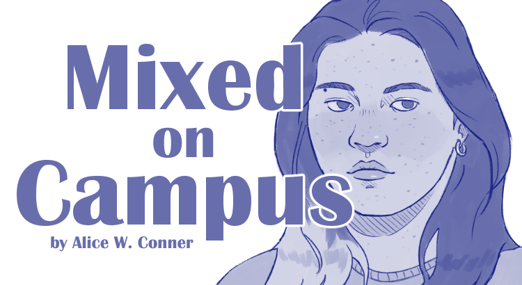
A Day In Our Lives #5

Hey guys!

This week I decided to focus on a common winter activity that I know a lot of artists like to do. A lot of my art friends take up crocheting or knitting when it gets cold. This year for my family I am crocheting scarves. I have about twenty-five people on my list to make scarves for. I can make about one daily, so I am on a very strict schedule. I like to sit with my MacBook and just watch TV next to my snowy window. I am excited about the upcoming break.  I like drawing these little windows in the back of the images because I feel like it gives the image more depth.

See you next week!

Marissa 

LOG-016: (Two) Eye(s) in the Sky

KHEPRI-1B

SPECIES NO. [ 009 ]

ARTICLE ARVHIVED FROM [ MARIAH BERGGREN ]

ARTICLE NOTES:

[ These streamlined, omnivorous creatures seem to spend most of their time gliding and soaring at high altitudes in the atmosphere of Khepri-1b. Their body structure is rather unusual; they have three pairs of translucent, thin wings; two large, simple compound eyes — one dorsal and one ventral; a dorsal, ventral, and tail fin for flight stabilization and steering; a small beak-like mouth at the anterior. Most of its body is covered in fibrous hair- or feather-like material, which lightens in coloration from top to bottom. They are clumsy when grounded, only able to maneuver by pushing with its second pair of wings and its short, stiff tail. ]

Industrious Illustrating #19 – Material Explorations

Welcome back to another week of Industrious Illustrating! This week I’m returning to discussing schoolwork and the creative process, as I’ve done for previous Industrious Illustrating columns.

For ARTDES 270: Visualizing and Depicting, we’ve been working on an assignment to create a short childrens’ board book about a letter of the alphabet. I ended up writing a book about mythological animals whose names start with the letter K. I made character designs and sketches in a mixture of watercolor and ink.

Before I made the final illustrations, I explored a few different approaches and mediums to figure out which one I liked best.

I tried gouache and colored pencil,

ink and collage, and digital painting.

In the end, I still ended up returning to using watercolors for the book project, but I now had a better idea of what I wanted to do with the character designs, compositions, and techniques in my final illustrations.

Next Friday I will post the finished layouts of my childrens’ book to compare between the conceptual process and the result. I hope everyone has a great and restful Thanksgiving break with the friends or family of their choice!

Letters by Lydia: Monami Plus Pen 3000

We’re finally bringing back the pen reviews this week, so get excited!

This week we’re taking a look at the Monami Plus Pen 3000:


Before we get into my opinions, let’s introduce these guys.  The Monami Plus Pen 3000 (I know, a bit of a ridiculous name) is a fine tip pen.  It’s also a felt tip, although I would argue it’s closer to a plastic nib (for felt tips, think Papermate flairs–these are a lot sturdier and skinnier).  Even though they have a fine tip, they have enough give to them to act as a pseudo-brushpen if you want them to.  I use these more often to color in small things or write, though.  You can see some different ways to use these in the picture I included.  One thing to note about the ink, though, is that it can be a bit splattery.  It’s not juicy enough where it will leak or splatter enough to stain things, though, it’s just worth noting because sometimes it can be hard to get clean lines.

The pen body isn’t my favorite–these guys are really tall and thin, and feel kind of cheaply made, which makes sense because they’re known for being super affordable.  They’re also known for coming in a huge color selection, including a lot of pastels, fluorescents, and muted colors.  The set of twelve I have is mainly just classic bright colors, but I’m obsessed with the case it comes in–it’s super satisfying to unclasp it for some reason, and it’s super convenient to keep in my bag.

As for purchasing information, I got this set for around $6 on stationery pal (great website for affordable stationery stuff).  If you want some for yourself, the site is currently having a sale that puts this set at $2.60, which is insane, so definitely check that out!

Overall, this set isn’t anything that stands out a lot to me, but they’re still nice pens, and the super cheap price and color range sets them apart enough that I’m definitely glad I added them to my collection.  I would highly recommend these to any beginners or people who don’t want to spend a ton of money on pens, as well.

As always, thanks for reading and have a lovely week!


OTM #17: Snowing

Each year, when the snow finally rolls in, I’m always thinking about the ending of The Shining. Especially this year – the weather had been so gorgeous for so long, and all of the sudden it dropped and snow poured from the skies. It’s the Michigan condition, and we have to love it a little, but it’s so drastic. My mood changes as the cold arrives, I want to do nothing but sit and think. I can see myself perfectly in the movie’s ending, just as Jack was out freezing in the dark, covered in ice and snow. Winter kind of sucks, I think to myself, but there’s comfort to be had in it, too. Break is coming up, and soon I’ll be cozied up by a fireplace eating turkey. The end of the semester is coming up, and I can finally take my winter hibernation. I hope you’re all fighting through the cold okay! Good luck this week and thanks for reading.

Letters by Lydia: Upstrokes and Downstrokes

Welcome to another week y’all! Today I thought I’d give you all a little intro on brush lettering 101.

To start, what exactly is brush lettering? Just what it sounds like.  It’s handlettering, but specifically with brush pens.  If you’re new here, a brush pen is basically a marker with a brush tip, which handletterers use when they want to get line variation in their letters.  I would say brush lettering is probably the most common type of lettering, but it definitely has a bit of a learning curve.

The key to it is in learning the different kinds of strokes, or lines.  The basics all come down to upstrokes and downstrokes.  Upstrokes are thin lines that use just the very tip of the brush pen, and they start from the bottom and go in an upwards direction (as the name implies).  Downstrokes, again, what a shocker, start at the top and go in a downward motion.  These are thicker lines because they involve using more pressure on the pen.  I demonstrated this with the pictures below, using my favorite brush pens, Karin brushmarker pros.

 Once you get these basic strokes down, you can start experimenting with more complicated strokes.  I’m not sure who originally came up with this set of strokes to practice, but I know I’ve seen @thehappyevercrafter and @ensigninsights use these on Instagram (highly recommend their accounts, especially for beginners!).  In any case, these are essentially the core kinds of strokes or lines you’ll need to be comfortable making, because they appear in a lot of letters.

They can definitely be a little awkward at first, but once you get the hang of them, lettering with brush pens will be soooo much easier!  In the picture I included here, I drew the strokes in the top line and added in a circle so you know where to start, and then arrows so you know which direction you’re drawing in.  In the second line, I drew the same strokes again just so you can see them a little more clearly.  As you can see, all the upstrokes are thin and all the downstrokes are thicker lines.

So how do these actually show up in lettering?  Let’s look at some letters so you can see 🙂

 Here’s your basic lower-case, cursive “a”.  To make this, you actually have to use two strokes (shown in the picture), meaning you pick up your pen once in between.  For the first stroke, the oval-ish shape, you start where I put the little 1 in a circle.  From there, you start with an upstroke, then transition into a downstroke, and finish off with another upstroke that connects to the first.  Then, you pick up your pen, and begin stroke two!  This one is a lot easier–start at the same height as the top of your oval, and just go straight down, then kind of flick your pen back up for that final upstroke.  I’m not going to guide you through every letter because we’d be here forever, but I did include a little sheet I drew of all the letters and some guiding arrows for each of the strokes involved.  I also color-coded them, so the stroke you start with is in red, followed by a yellow stroke, and on a few letters there’s a third stroke which is in blue.  Of course, there are tons of styles for writing the alphabet, and every lettering artist does it a bit different, but this is how I tend to do it!

I hope you enjoyed learning a bit about brush lettering, and please let me know if you try this and found it helpful, or have any questions! See y’all next week 🙂