Letters by Lydia: The Process

Hi y’all!  Hoping everyone had a good Halloween and enjoyed the lovely fall weather today 🙂

Instead of a pen review, this week I thought it would be fun to talk about my artistic process.  So, as a way to welcome the new month, I’m going to show you how I made this piece.

I don’t have a super strict way of doing things, so my process usually involves a lot of experimentation.  But, to start, you need a concept.  Sometimes these come to me super quickly, and other times I need to exhaust my Pinterest or Instagram feeds to get a spark of inspiration.  Either way, I usually come up with the word first, and then the visuals.  Today I kept it pretty simple with “November”, and once I picked the word, I knew  I wanted to involve autumn leaves and stick to a fall-themed color palette (warm, earthy tones).

I started by testing colors and playing around with how the leaves and letters interact.  I liked the idea of using negative space, so I experimented with that for a while.  As for the pens I used, I found that wider tips worked better for coloring in the large leaf areas, so I mainly stuck to Tombow Dual Brush Pens, Staedtler Marsgraphic Duos, and Pentel Fude Touch Pens (let me know if you’d like a review on any of these!).

Once I had a concept, general plan, and a satisfying set of markers, I began the actual finished piece.  First, I drew in the letters with pencil.  Because this is just for fun and all freehand, it took me a few tries to get the spacing right.  After that, I drew in outlines of a bunch of different types of leaves.  Using references was really helpful here!  As you can see, adding in the leaves kind of created a jumbled mess, but I was able to fix that a little bit through erasing.  

A bit about erasing: it’s important to erase the pencil lines because once you color over them with marker, they’re permanent.  But, you don’t want to erase so much that you can’t see the lines at all.  To do this, I like to use kneaded erasers (they have a texture kind of like silly putty) because you can erase by just pressing it on the paper instead of rubbing back and forth.  This way, you can lighten the graphite without getting those streaks or worrying about erasing too much.

After all that, it’s finally time to color!  This part took the longest, mostly because I kept getting confused about which leaf was what and how it all connected.  I also tried hard to make sure the colors were dispersed evenly, and that there weren’t any big empty spaces.  But, after an episode or two of Vampire Diaries in the background (guilty pleasure), my work was done!  Finish up with some extra erasing, cleaning up some lines, and there you have it!  Here’s the unedited finished product (with kind of bad lighting, apologies) which you can compare to the edited final at the top.

I hope you enjoyed a sneak peek at my process!  If you’re also an artist, I’d love to hear about your process too!! See you next week 🙂


OTM #14: Reaction

Happy almost-Halloween! I went to the theater to watch Perfect Blue with my friends last week, an old horror classic for animation nerds like myself. Every time I watch it, I’m profoundly affected; it so wonderfully blends reality and fantasy, its horror comes from its psychology. However, I think I was in a different mindset than the rest of the crowd. Several times throughout the film, people clapped, cheered; it was as if they’d seen the film millions of times and weren’t affected by it anymore. I was kind of shocked at this. I wasn’t mad by any means, but with such heavy subject matter, I wondered, how can they all be so cheerful right now? So when the lights came on at the film’s end, I sat there motionless, tears filling my eyes while the rest of the crowd happily moved on with their day.

This isn’t the first time I’ve experienced this – an insanely different reaction than the rest of the theater – but with this particular film, it felt personal. I want to laugh at myself a bit more, to say, “stop taking it seriously!” But I am who I am. I guess in some ways I like to be profoundly affected by media. Hope you are all able to enjoy a good movie (perhaps a horror flick) this week!

OTM #4: March

Hello again, hope you’re all well!

I’ve been taking a lot of walks as of late to cool me down from schoolwork, and I can’t help but notice the liminal beauty of March. Every day the air feels so heavy, the earth looks muddy and gross, yet there’s a sense of wonder about it to me. The weather almost heats up for just a moment, and I find myself wanting to spend more and more time in the gloomy nature. For this piece, I realized how much I wanted to draw the March landscapes around campus! It was really fun to work with mostly grays and browns, for any artists reading I highly recommend doing a study yourself. I hope you can all find some time to enjoy the weird air of March, have a great week!

The Rise and Fall of Picture Books

If a picture is worth a thousand words, then why don’t books have more of them?

Books that aren’t intended for fourth graders, I mean.  Seriously, in the early dating/infatuation phase of books and humanity, the uppercrust was obsessed with pictures books, which scholars refer to as “illuminated books”.

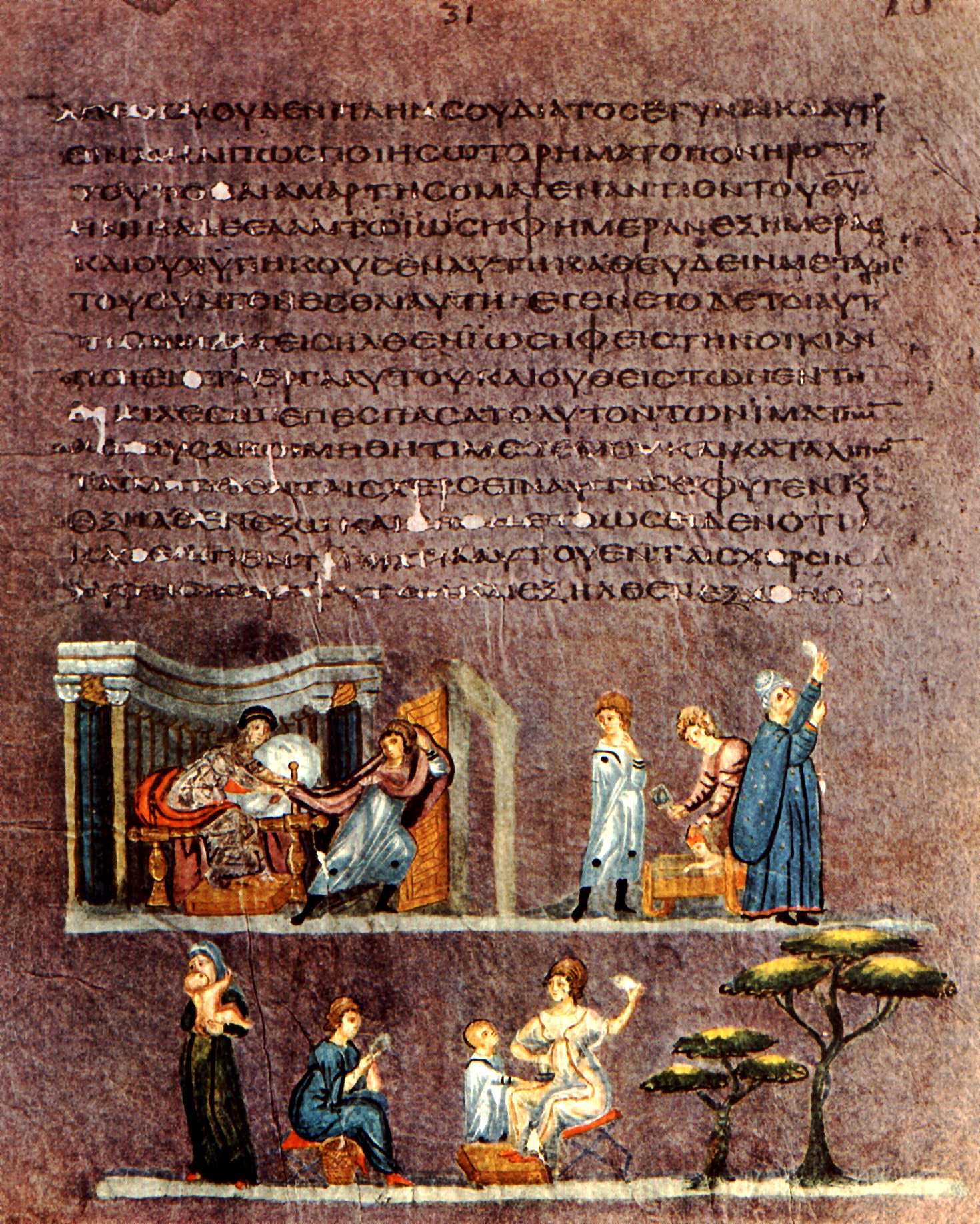
Just take a gander at some of these beauties from the early history of books, when they were codexes, barely out of their puberty papyrus phase….

This page is from the ‘Vienna Genesis’, which scholars date to mid-sixth century Syria.  It is a gorgeous  PURPLE dyed codex with silver writing.  It demonstrates how sixth century books were not merely illustrated, they were also color coded!   Purple meant that you were rich and brown meant that you had spilled beer on your book during the last round of Byzantine festivals.  This page shows the temptation of Joseph with that slut Potiphar’s wife, which landed him in prison :/  And then landed him in the position as Pharaoh’s go-to Grain Guy, which eventually led him to place a silver cup in one of his brother’s sacks (which is less weird than it sounds…).  If you don’t know the story, you should read it!  In terms of biblical narratives, it takes up thirteen chapters in the book of Genesis and sets up the conditions of the Israelites in Egypt which forms the kickass sequel to Genesis….the book of Exodus!!

But moving on in our history of awesome picture books….

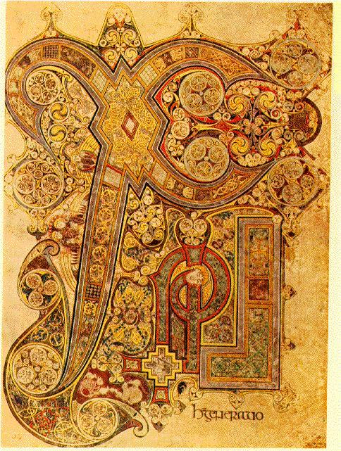
Chi Rho Page from The Book of Kells
Chi Rho Page from 'The Book of Kells'

This is the ‘Chi Rho’ page (the two Greek letters that spell the nomina sacra for ‘Christ’) of the Book of Kells which dates to roughly 800 AD (or possibly earlier).  In addition to beautiful Chi Rho pages such as this, the entire work contains other similarly adorned pages full of animorphic figures and colorful Celtic interlace designs.

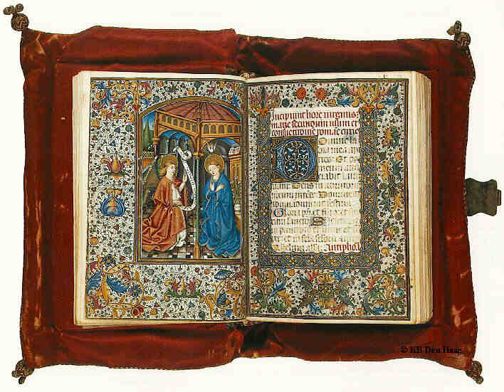
Jumping ahead six-hundred years, we stop upon a book of hours, which was a type of devotional book used by medieval Christians.  This one is from Valencia, but was most likely produced in a French workshop in the fifteenth century.

I have GOT to get me one of these!
"I have GOT to get me one of these!"

Jumping ahead three hundred years, we come upon the watercolor poetic works of William Blake, who was not merely a stellar poet and storyteller, but was also an excellent watercolor artist as well.

Poem and accompanying illustration for The Lamb from Blakes Songs of Innocence
Poem and accompanying illustration for 'The Lamb' from Blake's 'Songs of Innocence'

Yet another instance where illustration meshes with text in a beautiful way.

There are countless other instances of illustrated works throughout the history of manuscripts, print, and literature.  My charge to you (if you think you are currently creating the next great piece of literature) is to take the pictorial plunge and add illustrations!  We live in a visual culture.  And who knows?  Maybe now that we’re out of the prime age of watercolor and illuminated manuscripts, perhaps it’s time we started using vectors and programs like Photoshop to make our literature both intellectually and visually appealing again.