Hi Everyone!
I’m back again this week’s topic: Design Inspirations!
So, I’m curious, what things or what places would you guess we as aspiring designers get our ideas (please don’t say “your mind” or anything of the like)?
Take a moment, think THINK, give a guess?
Well, I’m going to give an educated guess about your guess, and say that you most likely said something along the lines of something on this known universe!! Like, famous precedents of the past, or perhaps a current proposal from a starchitect? Or even mundane, everyday objects? Experiences from our own memories? Or maybe even something that happened to us, almost as though in parallel to Newton being hit in the head by an apple?
So, this is gonna sound lame, but I’d consider all of the above as listed, as a partially right answer. I mean, we’re still humans, and we draw our ideas from live experiences from our human minds, so yes, all of the above could serve as points of inspiration, since they are all valid sources of Earthly experiences that can feed into our designs.
But, I say partially, because, all of those things are just the factors that serve more like kick-offs to further ideas into our designs. In other words, they’re like the lighter to firecrackers- they serve their single purpose to ignite the flame, and the rest of the party happens a few moments later, after having had time to absorb and chemically react to the ignition.
***
As a design student, we are often given a relatively detailed yet open-ended prompt to give us some context and general guidelines for the proposal that we are to make. Usually, I read it over a few times and look into any words I find confusingly used or I’m unfamiliar with, then try to interpret the prompt as concisely as I can in my own way, as I often find this to be the best way for me to understand what is expected of me and narrows down my scope of research for inspiration for my proposal!
In my current studio, we are doing a partnered project and our prompt is to make a facility to allow for the storage and display of artwork/artifacts primarily, but we are free to add any additional programs as we see fit.
My partner and I came to a compromise and agreed that our proposal is to make a facility that primarily functions as storage for artwork and artifacts of any medium and size (with just the limit that it must be able to fit within our site, and estimated square footage), and it would be able to accommodate for pop-up exhibitions through proactively interactive elements from the infrastructure of our facility.
From this, our first assignment (under this overarching project) is to (as best) clarify and demonstrate our first-pass ideas to actually build such a facility. We call this phase another research process, where we gather what other information we need, and create concept drawings (usually quick sketches) to communicate our thoughts in how we imagine as “answering” this “question” of how to make a storage facility that can also have interactive elements that change the building’s function from storage to pop-up exhibition. And these concept drawings then lead to concept models, also known as sketch models, which are usually pretty ratchet, and serve as a first attempt for us to literally get our hands on our ideas, and it shows us what does or doesn’t work, and usually also functions as yet another source of inspiration for more of ideas, which then lead to an ongoing cycle of creating other concept drawings and concept models.
Usually, what happens after this is, we present our ideas through talking with our studio professor about the idea, showing him our concept sketches along with that, showing him our concept model(s) and then explaining what elements of our ideas worked/didn’t work from those first-pass models. The professor would then usually reword the purpose of your proposal, to verify that we are on the same page of what ideas we are trying to portray. Then, he will critique what you’ve just showed to him, and when things can be done differently to be more effective, he will suggest his own ideas and even insight on how to make such amendments to our initial ideas. Sometimes, this can be pretty frustrating and end up in tears and torn up models and drawings, and you end up pursuing a whole new idea. Other times, we get the “okay” and continue to build upon it, revising drawings to make them ultra-clear to read, and building further models if necessary to clarify or experiment on a specific topic from those previous models.
***
So, my partner and I each decided to make our own study models over this weekend (since we agreed that we may each come up with interesting elements that we can then combine to create a perfectly partnered proposal afterwards).
I chose to tackle our proposal by brainstorming three potential methods for the storage infrastructure to become pop-up exhibitions. I asked myself, how can I create something that can assume both identities as storage and interactive exhibition spaces? Naturally, I went on Pinterest, and got hooked on images of origami til parametric architecture; essentially the idea of folding elements to create a new object and or space- I was envisioning elements that could be folded to save space, but also add elements of surprise to the space, especially if they could be reconfigured, or we play with different colors, textures, or materials.
And I came up with these three ideas, initially concept drawings, where I attempted to sketch what I was imagining, and then going back, scrutinizing that chicken scratch of a sketch, and writing down possible logistics on what would help it to function, and what would keep it from functioning well. In the image below, you can see I attempted to give each idea a sort of summary title (which helps to keep me focused on what the sketch should be and what purpose and elements it should have).

Then, I proceeded to look upon my leftover materials, and made decisions on how the heck I would construct a rough model to display these ideas best.
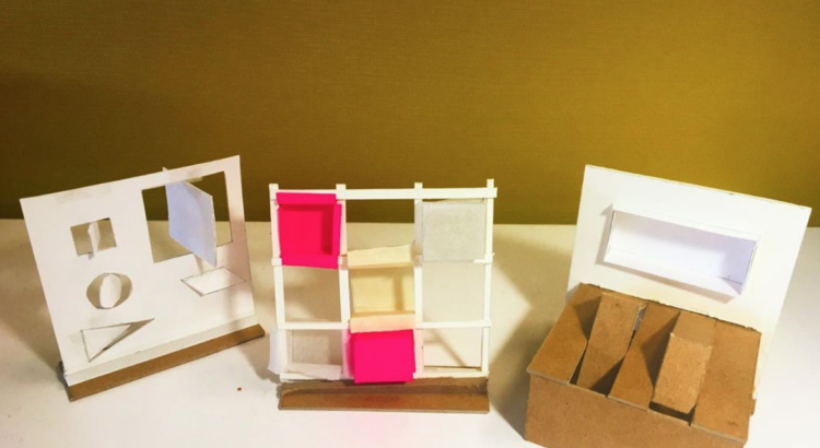
This is my first model (see below), which corresponds to idea #3 from my sketchbook, and I chose to just use Bristol- kind of like a fancier cardstock. I chose this because I like the clean look of white paper, but also it is a relatively easy-to-cut material that’s cheap, and that was really all I needed because I was just looking for a way to convey my ideas in the most affordable and decent-looking way possible! It’s a bit gnarly, but it serves its purpose (and ironically, it’s sometimes the ugliest of models that inspire the critics most haha).

The second model (see image below), which is meant to display concept sketch idea #2, I decided to construct from a mix of thinly sliced4-ply museum board, a hot-pink post note I found chilling around my desk, masking tape, regular tape, some white sewing thread, and scraps of trace paper. I was shooting for different materials that could suggest different materialities, and it was also just me trying to get a handle on how to best create these forms while attempting to maintain overall stability of the standing model.

Lastly, the third model (see below), corresponds to idea #1 of my sketches, and I decided to use a mix of scrap pieces of 3-ply cardboard, 4-ply museum board, and some bristol scraps. I was simply aiming for stable materials that wouldn’t be too much of a pain to cut and scour for folds, and they would be able to stand alone when re-positioned or refolded during demonstrations.

As you may have noticed, I took as best photos as I could of these ratchet models, not just for my own enjoyment as a photographer, but also since they serve as documentation for future mentions in portfolios, and I’ve learned the hard way that anything (drawings, sketches, mental mindset, etc) you bring to a critique can be drawn over or torn up for the interests of pursuing another idea off of your initial ideas!
***
I’m a little nervous and excited to present these to my partner, classmates, and professor in class tomorrow, but I’ve sort of gotten used to this feeling, as these kinds of assignments happen all the time for class.
But thanks again, to all of you, who took the time to read all the way to this exact line!! I hope you enjoyed my insights! If you have any questions or comments, feel free to respond to this post, and I’ll be so excited to read it! And if you’re interested in seeing more of my work, in and out of the studio, give me a follow on instagram: @themichiganarchitect!
Ciao 🙂


