REVIEW: Digital Engrams by Gabriela Ruiz

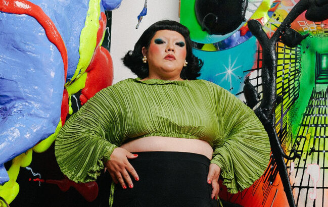
L.A. artist Gabriela Ruiz is a self-taught multimedia artist whose sculptural pieces blur the line between the virtual and the real. I watched Gabriela talk at the Stamps Distinguished Speaker Series earlier this month and I was immediately captivated by her distinctly Gen Z artistic voice. Ruiz is unafraid to confront questions that are still emerging in our culture, such as: what does identity look like for digital natives? Decorated in vibrant colors, lush textures, and a tangle of animated pixels, her art captures the experience of being online, particularly the struggle of navigating memories and identity amidst virtual chaos.

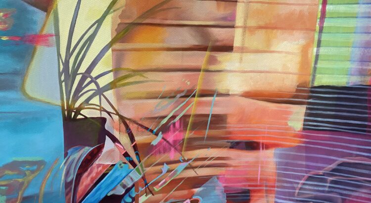
An engram is a trace of memory; a digital engram, then, is a memory stored in an artificial code. Digital Engrams is an exhibition tucked into the Institute for the Humanities Gallery, occupying one beautiful room. Red walls drench the space in color, contrasting against the bright greens and psychedelic lights of Ruiz’ geometric sculptures. Built into and around the sculptures are swirls, soft grassy forms, collages of screens, and interactive audio-visual tools, forming an immersive experience that teeters between the natural and unnatural. Not only is her work multimedia, but it is multidimensional— it is in two, three, and four dimensions, containing everything from time-based media to stationery sculptures. It’s a satisfying installation because of the sheer variety of forms Gabriela Ruiz incorporates into the space.


As I walked around the space, watching the screens’ surreal montages and cryptic messages, I felt immersed in the hypnotism and strangeness of Ruiz’ digital world. The colors, textures, and sounds were overstimulating in a way that was familiar, echoing the feeling of everything happening all at once in digital space. The decontextualized montages and projections lend the exhibition a feeling of absurdity and disorientation. Still, these feelings are overwhelmed by fascination; I resonate with the organic, grassy forms lying near the digital structures because I am always trying to reconcile my “organic” identity with my digital identity; I resonate with the confused chaos and ephemerality of the mosaics of screens, representing moments passed and immediately forgotten but always preserved in a web of data; really, I resonate with Ruiz’ ever-changing sense of belonging in a world of overstimulation and non-stop movement.

My only complaint about this exhibition is that it isn’t bigger— I would have loved to explore an even larger room, a maze full of abstract structures and glitchy footage, as if exploring the depths of Gabriela Ruiz’ mind. I personally believe it is hard to make art about the digital world without the vastness and clutter of it drowning out the meaning; Gabriela Ruiz, on the other hand, approaches the subject beautifully. Her art is abstracted enough to be open-ended, simple enough to be digestible, and just colorful enough to be entrancing without being nauseating. She finds the balance between the tangible and the digital, creating a physical map of a futuristic generational struggle.

Digital Engrams by Gabriela Ruiz is a free exhibition at the Institute for the Humanities Gallery at 202 S. Thayer. It can be seen through December 8th and is open 9-5 on weekdays.

REVIEW: The Silence of the Lambs

Every so often, the Michigan or State Theater will screen a classic— last Thursday, it was The Silence of the Lambs, the quintessential 1991 psychological horror, directed by Jonathan Demme and starring Jodie Foster and Anthony Hopkins. I went into the screening without any expectations, knowing only that the film involved a cannibalistic serial killer fittingly named Hannibal and I could probably expect gore. The horror was done incredibly well, but the genius of The Silence of the Lambs is that the gore and terror of murder were only a fraction of the film’s emotional appeal. Demme fills each scene with the psychological unease of reality as the story follows an FBI trainee, Clarice, who is constantly shown to be looked down upon or disrespected because she is a woman. The script declares this outright with creepy remarks from higher-ups and even from Hannibal himself, but this is also accomplished with careful framing: throughout the movie, close-ups force us to stare into the eyes of men as Clarice sees them, hauntingly blank or grotesquely hungry, eyes either pointing condescendingly down at the camera or unnervingly straight into our own. Clarice is often alone, often being hit on or disregarded by serial killers and FBI agents alike, and cannot avoid it despite her skillful maneuvering of misogynistic encounters. This inspires a very real fear rooted in our awareness of her vulnerability. We’re quick to doubt the intentions of the film’s men— which is where the character of Hannibal becomes complicated, who should be the easiest to distrust.

Clarice and Hannibal are expertly crafted, and their relationship keeps us on our toes. Close-ups of Hannibal, played perfectly by Anthony Hopkins, reveal his sunken features, his icy and unblinking stare, and the sense that every word is part of a secret, sinister plan; close-ups of Clarice reveal unwavering confidence and sly intelligence. The interrogation scenes between the two are laden with tension and electricity, the investigation unfolding to be double-sided as Hannibal and Clarice race to break each other down. As the film progresses, this relationship becomes tangled and unclear; despite being the most clearly deranged and untrustable character, Hannibal treats Clarice with more respect and curiosity than the rest of her peers. The psychological horror of the film lives largely in this relationship as we struggle to decode Hannibal’s intentions and predict his next move.

The Silence of the Lambs is evenly polished: the score is haunting but not overbearing, each scene is intentional, and moments of crude humor balance the gore. I can see how this film earned so many awards and became a classic— it has a cinematic simplicity familiar to the 90s, attaining the perfect balance of explaining some while leaving some to the imagination. Besides the more fast-paced third act, our fear relies on insinuations about what happened or what’s going to happen, close shots of corpses and bloody nail marks down a wall. The only point of the film that left a sour taste in my mouth was the film’s handling of Buffalo Bill, a serial killer who believes he is transgender and who multiple characters claim isn’t truly transgender, but rather psychologically confused and tormented on a more complex level. As much as Buffalo Bill is distanced from the transgender community, described as obsessed with transformation and envious destruction rather than conventions of gender, his portrayal aligns too closely with common stereotypes about transgender women being deceitful predators. The social commentary is fitting for the time of its release, and it is nuanced, but given this film’s insane popularity, it’s inevitable that some audiences would fit this portrayal into pre-existing biases and fail to critically analyze the character.

I loved the experience of watching this movie for the first time in a small theater; the audience was visibly excited, gasping at gory shots and laughing at absurd one-liners. The big screen amplified the intensity of close-ups and the architecture of the old theater amplified the nostalgia of the early 90s. Keep your eyes peeled for the next screening of a cult classic in downtown Ann Arbor, and keep a weekend night open so you can catch one; student tickets are only $8.50!

REVIEW: girlmuseum

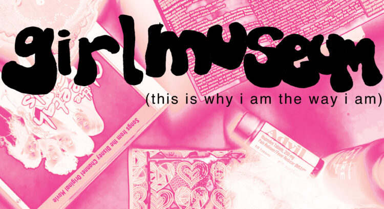
On September 21st, from 4:30 to 7 p.m., the Stamps Gallery on Division St. hosted a student-led exhibition called “girlmuseum”.  The exhibition is part of a class led by Andrew Thompson called “Gallery As Site for Social Change”, in which students collaborated to make multimedia projects for a temporary gallery space. Although many Stamps classes are collaboration-based and place emphasis on the power of interweaving imaginations and different perspectives, it’s not common to see these collaborations outside of the Stamps building. This work was also advertised a bit better than other Stamps exhibitions I’ve seen, as I received emails from faculty members and gathered flyers that showed off the exhibition’s nostalgic and girlish themes.

girlmuseum was located in the atrium of the Stamps Gallery; the small glass room created an atmosphere of openness and warmth, as the evening light bathed the pieces in color and enhanced details like dazzling embellishments and silky textures. The first thing I noticed was the coherent theme connecting all the pieces, all contained in a manageable space, while each piece still retained its own individuality and personal message. All the multimedia pieces acted as artifacts from girlhood, showcasing mementos from the pains, joys, and imaginative flairs of femininity. Bubbly pop music from the 2000s played as you walked through the gallery, creating a multisensory experience, and pieces were draped across the ceiling and tucked into corners to create a highly engaging space.

Two pieces that represented shrines of some sort flanked the entryway, and I found myself absorbed in the objects they held. Hannah Montana and One Direction CDs spoke to the nostalgia of my earliest childhood obsessions, and handmade wallets and beaded necklaces brought me back to a time of uninhibited creation when arts and crafts were ruled by bright colors and exploration instead of self-scrutiny. Some objects are seemingly more humorous or abstract in meaning than others, like a packet of silica gel hanging next to a patterned headband, and some carry dark or mature connotations, like objects referring to pregnancy and sexuality. I found myself connected to all of it, weaving together vague memories and nostalgic girlhood to create a full understanding of this somewhat universal experience for femme-presenting people.

Other pieces were more focused on modern social commentary, but their structure was still undeniably playful. A silk slip dress was bedazzled with cursive letters that read “I am made & remade continuously”, investigating the turbulence of having a feminine identity; multiple sculptural pieces were made from combinations of children’s figurines, fabrics, and found items, presenting miniature scenes that appear playfully absurd yet speak to age-old or brand-new ideas of gender. A banner draped across the ceiling— requiring that you crane your neck to even realize its presence— contrasts against the frills and fun of everything else, covered in all-too-common sayings that degrade, underestimate, or deny the worth and strength of girls.

girlmuseum was a testament to girlhood in all its glory and its suffering— from its excesses of glitter and playful creation to its paralyzing self-doubt. I was amazed by how interconnected the pieces were, all different enough to contribute a new dimension to the overall theme. This exhibition made me so much more excited for future Stamps exhibitions, and I especially hope to see more collaborative exhibitions in the near future. I recommend checking out the Stamps Gallery on Division St. whenever you are able— regardless of what they’re showing, it is always incredible to see the diverse talent of students, faculty, and professional artists.

REVIEW: Figment/Fragment: 2023 Stamps Senior Exhibition

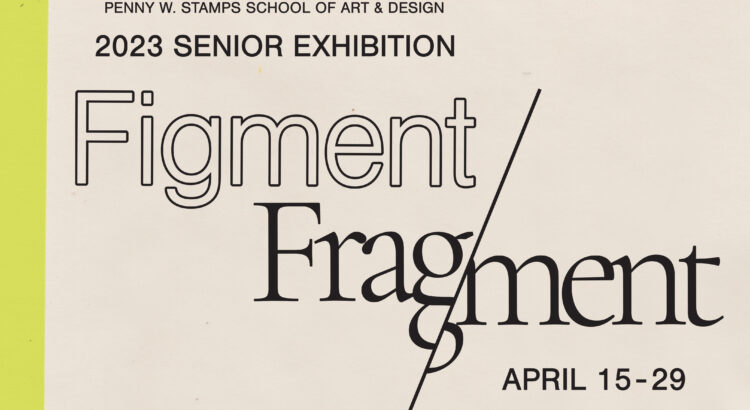
The annual Stamps senior exhibition, Figment/Fragment, is a showcase of the year-long work of seniors at the Stamps School of Art & Design— “Art & Design” encompassing just about anything and everything you could imagine within those spheres, from 4D installations to traditional painting to wood-cut prints to dirt collections. The exhibition is arranged within a massive maze of large cubicles, each cubicle holding the work of one student, arranged neatly and creatively within a few square feet. As you could imagine, the experience of the exhibition is just as diverse as it is impressive. The work is symbolic and experimental, often exploring aspects of the artist’s identity in an unconventional process and molding together multiple mediums. The space echoes with the sounds, lights, and moods of each work, waiting to be explored.

I was particularly captured by the work of Alyss Munson, titled Dreams Ashore. Their surreal work draws together the concepts of the human experience and technology, through overlapping mediums of printmaking, weaving, and oil painting. The multimedia work explores the complications of modern identity through oceanography and marine life motifs, situating the subject in vast open water and ocean-floor ecosystems. It may sound like a lot, but like the work of countless other Stamps seniors, Alyss Munson has a way of expertly tying together far-reaching concepts, forming a beautiful and comprehensive mosaic of their artistic identity.

Another work that struck me was Multifaceted by William Mizer. He explores trauma and healing through these layered, transparent film photographs, portraying black-and-white portraiture and abstract scenes as narratives building on each other. I found this medium to be completely new to me, and I was intrigued by the way the layers of film interacted with each other, forming a narrative— and also intrigued by how he had reached this medium as the most ideal mode of expression. I was blown away by the creativity within each space.

Michelle Knappe’s Will You Sleep With Me? took the form of a life-like bedroom, complete with a bed, nightstand, and miscellaneous objects. The artist encourages the audience to walk through the space and interact with the bed and hand-made quilt; themes of isolation and human connection are communicated through the audience’s interaction with and perception of the quilt, which reveals delicate motifs sewn into its underside. I found that exhibitions like this, which encourage the audience to immerse themselves and explore, caught my attention the most.

Figment/Fragment was a beautiful display of the diversity within Stamps— the diversity of stories, of identities, but also of creative modes. I left the exhibition feeling more inspired to experiment and express myself without the bounds of genre or medium.

The exhibition is free to attend and easily accessible within the Stamps building! Figment/Fragment runs through the end of the month, so be sure to stop by and browse the student work if only for a few minutes! I especially encourage U-M students who haven’t seen Stamps artwork in person to attend— there is so much talent within this school, and it gives me so much pride to see it on display. 

Featured image: I’m Home Here by Caitlin Martens

PREVIEW: Figment/Fragment: The 2023 Stamps School Senior Exhibition

Last year at this time, I attended the 2022 Stamps Senior Exhibition. The range of mediums, subjects, and talents was astounding— there was every kind of artwork imaginable, from paintings to animation to interactive 4D exhibits. The Stamps school, in my personal opinion, does a subpar job of promoting student work; the walls and display cases are often empty, and the senior exhibition feels hidden away and not adequately promoted despite being held in the largest room in the middle of the Stamps building. As a Stamps student, too, I’m excited to attend student work exhibitions, but fellow students often either don’t attend or aren’t aware of the exhibition.

Last year’s exhibition blew me away— the exhibition space was an endless maze of large cubicles, each displaying the refined and deeply personal work of Stamps seniors. I loved how each student presented wildly different ideas, in wildly different forms— from found-object sculptures, to video game designs, to walls covered with curated images and sketches, sometimes incorporating sound or touch, or video. It was inspiring to see each personality shine through the work.

This year’s exhibition, titled Figment/Fragment, is bound to be just as exciting! It’s open from 11am-5pm on weekdays, and it runs through the end of April. There is also a closing ceremony at the end of the month— but, really, if you could stop by any time before it closes, it’s sure to be a worthwhile experience. It’s also a great way to connect with fellow U-M students and appreciate the endless talent of our campus community, which deserves a spotlight.

REVIEW: Survivors Saving Survivors: Photographing the Ukrainian Refugee Experience in Poland

Chuck Fishman’s recent exhibition of work, titled Survivors Saving Survivors: Photographing the Ukrainian Refugee Experience in Poland, is a portrait of love and not war. Fishman is incredibly talented at capturing this; his portfolio is full of waving public figures and energetic jazz musicians, exposing the subtle attitudes and tender moments behind distinct lifestyles rather than the suffering that plagues so much of the world. His work has been featured on the cover of many magazines like Time and Life, earning him a reputation as a recognizable and exceptional photographer.

This series of photographs was taken in mid-2022 in Poland, particularly in and around the JCC Krakow— the Jewish Community Center of Krakow in Poland, which provided endless support and resources to the influx of Ukrainians in the city— food, dinners, events, beds, et cetera. Because there was no wall reading to introduce the context of the exhibition, I gathered information about JCC Krakow’s central role in this crisis by reading the plaques beside the pictures. That is how I pieced together the meaning of Survivors Saving Survivors— Fishman is referencing the historical suffering of the Jewish community in Poland and their empathetic support for another group in crisis.

The portraits themselves weren’t very telling about the context of the situation, but they are intricately emotional; one image shows a mother with a tired expression gently comforting her children while they wait their turn outside the JCC distribution center, and another depicts heartwarming smiles between Ukrainians at a community dinner. Each moment is tender, disconnected from the chaos, but still subtly pulled by it— children playing joyfully in a too-empty playground and smiles dampened by a dissociative gaze. Every image frozen in time, although captured in an age of war and instability, represents the indomitability of the human spirit. Chuck Fishman doesn’t attempt to draw distinct lines between the Jewish and Ukrainian communities but rather depicts them as one entity in mutual solidarity— existing together through a shared experience and drive to repair.

The gallery space itself is small, just a single room with art on all 4 walls. It was manageable, though, allowing me to linger on each image longer rather than feeling rushed through it, especially taking in the differences between the photographs. All subjects were different, and locations were different too, meaning the context of one image didn’t necessarily carry over into another. This complex and human-focused approach to photojournalism is refreshing because it does not paint survivors of war as mere subjects of pity— instead, they are multi-faceted, ordinary people, attempting to build some semblance of normal life under strange circumstances. Strange is what Fishman seems to be getting at, yet in a more optimistic than pessimistic way. It is strange, he seems to be saying, that people will persist through anything, and especially persist with each other. It’s a beautiful strangeness.

The exhibition is running through the end of April! It is showing on the fifth floor of Weiser Hall in room 547. It’s right next to the Central Campus Transit Center, free, and open to the public, so make sure to stop by and see some talented work before the end of the semester!