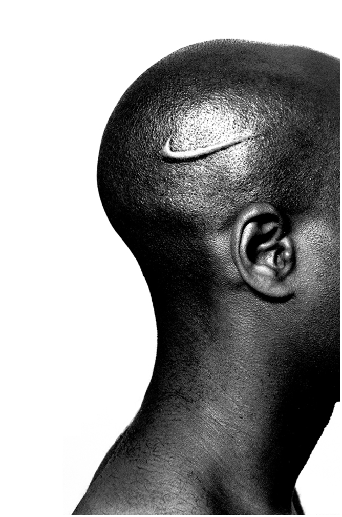
REVIEW: Stamps Speaker Series- Hank Willis Thomas

Prior to tonight’s lecture I knew little about Hank Willis Thomas aside from the fact I had seen and been particularly struck by one of his pieces in the Detroit Institute of Art.  I had no idea what a treat that night would be.

When Thomas walked out onto stage in a still brightly lit theater, phone clutched in hand, I’m sure many of us were unsure what to think. He said he then wanted us to start off the night with a collaborative project, to take a picture of a stranger or friend sitting nearby and post it on social media with the hashtag “#thetruthisIloveyou.”  You can find a smattering of these photos on his twitter account here.   This immediately set the tone for the overall optimistic and hopeful presentation, despite the dark subject matter.

Hank Willis Thomas and his Mother

After this brief activity, the lights were dimmed and Thomas started his presentation by introducing the audience to his mother, a talented photographer herself.  He told us about how his mother was once told by a college professor that she, as a woman, was taking up the space of a “good man.”  She carried those words with her for the rest of her life, but in spite of that professor, she has gone on to publish books well into the double digits and is currently a professor at NYU.

He then transitioned smoothly into talking about his own development as an artist.  Thomas said that he had not originally planned to become an artist, but rather fell into the role after his close cousin was murdered in 2000.  Finding himself lacking motivation and drive, Thomas eventually found his way into the artistic field.

An image from a sweater ad

He then took us chronologically through the various pieces and series that he has done. He began to talk about his fascination with framing, and how the theme of frames showed up in many of his college works.  He also produced the B(r)anded Series in which he explored the African-American male body in relation to popular brands and advertisements.   He was particularly fascinated with taking advertisement and stripping away all of the words and identifying information to let the images speak for themselves.  He showed us the various depictions of women throughout the last century, first showing the image and then making his audience guess what the ad was actually for.  It was an eye-opening and sometimes chilling experience.


He then talked about this idea of reformatting images and advertisements so that they can be viewed in a new way.   He would find photos that particularly resonated with him, often of apartheid South Africa, and then find a different way to frame those events, often through cast sculptures where only parts of the original photograph will be shown, leaving the viewer to fill in the rest of the information.


Lastly, he finished up the speech by showing some of the video recording from people across the globe for the  “The Truth Is” traveling project.  This project involved a recording booth shaped like a giant speech bubble that simply says “truth” that was then placed in high traffic areas. Civilians were invited into the booth to record a short video telling what they believed “the truth is.”  One of the most touching and heart wrenching videos, especially because of the recent developments in the news, was of a little boy not even 8 years old who wanted to share the truth that Muslims, like him and his family, were good, peaceful people.

One of the most inspiring things about his presentation, was how captivating of a speaker Thomas managed to be.  He managed to be calm and yet passionate at the same time, providing a wonderful and entertaining balance that still remained informative.

When Thomas finally walked off the stage, there were whoops and cheers scattered among the fervent applause, making this the warmest and most enthusiastic sendoff of any speaker I’ve seen here yet. True to this reception, the Q&A session was the most well attended that I had seen so far, while still remaining fairly small and intimate in the Michigan Theater’s annex. Thomas got to answer questions ranging from his work, to his history as an artist, to his political views.

You can find out more information about Hank Willis Thomas at his website. The STAMPS speaker series is free to the public and is offered every Thursday at 5:10 at the Michigan Theater.  You can find a full list of the upcoming speakers here. 

Photo Sources- 1, 2, 3, 4, 5


REVIEW: Stamps Speaker Series- Joe Sacco

I had heard rumblings that the night’s guest would draw a larger crowd than usual but I wasn’t prepared for how large the crowd might be.  As we filed into the theater from the packed lobby area, it was difficult to find an ideal seating spot. This presentation was co-presented with the University of Michigan International Institute’s Conflict and Peace initiative, and the official Stamps website contains a full list of the sponsors for the night.

Tonight’s event was not a formal speech, but more of an open discussion between the guest Joe Sacco and a host from the International Institute’s Conflict and Peace Initiative.  As the discussion proceeded different images of Sacco’s work were projected onto the screen behind them, and while switching from photo to photo could be highly distracting it was a nice visual supplement to the presentation, and often was used as a conversation point.

Joe Sacco, as we gradually came to know throughout the course of the talk, had originally received a degree in journalism at the University of Oregon, before finding that creating comics was both a way to indulge in his passion for art and to reach a wider audience that are put off by long history books and dense articles.  He approaches his subject matter in the same way a war correspondent might.  He traveled the world, and his very first comic, Palestine, was directly based off of his personal travels through Israel and the West Bank.  Some of his award-winning works include Footnotes in Gaza, Days of Destruction, Days of Revolt and Safe Area Gorazde.  He is highly regarded by comic lovers and news junkies alike for his careful research and thoughtful approach to delicate and politically charged subjects.

When asked what inspired his work and the topics he chooses to work on, Joe Sacco responded quite succinctly that anger above all else was the driving force behind his comics.  He looked for topics that created a sense of frustration or injustice in him, and just as importantly ones that he would maintain a passion for the many years that it takes to finish a single piece.  He also discussed his dislike of the word “graphic novels,” because of how his works are not novels despite fitting under that subcategory.  He admits, however, that the word is here to stay and will use it himself when describing his occupation to others.

One of the very first panels from “The Great Wall”

One piece that was discussed quite thoroughly was Sacco’s 24-foot-long graphic tableau “The Great War.”  Sacco spoke briefly about how fascinated he was with World War I while growing up in Australia, where that war takes up a large part of their cultural identity.  His inspiration for this specific piece was The Bayeux Tapestry, and he wanted to create a similar narrative scroll that told a story when read from left to right.

middle segment of “The Great War”

As an artist, I also found the discussion of the artistic styles to be quite interesting.  Sacco talked briefly about his upcoming project and how he will be turning traditional comic styles on their head in order to better convey the meaning and message that he wants to.  He’s working on a project about the indigenous peoples of Canada, and as such is experimenting with creating comics with no borders and an aesthetic style that focuses heavily on nature and natural forms.  He believes this will better fit the ideology and tone of the work itself, as the groups he will be focusing on have a specific way of thinking about nature.

Panel from his book “Days of Destruction, Days of Revolt”

As the crowds streamed out of the theater and into the brisk night air, we were once again greeted with live music.  A long line of people waiting for autographs trailed up the staircase to the second balcony, further proving the popularity of tonight’s speaker.

If you would like to check out more of Joe Sacco’s work you can purchase many of his books from amazon here.  The STAMPS speaker series is free to the public and is free to the public and is offered every Thursday at 5:10 at the Michigan Theater.  You can find a full list of the upcoming speakers here.


pictures from- 1, 2, 3 


REVIEW: Athi-Patra Ruga- Penny Stamps Speaker Series.

img_3197Tonight’s choice of organ music was none other than “Over the Rainbow,” from the Wizard of Oz, a fitting tune considering featured guest Athi-Patra Ruga recently put on a show of the same name. Ruga framed his lecture by talking about self-made superheroes, these characters or rather, avatars, that he has both created and embodied to deal with past traumas. These figures have become the central focus of all his varied artistic ventures throughout the years.

performance1One of the very first avatars he created was “Miss Congo,” who he describes as a “club kid.” At this time he took up tapestry work, saying that he would prefer to define his own fate, and his own story, rather than let others do so for him. In particular he wanted to explore the way that black women have been portrayed at art.

The next character he explored was “Injibhabha,” which translates from his native language of Xhosa into alopecia, or hair-loss, in English. This character was created directly in response to a specific incident that occurred in his life.  Ruga had been in Switzerland when he saw a poster featuring cartoon white sheep kicking a cartoon black sheep out of the country, with the message promoting “cleaning up” the country by forcing immigrants out of the country.  He had built up in his mind Switzerland as a kind of utopian space, but in this moment it all came crashing down.  He did a piece of performance art in which he dressed up as this avatar by sewing together an outfit of “costume afros,” and entering a pen of white sheep.  He continued to experiment with this avatar for a while, and some of the photos he took at this time of Injibhabha are placed below.

The Death of Beiruth

The next character he began exploring was “Beiruth,” which was made in response to a news story covering a South African woman that had been attacked by a man in a taxi for simply wearing a miniskirt.  Beiruth was meant to be hyper sexualized, and create an immediate reaction in those that come across her.  However, eventually the weight of these issues began to wear on him, and so he “killed off” both of these characters with a dramatic photo of Beiruth standing in front of the crashing waves.

screen-shot-2012-11-28-at-1-13-59-pmHis next major avatar was “Ilullwane,” which refers to a bat, or in the context of his culture, a boy who goes to circumcision school as a rite of passage. Many young boys would die because of infection and ill treatment during this process, and those who leave the program would have to face heavy social stigma.  He wanted to create a “superhero” that would provide inspiration for these young boys. This idea led to several other interesting works.  One of which being, “The Body in Question.”  He showed the video below during the presentation.

With this series he hoped to raise awareness about transgender rights. One of his more elaborate works with the avatar of Ilullwane involved a performance act in an Olympic-sized swimming pool and 12 synchronized swimmers.  The photo gallery below shows just some of the images from that performance.

night-of-the-long-knives-i1The most recent of his series is “The Future White Women of Azania.”  Azania is a word used to reference the East African coast line since at least 14 AD among the Greeks.  The major motif of this series is Ruga’s body entirely covered in balloons, and by popping these balloons he is “shedding his identity.” This project is ongoing, and he continues to find new ways to explore this series, already producing everything from sculpture to photography to textiles.installation-view4


The presentation ended with the premier of Ruga’s new video, “Queens In Exile,” which marks the start of yet another character. The video started out with Ruga dressed as a queen, with extravagant jewels and costuming.  The video took us through several distinctive sections before ending with the shot you see below.  You can see a clip of the video, and hopefully eventually the full video on Ruga’s Facebook page. https://www.facebook.com/AthiPatraRuga/

15032088_1260688283972649_6935085702406669574_n

I also got a chance to attend the Q&A session immediately following the presentation.  Nearly every lecture has a Q&A session, and I’ve always found them to be tremendously enriching. This time Ruga discussed in further depth his thoughts on the recent US election, the current trend towards conservatism globally, his process for getting into character, and the influence the internet has had on his life and work.

The Stamps Speaker Series is held every Thursday at 5:10 PM at the Michigan Theater.  There are only two more presentations this semester, but the series will pick right back up next semester.


REVIEW: Fred Gelli- Penny Stamps Speaker Series

The night opened up like any other Penny Stamps Speaker Series lecture, with lively organ music ushering the crowds into the theater.  An attuned ear might notice that tonight’s choice of music included none other than the Brazilian national anthem, fitting the esteemed speaker of the night.  Fred Gelli is an influential Brazilian designer and creative director of the design consultancy Tátil, most recently known for creating the visual identity of the 2016 Rio Olympics and helping plan the opening ceremony of the 2016 Rio Paralympics.

Gelli, through Tátil, has also worked with clients as far-ranging as Coca-Cola, Procter & Gamble, Walmart, Philips, Nokia and more.

img_3018

When Fred Gelli finally took the stage, the very first thing he mentioned was the beauty of Ann Arbor in the fall, pulling out a pristine orange leaf he had tucked into his front shirt pocket. This served as a perfect transition into a discussion of his primary source of design inspiration, nature.  He talked at length about how nature has already perfected design, outlining where he takes inspiration from items as mundane as fruit peels, and then uses these natural designs to solve very human problems.

img_3020He then went on to discuss his involvement in the 2016 Rio Olympics and Paralympics.  His design team had been selected from a group of 139 teams all competing for the same spot. First entering the crowded application room, he didn’t dare to dream that he and his team would be selected, but as the groups were narrowed down it looked more and more like his dream of designing the Olympics would become a reality.

Designing the logo for the Olympics was a huge challenge, as it will be seen the world over in nearly every form of media possible.  The final design had multiple layers of meaning.  It featured green, yellow and blue to represent the Brazilian Flag, it looks vaguely like the word “Rio,” and the shape of the logo was directly inspired by the natural landscape and mountains surrounding Rio.  The following video clip was shown during the presentation.

His team also had the privilege of not only designing the logo for the Paralympic games, but also orchestrating the opening and closing ceremonies.  He had chosen to work on the Paralympics opening and closing ceremonies despite being offered the Olympics as well because of the artistic freedom and relative low pressure it would provide. The following video is a montage of some of the best moments from these performances.

While Gelli may have quipped about English being his second language, following that up with “but I’m sure it’s much better than your Portuguese,” he was well-spoken throughout the lecture, eloquently giving us a peek into his creative process.

If you are interested in the Penny Stamps lecture series, I implore you to take a look at the upcoming lectures here.  http://stamps.umich.edu/stamps  They are held every Thursday at 5:10 PM in the Michigan theater and are free to the public!

REVIEW: Penny Stamps Speaker Series — Performance Animation

One of the many wonderful things about new technology is that it can lead to entirely new genres of art. Performance animation is one of those genres.

First, we were introduced to two blank screens. Then, a flash of light and color as animated landscapes splashed across the screens. A silhouette stepped into view, and we watched it interact with the buildings and plants and animals that appeared. At times the message was a clear narrative, while at others it was more of a series of dreams transposed on top of one another. If that makes the show sound trippy in any way, then good, because it absolutely was trippy.

Miwa Matreyek is a multi-talented artist currently on tour performing the two pieces that formed this week’s Penny Stamps event. “This World Made Itself” seemed to be more of a love story, although love was by no means the only theme. The juxtaposition of her gigantic form with a city skyline, and her interaction with a tiny animated figure, had strong allusions to King Kong.

img_20161006_173124

Her second piece, “Myth + Infrastructure,” dealt with the biggest themes possible: the birth and death of the world, modernization, death, life, and the interaction of mankind with the natural world.

img_20161006_174617


Time and again we watched Miwa swirl through bodies of water, capture and free flying insects, blend in and become one with the Earth.

Several times it was like a magic show. The audience and I reacted with awe when Miwa sprouted wings out of thin air and her arm melted away into a swarm of white petals. “How did she do that?!” the people next to me exclaimed as they recorded the performance for their Snapchat stories. I wondered the same thing as I too recorded a clip for my story.

Shows like this are rare opportunities, and I strongly encourage you to see the show in Ypsilanti on Friday, October 7 if you can.

You can get a small taste of the performance in this TED video here.

REVIEW: Julian Schnabel (Stamps Speaker Series)

"The Patients and the Doctors" (1978) by Schnabel
“The Patients and the Doctors” (1978) by Schnabel

Artist Julian Schnabel spoke on Thursday evening at the Michigan Theater. Industrialist Peter Brant joined Schnabel onstage and the multi-millionaire duo discussed the Julian Schnabel exhibition on display from early July until mid-September of this year before formally answering questions from the numerous members of the audience.

The audience was unsurprisingly enormous. The organ music ended before someone introduced the speakers. Schnabel and Brant walked onstage and the audience burst out clapping. Audience members seemed excitable and were presumably star-struck. Schnabel wore sunglasses and a comfortable-looking jumpsuit. The audience silenced as Schnabel repeatedly asked the management to dim the stage lights. The majority of the event took place in darkness as we viewed the prepared slideshow presentation.

The event was surprisingly interactive. Audience members randomly shouted out their comments, questions, and clarification requests; they posed such comments, questions, and requests without microphones and, consequently, the speakers often misheard them. At the end of the event people lined up in front of microphones in order to pose questions to the speakers in a more formal manner. Schnabel seemed simultaneously up-front and self-righteous in his interactions with audience members. Sometimes his answers would be either “I don’t know that” or “you should know that;” other times the artist refused to answer questions and insisted that his interrogators “figure it out.”

Artists require financial benefactors in order to achieve financial success. Much of Schnabel’s success stems from his personal connections as well as from his artistic talent. Schnabel debuted his career with painted-over plate fragments such as “The Patients and The Doctors” pictured above. Multiple layers and textures often add visual complexity to his work. Interestingly, Schnabel makes films in addition to painting; during the event, however, he admitted that he prefers painting to filmmaking. Painter, sculptor, and filmmaker Julian Schnabel is unafraid to experiment with a wide range of mediums and techniques. Most artists can draw inspiration from his artistic flexibility and his unabashed nature insofar as self-doubt and narrow-mindedness harm creativity.

Click here for Schnabel’s website.