REVIEW: The Draft

I was first introduced to The Draft exhibition by African-Canadian artist Esmaa Mohamoud just around a year ago.  I was far from the familiar, quaint Ann Arbor, in the bustling international hub entirely different country to be precise!  While that statement exaggerates what was essentially a weekend jaunt to Toronto, there is no exaggeration when describing how impressive this series of work was when I first saw it.  Thankfully our campus was bestowed the privilege earlier this fall to host Mohamoud’s amazing series of work, and I was eager to compare my experience viewing it in a local setting to how it was displayed at the prestigious AGO in Toronto.

When I first arrived, although the gallery door was firmly locked, I was officially within the 10am-5pm time period that the gallery should be open to the public.  Thankfully after quickly asking the front office about gallery they were more than willing to unlock it for me, so don’t be discouraged if you find yourself in a similar position.

The pieces were spread out between two rooms, with the first room being a dedicated space to show the exhibit, complete with both  various sculptures and photographs. The second being a conference room with three of the large scale photographs hanging on the wall. The space in the first room was very well utilized, with a low sculpture placed in the middle activating and working in harmony with the pieces around the room. On the other hand, while the large-scale photography works certainly elevated the conference room they were hanging in, I couldn’t help but feel slightly disappointed at how these meaningful photographs felt relegated to the same level as the generic abstract paintings used to spice up mid-tier hotels.


While I wouldn’t have guessed many of Mohamoud’s intentions with each piece without reading the description, her passion for basketball shines through in the way she handles this series.  As for what I did glean from the description posted outside, the series meant to explore themes of “gender, race, empowerment and disillusionment” within the world of basketball. The white, deflated basketballs in the main sculpture are meant to represent the 30 NBA draft picks every year and the rusted chain hoop is meant to “suggest the weird allure and enmeshment of the past.”  The photos of men in basketball jerseys and large ballroom-esque hoop skirts is a representation of Mohamoud’s complex feelings growing up as a girl immersed and in love with what was considered a “men’s sport,” and I also argue could be a statement on perceived masculinity in today’s sports world as well.

When the work was displayed in the AGO in Toronto, Mohamoud had the original models from the photographs in the series wear the same outfits and perform in the space.  While I was not able to attend the performance itself, I did get a chance to see the dress in person, which we were not able to display here at UM. I found this to be truly unfortunate as the dress was, by far my favorite part of her work.  It’s sheer size and volume are unable to be captured by the cropped photographs shown in the exhibit. Below is an image of the models wearing the dresses so viewers can get an idea of what they were like. While I would have loved to see one of the dresses on display in conjunction with the other pieces, I know that there were probably a long list of complications that kept from UM being able to do so, and the gallery space itself would have nearly been dominated by the dress’s physical size and presence even if it was somehow able to be displayed.

The Gallery is often rotating new and exciting exhibits, available right on campus free to students and the general public alike. The exhibit is the first door to your left upon entering the South Thayer building, and the building itself is directly across the street from the MLB and North Quad. Be sure to check out the upcoming exhibition as well, as the gallery is constantly rotating shows. I highly recommend taking the five to ten minutes that it takes to hop into the gallery any any day you need a quick artistic pick-me-up or shot of inspiration while walking around campus. 

REVIEW: RC Student Studio Arts Invitational Opening Reception

On a busy Friday the 13th, the Residential College’s art gallery opened its doors to show off several lucky students’ work. Granted, this exhibition is invitational and students were encouraged to drop off their works by their own hands, but we’re all pretty lucky to have this opportunity. All work from this exhibition is done by students taking RC studio arts courses and who have elected to show some of their work: ceramics, printmaking, sculpture, photography, and drawing. Individual works are not labeled, though a placard listing each contributing student rests among the artwork.

Even after four years at UM and several classes in East Quad, I’ve somehow never been inside this small gallery. It felt roomier than I expected, in a way that maximized the intimacy of the space. While I roamed around alongside a few other students, I still felt that I had plenty of time and space to admire the art on display.

Prints and drawings color the long wall and give it life. Several pieces were more political than others, though holistically mixing textures and adding to said life. A piece with a person stretching to reach their foot says “Let me live” beside a different piece shouting “The first pride was a riot” in stark contrast; a piece with an image of a gun and “Never again” sits above one of a mountain. I liked seeing how the creative minds of classmates look beside each other and how the individual pieces work into the whole. Despite so many different approaches, it all worked so well together.

From there, the gallery moves into sculpture and ceramics. A series of patterned blocks make a nice juxtaposition with a smooth and more organic-looking shape. Surrounding it, wire sculptures make shadows on the walls, reminding me of various works by Alexander Calder and their placements in other galleries. Mixed-media sculptures rest in the middle of the room: one being a sculpted human heart held up by wires attached to a three-dimensional frame.

Opposite the prints, ceramic vases and series give the walls texture among another color print and several black and white photos. I especially liked the glaze techniques on the smooth vases and the patterns that the artists were able to create — and I really loved the leaf patterns on one of them, with 3D ceramic leaves crawling around its rim. It was calming to view.

One of the walls of this gallery is a large window, so people can glance at art while walking past. Between that window and the rest of the gallery, exhibition space was definitely maximized by adding other walls. I liked this because of the chance given to see work during its closing hours: different types of work are displayed together, ceramic and photo in particular, giving passersby a glimpse into what the rest of the gallery has to offer.

My own work is on display as well (photos and poems teamed together). I’m taking the black and white photography course this semester, so I recognized some of the photos and series of photos from my peers. I haven’t been able to see the other section’s photos until this exhibit, and I enjoyed seeing what they’ve been coming up with for certain projects. Their displays both juxtaposed and mirrored the prints coloring the opposite wall: several different artists with different approaches/subjects adding to one array that still works holistically.

Part of me wished that each piece was individually labeled with titles and/or artist statements so I could see what some of the artists had conceptualized, but I also liked that they stood alone. This element truly added to the idea that art can have as many meanings as people who see it, and sometimes it’s fun to make your own thoughts separate from what the artist wants you to think.

This exhibition of student work is on display until the April 27th, so you have plenty of time to go see these wonderful pieces! The gallery is always free, and open M-F from 10am-5pm. If you’d like to one day have your work shown in an exhibit like this, consider taking an RC studio arts course. Some seats are open to non-RC students.

And, for those who also have their work exhibited — truly great work! I hope you’re as excited as I am to have something original shown in a nice gallery space.

PREVIEW: RC Student Studio Arts Invitational Opening Reception

Maybe you’ve been taking studio art classes in the Residential College, or maybe you have friends (such as yours truly) who have, or maybe you’ll be around East Quad at some point this month with art on the mind. Maybe you’ve been itching to see student photography, ceramics, drawing, printmaking, and sculpture all in the same little space.

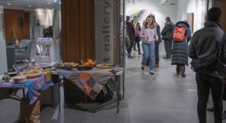
Lucky for you, the RC Art Gallery will be full of student work from various RCARTS courses from the 13th-27th of April, completely free to browse. The gallery and student exhibition will open with a reception on Friday, the 13th of April from 4-6pm — also free and with refreshments! The gallery is just to the right of the East University entrance when you first walk in and is usually open M-F 10am-5pm, special exception for this event.

Date: Friday, April 13th, 2018
Time: 4-6pm
Location: East Quad’s RC Art Gallery

*Featured image credit: “Date Night” by Henry Schreibman

REVIEW: Aftermath: Landscapes of Devastation

The sublime is what captivates your attention, the mix between horror and beauty. This discomfort that the sublime evokes by being fascinated with something horrifyingly beautiful is what the latest photography exhibition at the UMMA revolves around. Aftermath: Landscapes of Devastation brings to the forefront of our minds how we use photographs to mediate and memorialize disasters. While the exhibition includes 150 years of medium, it depicts the course of over 2,000 years of human history and photographs moments to last into the infinite future.

Instead of displaying the pictures in chronological order of when the event occurred, the pictures play with time, as the sequence is nonlinear, the arrangement dealing with the increasing amount of time between when the event occurred and when the photograph was taken. By capturing a landscape of devastation mere seconds after the event or two thousand years later, the effects of that devastation can be either visible or invisible, creating a landscape with a timeless story tied to the land.

A lot of the photographs were indirect, not clearly depicting any “devastation” at first glance. This exhibition really makes you stop and read the description to understand why certain photographs belong in a collection that starts with the mushroom cloud of an atomic bomb. Even that is an interesting choice — a distant view of a giant cloud in the sky that is a clear sign of devastation without overtly showing the scene from the ground. It is hard to miss the mushroom cloud, but the unimaginable carnage of bodies remain unseen. The picture that follows is an aerial shot of an accident on a beach, the conglomerating crowd and oblivious beach-goers fully captured in this spectacle that is centered around one individual’s life and near-death, an unforgettable memory that will now always be remembered.

9/11 has its place in this exhibition, the two selected photographs shaping our collective memory and national identity as we continuously return to this historic event. However, events of less obvious violence that are equally devastating have their rightful place too. The repetition of the land at Shiprock taken throughout one day represents the relative timelessness of a geographical sight that is perceived despite the destruction on native land that has slowly taken its course through many years.

One of the most interesting photographs was one of joy in an environment of devastation. Bosnian-Muslim refugee children are playing in a bombed building, this innocent side of human nature persisting in a haunting scene very unnatural yet very human, and this direct juxtaposition tugs at your heart as the suffering and resilience of families during a period of war and genocide makes this image — and this ongoing reality — truly devastating indeed. There are certainly many more photographs, each as intriguing and thought-provoking as the last, that makes this exhibit that is on display until May 27 worth seeing.

There is beauty and tranquility in these photographs despite the devastation, and it is precisely because of that that there is something harrowing about them, these moments — or aftermath of moments — suspended in time and carried into infinity. Natural and manmade destruction is never forgotten. Even if it escapes the lens of a camera, it will be forever ingrained in human memory and the natural history on the land.

PREVIEW: Accidental Photographer: Seoul 1969

Stationed in Seoul as a member of the Peace Corps in 1969, U-M alumna Dr. Margaret Condon Taylor was a witness to monumental shifts in South Korean society. Accidental Photographer: Seoul 1969 opens at the Institute for the Humanities this week, and presents her color snapshots of the city for the first time in nearly 50 years.


On view December 7th – Jan 12th at the Institute for Humanities Osterman Common Room (202 S. Thayer St).

Opening reception, lecture by Assistant Professor Se-Mi Oh (Asian Languages & Cultures), and Q&A with Dr. Taylor on December 8th from 12-1 PM.

Presented by the Institute for Humanities and the Nam Center for Korean Studies. Curated by Associate Professor Youngju Ryu (Asian Languages and Cultures) and Professor David Chung (Penny W. Stamps School of Art & Design).

REVIEW: GLOSS: Modeling Beauty

Gloss: Modeling Beauty was a pleasant surprise. All I knew about this exhibit was that it “explores the shifting ideals of female beauty that pervade European and American visual culture from the 1920s to today,” which was the UMMA’s online description. I expected magazine covers of willowy, white women in the highest fashion from the early 1900’s and today’s fashion magazines with sleek, androgynous women. Maybe it was just me, but I found the theme of the exhibit to be different from what the online description conveyed. Rather than depicting shifting trends in actual beauty standards, I felt like the exhibition portrayed the photographer’s stance and mentality towards fashion and beauty in their time period.

For example, one of the first images shows a black women posing for an advertisement in typical Harlem 1920’s attire. The photographer, James Van Der Zee, tries to offer an alternative to the mainstream white models of the time. Another photographer had several images of women in more experimental, sexual clothing, but it was the 1970’s during the sexual revolution… so it’s not too out of place. The gesture of empowering women was appreciated. To be honest though, some of them I just didn’t “get”. According to the plaque, Paolozzi’s pop art photos were supposed to “engender comical and ambiguous analogies”. Yeah, I found them very ambiguous.

The work that stood out the most for me was a set of six photos from a clothing catalog for the store Bloomingdale’s. The set of photos are honestly kind of creepy more than anything else. Each photo has several women in the shot, but it looks like they are all doing their own thing and just happen to be in the same space. There is little interaction between them and their expressions are oddly intense. One woman sits on a couch and stares directly into the camera completely straight faced, which I actually found a little unnerving. Maybe that was the point…? I’m not sure. Each image also has a high contrast between light and shadow which heightened the bizarreness for me.

One thing did disappoint me a little. The exhibition was quite small– taking my time and reading every single plaque, I went through the two walls of photos in about twenty minutes. Overall, I appreciated the few pictures with women of color. I wish there had been more diversity but the absence makes sense since the exhibition is a reflection on whom society deems worthy of representing beauty.

Would recommend if: you have spare time between classes, you understand photography more than me, you want some insight into how photographers use media as a tool for communication.