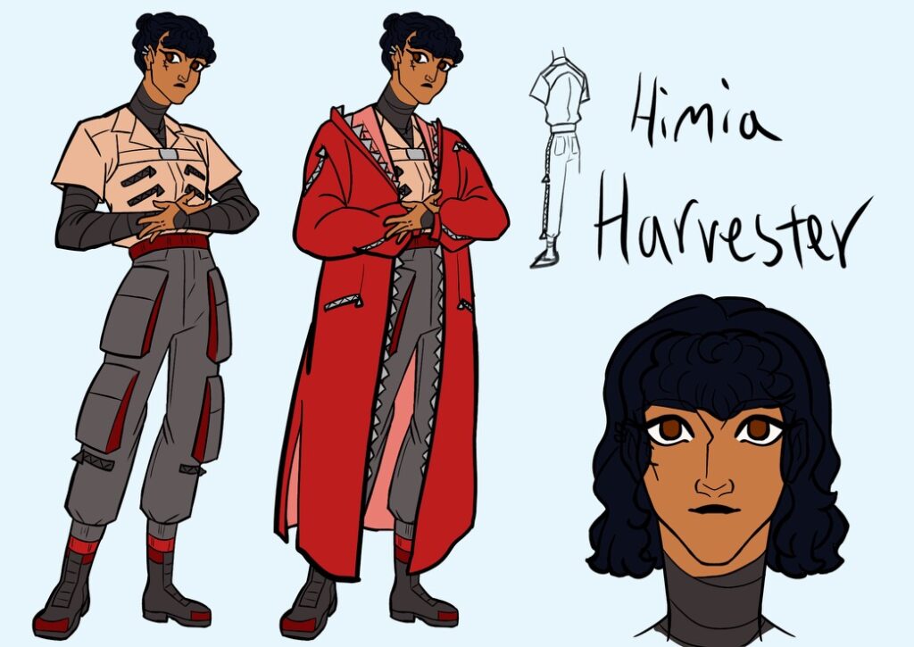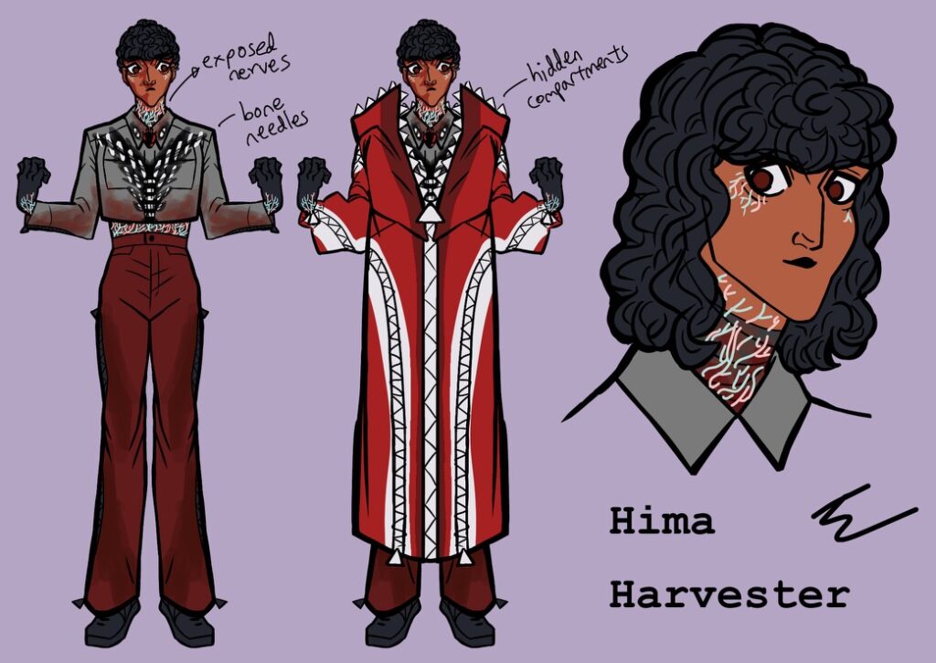

Once I finish redoing a character, I like to make a new character sheet. There should be additional sketches coming the following weeks.
My goals for Hima’s new design were: make her look her age of 21, her colors more cohesive, and her clothing better reflective of her personality. The process involved giving her a jaw, changing her eyes, and replacing her veins with stitches, but I’m proud to say that Hima looks much more like a confused young adult, which she is. Her techwear-inspired clothes reflect the futuristic setting of her world and shows how she prioritizes simplicity and comfort over fashion, unlike Simon. Her giant red parka is a big part of her character, so I tried to give it the weight and heft it deserves. The pale orange was a last-minute choice; her shirt was supposed to be a light grey. She looks warmer now.


Leave a Reply
2 Comments on "Hima’s new character sheet"
Love seeing how you develop these character designs. Where do these characters go after you’ve created them? Do you ever animate them or put out a comic book / webcomic with them?
Thank you for your comment! I plan on writing a story about these characters. These designs are to help me visualize them better in my head. Aside from events like artfight, I currently have no plans to do any big art projects featuring these designs.