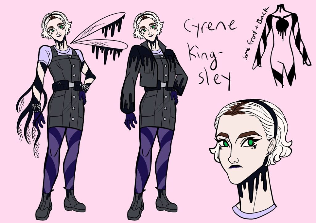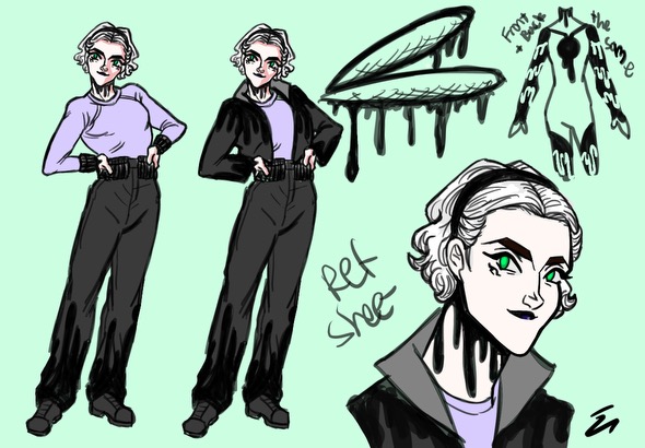

I redesigned Cyrene! My girl! The redesign’s on top, while the Summer 2023 design is on the bottom.
I didn’t have many goals for this redesign, except to give Cyrene a functional jaw and also to make her fancier. I’m glad her redesign exposes her tattoos because those are a big part of her witch powers. I’m also glad I added more purples to her look, and let her roots show to humanize her better.
Cyrene’s hair was always a challenge for me. I though basing her look of a live-action character, Sabrina from the Chilling Adventures of Sabrina would make things easier because I had a live-action reference. It didn’t and I always had trouble with making Cyrene’s hair look too sculpted and unnatural. I found the solution was to relax my lines and remove the amount of curls I drew.


Leave a Reply
Be the First to Comment!