Hima Concept Sketches

Read more: Hima Concept Sketches

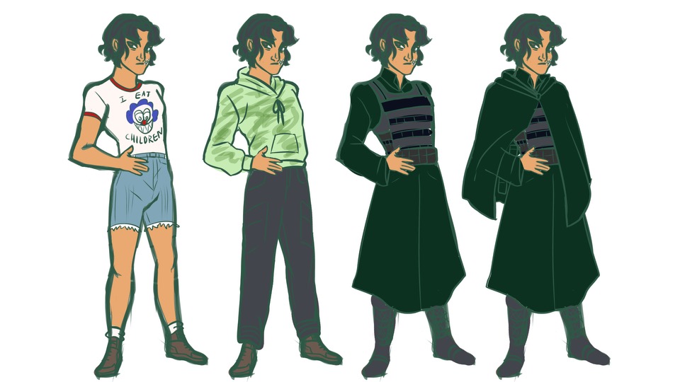
Here are the Hima concept sketches I mentioned a lot of weeks ago! You can tell I tried to make her look younger. I found the solution to be making her eyes bigger and her face smoother. She is 21, after all.

Throughout the sketches, you can see my drawings of her in workwear. I also added sketches of her in fancy dress, her as a child, and her in a bra. The more revealing pieces are to show off the scars she got working under a tyrannical company. As you can see, I gave her face stitches, to show that she can’t hide the damage no matter how many bandages she wears. In her poses, I try to communicate how tall and lanky Hima is. I think it worked.

Cyrene’s Redesign

Read more: Cyrene’s Redesign

I redesigned Cyrene! My girl! The redesign’s on top, while the Summer 2023 design is on the bottom.

I didn’t have many goals for this redesign, except to give Cyrene a functional jaw and also to make her fancier. I’m glad her redesign exposes her tattoos because those are a big part of her witch powers. I’m also glad I added more purples to her look, and let her roots show to humanize her better.

Cyrene’s hair was always a challenge for me. I though basing her look of a live-action character, Sabrina from the Chilling Adventures of Sabrina would make things easier because I had a live-action reference. It didn’t and I always had trouble with making Cyrene’s hair look too sculpted and unnatural. I found the solution was to relax my lines and remove the amount of curls I drew.

Simon’s Redesign

Read more: Simon’s Redesign

Here’s Simon’s redesign. It’s the one before the readmore. His old, summer 2023 design is on the bottom. As you can see, I made the blacks darker and replaced the magenta with red. I can really tell how my style changed with this one. I’m less angular, and my noses at a 3/4 view are bigger.

Here are my changes: I made the insides of Simon’s jacket a royal blue to contract better with the light blue. I gave Simon a muscle shirt to replace his open one because the open one’s folds were too complicated to draw. In a sense, I wanted to make the royal blue Simon’s signature color, so I also changed his scabbard to royal blue. I changed his pose and made his tattoo more visible by turning the ink purple. The old design had a scar from getting struck by lightning, but I read somewhere that lightning scars fade fast, so I had Simon get a tattoo to memorialize the event. I also gave him purple spots on his body because of story updates. Overall, I’m pretty happy with his redesign.

The Skinned Lady

Content warning for gore under the readmore

Read more: The Skinned Lady

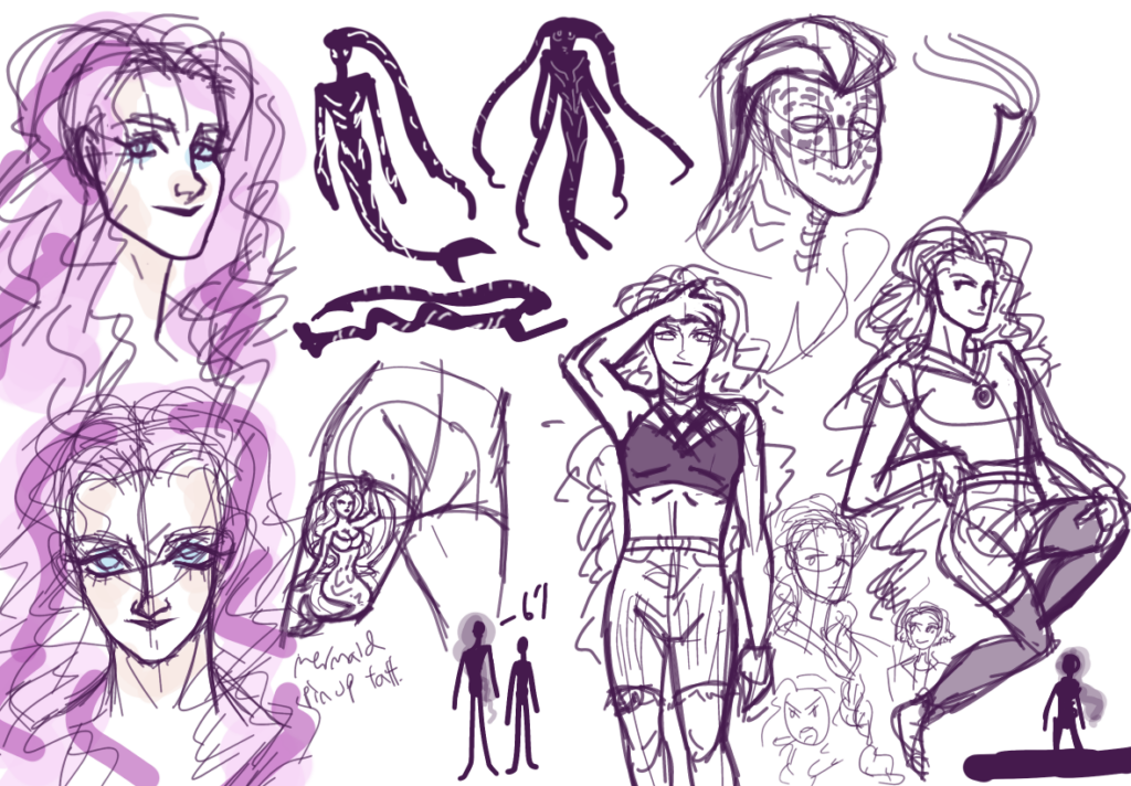
I’ve finally come up with a final villain for my story! She shall be referred to as Ilona. She’s this witch from the early 19th century who was murdered. In her death, she sent out a curse that manifested as these deadly thorned vines I refer to as ‘Kudzu Rose’. Flash forward to the mid-2010s, a cult took the magic left in Ilona’s vines and shoved it back into her modified body, ‘resurrecting’ her.

Ilona’s design’s based off Julia Cotton’s skinned form from Hellraiser 2. As you can see, some of the designs are directly lifted from the movie. I love the contrast between her classy 19th-century design and the bareness of her current one.

My current goals are to simplify the facial muscles, find a fullbody design, and hopefully make her look less like a carbon copy of Julia.

Hima’s new character sheet

Read more: Hima’s new character sheet
Hima’s old, July 2023 character sheet

Once I finish redoing a character, I like to make a new character sheet. There should be additional sketches coming the following weeks.

My goals for Hima’s new design were: make her look her age of 21, her colors more cohesive, and her clothing better reflective of her personality. The process involved giving her a jaw, changing her eyes, and replacing her veins with stitches, but I’m proud to say that Hima looks much more like a confused young adult, which she is. Her techwear-inspired clothes reflect the futuristic setting of her world and shows how she prioritizes simplicity and comfort over fashion, unlike Simon. Her giant red parka is a big part of her character, so I tried to give it the weight and heft it deserves. The pale orange was a last-minute choice; her shirt was supposed to be a light grey. She looks warmer now.

Environmental Design

This isn’t character work this time! Or at least, on paper. Last year I got a book called “The Field Guide to Witches”, where artists reimagine different types of witches from sketch to full illustration. One of those steps was to design and imagine where the witch would live. I thought that was interesting, so I decided to apply that step to my character Sigi, who is a Volva, or the Viking version of a witch.

Sigi lives in a Nordic-inspired, urban, poor, factory-and-unemployment-heavy area with a lot of waterways and heavy winters. She also works at a lace factory. I imagine her living area to have a heavy gilded-age aesthetic – lots of industrialization and income inequality. I referenced bay cities like Montreal and Copenhagen, as well as industrial-era factories and environments. I wanted to get across that Sigi lives in an area with lots of struggle, and that struggle makes people party harder.