The Kingdom of Tokavsk, Session 11: The Forbidden Love Letter

My Heart,1

Winter was barely a chill compared to the cold of your absence.  The heat of your hands entwined in mine and the warm blush of your cheeks keep me alive in this frosted land.  Even so much as an hour away from you is as an eternity in the ice.  I do wish we could make our bond known.

I know we cross paths out in the open, but unless we are alone holding hands I see you as a total stranger.  I wish I did not feel this way, and I hope you can forgive me for harboring this sentiment.  I am glad we are closer together now and that I no longer have to withstand these frigid nights alone.

I dreamed a dream that someday we could be together as we hope to be, but in my mind I know it cannot be.  I wish I could deny my love for you, but you have caught me in a deer trap so sure that I know I will never escape it.  For now, we must be content with these little moments.  I sense a time when we may have to be apart for good.  I fear this time, but I try not to dwell on it.  I much prefer dwelling on you.  My heart,2 be steadfast.  We must savor these moments before everything comes to its glorious, frightful end.

I do pray you can forgive me.


Now and forever,


Your soul3


  1. This letter is presumed to be from one courtier to another. The writer and intended recipient are anonymous, indicating a forbidden relationship, possibly an extramarital affair.
  2. The author seems to be talking both to the recipient and to themselves.
  3. “You are of my heart and I am of your soul” is a line from a traditional Tokavskan romantic epic. “My heart, your soul” is a colloquial phrase used in romantic relationships to signify true devotion.

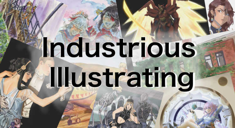
Industrious Illustrating #26 – Character Concept Sketching

While I’ve been trying to get back into a regular artistic workflow by working on more sprites and illustrations for “Flamechaser”, I also feel like I could benefit from exploring new ideas more. Because of that, I found some time this week to sketch out a character design for an original character I’m going to call Rashida Kuromiya. She’s a cybernetically enhanced freedom fighter who dons a helmet shaped like a canine’s head in battle.

While I haven’t gotten around to fleshing out a full backstory for Rashida, I enjoyed drawing her and I want to draw her more in the future. Eventually I want to implement her into a story idea I’m working on called “Blade of Seafoam” that follows an amnesiac super-soldier who’s traveling across a post-apocalyptic archipelago to find clues about his past. I’m not sure yet whether I want to make this idea into a comic or a visual novel, so I may have to adjust the character designs based on whether I’m drawing them just a few times to make sprites and illustrations, or a hundred times for each panel they appear in. I’m working on character turn-arounds for Blade of Seafoam for my ARTDES 220 iterative projects, so I’m looking forward to being able to share them with everyone once I’m done with them.

In other news, I recently sent applications to several conventions happening this year hoping that I’ll be able to get into at least one or two Artist Alleys. I really enjoyed my experiences at Con Ja Nai, Anime Park, and Youmacon, and I’m hoping to make more good memories and sales at future conventions!

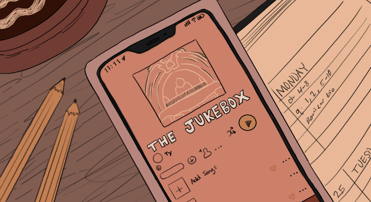
The Jukebox: Abigail

Lyrics from “Abigail” by Frankie Cosmos. I think a lot of people can relate to looking back at their past selves and feeling embarrassment or even aversion. This song follows up that sentiment by stating they should cut their past self some slack, as much as they might dislike them now. Oftentimes we were doing the best that we could given certain circumstances, and didn’t have the knowledge or wisdom we currently have. I wanted to visualize this by showing the past version of oneself tangled up in a metaphorical string, unable to get out or protect themselves from the rain. The present version has the resources to keep themselves dry. Though they can’t help protect their past selves they can give them grace. I think doing our past selves small acts of kindness like this is really important to taking care of ourselves in the present.

Sagas Among the Arcana: Four Haikus


Judgment

she opens the mind

weighing scales for those once blind—

those that surrender


The Hermit

it— a lonesome beast

now striking the match itself

to light its own lamp


Two of Cups

snakes are arduous,

both in their love and their hate

they’re bound together


Queen of swords

student of judgment

sword polished for punishment—

she falls without detachment 


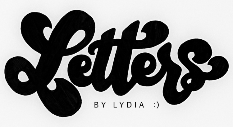
Letters by Lydia: Cursive vs Calligraphy vs …?

Happy Wednesday, y’all!

Today we’re gonna take a bit of a deep dive into the terminology for different types of lettering.  Overall, it really doesn’t matter, but I would say the most common question when it comes to lettering is “isn’t it just cursive?”  If you don’t know the difference either, no worries!  Hopefully this clears things up 🙂

So what’s cursive? I’m sure most of you are aware of what cursive actually is, but things probably get a little foggy in terms of how it differs from other forms of lettering. The main difference is that cursive isn’t really a form of art and instead a style of writing. Cursive is supposed to be a way of writing that’s more efficient than regular writing because your pen never has to leave the page–in other words, it’s practical and more of a fancy-looking shortcut than anything.  It’s also much more rigid in terms of style and rules; there’s a cursive alphabet that, aside from a few stylistic variations, is pretty set in stone.

Lettering (synonymous with handlettering), on the other hand, is an umbrella term for all sorts of word art. Calligraphy, which falls under the lettering category, is probably the most similar to cursive.  There’s a lot of different kinds of calligraphy, but it’s typically based loosely on cursive, and is centered on the idea of using strokes (you can check out my post on upstrokes and downstrokes to learn more about that!).  Unlike cursive, calligraphy is much more flexible and can involve a lot of experimentation or style variation, which in my opinion makes it a lot more fun.  You can see my version of a calligraphy alphabet below, and then I also included potential variations of uppercase letters (A) and lowercase letters (I chose “r” because it has a lot of fun options).  Some people also refer to this as modern calligraphy, because calligraphy can also refer to the sort of gothic style that would use a pen and ink or some sort of pen with a nib.

Lettering in general essentially just means “drawing letters” in an artistic way.  This means that instead of adhering to strict rules like cursive, or requiring the use of strokes like calligraphy, lettering can be any creative depiction of letters.  For example, bubble letters would fall under the lettering category, because instead of using lines and strokes to create a letter, you’re using shapes.

There are pretty much limitless other categories that fall under the umbrella of lettering, but some other common ones include brushlettering, which I’ve talked a lot about, faux calligraphy, serif and sans serif, gothic, and tons of other ones.  Hopefully that helps clear up any confusion, but feel free to leave any other questions in the comments!

Have a lovely rest of the week everyone 🙂

OTM #22: Perception / Characters

Lately, I’ve been thinking a lot about art. About how much I draw myself. I can give myself any form, and over time this can become more and more abstract.

I’ve been doing OTM for almost two semesters now, and thinking about how I’ve created a sort of persona for myself. I’ve always loved character design; I think comics and cartoons are so amazing at creating relatable characters with simple shapes. I’ve tried to make my own drawings of myself come off that way – I’m most inspired by stuff like Calvin and Hobbes, using simple dot eyes and fun expressions. I don’t really draw myself based on how I look most days anymore, but rather use a recognizable, repeatable, exaggerated version of myself. Truth be told, the blonde streaks I draw on the underside of my hair are barely visible anymore. But over time, I’ve grown really attached to them as a part of my cartoon “persona”, so I continue to draw them. It’s really fun to be able to think about these things, and I’m really grateful I get to reflect upon how I see myself through art. That’s always been my favorite aspect of art – being able to see how people view the world through their work. I’ve been thinking about characters and character designs a lot because of this, practicing making my own interpretations more.

These are a few of my results from my drawing exercises; characters from one of my favorite childhood games, “Ib.” The original sprites are above, my drawings are below. The original sprites are pretty vague and simple, so it was super fun to be able to draw out fun colors and interpret what kind of outfit each character was wearing. My result is very different than the original, but that, to me, is what makes it so fun. Fans of “Ib” could still recognize them as characters from the game, but I’ve given my own personal touch of love. Character design is so amazing!!!