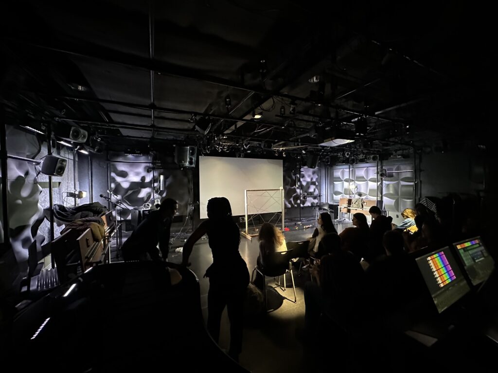
Hello everyone!! As we approach the end of the semester, I wanted to take a moment to extend warm regards and share a unique collaborative endeavor that has been brewing in one of our classes, involving students from the PAT, Stamps, and Dance departments.
Titled “Missing Piece,” this project is more than just a performance; it combines live performance art, dance movements, and live piano interludes. What makes it truly special is the active involvement of our audience. We’ve extended an invitation for them to bring objects of personal significance, items that hold meaning and significance to them, and seamlessly incorporate these objects into the fabric of the performance itself.
As we eagerly await the culmination of this project, I can’t help but anticipate the final recorded performance. It promises to be a testament to the power of collective creativity and the magic that ensues when diverse talents intertwine to create something truly special.
Stay tuned for the final performance video, as it’s sure to encapsulate the essence of our collaborative efforts and the meaning behind “Missing Piece.”
Ethereal
In my chest
a raw, flippant beating
taken but breathing
in your smell
frost and rose red
a chill on my skin
just looking at you
petals to pupils
dilate, and my diaphragm
folds at the bend
the arch of your spine
like a branch
your arms enveloping
the moment encased
I wish to stay
forever or longer
with you
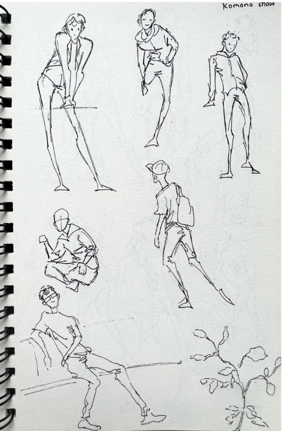
I observed people’s emotions and motions at school and on the street. With people constantly moving, I try to capture the figure and mood quickly. Each of the figure drawings on the second page took around 20 seconds to draw. This is a quick page of sketch with an emphasis on the flow and emotion of people.
On a particularly bright day, there was a woman walking down the street. Her sneakers shuffled against the pavement rhythmically. She pushed a twin-seated stroller that held two babies peacefully lulled into slumber by their rolling carrier.
The woman hummed a melodious tune that had passersby’s ears perking. The people turned their heads to stare at her. However, they could make nothing of her visage for it was shadowed by a worn baseball cap, and her eyes were hidden by thick sunglasses. Honestly, she was rather plain— yet despite this, she walked cheerfully and that entranced the people. Simply the sight of her and her sweet babies made them happy.
The woman finally arrived at her destination— a small storefront painted in an unflattering green with a large show window rimmed in white. The window displayed a wide array of delicate and attractive flowers. The woman pushed open the door and pulled along her stroller. The chiming bell welcoming her roused the babies awake. They softly grumbled and cooed, reluctant to open their eyes.
“Good afternoon!” The store clerk greeted cheerfully.
The woman nodded in acknowledgment briefly and began her perusal of the store. She left the stroller by a display of sunflowers that faced the teenage girl working the register. The girl peered curiously at the stroller.
Under their eyelids, the babies’ eyes shifted— a prelude to their awakening.
Meanwhile, the woman brushed her fingers over an arrangement of white chrysanthemums. She smiled under the cover of her cap.
Suddenly, the teenage clerk gasped, stunned. The babies’ eyes sparkled iridescently. She couldn’t tell if they were golden or blue. Only when their mother returned with her selection did the girl cease her unabashed starring.
She coughed awkwardly as the mother approached. “Ahem— did you, uh, find your choice satisfying?”
“Yes, very.” The woman didn’t seem bothered by the girl’s embarrassment. She presented her pick of chrysanthemums.
The girl stuttered, realizing the possible reason for those flowers. “Oh, I’m sorry for your—”
The woman waved her hand dismissively. “Oh, it was an inconsequential loss.”
“Uh . . .”
“They were really—” she lowered her sunglasses to the bridge of her nose, revealing iridescent eyes, much like those of her children, that glowed surreally “ —meaningless.”
Did I say “next week” in my last column? Oops. I kinda forgot that Thanksgiving break was coming up, and then I ended up too busy with personal life stuff to actually make this post. Anyway, now I’m making this quick-ish overview of paper terms and types for making prints!
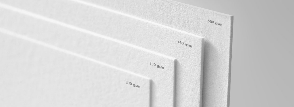
When making prints on paper of your artwork, something important to keep in mind is paper weight (which is almost always equivalent to thickness). Thicker paper is sturdier and harder to damage or bend, which both keeps your stock safer and also feels better for your customers compared to receiving a super thin paper print. Usually the way to evaluate printing company paper weight is through points, which is a whole number version of how many fractions of an inch thick the paper is. For example, 12pt cardstock is .012 inches thick. There’s also other ways of evaluating weight such as pounds or gsm (grams per square meter) that sometimes show up, but I’m less familiar with how those work.
A sampling of papers with different gsm. Source: samedayrushprinting.com
There’s also a myriad of different paper types available for printing, but the ones used most often for poster prints are text and cardstock. Text paper is thinner paper similar to office printing paper or the pages of a book, while cardstock (also known as cover stock) is closer to the paper used for a greeting card or the cover of a softcover book. There’s also giclee, which is an archival-quality paper used for more expensive fine art prints that are meant to last, but I don’t use it since the per-unit cost is much higher than cardstock and my customer base prefers relatively affordable posters.
If you want personal recommendations, the paper I use from Catprint is specifically their Light Cardstock – Satin, which I feel has a good balance of sturdiness, light-weightness, and a finish that subtly enhances the artwork (I’m not sponsored, but I definitely wouldn’t turn down a sponsorship if I got an email about it). I’ve also tried 12pt gloss cardstock from Greko Printing (a Michigan-local printing shop) and found it similar in thickness and quality to Catprint’s Light Cardstock Satin, so that’s a valid alternative if you want to support local.
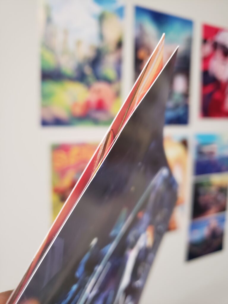
The print I made with Greko is on the left, while the print I made with Catprint is on the right. Greko’s feels slightly thicker, but otherwise the two prints are quite comparable.
If you print at home or (as a Stamps student) in the Digital Printing Lab using an Epson printer — which is a valid option if you prefer total control over your prints and can tolerate wrangling the printer yourself — Epson typically makes several types of papers that are good for art prints. I personally liked their matte premium presentation paper the most — their non-premium paper is way too thin and light for my liking, and I didn’t really like how the gloss finish on their gloss papers made my artwork look overly shiny. They’re typically available in packs of 25 or 50 online in various sizes (usually 8.5×11″ or 11×17″), and they even have some extra premium options like a canvas finish or extra thick paper that I’ve never tried but might elevate your prints.
Don’t make my mistake — make sure that the paper you’re getting has the “Premium” at the top!
Honestly, the best advice I can give in the end is to order a sample pack (usually either free or at a small cost) from the printing company you’re interested in to actually see and feel for yourself which paper type would work best with your own artwork. Enjoy having your artwork physically sit in your hands as a custom print!
In terms of next week’s topic, maybe I’ll go back to showing and talking about my own artwork, since it’s been a few weeks of just talking about art business-related topics. Of course, I’d like to hear if you guys want me to cover anything specific in the future!
Here’s another Fae-Dragon court concept! I kinda forgot which name I gave this one, but it’s winter-themed! I kept in mind winter animals, bones, frostbite and other nasty cold-induced injuries while I filled this page out. I imagine this court is in charge of the Wild Hunt. The nobility rampage across the lands in winter, hunting all unfortunate enough to cross their path.
The centuar-ish one is supposed to be the court’s main herald/head honcho. I think their hanging bodies/horn accessories might overshadow their actual body. Maybe they could be the main herald’s servant instead. I like what I did for the skull design.