A Day In Our Lives #15

Hey guys,

I found my apple pencil! This week I am including another art piece that took longer to work on. Two of my posts so far have featured dinosaurs because I am extremely interested in them! I created this art piece first by drawing out the perspective lines on paper, and then I took a photo of the drawing on my phone. I sent the image to my iPad and colored it in a monochrome grey palette. I really wanted to focus on perspective and lighting in this drawing. I like how the energy of this drawing turned out.

A little update about campus life, I went to the snowball fight on the Diag with my friends this week! I encourage you all to attend cute events like this because it was a really cool and really made me feel like I was a part of the UofM community.

See you next week!

Marissa


LOG-018: redshift

THE NARRATOR – Thousands of years of civilization, hundreds of years of exploration, lifetimes spent searching. Only for all of it to boil down to this.

YOU – What do you mean?

THE NARRATOR – One massive anticlimax.

CHIAROSCURO – You’ve searched every corner bright and dark, but not everything’s meant to be found. Life’s full of disappointments; surely, you would have learned that lesson by now.

MIDNIGHT SUN – The light that once flared now flickers and fades…

CREPUSCULARITY – It is a slow but steady march towards an inexorable fate: one day, this world will cease.

LOGIC – Oh, quit the dramatics. More likely, this exaggerated fate is simply the product of an overactive and anxious imagination. It is a miracle that you still function.

YOU – What? Why?

APHELION – Perhaps it is better that you have forgotten.

YOU – You reach deep into memory, but only recall fleeting impressions: fire unfurling around you. A flash of tooth and scale, a gleaming portent. Liquid glass, slowing to a trickle, its shimmering kaleidoscope of eye-watering color searing your retinas. Dizzying.

MIDNIGHT SUN – Painful.

YOU – What really happened?

DIRECTIVE – It would be easier to ask what *didn’t* happen: everything that could have gone wrong went wrong. Everything failed.

DIRECTIVE – *You* failed.

RHETORIC – Let’s be reasonable, here. It was a cascade of failures, an error so large no one being could be solely responsible, even if you had played a part in it.

META-ANALYSIS – Industrial sabotage, development oversights, exceeding safety margins — even strange quantum phenomena — the list goes on.

DIRECTIVE – Does it even matter? Here in the dark and bitter cold, it won’t change a thing.

RHETORIC – No. It won’t.

YOU – But does that matter?

APHELION – No. It won’t.

ENDURANCE – You’ll keep going.

CREPUSCULARITY – You’re foolish to subject yourself to this any further.

YOU – Well, you know what they say about humans and irrationality.

APHELION – Yes. You’ll keep going, even if it means clawing your way back blinded and deafened and numbed, again and again and again.

EMPATHY – Maybe none of it matters. But it meant something to you. *Means* something. And that is enough reason.

APHELION – It will have to be.

Letters by Lydia: Sometimes it Doesn’t Work

Welcome back to Letters by Lydia! Hopefully everyone was able to stay safe and warm in the snow, or maybe even go out and build a snowman 🙂

Today I want to talk about all the times–and trust me, there are many–that lettering ideas and techniques don’t work out.  A lot of times in the art community, especially on social media, we only see the work that people are super proud of: work that’s polished, high quality, creative, unique, and so on. Because of this, it can be really easy to fall into the trap of feeling like your work isn’t good enough, or that everyone else is much more talented. That said, I have noticed lately that people on social media seem to be getting a little more vocal about the importance of the process. Bad art is just as important as good art, because it helps you learn and grow as an artist. If your art was perfect all the time, there would be no room for experimentation, doodling, mistakes, and most importantly, fun!

I’m sure none of this is news to most of you, but I wanted to share an example of some lettering I did today that I couldn’t quite figure out. I wanted to try a new lettering style where it looks like letters someone wrote with their finger in the snow, which ended up being much harder than I anticipated.

After consulting an overwhelming number of google images, my first attempt landed me with this:

When I first did this, I wasn’t in love with, but with some distance I can honestly say this might’ve been my best attempt.  I chalk it up to beginner’s luck, though, because I could not for the life of me produce this kind of style again.  In hindsight, I think the key was only using two colors, because this was the only attempt where I limited my color palette that much.

My next attempt I’m actually super proud of and think looks pretty realistic. The issue? It took forever, so it didn’t feel reasonable to try and do a whole word in this style. My original idea was also to have this as a type of style, not a kind of one-time piece that would be difficult to recreate.  In any case, this is what I ended up with here:

After this, I started trying whole words, and played around with using the colors in different ways, different textures, and different thicknesses.  I don’t dislike any of these, but I don’t think any of them read quite as I wanted them to–they look like pretty snow-themed pieces, but not necessarily like someone was writing in the snow, unless you’re looking at them with that style in mind.

Of course, in this example of things not working out, I still generally liked the end results, they just weren’t what I had in mind originally.  That said, I can’t tell you the number of times I try things that end up looking absolutely terrible, and I can definitely start sharing that stuff too! But I thought it was important to show that there’s also this middle ground where the work you produce is still good, it just doesn’t align with the vision you had, because this also allows for artistic experimentation and learning new styles and techniques.

This is a style I plan to experiment with a bit more and see if it’s something I can refine, but even if it isn’t, I had fun playing around with something new!

I hope you enjoyed reading, and stay safe out there in the snow!

A Day In Our Lives #12

Hey guys!

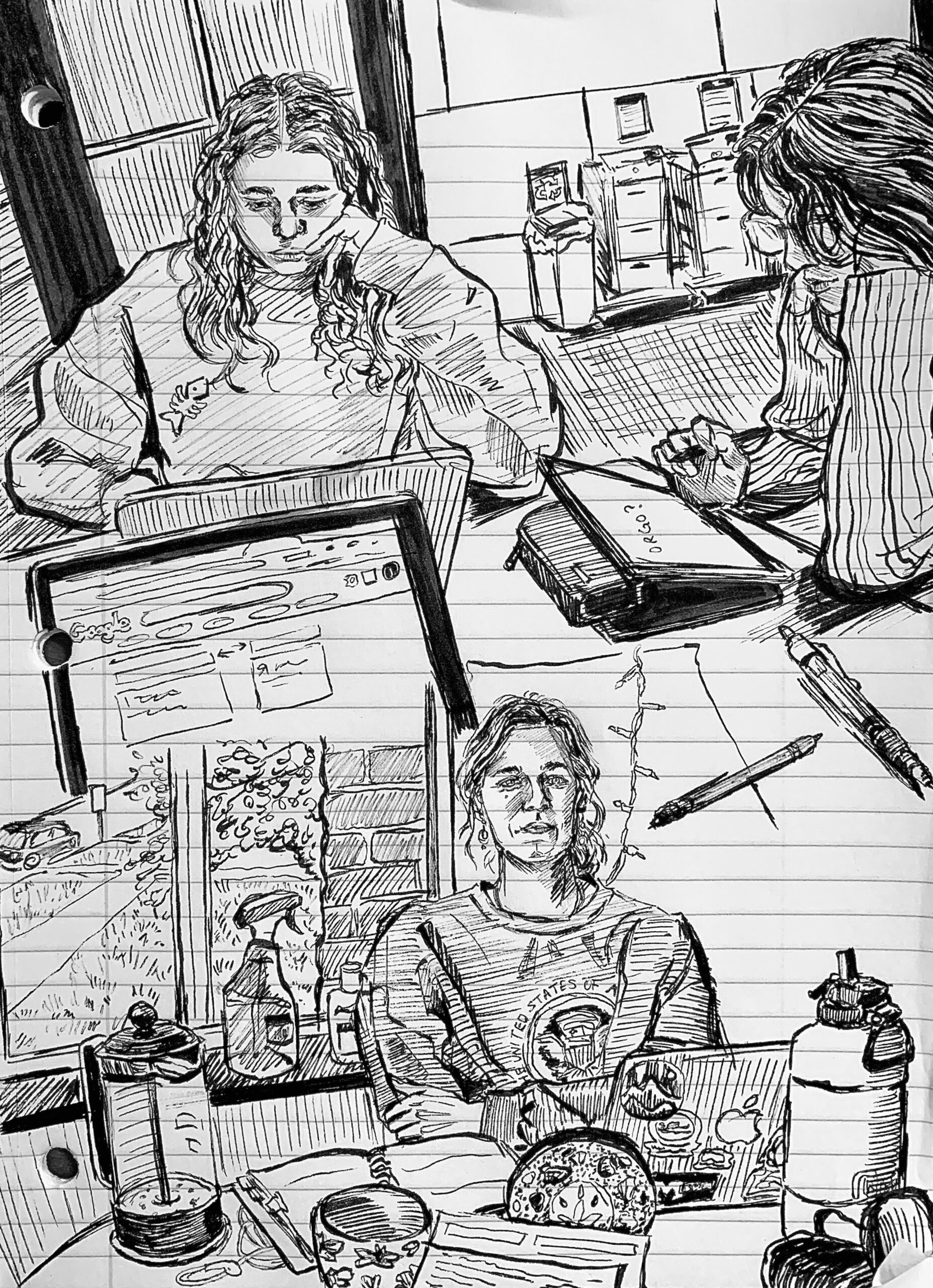
This week I wanted to draw what my commute to school normally looks like. I feel like I am always carrying a million things! Art school needs a lot of supplies. I live on central campus and have to commute to north campus to go to school, which means I have to take the bus. It feels awful to have to carry a lot of art supplies or your own artwork for everyone to see. The experience is awful especially when it is an art piece I don’t like or aren’t proud of. Have sympathy for us art kids <3  I hope the start of everyone’s semester is going well! All of my artwork in this blog is done in procreate.

Marissa Woods 

LOG-017: Hammerhead Strider

KHEPRI-1B

CATEGORY [ XENOBIOLOGY ]

ARTICLE ARVHIVED FROM [ MARIAH BERGGREN ]

ARTICLE NOTES:

[ The hammerhead strider is a large, terrestrial strider native to Khepri-1b. Two distinct species have been thus far identified: the common hammerhead strider and the marsh hammerhead strider. The former lives in a broad range of grasslands and shrublands, while the latter live in swamps and other vegetation-rich wetlands. They are often spotted travelling in small groups. ]

A Day In Our Lives #10

Hey guys,
I am currently writing this post on Christmas! There has certainly been a lot of crazy weather this week so far. I drew my mom’s dogs in costumes for the holidays. I draw all of my artwork on this blog with Procreate on the Ipad. I like filling up the canvas with different patterns or little details surrounding the subjects in made-up backgrounds. I am excited to get back to campus for the new semester!

Happy holidays everyone!

Marissa