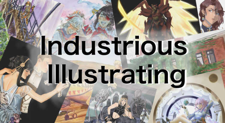
Industrious Illustrating #35 – Mecha Design

While I’ve posted mecha art and mecha designs here a few times before, I haven’t posted an actual mecha design sheet akin to what would be used on a project such as a video game to guide 3D modelers and other artists further down the production pipeline when replicating the designs that will appear in the final product. As such, I fleshed out and designed Toshiaki Mizushima’s Oyoroi mech “Bhairava” to demonstrate my mecha and character design skills in a portfolio-ready art piece.

While I referenced several different mech design sheets (such as color guides for gunpla and design sheets for fanmade Gundams) to inform what visual information I needed to convey with this design sheet, I took heavy inspiration from the information conveyed by this mech design sheet made for Honkai Impact 3rd.

Also, if you’re on campus on Saturday, April 1st, you can come see me and buy prints from me at the What the F Art Fair in the Kuenzel Room of the Michigan Union from 12:30-4:30. Yes, it’s on the same day as Hash Bash, and no, it’s not an April Fool’s Day joke! You can also come find me tabling at Con Ja Nai in the Modern Languages Building on April 8th from noon to 6pm, so there’s plenty of opportunities to come find me!

Industrious Illustrating #31 – Sticker Designs

Sorry for the late post — midterms week and the beginning of spring break were a bit chaotic for me. This week I have a few sticker designs to show that I made for the Hong Kong Student Association. I don’t do a lot of sticker or small designs, so trying my hand at them was interesting. I personally really like cute food-themed designs, and my favorite Hong Kong foods are egg waffles, shrimp dumplings (and dim sum in general), and egg tarts, so I made three designs inspired by them.

In the end, HKSA ended up selecting the first two designs, and the tshirt/sweater/sticker order form is currently open to club members! I’m glad that I took the chance to challenge myself by working with something different, and I’m going to consider making more dessert/food-themed designs in the future for my personal enjoyment in the future.

Artist Spotlight: Legendary Designer Tinker Hatfield

With a name like Tinker Hatfield, the famous shoe designer and architect seems destined for fame. Tinker Hatfield is an American designer and currently the Vice President for Design and Special Projects at Nike, best known for his work on the Air Jordan brand, including the Air Jordan III (credited for saving Jordan’s relationship with Nike), the Air Max 1, and other iconic shoe models. In 2019, he was even presented with his own sneaker, the Nike React Tinker Hatfield at SXSW.

After receiving a Bachelor’s degree in Architecture at the University of Oregon, where he was a pole vaulter, Hatfield joined Nike in 1981 and began working on sneaker design in 1985. He soon after designed the Air Max 1, the Air Trainer 1, the Nike Air MAG as shown in Back to the Future II, and the Air Max 90–all within his first five years at the company. These shoe designs remain ever-popular among sneaker-savvy fans, for their classic, timeless aesthetic.

In 2011, Hatfield designed the graphics for the Matthew Knight Arena at his alma mater, the University of Oregon, which features fir tree silhouettes that outline the basketball court.

“The Architect’s” trendsetting designs have earned him the title of one of the most influential designers of the sneaker and fashion world. To this day, he continues to elevate the Nike brand and footwear as we know it. When you wear a pair of sweet Nikes, it’s probably due to Tinker.


Jordan III Tinker Hatfield


Jordan IV


Nike Air MAG
Air Max 90


Air Jordan 11


Nike React Tinker Hatfield


Matthew Knight Arena Floor


Artist Spotlight: Zach Lieberman and New Media

After watching one of Zach Lieberman’s talks for my Creative Programming class, I was enthralled by his colorful, multidimensional, and ultimately experimental software sketches. Software sketches are made by using programs such as Processing, which enable artists to use code to create drawings and animations.

Lieberman helped create the School for Poetic Computation, an alternative school/art collective/residency program in New York that helps artists learn code, technology, and design.

I find the intersection between code and art fascinating–since they are traditionally thought of as polar opposites. However, like the SFPC mission states, it aims to promote “completely strange, whimsical, and beautiful work – not the sorts of things useful for building a portfolio for finding a job, but the sort of things that will surprise and delight people and help you to keep creating without a job.”

What attracts me most to Lieberman’s work is its noticeable curiosity–endless iterations, research, abstractions, sketches all made for the sake of creation and experimentation. In today’s hyper-aggressive art and design world, it’s not uncommon to find projects made for the sole purpose of showing off. Meanwhile, Lieberman’s plethora of sketches explore color, shape, form, texture, and light, all through the medium of code.

Head to Zach Lieberman’s Instagram for a mesmerizing look at this animated sketches. He also sells prints here.

extruded blob #1


color ribbon study #2


curved cones study #1


blob pack #3

Land Lines – a Google Chrome Interactive Art Tool

Extraordinary Slippers: Nicole McLaughlin

Nicole McLaughlin is a Boston-based artist and designer who produces one-of-a-kind fashion creations. Her zany accessory designs, including a slipper made out of tennis balls, or a vest fashioned out of cereal bags, span all sorts of materials and brands. I came across Nicole McLaughlin’s Instagram page over a year ago, intrigued by the hype surrounding upcycled clothing.

The young designer has also achieved more fame due to her footwear and accessory collaborations with popular brands, such as HighSnobiety, Reebok, and Opening Ceremony. She now boasts an impressive following of 384,000+ on Instagram.

McLaughlin’s compositions are the kind of simple but wonderful creative explorations I wish I could make–some designs are hilarious but impractical, others visually delightful. A graphic designer by day, she fabricates her personal experiments for the fun of it. McLaughlin’s designs are always pleasantly surprising–I’ll definitely be on the lookout for more of her work to come.

All images via Nicole McLaughlin

Subverting Expectations in Art

I’m always discovering more about why I love art and what makes a certain work of art stand out to me, and personally that’s one of my favorite parts about enjoying art. Over time I’ve found that I have really unique interests in the underappreciated areas of art, specifically the small details that often go unnoticed by others. I think these details often go unnoticed consciously, but have a huge impact on how we experience art, and that’s why I love to analyze and explore these details in order to better understand why a certain work of art feels the way it does. Recently, I’ve been thinking a lot about art that subverts the viewer’s expectations, whether it be a movie breaking the fourth wall, a game that has an artistic twist, or a song that features variations on a theme that take the listener by surprise. Eventually I would love to explore these concepts in all forms of art, but first I want to start with great examples from two of my favorite games: Journey and Monument Valley 2.


I talked about Journey in a previous post, in which I emphasized it as a game of quality over quantity. It’s an overall spectacular game, featuring a gorgeous color palette, emotional story-line, and a beautiful orchestral soundtrack. I was playing through it again recently when I rediscovered one of my favorite parts, in which the game takes this beautiful breathtaking moment to break its format and reveal itself as the work of art it is. The entire game is from a third person perspective, mostly limited to the back of the protagonist, except in this short and surprising scene where you’re surfing down sand dunes and suddenly enter a tunnel, where the camera pans over to display you in profile with this gorgeous and mystical cityscape laid out under a looming mountain and fiery orange sun. It really is breathtaking when you play the game; it comes out of nowhere, and evokes this feeling of pure serenity and awe that is completely unique to this game. The visual nature is perfectly complemented by a reprieve in the music, featuring a bittersweet cello representing the solitary character. It’s an incredible game as a whole, but I think this moment itself characterizes the entire artistic feeling of the game. Art is an emotional medium, and understanding how that emotion is conveyed is essential to understanding what makes it unique. In Journey, it’s this subversion of expectations and a fleeting moment of calm that forces the player to step back and evaluate how the game conveys emotion.


Another great example of art subverting expectations is Monument Valley 2. I’ve discussed Monument Valley before, specifically how it stands apart as a mobile game and how the soundtrack itself is a great example of thoughtful and well made ambient music. However, Monument Valley 2 does something special that the first doesn’t, and that’s including a variation of the theme, essentially breaking its own rules and forcing the viewer to rethink their understanding of the game. The entire game relies on ‘impossible geometry’, level design that is impossible in the real world, but stunning and satisfying in the minimalist world of Monument Valley. It’s 3D and geometric as a result, using an isometric style to make the impossible geometry possible, which in turn defines it’s artistic style and sets the expectations on how the game is played. However, in one sub-level of the game, seemingly out of nowhere, the game breaks its own format and the result is another breathtaking moment (that may sound dramatic, but I’m not exaggerating when I say that these details make me pause with appreciation and respect). Instead of following the expected 3D style, the level is suddenly in 2 dimensions. But that’s not all: interacting with the puzzle reveals the hidden nature of the level, in which a combination of clever 2D design and classic 3D impossible geometry provide jaw-dropping illusions and solutions. Not only is this surprise fascinating enough artistically, I love the self-aware shapes in the background that reveal their hidden dimensions depending on how the level is rotated. The designers clearly knew what they were doing, and since this is the only time this is ever done in the entire franchise, it doesn’t come off as cheap or gimmicky, but instead as an amazing artistic choice that sets Monument Valley apart as a work of art.

Hopefully I was able to explain how important these small details and artistic surprises are in developing the style of a work of art, and hopefully you can appreciate them as much as I do. I definitely recommend keeping an eye out for similar subversions in all fields of art; I think you’ll find that many of your favorite and most memorable pieces feature some element of artistic surprise.