Artist Spotlight: Legendary Designer Tinker Hatfield

With a name like Tinker Hatfield, the famous shoe designer and architect seems destined for fame. Tinker Hatfield is an American designer and currently the Vice President for Design and Special Projects at Nike, best known for his work on the Air Jordan brand, including the Air Jordan III (credited for saving Jordan’s relationship with Nike), the Air Max 1, and other iconic shoe models. In 2019, he was even presented with his own sneaker, the Nike React Tinker Hatfield at SXSW.

After receiving a Bachelor’s degree in Architecture at the University of Oregon, where he was a pole vaulter, Hatfield joined Nike in 1981 and began working on sneaker design in 1985. He soon after designed the Air Max 1, the Air Trainer 1, the Nike Air MAG as shown in Back to the Future II, and the Air Max 90–all within his first five years at the company. These shoe designs remain ever-popular among sneaker-savvy fans, for their classic, timeless aesthetic.

In 2011, Hatfield designed the graphics for the Matthew Knight Arena at his alma mater, the University of Oregon, which features fir tree silhouettes that outline the basketball court.

“The Architect’s” trendsetting designs have earned him the title of one of the most influential designers of the sneaker and fashion world. To this day, he continues to elevate the Nike brand and footwear as we know it. When you wear a pair of sweet Nikes, it’s probably due to Tinker.


Jordan III Tinker Hatfield


Jordan IV


Nike Air MAG
Air Max 90


Air Jordan 11


Nike React Tinker Hatfield


Matthew Knight Arena Floor


Artist Spotlight: Zach Lieberman and New Media

After watching one of Zach Lieberman’s talks for my Creative Programming class, I was enthralled by his colorful, multidimensional, and ultimately experimental software sketches. Software sketches are made by using programs such as Processing, which enable artists to use code to create drawings and animations.

Lieberman helped create the School for Poetic Computation, an alternative school/art collective/residency program in New York that helps artists learn code, technology, and design.

I find the intersection between code and art fascinating–since they are traditionally thought of as polar opposites. However, like the SFPC mission states, it aims to promote “completely strange, whimsical, and beautiful work – not the sorts of things useful for building a portfolio for finding a job, but the sort of things that will surprise and delight people and help you to keep creating without a job.”

What attracts me most to Lieberman’s work is its noticeable curiosity–endless iterations, research, abstractions, sketches all made for the sake of creation and experimentation. In today’s hyper-aggressive art and design world, it’s not uncommon to find projects made for the sole purpose of showing off. Meanwhile, Lieberman’s plethora of sketches explore color, shape, form, texture, and light, all through the medium of code.

Head to Zach Lieberman’s Instagram for a mesmerizing look at this animated sketches. He also sells prints here.

extruded blob #1


color ribbon study #2


curved cones study #1


blob pack #3

Land Lines – a Google Chrome Interactive Art Tool

Extraordinary Slippers: Nicole McLaughlin

Nicole McLaughlin is a Boston-based artist and designer who produces one-of-a-kind fashion creations. Her zany accessory designs, including a slipper made out of tennis balls, or a vest fashioned out of cereal bags, span all sorts of materials and brands. I came across Nicole McLaughlin’s Instagram page over a year ago, intrigued by the hype surrounding upcycled clothing.

The young designer has also achieved more fame due to her footwear and accessory collaborations with popular brands, such as HighSnobiety, Reebok, and Opening Ceremony. She now boasts an impressive following of 384,000+ on Instagram.

McLaughlin’s compositions are the kind of simple but wonderful creative explorations I wish I could make–some designs are hilarious but impractical, others visually delightful. A graphic designer by day, she fabricates her personal experiments for the fun of it. McLaughlin’s designs are always pleasantly surprising–I’ll definitely be on the lookout for more of her work to come.

All images via Nicole McLaughlin

Subverting Expectations in Art

I’m always discovering more about why I love art and what makes a certain work of art stand out to me, and personally that’s one of my favorite parts about enjoying art. Over time I’ve found that I have really unique interests in the underappreciated areas of art, specifically the small details that often go unnoticed by others. I think these details often go unnoticed consciously, but have a huge impact on how we experience art, and that’s why I love to analyze and explore these details in order to better understand why a certain work of art feels the way it does. Recently, I’ve been thinking a lot about art that subverts the viewer’s expectations, whether it be a movie breaking the fourth wall, a game that has an artistic twist, or a song that features variations on a theme that take the listener by surprise. Eventually I would love to explore these concepts in all forms of art, but first I want to start with great examples from two of my favorite games: Journey and Monument Valley 2.


I talked about Journey in a previous post, in which I emphasized it as a game of quality over quantity. It’s an overall spectacular game, featuring a gorgeous color palette, emotional story-line, and a beautiful orchestral soundtrack. I was playing through it again recently when I rediscovered one of my favorite parts, in which the game takes this beautiful breathtaking moment to break its format and reveal itself as the work of art it is. The entire game is from a third person perspective, mostly limited to the back of the protagonist, except in this short and surprising scene where you’re surfing down sand dunes and suddenly enter a tunnel, where the camera pans over to display you in profile with this gorgeous and mystical cityscape laid out under a looming mountain and fiery orange sun. It really is breathtaking when you play the game; it comes out of nowhere, and evokes this feeling of pure serenity and awe that is completely unique to this game. The visual nature is perfectly complemented by a reprieve in the music, featuring a bittersweet cello representing the solitary character. It’s an incredible game as a whole, but I think this moment itself characterizes the entire artistic feeling of the game. Art is an emotional medium, and understanding how that emotion is conveyed is essential to understanding what makes it unique. In Journey, it’s this subversion of expectations and a fleeting moment of calm that forces the player to step back and evaluate how the game conveys emotion.


Another great example of art subverting expectations is Monument Valley 2. I’ve discussed Monument Valley before, specifically how it stands apart as a mobile game and how the soundtrack itself is a great example of thoughtful and well made ambient music. However, Monument Valley 2 does something special that the first doesn’t, and that’s including a variation of the theme, essentially breaking its own rules and forcing the viewer to rethink their understanding of the game. The entire game relies on ‘impossible geometry’, level design that is impossible in the real world, but stunning and satisfying in the minimalist world of Monument Valley. It’s 3D and geometric as a result, using an isometric style to make the impossible geometry possible, which in turn defines it’s artistic style and sets the expectations on how the game is played. However, in one sub-level of the game, seemingly out of nowhere, the game breaks its own format and the result is another breathtaking moment (that may sound dramatic, but I’m not exaggerating when I say that these details make me pause with appreciation and respect). Instead of following the expected 3D style, the level is suddenly in 2 dimensions. But that’s not all: interacting with the puzzle reveals the hidden nature of the level, in which a combination of clever 2D design and classic 3D impossible geometry provide jaw-dropping illusions and solutions. Not only is this surprise fascinating enough artistically, I love the self-aware shapes in the background that reveal their hidden dimensions depending on how the level is rotated. The designers clearly knew what they were doing, and since this is the only time this is ever done in the entire franchise, it doesn’t come off as cheap or gimmicky, but instead as an amazing artistic choice that sets Monument Valley apart as a work of art.

Hopefully I was able to explain how important these small details and artistic surprises are in developing the style of a work of art, and hopefully you can appreciate them as much as I do. I definitely recommend keeping an eye out for similar subversions in all fields of art; I think you’ll find that many of your favorite and most memorable pieces feature some element of artistic surprise.

In the Eyes of an Architecture Student: About Mental Health

Hi Everyone!

I’m back again this week to discuss the topic: Mental Health.

More specifically, I will be discussing my take on what mental health is, how to deal with it, and what design potential there is in this field.

Disclaimer, these are by no means definite answers or correct answers. This is my own take on mental health and the field of architecture.

In my Health by Design course last night, I was struck by three thoughts during class, that I did not mention despite the open share quality of the course.

  1. Design has so much potential, yet we are constantly stuck in the aesthetic realm thinking about it
  2. Health, especially mental health, is a hot topic in today’s society, yet we have only just tapped the surface in the amount of research that has been done about it, over all of these years that humans have been existent on this planet.
  3. I think it’s ironic how much I value the idea of wellbeing and health, including mental health, yet it is still something I grapple with to improve within myself.

Why didn’t I share these thoughts in class? Well, first off, it would sound pretty irrelevant in context to what we were discussing during class, or more so that I would be going off on a dramatic tangent. We were discussing essentially different methods of using design to solve for issues for specific personas (people) that we made up, but are highly realistic. And it hit me that, sometimes, it’s hard to understand and believe that our field and abilities as humans can be limited. For instance, we often take the internet for granted. we expect everything to be stored and processed through this virtual space, yet so few of us really understand how it works, and mos importantly forget that virtual space still has limits despite how limitless or imaginary it seems. In other words, google drive, which a ton of people use (still an understatement) has a lot of space but it will run out one day, and you’ll be doomed, once you’ve already utilized all hard drives, etc. Now, think of architecture. Really, it is quite similar in the manner that architecture can only do so much to attempt to reshape human interactions and habits. But what both these fields share is the potential to do so many things, to say the least. Yet, we as humans are still in control of the decisions we make.

Perhaps this is the issue. We as humans, are surface creatures. We like pretty things above all, and this is shown with research that has been done demonstrating that people within the US value beauty care more than health care, and this is evident from the enormous gap of spending between these two sectors. And, this is not just because of the price ranges or number of products offered from either sector. This is seen once again even through design. Products are made to be most visually appealing to capture the eyes and hearts of consumers, and this includes everything from the plastic wrap around the toilet paper you purchase, to the home you decided to settle into. Even humans can unfortunately be seen as products, when we are commodified through apps like Tinder or Facebook, where the surface qualities are prioritized. All of these “little things” add up and you end up with the medical bills for poor physical and mental health.

What can we do, to improve our own health? If we each are able to easily answer such a task and do so, then health would never be such a societal issue as it is today. I found it sad, yet truthful that perhaps not all, but a lot of college students tend to prioritize anything but their wellbeing. I definitely see myself as someone that prioritizes work above all else. Peper not finished? I’ll sleep later. Model not done? Just a nap will do. Have class until 9? I’ll have dinner after (if I remember or feel hungry still). I laughed when my professor asked us these exact questions, and totally agree that it’s almost ridiculous how basic these questions are. Anthropologically speaking, these questions are essentially the basis foundation of how people survive. But this is what is different about humanity is now, than the humanity that really prioritized survival all those thousands of years ago. Humans today depend on more than just the essentials before being fully happy and satisfied with life. This varies from person to person, but it’s pretty much real and true for humans nowadays, and it makes me anxious to ponder how the future humans may be. So, what can we as humans, and designers do to reverse this habit and fully change society?

That is the big question in architecture today, and unfortunately I am still frazzled with how to even begin to process such a question.

Above all, I consider my interest in architecture to be about wellbeing. I want to design spaces to create a sense of comfort and serenity for people, not just in hospitals. I want to create spaces that inspire people to do the best they can for themselves and for others. Such spaces that would encourage people to desire to live, not just make living “work.”

Much of design is about aesthetics, but also a lot about functionality and efficiency as well. And, after having thought about this a lot, I argue that these are all qualities that we as designers need to let the consumers decide what is best for them.

Designers often mean well, doing mass research in attempts to “get to know” the person(s) they are designing for. But no matter how much we do, we will never truly be in their shoes, and we will always be designing for our own ideas about them. Designers cannot help but project a personal manifestation of their own thoughts and beliefs about the consumer and the context. This will never change, no matter how much we are aware of it or despise it; it is simply something that happens as humans, in any field honestly. But consumers also cannot do the design tasks themselves because they have not been schooled for such things. And to be fair, designers should really be working more with people from other fields, so that more voices are heard in the design process to provide the best possible results, partially because other fields are much more well-researched. I do also argue that architecture itself is a challenging field to do research in, mostly because of how long it would take to yield results, and how difficult it can be to take measurements of specific things, like the amount of happiness or anger that a space has resulted in. There are sort of ways around this to make it work, but these are also very complex “things” to take measurements of even if you can get closer to doing so through, say, taking measurements of blood pressure or vitamin deficiencies. Perhaps some issues were never meant to be “solved.” Perhaps this is the essence of existence. Not to be philosophical, but it really hits me that all of these fields on study were meant to be used together to yield the best possible results to help us as humans, and yet we are expected to “specialize” in one, being almost completely clueless about others.

I’ll let you ponder on these things, but I will definitely be thinking about them more on my own, and through the perspective lenses of that course. I’d love to hear your thoughts and opinions on this subject, so feel free to drop a comment!

Ciao 🙂

From the Eyes of an Architecture Student: Methods to Become A Better Designer

Hi everyone!

I’m back again, to discuss this week’s topic: methods to become a better designer.

Honestly, I was a bit hesitant on how to title this week’s discussion topic… mainly because I wasn’t sure if there was an actual, formal title for  it, other than just “practice” in preparation for architecture as a professional discipline in the real world.

Precisely, unlike medical students, who have cadavers to poke and cut into, or computer science students who have actual coding websites to get some very realistic, representative practice, we architecture students don’t have such a staple medium to “practice” being designers with.

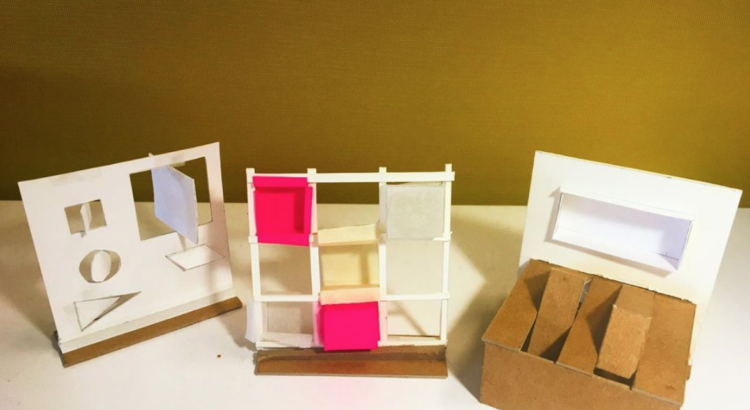
In a way, yes, assignments and projects can be considered “practice” since we are expected to use our designing minds to create our own unique creations out of each given prompt, but they’re more of the education aspect of design school. We design things, get critiqued, and keep coming back to produce our own hypothetical solutions to design problems. However, I oftentimes this is more educational, because this process seems to be more about meshing our minds in a certain way as designers. Design school is meant to shape our thinking process (which I find leads to more aesthetics than technicality in problem solving in design, rather than shaping how we should be critically thinking as designers. However, this seems to be the case in most design schools now, as there seems to be a sort of identity crisis within architecture; almost like an argument about what power we do or should have as architects, and our place in the world.

Aesthetics is the way to the eyes of the consumers of buildings, which I often find is the way to build initial intrigue about the building; it’s essentially the same with people. Take Tinder for instance, you swipe left on either seemingly boring people, or unattractive people, and you swipe right for those you find as a match for your values, or physically attractive- it is our eyes that decide the initial interest. I find that this is the same reason why designers seem more concerned about the aesthetics in design. In design, aesthetics of your proposal representation not only softens critics’ hearts, but also serves quite effectively in capturing the interests of those outside of design who say, “I don’t know what that is or what it means, but it looks cool!” Our representation not only serves as the communication mechanism between us and our critics, or clients, it also serves as our method of marketing ourselves as a brand in the real world (in terms of applications to jobs, internships, and graduate schools). Perhaps it seems this way because of my limited experience as an undergraduate. From the glimpses of graduate students’ work, it seems more technicality comes in graduate level education, but even then, I find it should still be necessary to have a cohesive educational experience in terms of always being thoughtful about our designs and staying true to what real-world consequences they would have in the real world. Perhaps our undergraduate experience is suppose to serve as just an introduction to the mechanics behind being a designer, and its purpose is just to market ourselves to get jobs in either firms, or appear as attractive candidates in graduate school applications.

I have always thought about this topic, but only gotten more critical in views after my current experience of  “rodeo reviews” in class, where everyone in our third semester studio had to pin-up for presentations, and we we basically split into halves and rotated around so we could have the experience as the presenter, but also critics of each other’s work. Sounds kind of fun and casual, right? You get to show your friends your cool work, and even speak with other sections’ professors… which isn’t an incorrect description of what it was. I just spoke with classmates and gauged two types of mindsets about this whole presentation method: critical (not finding it that useful), versus positive (thought it was a nice new, different experience). Of course, there is the factor that it really depends on your luck and what students you had as your critics, or maybe even what region you were assigned to pin-up in. But, generally, it seemed that the issue was that we were just sprung onto this unfamiliar role of being forced to give specific people feedback- the selections were completely random, so most people found that they were reviewing the works of students they never really got to know, and just being put on the spot to say useful things to help others improve their work.

It was then that it struck me that being a designer is not just about being good at communicating your own ideas to the world, or making your own work look cool. It also includes the ability to understand unfamiliar work from just reading their drawings, or listening to their one presentation and asking them a few questions. What’s its relevance? Well, I’m sure at one point you’ll be forced to reflect on a colleague’s work, and it’s not too great if you just blankly stare at them or their work. Or, say you’re working with someone new and they’re not able to be there to tell you about their work and just left you to read their work temporarily. It’s good to be independent and have the ability to understand other’s work, and have a view that you can offer. I find that this ability often coincides with our own abilities to understand our own work and be able to concisely portray it in a compelling manner.

Oftentimes, I’ve found difficulties in reading others’ work from their drawings, or maybe even an uncompleted model that they have. And, it’s still something I need to work on, even though I recognized my own (ever-improving) growth in my own project’s proposal representation. But this rodeo review really opened up my eyes to that observation, and the way that I was really glad that my improvements in my own representation seems to have opened my mind to this newfound ability to understand others’ work and what they have drawn or modeled, and draw upon my own experiences to give them helpful feedback to improve the way they can further portray their ideas more effectively and clearly. I used to find reviewing other people’s work a bit boring, and super irrelevant to my own work, but now I am grateful to say I can finally understand why our education is designed in such a way to allow for this sort of learning to occur.

It also occurs to me that this isn’t the only way to become a better designer. I can continue learning and applying these skills to real firm’s proposals, and perhaps offering memorable and helpful insight to firms during interviews or the actual internship. And it would circle back to helping me step back from my own work, and be able to see flaws in my representation rather than having always been so dependent upon my professors’ feedback to help me decide on what views to produce for my proposals.

***

Well, that’s all for this week!

So excited to write again next week!

Ciao 🙂