Tracey Snelling’s ‘How to Build a Disaster Proof House’ is on exhibition in Institute for the Humanities’ Gallery and Osterman Common Room. The exhibition itself is not huge – one can definitely squish it into their lunch or dinner time as an after-lunch/dinner art experience. I recommend doing so – this is an interesting exhibition where everyone will find different things to focus on and to muse that will definitely be worth your time.
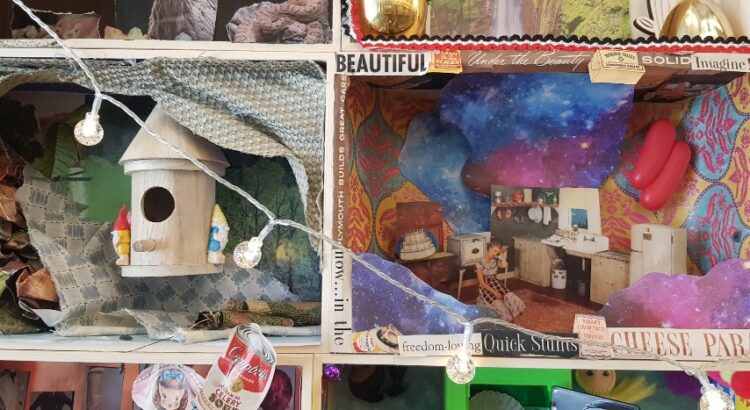
The exhibition is mainly comprised of different styles of rooms, some small and some real-life sizes. There is no common theme shared in their aesthetics, and each and every one of them is decorated with vibrantly colored objects and cut-outs from prints. They seem to represent different lifestyles, or even, different scenes from life. However, they have kitsch, even a bit eerie, or extraordinary atmosphere. They do not fall into what we would mentally categorize as ‘normal life’. The feeling of wild, chaotic energy seems to derive firstly from the background, as the artist had placed huge posters or drapes of natural sceneries on the walls of the space, forming a background that adds energy to the exhibition. As can be seen from some pictures, these sceneries are not the ones that calm your mind. The colors in it are exaggerated and overly vibrant, adding to the active, uneasy vibe of the exhibition. Also, the use of diverse materials and colors for objects that demands attention all at once also adds to the vast input of information from the exhibition. Additionally, the placement of the artworks that place life-size rooms and miniature-size rooms together also creates unbalance in the scope of the attention: while the viewer is focusing on the smaller size works, their attention is overwhelmed by the relatively huge, life-size objects while the small ones nag and demands attention while they are taking in the life-size ones, creating the uneasy tension between the two sizes. Lastly, the artist had interestingly integrated video into her work-lots of videos are played simultaneously from the windows of small houses, adding chaotic audio on top of all the rich visual information that the viewer is already processing. All this adds up to create an audiovisual influx of information and this is where the exhibition consisted of static rooms filled with un-moving objects shifting into the concept of moving and alertness in disastrous situations. When in a situation of a disaster, people are more alert toward inputs from the world to detect danger and this overwhelms them. The exhibition creates a similar experience for us while reminding us that disaster is different from mundane life but perhaps not so far apart – this is expressed by how the artist chose the area that we are familiar with, personal rooms, but filled it with items and contexts that are not common.
There were also a few rooms where I could detect the trial to bring in social messages and status quo, like in the picture above. However, that was not emphasized much, and like it was addressed above, I think the author did a creative take on explaining disaster without using direct reference from society.


