PREVIEW: Here Nor There

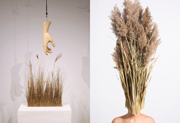
Here Nor There is a new solo exhibition by multidisciplinary artist and environmentalist Kristina Sheufelt, who recently received her MFA from the Penny W. Stamps School of Art and Design.

In Here Nor There, Sheufelt uses “a variety of media to blur the lines between land and body.” Sheufelt has spent her past few summers living in remote backcountry locations to work on research projects where she monitored marine wildlife populations and self-directed a study of emotional psychology in the wilderness. In this exhibition, Sheufelt processes “the emotional and ecological implications of returning to life in the city between reunions with the wild.”

As someone who loves the wilderness and relates to the jarring back and forth between the city and backcountry, this caught my eye right away, and I think I’ll be able to draw a lot of personal connection to the collection. I also got a peek through the RC art gallery windows, and from what I could tell, the collection looks really raw, unique, and evocative.

It will be available to view at the RC art gallery from September 9 – October 14, 2022, 9am – 10 pm! Come see Here Nor There!

Event page on RC website: https://lsa.umich.edu/rc/news-events/all-events.detail.html/97342-21794350.html

REVIEW: The Clements Bookworm: “Framing Identity” Online Exhibit, Empowerment and Resilience in the Black Experience

Like a telescope, the camera takes a lens to both distance and bring closer the image on the other side: something captured which previously went unexplored, an instant in time that is taken and set into memory. In both instruments, what we see is something we’ve created with the help of the setting of the time, the cultural moment, the positions of various actors across a space. Just as a telescope offers a look into the positions of an infinite number of celestial bodies in relation to one other, a camera creates a record of social climate, inequities and labor for justice.

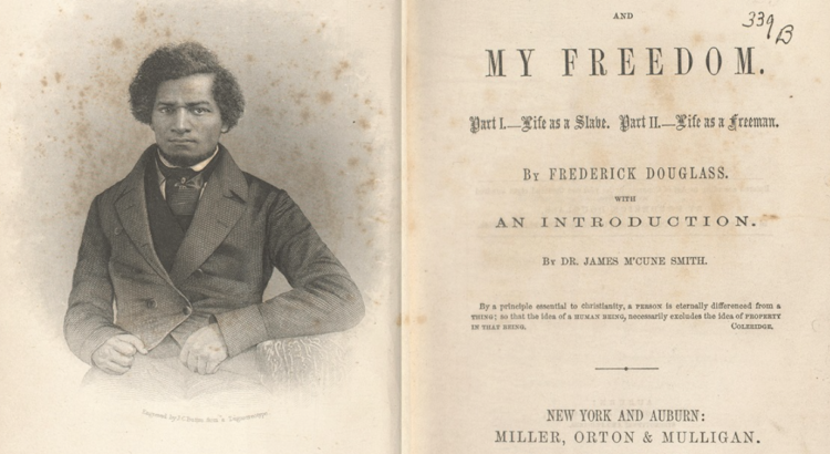
But that’s enough for botched and rambling similes. The Clements Bookworm discussion was a great addition to simply viewing the online exhibit alone. Samantha Hill was invigorated as she spoke on the pieces in the collection, highlighting many Michigan photographers and communities. There wasn’t time to go through each picture in the detail it seemed she wanted to, but her summaries did a great job to show overarching themes and the changing trends of the representation of Black individuals and communities over nearly two centuries. The reversal of negative stereotypes/caricatures in portrayals of Black people is an ongoing, complicated process which the artistic greats of history, like Frederick Douglass, expanded into new media.

As photography became omnipresent, saturating first the print news and eventually dominating the Internet, it grew in accessibility, challenging everyone to really consider their identity, how they’d like to be perceived, where they fit into the rest of society. From the first powerful, dignified portraits of Douglass to today’s glamorous Fenty photoshoots, self-expression and framing of POC has evolved and strengthened with race discourse and culture, continuously inspiring new questions and conversations, driving our society towards equity.

Hill discussed The Colored American Magazine, one of the first periodical publications to celebrate Black art and achievements. I wish she had talked a little longer on this, given the great influence of media representation, especially after the Internet became ubiquitous. She brought it into the present a while later, with examples of former President Obama in magazines.

For me, the media brings up an interesting thought: how does putting one’s representation back into the hands of another change the resulting image? Whitewashing in magazines and Instagram ads is an obvious example, but what about posture, facial expression, two important factors in Douglass’ revolution? The style of dress, the position of the subject in what kind of background? We’ve seen a regression of some kind, or rather a continuation of what had already existed. What would Douglass say to us if he saw how his vision and goals have evolved?

For more online events from the staff at the Clements Library (which I’d definitely recommend attending!), check out their Facebook page, William L. Clements Library. Discussions occur fairly frequently, covering a range of art and history topics. If you’d like to watch the recorded webinar from this exhibit, you can find it here. 


PREVIEW: The Clements Bookworm: “Framing Identity” Online Exhibit, Empowerment and Resilience in the Black Experience

Photography, while being a comparatively new art form, has a rich history. Its power to explain and illuminate complicated ideas in a single image is immense, and has led to some of the most impactful art in the world.

This month’s event focuses on Frederick Douglass’ transformative work in photography; how his lectures and images inspired the next generations of creators to bring the Black experience into the art world. Join in on an online viewing and discussion with Clements Library fellow Samantha Hill and graphics curator Clayton Lewis February 19th at 10AM.

Register for the free event here: myumi.ch/gjgzR, or view the virtual exhibit any time.

REVIEW: Photography Exhibition: Images of Incarceration


A little bit haunting, a whole lot confusing, maybe threatening. These pictures gave me the feeling of a kid from the Peanuts gang; kept from some secret like the unintelligible monotone of the adults’ voices. It was something special to be let in at all, but the opacity of the images’ meaning both disturbed and delighted me. The lighting–heavy flash going off in naturally-lit or dark indoor environments–put me back in time a bit. The images were reminiscent of the 1990s with their coldly fashionable earth tones: grays, browns, tans, beige.

The ones with captions seemed like they could have had a clearer intent. We have location and the number of inmates, but that’s about it in terms of context. I needed more from the literature if the artists wanted to include it at all. Mere numbers fail us in giving meaning to most things; I need more description of living conditions, maybe a hint at artifacts of the imprisoned life, the possessions they leave behind at the gate, art made by inmates, some little picture of influence they have on their surroundings and the lives of others.

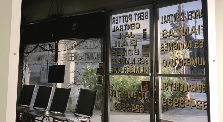
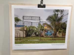
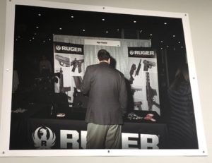
It was interesting that all the photos surrounding correctional facilities were taken from the outside (necessitated by strict no-photo policies, undoubtedly), often not including the buildings at all, but focusing on the surrounding landscape. Most of the others–bail bond shops, police gun shows–were taken from inside. Are we meant to feel a kinship with the law, or just deny ourselves a false connection with the incarcerated? To be outside is both a privilege and a curse: it grants us our continuing freedom while suffocating the possibility of real understanding.

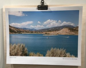
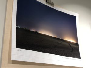
Using such majestic landscapes was a unique artistic choice for me. Many incorporated deeply vibrant colors in the sky and greenery; there was a lot of sunshine and a calming, natural glow to them. Several could have been featured on a ritzy resort’s website. They’ve taken away the images of concrete blocks and barbed wire I would normally associate with prison and replaced them with a richer depiction. “There is beauty here!” they shout. There is no longer the usual isolation of a building from the land on which it sits; instead it becomes a part of something more complete. Exactly what that is, I’m not quite sure. There is no reference to the incarcerated housed within the walls we cannot see from our vantage point, save for a mention of how many there are. Personalization is negligible, nothing more than the city and state printed below the picture. If we are not meant to focus our thought on the prisoners, what else are we supposed to consider? Or is their absence itself the point? Thus the argument is unclear. I will definitely be going to the artist talks coming up, and I suggest you all do the same after perusing the gallery. Steph Foster will give an artist talk on Friday March 27, at 4:45 PM, and Ashley Hunt will give an artist talk on Tuesday March 31, at 4:30 PM.


PREVIEW: Photography Exhibition: Images of Incarceration

Little spaces for viewing art are the best! Maybe being hidden, somewhat out of the way, tucked in a corner makes them a challenge to find, but stumbling upon is far better than being smacked in the face with a million advertisements.

East Quadrangle’s Residential College Art Gallery is a perfect example of this. They humbly exist in a small, glass studio, the work always visible from the outside but only really observable from within. I invite you to step inside for its upcoming exhibit “Images of Incarceration.”

Ashley Hunt and Steph Foster’s photographical artwork depicting the realities of the legal system will be on display beginning this Friday. There is no admission; just come on down during the hours of 10AM-5PM weekdays from February 21st to April 9th.

REVIEW: Deluge

At the Friday gallery opening for Gideon Mendel’s Deluge, I had grabbed a seat in front awaiting the artist’s talk when the artist himself appeared and encouraged us to first go and watch his 14 minute piece in full before returning for his talk.

A full fourteen minutes would usually test my patience for any single video piece- but the alien, overwhelming imagery coupled with constantly changing scenes spread out across five screens made the piece seem much shorter. When the piece looped back around to the beginning, I was sadly not yet ready for it to be over.  There were scenes that were very human and intimate, with figures forlornly staring into the camera in the flooded remains of their house. Other scenes looked like something straight out of a post-apocalyptic film, featuring boats gliding through sunken cities. Still others were more purely visual, focusing on the way that reflection and the waterline changed the landscape on both large and small levels.

The artist’s talk following our viewing of the piece itself was quite enlightening about both Gideon Mendel’s process and personal reflections on the work. We learned that the project was over a decade in the making, and had originally been meant to cover all environmentally caused natural disasters, but then narrowed in focus. He also reminisced that he encountered an overwhelming sense of dissatisfaction with the government and the status quo regardless of where he went, whether it be the most affluent or the poorest neighborhood imaginable. I was struck by the equalizing power of natural disasters, not caring about the color of your skin, or your background. Although, and Mendel made sure to note this, those previously mentioned factors made a world of difference when it came to an individual’s ability to recover from said disaster.

One of the things that I appreciated the most out of the entire event, was when the artist was prompted to answer where he felt his work best fit between the worlds of photojournalism, environmental activism, and fine art.  He instead insisted that his work not be pigeonholed into any one single realm, instead occupying a sort of middle ground. I could certainly see aspects of all three in his work, and agree that they were far more effective when used in harmony, rather than trying to merely fit only one category.

Another interesting element of this particular exposition was displayed in the utilization of the dual rooms.  The main gallery space was used to very effectively show the video, completely darkened with benches to allow viewers to sit and enjoy the entire 14 minutes of the piece.  The other room was used as a peek into Mendel’s behind the scenes process and organization of his material, with raw footage being played on projection and several wall installations on each of the walls.  Over the course of the two weeks that Mendel was to be staying at UM, he was challenged by the gallery curator to experiment in arranging, rearranging, and adding to the walls, so they might appear different in a week’s time than they were when I photographed them.  I was particularly inspired by the artfully arranged collection of photographs. The other wall was a play on the square format that is currently so ubiquitous due to influences such as Instagram.

Deluge will be displayed at the Institute for the Humanities Gallery right inside the entrance of the South Thayer Building until the end of the semester, December 18th.  The gallery is only open from 9am-5pm M-F, so be sure to stop by in between classes and experience Gideon Mendel’s provoking piece for yourself. Also if your interest was piqued by this piece, definitely check out Gideon Mendel’s website (http://gideonmendel.com/) or check out his instagram @gideonmendel .