“what is art?” Post #2 – Shepard Fairey and his street ART

In 2017, I became fascinated with stenciling, image manipulation, and silk screen printing, and this was due to artists like Shepard Fairey. Born in Charleston but residing in LA, Fairey is a well known graphic artist who commonly works with portrait images to create meaningful messages whether it be fine art or graffiti. He got his Bachelor of Fine Arts at RISD in the early 90s at around the same time he created his first art revolution that took over the streets of Providence, RI. 

Attending middle and high school in Providence, I was surrounded by the art encapsulating the city. RISD was right downtown and my friends and I would constantly hangout there. The first time I saw Fairey’s work was in the form of a sticker on a telephone post on Thayer St.–which is the S. State St. of Brown University. As I looked at the sticker that could be no bigger than 3”x4”, my friend told me over my shoulder that the sticker was Andre the Giant. I replied with, “Who?” She then told me Andre the Giant was a pro wrestler in the 1980s and that these stickers are all around Providence. I then asked, “Why?”, and she shrugged her shoulders. 

I remember not bothering with this “Andre the Giant” sticker until later on when I noticed it was everywhere and in different sizes/mediums. It was on walls, telephone posts, sidewalks, billboards, cars, etc. I didn’t understand why it was consuming the city and I didn’t understand why it was Andre the Giant. It made no sense to me but I wanted to be apart of it. I wanted to give someone that feeling of confusion and wonder. Fast forward to my online black hole search of Shepard Fairey. 

Fairey was a skateboard punk lovin artist in the 90s who wanted nothing more than to prove that he existed. He believed that a majority of what he was interested by and the hidden stories that he thought people should talk about were found in the skateboard and punk rock communities. He was apart of the “do-it-yourself” era where young people were seen creating their own advertisements and fashion. Fairey was inspired by graffiti and poster making causing him to wedge himself in and become apart of the movement. He created the image of Andre the Giant as sort of a joke from a newspaper ad. Fairey began sticking these abstract portraits up all around Providence to symbolize himself condemning his own interests. He wanted people to be confused, look at the details in his abstract image, and wonder, “Why?” Shepard Fairey realized he could cause change and impact after his image of Andre the Giant became something familiar to residents of Providence. This phenomenon sparked Fairey’s career, led him to create his OBEY empire, and also become one of the top influential artists of our time.


Shepard Fairey is someone I look up to not only because of his inspirational work but mostly because he didn’t care what people thought of his work even from the beginning. He just wanted to be something which is what almost everyone wants but he was different because he was confident enough to do it and succeeded. To put it in a short sentence, he grew from being a college student in a small city to a widely known artist who created the infamous campaign poster of Barack Obama. Like…wut.

Today, Fairey is fighting copyright issues pertaining to this image of Obama and in the past he has also dealt with issues with the law because his art is seen as vandalization. To create his existence in the world, Fairey believed to put his art everywhere so people would HAVE to look. I believe in human ownership rights but there also comes a line in my opinion, especially with art. One can simply not take someone’s art and claim it as their own, however I do believe in using someone’s art to inspire you to create. Fairey is in trouble because he takes images from Google as references and manipulates them into his graphic art. Furthermore, graffiti is a way of communicating expression with rebellion. Getting your work into the public eye without permission and without instant gratification interests me because it is a personal way of displaying art. The artist creates conversation with the world but also sparks a discussion of what their responsibility to the world is. 


As an art student with a passion for storytelling, I believe anyway to get your message across is art to me. I get excited especially when individuals have the courage to share their expression without hesitation. Graffiti has its faults but so does every single little puny tiny lil thing in the world. I mean don’t even get me started with discussing art galleries… 


Whether or not I understand his work or don’t, I will forever be enamored by Shepard Fairey’s use of art to create his voice and his way to live fearlessly through art. Fairey and other artists that arose in the street art movement face harassment and it is to each their own what they think of them. However, these artists will create no matter what their audience believes and this is why they have become some of the most influential conversation starters, as well as why I believe they should themselves be talked about and receive recognition. 

Afterthought:

Some fun questions I like to ask many people are, “Is graffiti art?” and ,“Is graffiti wrong?” Everyone has different perspectives and beliefs so it is interesting to collect their answers and why they believe this way. 

work cited:
“About Shepard Fairey Biography.” Streetartbio, http://www.streetartbio.com/shepard-fairey.
Moll, James, director. Obey Giant. Hulu, Allentown Productions; Elysium Bandini Studios; Thruline Entertainment.

 

“what is art?” Post #1 – Niki White Audio Interview

Nicole Denise White, also known as Niki, is a sophomore within the Interarts Performance BFA program at the University of Michigan. She aspires to work with scenic design, theater, and film in the future. Take a listen to her thoughts on what art is, what kind of art she enjoys creating, and the importance of human connection through art.

website: https://nicoledenisewhite.com

“what is art?” column introduction

For hundreds of years, the definition of “art” has been questioned, debated upon, and altered. I myself, have no idea how to EVEN try and define this ambiguous term. Growing up in a traditional household, I once believed art was solely realistic paintings and drawings. I thought to be a professional artist I must achieve the skills these talented individuals have and millions will love me. Granted, this was when I was in kindergarten. Okay, maybe fifth grade (we don’t need to talk about it). Since then I have luckily expanded my definition to not only different types of visual art but also performance. I believe art consumes our world and to label it would be to limit what it can be. Instead we must explore what kinds of art can be discovered and share them. I am personally passionate about visual storytelling and I believe the most effective way to connect with an audience through story is with artistic platforms. 

Last semester, I used my column as a place to dispense art information I had found out and wanted to reach others with. In addition, I also wrote about my own class art projects and rambles about topics/questions about art that interests me. For this year, I hope to make my column connected to this theme of “What is art?”, “What can art be?”, and “What does art mean to you?” I will be interviewing a wide range of student artists and maybe professors as well. I will probably slide in a couple of posts about art seminars, galleries, and performances I attend too. I hope by doing this it will engage whoever you are that is reading this and expand your own definition of what art is/can be. I will be posting every Thursday so keep an eye out! I am excited to start this journey with you all but until next Thursday all you get are some favorite photographs I took over the summer. And yes, I believe this counts as art. 

🙂

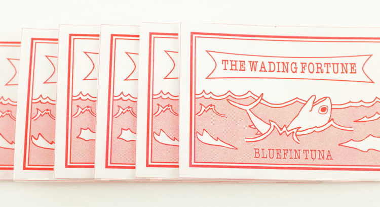
“The Wading Fortune”

For my final project in my Methods of Inquiry(an odd pre-req Stamps students must take to graduate hahahahah.) class I had to create an “advocacy desktop companion”. A weird name? Yes. But, I did not question the title of my project but focused on what I wanted to advocate for and what my individual project would look like. Right away, I knew I wanted it to be on excessive consumerism and/or animal cruelty. I decided to do overfishing because I feel like this topic is not talked about enough or even at all.

When sketching ideas I came to many dead ends but then my friend recommended to look up “Fortune Teller Miracle Fish” to seek inspiration. I found out that these fortune tellers are small envelopes that contain red fish on the inside that will tell one their “fortune”. To find their fortune, an individual would place the fish on their palm and see it move around because of the static it has. Then you would match the movement to a fortune found on the back of the envelope. For an example, if I placed the fish on my palm and it curls up entirely it would mean I am “passionate” according to the chart. After learning about this awesome and ridiculous invention I decided to recreate this into an overfishing advocacy project.

Instead of just any red fish I decided to create three types of envelopes for three different species affected by overfishing: green sea turtle, bluefin tuna, and vaquita dolphin. I drew these species out and then created my designs on photoshop. After, I printed the designs out and folded the paper into envelopes, I then cut the shapes of each species out of red acetate to put inside them. In addition, I created description cards for each species about who they are, why overfishing affects them, what has been done to help, and where someone could find more information.


When completing this project I had to do minimal research but after just reading one article, I was sent down a hole of digging up dirt on this world wide crisis. I also came to the realization that to get someone’s attention about this issue, they needed to hear tragic numbers and I needed to share horrible stories in order for a variety of people to sympathize. After I finished my envelopes it made me question how I could spread awareness with not only a desktop companion(lol) but something even bigger. I have begun to watch many documentaries that advocate for an issue and I believe this would be an interesting project to be apart of and I hope to keep this idea in mind for the future. ANYWAYSSS… Below I will include some pictures of my project. Also y’all should go to WWF.com and find out more information about overfishing. All the information is very interesting and good to know.


P.S.

Dear people,

I have some news to share with you all. Our environment is in danger. Are you surprised?

Best,

:0


Poster Design Connection from 1917 to 2017

This semester I have been enrolled in Art and Design History through the art school. Each week we have to do a discussion post and this weeks caught my attention more so than others, because of the interesting connection from an art piece in 1917 to 2017.

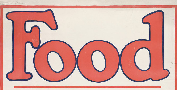
We were given a task to answer a question about one of the pieces of artwork our professor put in a display case in the Duderstadt Center. The one I chose was called “Food —don’t waste it” (2017), by Amos Paul Kennedy, Jr. Although I was struck that the artist is based in Detroit, it was his design in reference to one from the first World War that caught my attention the most.


2017


Kennedy brought up the conversation of food conservation with his design but also how it relates to this same topic during WWI. In the early 1900s, America was trying to lower food consumption in order to feed their troops. They needed to conserve to help the people who were fighting for them. I find it interesting that in 2019 although we are producing food faster and more abundantly, we still are hearing these same conservation slogans about our food habits. In recent years, food conservation is also needed but in a completely different way. We are getting our food from mass produced businesses and this is causing harm to our environment. Although many are unaware of the damage we are creating, Kennedy creates discussion about it through simple slogans and advice for sustainable options.


1917

image taken from https://www.nal.usda.gov/exhibits/speccoll/exhibits/show/poster-collections/item/224 


This poster interested me with its color, text, simplicity, and message. I recently have started eating by a plant based diet (mainly for environmental concerns) and this poster connected with me because of my new beliefs. I believe art starts conversations about topics that are hidden and I think Kennedy is doing this because food conservation is being pushed aside by the people in our government. Kennedy uses memorable slogans and simple designs to create outreach just like the artists did in the early 1900s and to see more of his amazing prints go to http://www.kennedyprints.com/ YOU WON’T REGRET IT!

Goodnight (if you are still up) and have a wonderful week:)

“Stamps Senior Studio” vle blog response

When I visited Stamps during campus day last April the main area that stood out to me were the senior studios. As you could have read in columnist “vle”’s April 5th blog, these studios are for Stamps BA and BFA students. They are filled with inspiration and each cubicle has its own personality. I could spend hours looking at each artists space and how they have cultivated their work over the years here in Ann Arbor.

Personally, my creative process is at it’s best when I have a space to my own, where I can establish my work and a neat mess (yes this is a thing and I know everyone knows what I am talking about). I also thrive off of being surrounded by other artists because I get to watch their unique way of creating in addition to their way of being inspired. After the discovery of how I creatively flourish, I came up with a design for the Stamps building itself and for its curriculum as a whole. After reading “vle”’s blog I decided to share my thoughts on the studios and my idea for Stamp’s future.

Problem(s):

First, second, and third year students don’t have their own space to work in the building. In order to complete work they must go to free classrooms or work at their homes, apartments, or dorms. This causes travel concerns when transporting supplies and the actual pieces of artwork. For the amount of money students pay, I believe they deserve a space to create and inspire others.

Why:

I believe in fixing this issue because of listening to other students concerns. Whenever students speak about this problem, they usually complain instead of problem solve. They and I, adapt to what we have been given because dealing with this problem requires (a lot of) money from the school.

Solution:

I believe Stamps should include a studio space design expansion for their future projects. My idea is to build up on the Stamps building, where the senior studio spaces are now located in the front. The classrooms that are located over the senior spaces now should be moved to a separate addition to the Stamps building itself. There should be four floors for each student based on year. In addition, instead of moving each class every year, when the seniors leave, their floor would be filled with the incoming freshman.

Conclusion:

I think this idea will give students an amazing opportunity to grow and create in their own space for four years at Michigan. It will allow for immense student collaboration and help students connect with the other artists in their class. Although it costs $$$$$$, I believe this would make the art school way more attractive to prospective students and allow for graduated students to rave about the school even more than they do now. Yes… I do realize what I propose is an absurd idea which requires lots of money, work, and effort but just think about it. Let it sink in. Process it. Appreciate it. Love it. Okay, I am done sharing my idea.


Have a beautiful day!