“what is art?” Post #8 – University of Michigan’s brand identity

At last week’s Stamps Lecture Series, artist and designer Marina Willer spoke about not only about overall design but specifically brand identity. She explained how she artistically creates a brand’s identity from art practices she studies and activities she does with her kids. Her process is unique because it is not super structural but more creative. This allowed the large audience to understand how what she does is a type of art and also a very expressive kind of art. 

After her talk it made me begin thinking about Michigan and our brand, the block ‘M’. I was curious how it originated and if this went through a large creative process like Willer’s. 

Stumbling across a Michigan Daily article written in 2014, I found all of my answers I had been seeking. The writer, Austen Hufford, spoke about the origin of the Michigan logo, the birth of the block ‘M’ and how it became the face of Michigan today. 

Coming to this school, I figured the block ‘M’ had been our logo for YEARS. However, I was surprised to find out it actually only has been solidified as our brand since 2014. The ‘M’ began to symbolize sports, specifical football in the 1890s. It was used on football uniforms and then in 1897 the University’s Athletic Association released a button exclusively for its members featuring the block ‘M’. After winning four consecutive national championships from 1901 to 1904 although people were increasingly seeking how to buy Michigan apparel, the block ‘M’ could rarely be found off the football field. Starting in 1909, the Michiganensian posted an advertisement for “Plain Solid Gold block ‘M’ pins” for $3 which became extremely popular and sparked the interest of further block ‘M’ merchandise. 

In 1948, the block ‘M’ was present in the official Michigan athletics logo and it wasn’t until the 1970s that the block ‘M’ began to be seen all over campus and the state of Michigan as well. This transition and “rebirth” of the block ‘M’ can be due to the athletic director from 1968-88, Don Canham. 

Although not an artist or designer, Don Canham is seen as the man behind the marketing strategy of the block ‘M’ that helped improve the athletic department’s financial stability. He used marketing of the block ‘M’ to increase attendance and sell a variety amount of merchandise. While holding the athletic director title, attendance to Michigan football games rose from 67,000 to over 100,000 each game. 

Canham saw the power of the block ‘M’ and used it to brand Michigan’s athletics. This started the path of the block ‘M’ being trademarked in 1982 and for the next forty years, it’s continual growth to not only be the brand identifier of Michigan sports but the University as a whole. 

In the late 1990s and early 2000s, the logo for the University of Michigan was questionable and almost unknown. In Hufford’s article he pointed out that, “Until UMHS was created in 1997, even departments within today’s UMHS had vastly different logos and marketing methods.” Many departments started to incorporate the logo into their own image but used many different colors and types of block ‘M’’s. The distorted expansion of the block ‘M’ led to a brand study in 2011, “which paved the way for a complete standardization of all University logos by 2014.” Since 2014, the University has finally had consistent branding and today in 2019, the block ‘M’ is the brand of everything Michigan related and is worn by all. 

From its creation in 1891, the block ‘M’ was continuously designed in various ways and studied to become the reliable logo it is meant to be today. After learning all this information I am astonished at the long journey the block ‘M’ has gone through. Although it did not go through Marina Willer’s brand identity process, Michigan’s ‘M’ went on an interesting path and as a student, I can confidently say the block ‘M’ clearly embodies the spirit and academics of the school I love. 


If interested, take a look at this LINK to find out more information on how to brand and/or create with the Michigan ‘M’ block. 


Austen Hufford’s Michigan Daily article —> CLICK ME

“what is art?” Post #7 – Silkscreen Printing

Do you ever wonder how a design was printed on a shirt, poster, sign, etc.? Well I am here to inform you, it was most likely done by silk screen printing! *golf clap, golf clap*

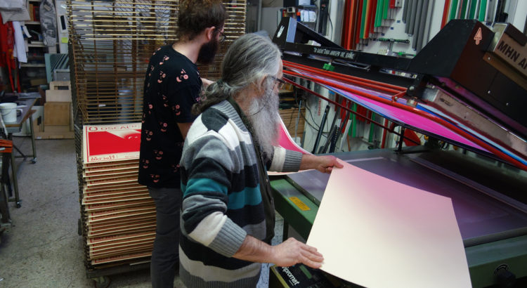
Silkscreen printing is an art in which one creates a design and prints it onto an object with clean crisp precision, that you can’t get with painting, drawing, etc. It is a technique that uses the mesh of a silkscreen to print a design onto a surface. The design is transferred in areas where the silk is permeable compared to areas blocked off. 

In any type of printing, one must think of their design and how it can be created in layers. In contrast to painting, when printmaking you have to print colors in different layers and with different shapes. 

A common type of printmaking is relief printmaking also known as block printing. This is a form of printmaking in which the image being printed is carved out from a surface(linoleum, wood, etc.). The pieces of material that are removed are the parts that will not be printed and the pieces left will be printed. For this process, think of a stamp. If you look at the face of a stamp whatever will be printed is the raised surface. The face also displays the backward image of what you are printing. 

Although silkscreen printing relates to relief printing with its technique of layering designs to create a piece, it differs in process. The materials used in this process are a silkscreen, squeegee, emulsion scooper, harsh light, UV screen exposure light bulb, screen printing ink, emulsion, and a surface to print on. To put your design on the screen you must expose it on the screen. To expose your design you put a thin coat of emulsion on your screen and shine light onto areas of your screen you don’t want to be printed. Once the emulsion catches the screen you have to rinse out the areas you want to be printed and then your screen is ready to be used in the printing process. 

When pulling ink through your design, one must consider transparency/opaqueness. This affects how your design will be perceived by your audience. Furthermore, when using this process to print a design one must note that the steps for exposing and printing each layer is time-consuming but in the end is very rewarding.

The technique of silkscreen printing is not easy to learn but once it is practiced it can be a very useful skill to have. Silkscreen printing is a beautiful and remarkable type of art and to see some examples of well-known screen prints or screen printing companies around Michigan look below!

Warhol

Lichtenstein

Fairey

Check out Stamps alum Ron Watters business One Custom City in Detroit!!!

“what is art?” Post #6 – What You Wear

Oh, fashion. How could we do without?


Last Spring, I came across a documentary about a wonderful woman named Iris Apfel. Interior and textile designer by day and accessorizer by night, Apfel is known to have the largest couture wardrobe collection in the United States. Starting at a young age, she began collecting accessories and clothes as she traveled the globe with her husband, leading to the infamous wardrobe she has today. In 2005, an exhibition was hosted by none other than the Costume Institute at the MET(!!!), showcasing her style. She was the first non-designer individual to have a show dedicated to her clothes and accessories at the Met. This exhibition was so successful it went on a little tour, and currently, a museum in Florida is designing a building that will have a dedicated gallery of Iris’ clothes, accessories, and other collectibles representing her artistic style. At the age of 98, she continues to wear show-stopping outfits and share her hobby and love for a variety of unique fashion. 

Reflecting on Iris, one can consider how someone’s creative expression as a hobby can be culturally seen as art and was art before anyone brought attention to it. The art side of fashion is frequently seen as exclusive or elite so it is fascinating when we get to see people come into the fashion art world although they were not designers themselves. 


We constantly consume information and express our feelings through what we do and I believe in what we wear as well. It is not just the clothes or accessories we put on and how they look but it is more about how they make the person who is wearing them feel. My clothes have a wide array of styles but that is because this reflects my many different moods and creative ideas/outlets. My favorite way to style my outfit is to layer. This allows me to wear a multitude of colors, patterns, graphics, etc. which allows me to show off my personality even more than my extroverted self already does. Additionally, I have personal items in my wardrobe that have sentimental value to me and I wear them for security, strength, and confidence. 

Comparatively looking at Iris’ and me I can see why her vibrant and culturally dense wardrobe got an exhibition at the Met and mine didn’t but that doesn’t mean mine is of any less value. Although my collection is not valuable expense wise, it is representative (so far) of my identity and what I make of it. Who knows, if I live until I’m 90 maybe someone will come to take a look at all the weird goodies I have and put it on display. I imagine in the future they will have a large exhibition about 21st Century style so maybe I as well as other “ordinary” folk could be in apart of that. The possibilities are endless in what the future has in store for all of us. 


Last year, Iris released a book with the symbolic title, Iris Apfel: Accidental Icon. The title represents how she has never intended to showcase her style but rather collected these treasures for herself. Considering Iris, I want people to consider how there are many different types of fashion and how all can be considered art if you look at it from the right perspective. On-campus if one were to look around they could see that everyone may look like they dress the same but if you take a deeper look no one is identically dressed alike and this revolves back to their identity. Iris showed the world what can become of wearing who you are and without realizing, we do this every day too. Art consumes our lives and we often forget that we can be the art ourselves. Fashion doesn’t have to be a restrictive category but rather something everyone embraces with displaying who they are.


And with that, I would like to close with three arguments to contemplate. 

#1 How you wear something is art. 

#2 Why you wear something is art. 

#3 What YOU wear is ART.


“what is art?” Post #5 – Lauren Kuzee Audio Interview

Lauren Kuzee is a sophomore studying Art & Design, as well as programs in the environment. She aspires to work in the field and to combine her love for art and the environment to make people more aware of the current world environmental issues. Take a listen to Lauren discussing her projects, the classes she has enjoyed taking in the past year and a half through LSA and Stamps, how she chose her majors, and her thoughts on what art is.

Instagram: @larunkuz


“what is art?” Post #4 – Yes, typography IS a form of art.

When an average person thinks of graphic design, usually they rarely think about the type of text used. An individual usually focuses on the greater message that the poster, ad, etc. conveys. However, text design plays a bigger role in what is and is not noticed by the viewer than one might think…


For example, if I were to look at a poster with good type, I would look past it and instead focus on the graphics displayed. On the other hand, if the type was presented poorly I would be stuck on the fact that the text is bad rather than looking at the poster as a whole. 


During the process of choosing the overall type of a project, many factors are involved. One must first think of who their audience is, what they want to say, and/or what they are literally saying in the text itself. You must consider what you are printing on, the colors of the type, the colors of the background. Do you want the text to be legible and readable? What spacing and alignment do you want? How will this affect the overall look? What do you want the shape of your text to look like and what emotions will that evoke? What about the tracking and kerning? How will you alter those to contribute to your piece? Furthermore, one must think of text size, line length, leading, and a million other characteristics when creating their text design. 


Before heading into my typography course this semester, I never even knew there’s a difference between a font and a typeface. Did you not know there was a difference either? Well, font refers to if the type is roman, boldface or italic type and typeface is the design of a set of characters; usually referred to as what family the type’s style is in. So when choosing the type you think of what typeface or family your text should be in and you also consider what “member” of the family or font you desire. For an example, in this blog post, I am typing in the Georgia Pro typeface and the roman font style–the default typeface for WordPress hoorah!


A typeface that leads to a huge controversy is Comic Sans. Initially created to present a warm, childlike, and innocent feel, it has been used in comics but also used very inappropriately in other text designs. When it was “born”, the typeface went global and was used immensely. However, since it was used too much, people started to have a “hatred” for it which proved the typeface’s limitations. Without hesitation, a majority of people can tell when Comic Sans is used properly or not well. Since the typeface portrays a comedic-like feel, when used in other scenarios than children’s books or cartoons it seems very very veryyy wrong. See below. 


If I have learned anything from my typography professor(Audrey Bennett… a true icon), it is to never use comic sans. 


Since I have been in my typography course, my eyes have been opened to a whole new world, an overwhelming world at that. Now that I have knowledge of all that goes into picking a typeface, it is even harder for me to select one. I used to just be like “Alright I guess this seems right.”, but now I go through questions like, “Does the alignment look right?”, “What type weight do I want to use?”, “How is my kerning?”, “Does this have enough gestalt?”. 


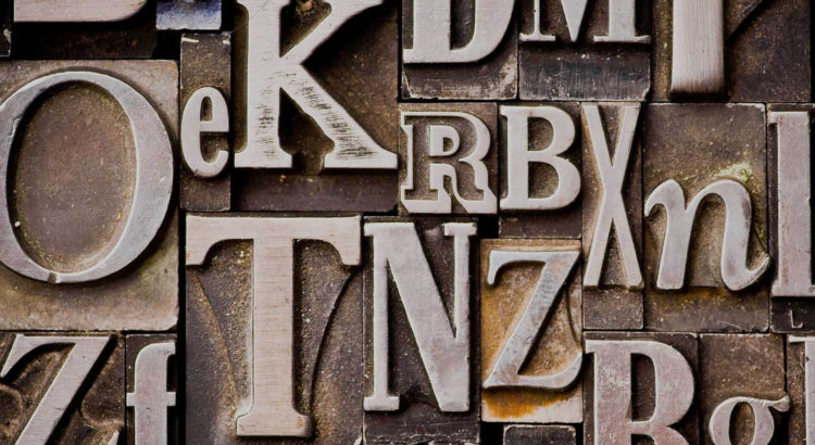
Most individuals don’t typically consider type an art, but boy are they wrong. Not only are there so many aspects of choosing a font, but there is even more when creating one. Some fonts have been revolutionary to society and the art world especially. Take Helvetica. With its simplicity and elegance, this typeface is multifaceted and allows people to show their message in a straightforward manner. Helvetica is the face to thousands of businesses, companies, and brand logos. It is one of the most significant fonts in history and shows how vast the world of typography is and how it links everything together. I mean, the typeface even has its own documentary. 


Whether or not you agree typography is an art or not, it is the core of how humans communicate with each other and there is no arguing that. Typography is one of the most influential factors in our decision making but because it has become second-hand nature, we have come to think of how it affects our life subconsciously. If one were to take a step back and observe how much type is around us and how it is being presented, surely they could create a discussion that could last an infinite amount of time. 


Typeface and the study of typography are usually not seen as art to the average person. However, it is important for us to reflect on how typeface is something we interact with every day and what art is truly defined by. 


This week, I encourage you all to ponder if typography is an art and maybe do some light research on how much goes into type design. And with that, I shall say, “See ya next week!” and also, please don’t ever use Comic Sans. It’s for everyone’s sake.

Peace!

“what is art?” Post #3 – The Art of Passing the Time Away

Lectures are tough. Interesting? Indeed! But still, tough. 


All Stamps students are required to take two art history courses, Art and Design History and Art and Design in Context(which is basically Part II of the first one). Don’t worry, I can assure you they are as “bleh” as they sound. Occasionally there will be exciting topics in lecture and discussion but for the most part, the class is filled with information I will not retain even if I tried. Last semester many students decided not to show up because they believed they could make better use of their time by working in the studios instead. Since so many people skipped, my professor eventually made it extra credit if you attended. lol.


The small “rebellion” towards our required course led us to this semester for Part II of Art and Design History where my professor(same one:)) has implemented a new strategy to reel us in and trap us for an hour. Her secret weapon… iclickers. These $40 little remotes are the devil. They allow my professor to smirk at us and say, “Lecture is not mandatory but it is welcomed.” To put the cherry on top, this semester’s lecture is at 5pm. Although it is not tooo late, everyone is dead by the time lecture rolls around and most people fall asleep during it. Honestly, very good lecture entertainment if I do say so myself. 


To make these one hour lectures on Monday and Wednesday go quicker, students chat and doodle. I mean it’s art school. What do you expect? Doodling is a pastime and makes the clock move faster than one can imagine. My “note-taking” pages in my sketchbook are filled with a bunch of random thoughts, weird monsters, the occasional note, and drawings of my professor. The other day I noticed it was not just my sketchbook filled with these things but everyone else’s as well. This brings me to my “argument” for this week…drum roll please…du.du.du.du.dudududud…doodles are art! I started to ask all of my friends to see what consumed their notebooks and was happy to see their pages dancing with doodles. I mean, a whole gallery could be dedicated to ARTDES150’s lecture doodles! Okay. That’s dramatic. A wall could be dedicated to ARTDES150’s lecture doodles!*


My favorite characteristic of doodles is that you don’t have to try to make them. You kind of just do it, it’s there, and nothing really happens besides simply bringing the one who drew it joy. (Although I must mention too, sometimes doodles can start a career. There is literally an artist named Mr. Doodle, who creates patterns with doodles. Granted, they are pretty amazing, but still, there is proof of a doodle career!)


Furthermore, another quality of doodles I enjoy is that literally, EVERYONE creates them. Going to the University of Michigan I have met numerous people with a variety of majors and they all have lil doodles in their notebooks too. Whether or not people believe they create art for enjoyment, there is proof it is inside all of us. Doodles are the evidence that everyone has creative energy and although they are usually small they can lead to big ideas. 


This week I encourage everyone to doodle there professor like the Stamps kids in ARTDES150. It is quite fun and again, passes the time. For inspiration and to end this post, here are a couple of snapshots of the doodles that fill the Stamps Lecture Hall. Enjoy!