Welcome to another week y’all! Today I thought I’d give you all a little intro on brush lettering 101.
To start, what exactly is brush lettering? Just what it sounds like. It’s handlettering, but specifically with brush pens. If you’re new here, a brush pen is basically a marker with a brush tip, which handletterers use when they want to get line variation in their letters. I would say brush lettering is probably the most common type of lettering, but it definitely has a bit of a learning curve.
The key to it is in learning the different kinds of strokes, or lines.  The basics all come down to upstrokes and downstrokes. Upstrokes are thin lines that use just the very tip of the brush pen, and they start from the bottom and go in an upwards direction (as the name implies). Downstrokes, again, what a shocker, start at the top and go in a downward motion. These are thicker lines because they involve using more pressure on the pen. I demonstrated this with the pictures below, using my favorite brush pens, Karin brushmarker pros.

 Once you get these basic strokes down, you can start experimenting with more complicated strokes. I’m not sure who originally came up with this set of strokes to practice, but I know I’ve seen @thehappyevercrafter and @ensigninsights use these on Instagram (highly recommend their accounts, especially for beginners!). In any case, these are essentially the core kinds of strokes or lines you’ll need to be comfortable making, because they appear in a lot of letters.

They can definitely be a little awkward at first, but once you get the hang of them, lettering with brush pens will be soooo much easier! In the picture I included here, I drew the strokes in the top line and added in a circle so you know where to start, and then arrows so you know which direction you’re drawing in. In the second line, I drew the same strokes again just so you can see them a little more clearly. As you can see, all the upstrokes are thin and all the downstrokes are thicker lines.
So how do these actually show up in lettering? Let’s look at some letters so you can see 🙂
 Here’s your basic lower-case, cursive “a”. To make this, you actually have to use two strokes (shown in the picture), meaning you pick up your pen once in between. For the first stroke, the oval-ish shape, you start where I put the little 1 in a circle. From there, you start with an upstroke, then transition into a downstroke, and finish off with another upstroke that connects to the first. Then, you pick up your pen, and begin stroke two! This one is a lot easier–start at the same height as the top of your oval, and just go straight down, then kind of flick your pen back up for that final upstroke. I’m not going to guide you through every letter because we’d be here forever, but I did include a little sheet I drew of all the letters and some guiding arrows for each of the strokes involved. I also color-coded them, so the stroke you start with is in red, followed by a yellow stroke, and on a few letters there’s a third stroke which is in blue. Of course, there are tons of styles for writing the alphabet, and every lettering artist does it a bit different, but this is how I tend to do it!

I hope you enjoyed learning a bit about brush lettering, and please let me know if you try this and found it helpful, or have any questions! See y’all next week 🙂
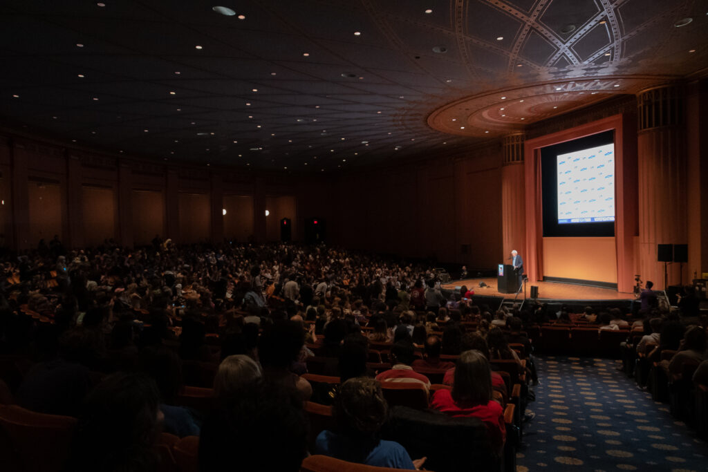
 Nguyen uses the poems titled Triptych and Gyotaku to experiment with form—there are three of each. Gyotaku is a traditional Japanese method of printing fish that dates back to the mid-1800s. The Gyotaku poems vary widely in how they’re arranged, but I chose the one below because I love its simple elegance—and again, there are themes of sound and music present. Nguyen’s poems sound and feel like music themselves; in this collection, each poem is its own brief elegy. You can see an example of it off to the side, and a sample of her take on the art form below.