I hope that you are all doing well and I want to congratulate you all on completing yet another year (for my student readers out there)! Many of you, including myself, graduated and will start a brand new chapter of your lives. I just graduated with a bachelors in Molecular, Cellular, and Developmental Biology with a double minor in Art & Design and Sociology of Health & Medicine. I will now be moving on to medical school this summer. It is incredible to say those words, I’m not sure it’s really hit me yet.
Looking back at these past four years, I am so grateful for all of the opportunities, guidance, mentorship, and love that I have received. I have failed and fallen many times, but each time, because of the strength and confidence everyone in my life has helped to instill in me, I have been able to stand up.
I do not have much to say besides thank you. Thank you so much to everyone who has stood by me on my journey. It has been my lifelong dream to become a physician, working to break down healthcare barriers, working to save lives, working to serve other humans every single day. Though my journey in medicine has just begun, I now can see the light at the end of the tunnel assuring me that I will one day be Dr. Riya Aggarwal, MD. What a privelege.
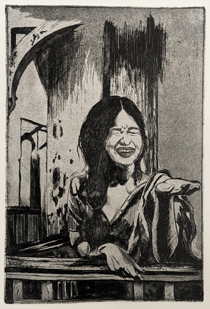
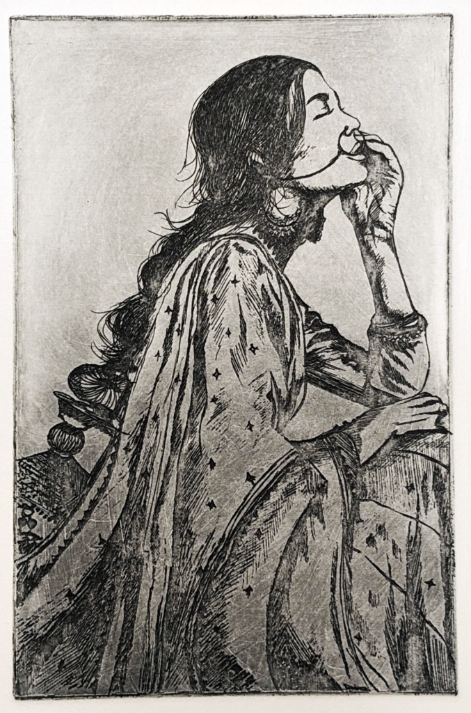
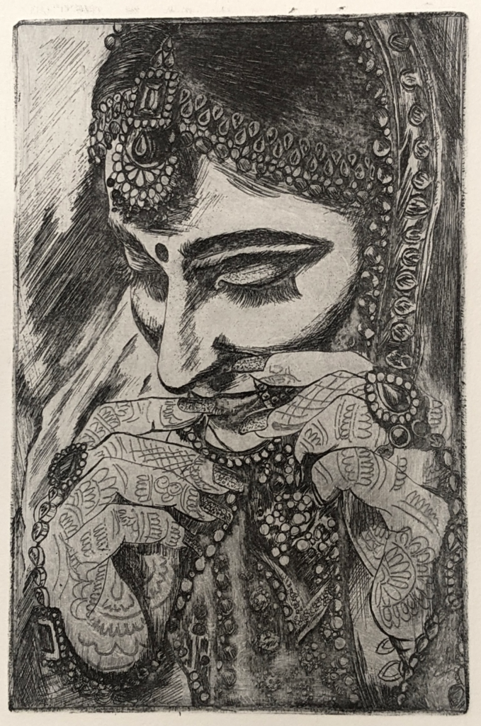
Art has been one of my largest supporters and the truest love of my life. Even if I went a year without touching a brush, paint, or even a pencil, just seeing my canvases sitting in my room, my colors and pallets adorning the shelves, or my countless pens and pencils strewn about, I felt a sense of comfort and safety. Reminding myself of my creativity, of my artistic capabilities, has given me the confidence to face many battles unrelated to the world of art. I am so grateful to be an artist. I am so grateful to have this part of my life and I promise to make sure that I never take it for granted.
To all of the artists, newly-minted graduates, longing creators, and hopefuls out there, never forget your passions. It is so easy to get caught up in the work, in the day-to-day of the achievement culture; however, it is the authentic parts of yourself, the parts that you yearn for at the end of a long day, the parts that shine when nobody is looking, that are the most important. It is your own definition of art that will teach you the most about you. It is through my art that I have grown the most, found the most solace, and cultivated the most confidence. This feeling is irreplaceable and inimitable. So harness it, chase it, and watch as its effects permeate into the rest of your life.
Once again, thank you so much to anybody who has ever read a post of mine, my family, mentors, professors, friends, and arts, ink., for giving me endless support, encouragement, and unwavering love. I would not be where I am and who I am without you.
Signing off,
Riya Aggarwal