
At last week’s Stamps Lecture Series, artist and designer Marina Willer spoke about not only about overall design but specifically brand identity. She explained how she artistically creates a brand’s identity from art practices she studies and activities she does with her kids. Her process is unique because it is not super structural but more creative. This allowed the large audience to understand how what she does is a type of art and also a very expressive kind of art.
After her talk it made me begin thinking about Michigan and our brand, the block ‘M’. I was curious how it originated and if this went through a large creative process like Willer’s.
Stumbling across a Michigan Daily article written in 2014, I found all of my answers I had been seeking. The writer, Austen Hufford, spoke about the origin of the Michigan logo, the birth of the block ‘M’ and how it became the face of Michigan today.
Coming to this school, I figured the block ‘M’ had been our logo for YEARS. However, I was surprised to find out it actually only has been solidified as our brand since 2014. The ‘M’ began to symbolize sports, specifical football in the 1890s. It was used on football uniforms and then in 1897 the University’s Athletic Association released a button exclusively for its members featuring the block ‘M’. After winning four consecutive national championships from 1901 to 1904 although people were increasingly seeking how to buy Michigan apparel, the block ‘M’ could rarely be found off the football field. Starting in 1909, the Michiganensian posted an advertisement for “Plain Solid Gold block ‘M’ pins” for $3 which became extremely popular and sparked the interest of further block ‘M’ merchandise.
In 1948, the block ‘M’ was present in the official Michigan athletics logo and it wasn’t until the 1970s that the block ‘M’ began to be seen all over campus and the state of Michigan as well. This transition and “rebirth” of the block ‘M’ can be due to the athletic director from 1968-88, Don Canham.
Although not an artist or designer, Don Canham is seen as the man behind the marketing strategy of the block ‘M’ that helped improve the athletic department’s financial stability. He used marketing of the block ‘M’ to increase attendance and sell a variety amount of merchandise. While holding the athletic director title, attendance to Michigan football games rose from 67,000 to over 100,000 each game.
Canham saw the power of the block ‘M’ and used it to brand Michigan’s athletics. This started the path of the block ‘M’ being trademarked in 1982 and for the next forty years, it’s continual growth to not only be the brand identifier of Michigan sports but the University as a whole.
In the late 1990s and early 2000s, the logo for the University of Michigan was questionable and almost unknown. In Hufford’s article he pointed out that, “Until UMHS was created in 1997, even departments within today’s UMHS had vastly different logos and marketing methods.” Many departments started to incorporate the logo into their own image but used many different colors and types of block ‘M’’s. The distorted expansion of the block ‘M’ led to a brand study in 2011, “which paved the way for a complete standardization of all University logos by 2014.” Since 2014, the University has finally had consistent branding and today in 2019, the block ‘M’ is the brand of everything Michigan related and is worn by all.
From its creation in 1891, the block ‘M’ was continuously designed in various ways and studied to become the reliable logo it is meant to be today. After learning all this information I am astonished at the long journey the block ‘M’ has gone through. Although it did not go through Marina Willer’s brand identity process, Michigan’s ‘M’ went on an interesting path and as a student, I can confidently say the block ‘M’ clearly embodies the spirit and academics of the school I love.
If interested, take a look at this LINK to find out more information on how to brand and/or create with the Michigan ‘M’ block.
Austen Hufford’s Michigan Daily article —> CLICK ME


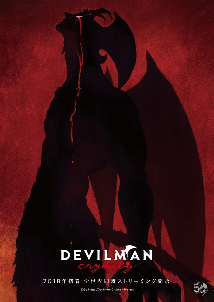 Devilman Crybaby is an original Netflix anime adaptation of the original manga by Go Nagai, and although I highly recommend watching it, I’ll try to save some of my praise for another post. The essential story is about a young boy named Akira who gets wrapped up in an emerging world of demons by his mysterious childhood friend Ryo. It features existential and dark themes, and raises questions about humanity, society, and love that make you think long after the show is over. It’s a tragedy to be sure; be prepared to cry when it’s over, but it is not without its moments of hope. The soundtrack to the show mirrors this so accurately and poignantly, making it the perfect complement to the show and adding something that makes it entirely unique. The aesthetic of the soundtrack perfectly fits the artistic style of the animation; it’s primal and pounding at times, matching the intense scenes of chaos, and other times it’s subtle and futuristic, setting this iconic tone throughout the show that lasts long after its over. My favorite tracks however are these long orchestral pieces, featuring these solemn and mourning grand piano melodies that are absolutely haunting. They contrast so well, both on the overall album and in the show itself; they provide these thoughtful reprieves from the chaos, where both the characters and audience are forced to reflect on the tragedies of humanity. Overall, I find this soundtrack incredible in how it affects the story, and how well crafted it is that it can stand alone.
 Another great example of a stand out soundtrack is Swiss Army Man, a small indie film featuring Daniel Radcliffe and Paul Dano. Again, one of my favorite movies; a little quirky and hard to swallow at first, but it leaves a lasting impression and is just genuinely fun to watch. Similar to the Devilman Crybaby soundtrack, this soundtrack stands out for its aesthetic and style: it is fun and folky, featuring a lot of vocals and accapella, accompanied by simple instrumentation and haunting chords. All of the vocals are performed by the two actors as well, which is ingenious, especially during the film when the characters are quiet and the music speaks for them. The movie mostly takes place in the woods and is an unusual love story, which is reflected well in the soundtrack. It features a variety of unusual songs, mostly focused on the relationship between the two main characters, and tells its own story in a way that the film itself can’t. In this way, the soundtrack adds an important element to the story and can’t be ignored. These reasons make the soundtrack stand out, and as a result I still find myself listening to it, reliving the great moments of the story through music.